7 Tips for Designing a Better Checkout Page
With the holiday season right around the corner, many of us will be doing some shopping online. (OK… maybe a lot of shopping!) The checkout page of a website can make that experience one to remember, or one you wish you could forget.
If you are designing a checkout page, there are so many considerations – functionality, usability, security and design. The last element is something every designer can have impact on. A checkout page should not be designed as an afterthought; it is arguably the most important page in the online shopping experience.
Make it Visual
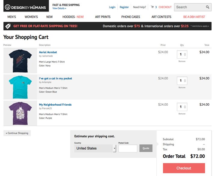
This may sound like an obvious idea, but the checkout page of an e-commerce page needs to be visual. Too many websites turn it into a basic form.
This is important for several reasons. A visual connection between the checkout pages and the rest of the site establishes brand credibility. If the checkout page looks like the rest of the site, it feels safe and like it belongs to the site. Visuals, from logos to items in the cart, help users remember why and where they are on the web. (Remember, much of the world is a quite distracted group of internet users.)
So what kind of visuals should you be using?
- Images. At a minimum, every item should be accompanied by an icon that shows what the user is buying.
- Logos. The company logo should always be clearly visible (and clickable to get back to the rest of the site).
- Big buttons. Make calls to action like “Add to Cart,” “Update Item” and “Buy Now” large, colorful and visually appealing. Buttons should be easy to find and make you want to click them.
- Color. Too many checkout pages are all white with outlined boxes. It is OK to use color. Maintain the color scheme of the rest of the website on the checkout page.
- Typography. Text should be simple and easy to read. (People tend to “trust” simple serif or sans serif typefaces more than a script or novelty font.) But you can also have some fun with larger text elements.
Include Payment Logos and Security Seals
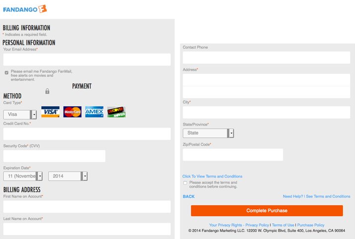
Include visuals that make users feel good about shopping with you. While most people understand they can pay with a credit card online, having small logos next to payment buttons reinforces this idea.
It’s a small, yet reassuring, visual cue for users. It can help eliminate confusion about what types of payment are accepted.
Just remember to include logos for all payment types. (Too many sites remember credit card logos but forget PayPal or Apple Pay.) Keep the images small and group them in an organized manner. (Thankfully for designers most of these elements render well in small formats and have similar aspect ratios.)
Consider designing or downloading a specialty user interface kit of logos for this purpose. You are not limited to stock logos from the company. Just don’t get too wild with the design; the goal is for users to recognize the logos at a very small size on the screen.
Consider Enlarging Images
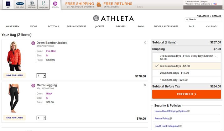
Checkout pages that allow users to get one last look at items in the cart are a great bonus. Hover effects that enlarge each item in the cart or a pop-up can make it easy for users to see potential purchases one last time and eliminate the frustration of having to navigate back to check a color or size.
Another option is to create oversized thumbnail images for items on the checkout page. This additional image can help a user confirm is or her shopping choice and feel even better about the purchase.
Too many designers neglect to include images at all, making it easier to abandon a cart. Think of it this way, having an image at checkout is equivalent to standing in the line at a physical store with an item in hand. Not many people change their mind at this point.
Use Tables
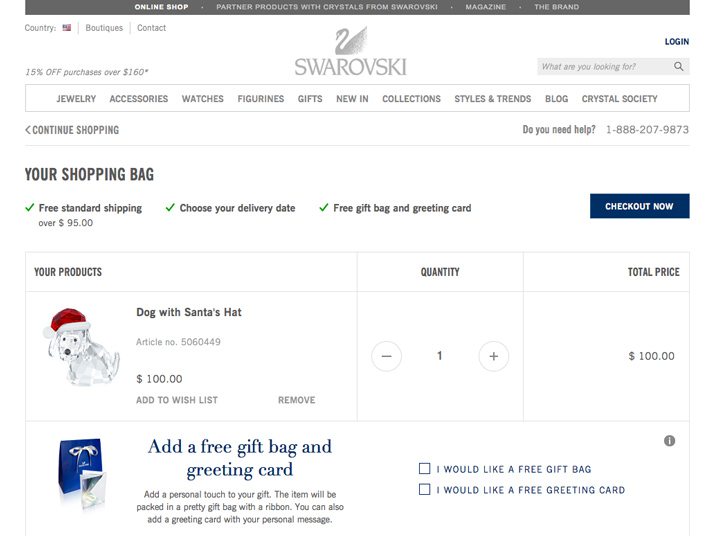
Information in the cart needs to be organized to perfection. The easiest way to achieve this is to design the cart in the form of a table or similar grid-based format.
Use columns and rows to display each item, an image, description, quantity, price and any other relevant information. Items should sort vertically in columns with other information in the corresponding row. This style of sorting is essential for carts with multiple items so that users are not forced to move across screens instead of up and down (which is more comfortable).
Within each table or grid, use consistent alignment. Left is most common. Consider the way prices align as well so that are easy to see on the screen. Ideally prices should line up so that the numbers before and after a period are in the same positions for each item.
Think About Functionality
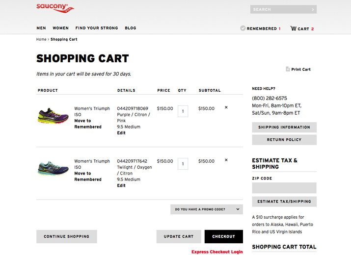
While much of the overall functionality of a checkout page design might not be the directive of a designer, it is something that needs to be considered. (Whether designers or developers create these concepts can vary by team.)
Key functionality concerns that need design elements include:
- Capability and ease of printing from multiple screens, including before and after checkout.
- Include wishlist functionality or another method to save items for later purchase. Make that information shareable.
- Too many checkout pages become dark holes without links back to other parts of the shopping experience. Don’t lock users into pages they can’t get out of.
- Allow in-cart editing of items.
- Consider a printable invoicing option or page. (This is especially important if your customers include business clients.)
- Make it easy for users to understand how to modify, change or update orders. Many checkout pages include a quantity counter next to each item. Make that number easy to edit (and it should update automatically).
- Make it easy to create an account after checkout. Not every customer has shopped with you before. It should be quick and easy to make a purchase and then sign up for an account. Covert the sale first.
Key Icons Should Appear on Every Page
Thinking about checkout page design, starts the minute the website concept begins to include an e-commerce option. Certain design elements need to carry throughout the entire website.
Add to cart and checkout page icons should be carried throughout the design. The buttons or navigational elements should have the same design (or quite similar) as the corresponding action buttons on the checkout page.
Remember Mobile Users
A growing percentage of sales are happening on mobile devices rather than desktop computers. Think about the design of your checkout page and ease of use for these customers as well. (Nothing is more frustrating – and all too common — than a website that works on a phone up until the checkout page.)
Design elements with tap and swipe in mind. Buttons should be larger and easier to see. Form should include deeper boxes so that they are easy to tap into without having to zoom the screen in.
When it comes to mobile users, keeping everything on a single page is equally important. Create a checkout page that scrolls rather than flips through multiple screens.
Conclusion
Designing a checkout page can be a big task for any designer. The key is something we talk about often in the design community: Keep it simple. Design a simple outline with minimal effects and a focus on usability and you are more likely to find success.
Remember the user when you think about checkout pages. Strive to design a page that has visual appeal, logos to guide and inform users, plenty of images, an organized layout, function, icons to guide and promote sales and a mobile-friendly interface.
Stock Photos Courtesy of Creative Market.