Best and Worst Design: 50 U.S. State Websites
In the past, we took a look at fifty of the best and worst university websites from around the United States, a post which launched an interesting discussion about how web design projects can be destroyed by committees and politics, even if talented designers are leading up the team.
Today we’re following that up with a similar discussion on official state websites. Which U.S. states have the absolute best looking websites and which have sites that look like they haven’t been updated since Clinton was in the Oval Office? Read on to see how your state ranked.
And The Winner Is…
Let’s face it, government websites are an easy target. In the world of web design critiques, they’re pretty much the low hanging fruit. For this reason, I wanted to start off with the positive feedback. To my surprise, not every state website was horrible. In fact, some of them are quite nice!
With that in mind, my personal pick for the best official U.S. state website is Utah.
Utah
I’ve said it a thousand times on Design Shack: good photography makes for good design, and this site proves it. I couldn’t call this site ugly even if I wanted to. As soon as the page loads, you see this giant, gorgeous photograph that immediately sucks you in.
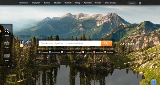
Beyond the gorgeous photo though, there are several reasons that I think this site succeeds. First of all, government websites are known for being just a massive list of links, which you’ll see in some of the other sites below. A list of links is only helpful to a point, but once you add too much to it, it ceases to be useful and simply turns into a mess that’s impossible to sort through.
So how do you organize a site when the amount of information at your fingertips is mind boggling? The people behind the Utah website realized that this problem was solved long ago with search engines. When you visit Google, virtually the entire web is a few clicks away. Rather than attempting to list every site on the web though, they provide a few simple categories and leave the rest up to search, that way you can get exactly what you want in seconds.
Utah’s website might look like a ripoff of Bing, but I think it’s just about perfect. If I want to renew my driver’s license, I type in “DMV” and right away get where I want to go.
Also be sure to scroll down the page, I really like how they separated the background images with flowing arches. Top to bottom, it’s just a great design and I didn’t hesitate to name it the winner in this little contest.
The Cream of The Crop
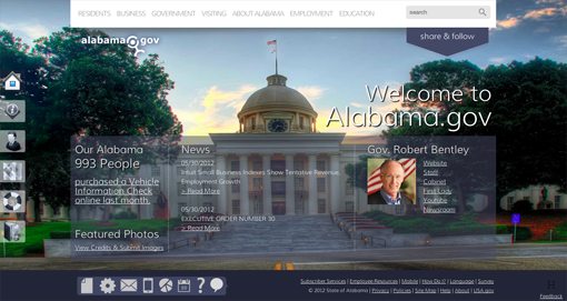
This is the list of “also ran” sites that clearly stood out as better than average. Those that I tend to favor pick up the large photo, search engine theme that we saw in the Utah site. A few of them, such as the Alabama site, are marred by small things like ugly stock icons, but are otherwise quite good.
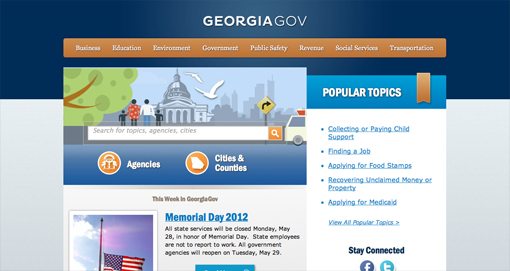
In the realm of unique designs, I thought Georgia was a solid entrant. It’s not the most beautiful site I’ve ever seen, but I really appreciate how unique it looks. The color palette is bright and friendly and the entire thing has a custom feel that is the very opposite of boring and templated.
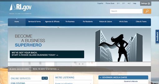
The second place site, and really it probably should be the first place site (dang my visually biased brain), is Rhode Island. The reason for this is that the site is actually responsive! I definitely did not expect any of these sites to be that forward thinking. Hats off to the folks behind the Rhode Island site, it’s beautiful and highly functional; stellar work.
Alabama
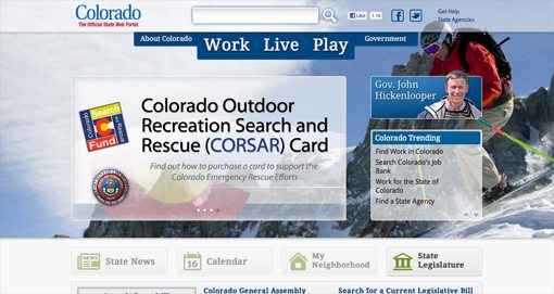
Colorado
Georgia
Indiana

Maine

Missouri

Rhode Island
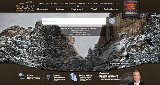
South Dakota
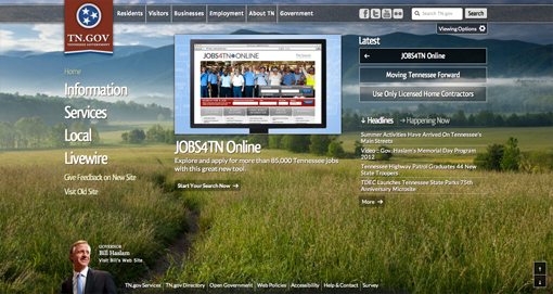
Tennessee
Could Be Worse
In this section, we have the state sites that aren’t necessarily horrible. I wouldn’t call them attractive, nor would I call most of them highly usable, but they’re not bad enough to openly trash.
A lot of the problems with these sites really become more apparent when you view them up close, so be sure to click through on a few of them. Looking through my thumbnails, I thought about moving a few of them to the previous category, but when I followed the links and viewed them large again, I quickly understood why I had placed them in this category. Ugly typography, poorly styled links, and nasty low resolution images abound here.
With some love and attention, several of these sites could be made “good,” but in their current incarnations several of them feel a little sloppy. If they aren’t sloppy, they’re just dated. Overuse of rounded corners, really dark drop shadows and bevel/emboss effects simply scream “this website is ten years old” to me.
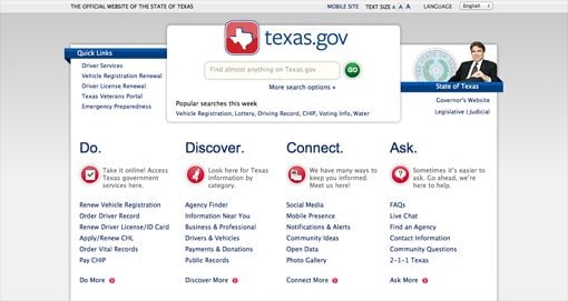
This certainly doesn’t speak to all of the sites in this category though. For instance, I think the Texas site is actually quite good. It’s simply boring and uninteresting. I think there should be a balance here between giving local residents what they need and selling out of state residents on where you live.
The Utah site sells me immediately. When you see that photo, you want to go there right away. The Texas site on the other hand, simply doesn’t make me want to visit. TravelTexas does a little better, but there’s still nothing that really grabs me.
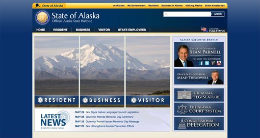
Alaska
Arkansas

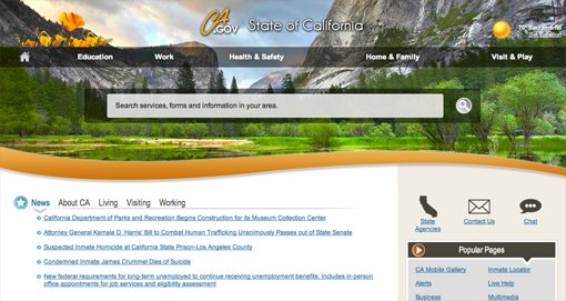
California
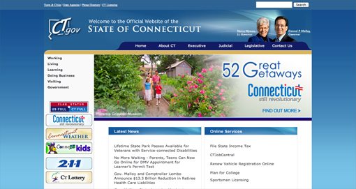
Connecticut
Delaware

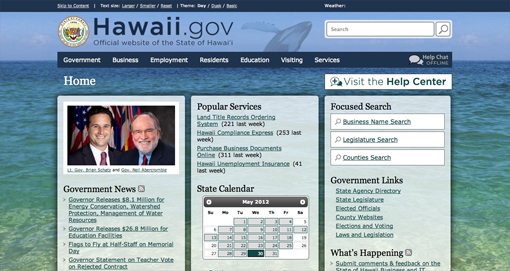
Hawaii
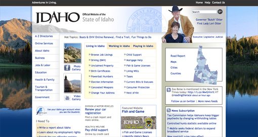
Idaho
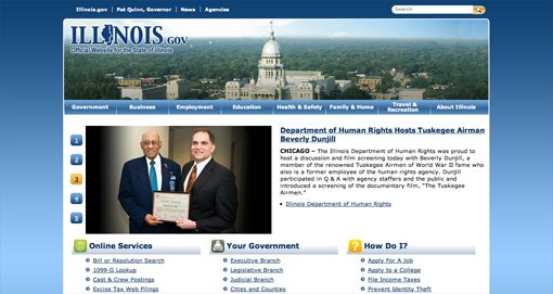
Illinois
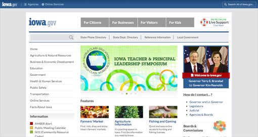
Iowa
Kansas

Kentucky

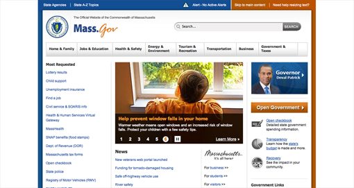
Massachussetts
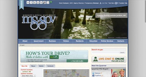
Mississippi
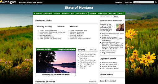
Montana
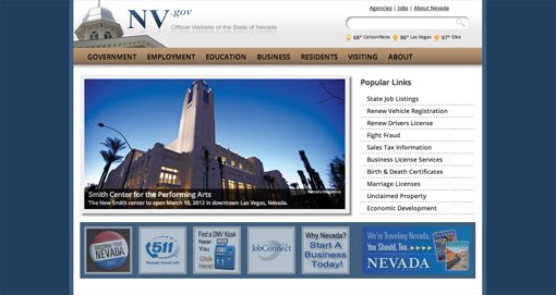
Nevada
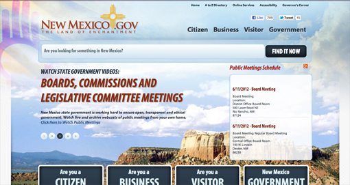
New Mexico
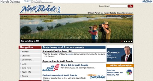
North Dakota
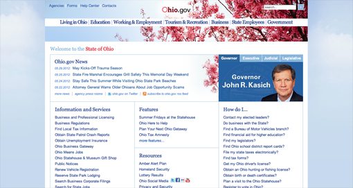
Ohio
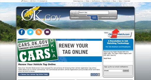
Oklahoma
Pennsylvania

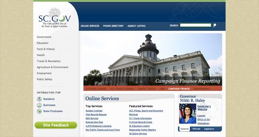
South Carolina
Texas
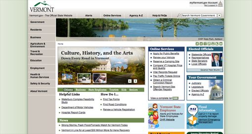
Vermont
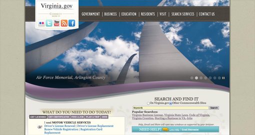
Virginia
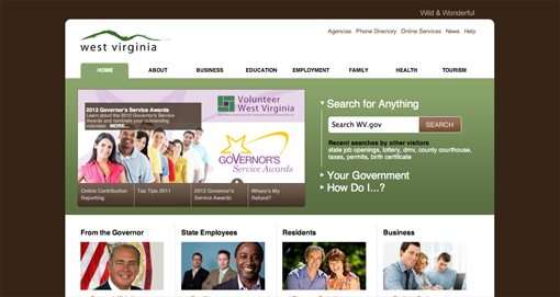
West Virginia
Really? This Is What You Came Up With?
Up to this point, I’ve tried my best to be nice. Real people work on all of these sites and we should never forget that they’re surely not trying to make bad websites. That being said, I really don’t feel like the states in this category are really investing a lot of time and effort making their site the best it can be. If they are, it’s even sadder because these websites are a train wreck of hideous aesthetics and nightmarish organizational schemes.
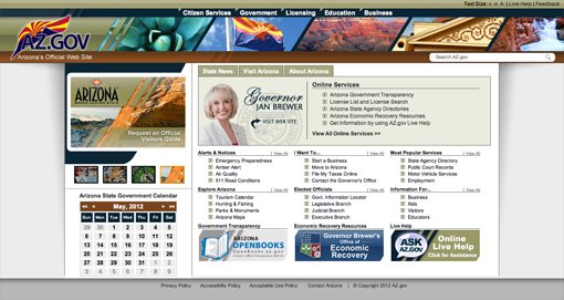
I’d like to note that the first state on this list is my home: Arizona. You’d think I might be biased and go easy on them, but it’s the opposite. I’m actually ashamed that my state can’t come up with something better. To be fair, the organization isn’t too bad, the biggest problem is that the site is just flat out ugly. It simply does not reflect an understanding of modern web design practices.
With all the negativity that I’m slinging on Arizona, it’s actually one of the best sites in this category! Most of the pages here are straight out of the 1995 web design playbook. Let’s take some time to openly criticize a few because they’re earned it.
Warning: Harsh Criticism Enclosed
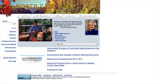
Hey North Carolina, the screen doesn’t stop after 800 pixels. Oh, and Nebraska, simply because you can make your text all different colors doesn’t mean that you should.
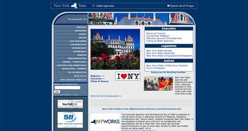
I’m sure everyone is jealous of those super intense rounded corners on the New York site though, the whole page is like an unpleasant pill that you just have to swallow while hoping it doesn’t have a bad aftertaste that’s going to stick with you all day.
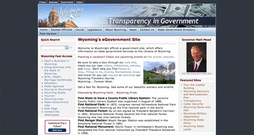
You have to give Wyoming some credit, they had the guts to just stick a huge pile of money in the header. That’s the visual hardworking tax payers want to see! I could go on for days, but I’ll spare you. Here are the sites if you can bear to look.
Arizona
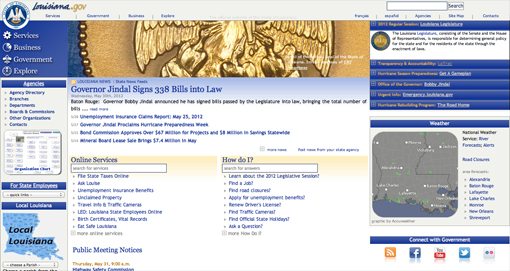
Louisiana
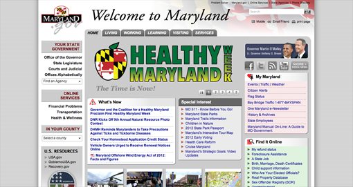
Maryland
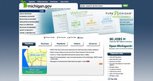
Michigan
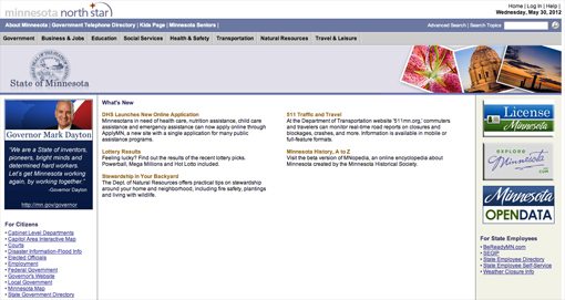
Minnesota
Nebraska

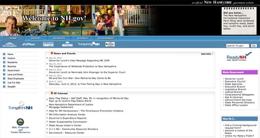
New Hampshire
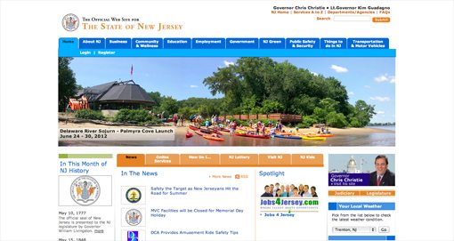
New Jersey
New York
North Carolina
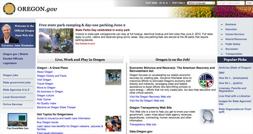
Oregon
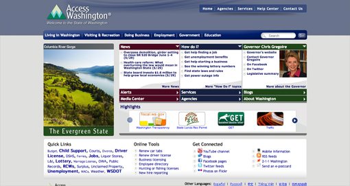
Washington
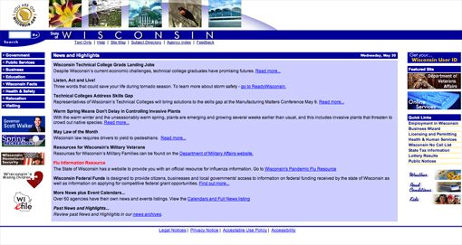
Wisconsin
Wyoming
The Prize for Worst Site Goes To…
It wasn’t hard to pick the best site for this post, but it was very difficult to choose the worst. The sites in the pervious category are all pretty bad, but the one that really just made me wonder if the entire web team simply died off a decade ago was Florida.
Florida
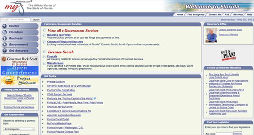
I have to be honest, I’m not sure if the organization here is decent or not because I can’t bring myself to read it. Initially, I wasn’t even sure if this was the actual official site, but as far as I can tell, it is. It’s obvious that the Florida Governor’s Office is gobbling up the entire web design budget, leaving nothing left for the poor abandoned state site.
Interestingly enough, the layout here is actually repeated in several of the sites above. My assumption is that most state websites at one point shared this general template and some, like Florida, simply haven’t moved on yet. Let’s hope they have someone working on it. The world would be a better place if this site design were dead.
How Does Your State Stack Up?
Now that you’ve seen my praise and brutal criticism for the fifty state sites, it’s time for you to chime in. Do you agree with my assessments or would you move around a few of the sites to different categories? Where do you live and what do you think of the site for that place?
I realize that a huge chunk of our readers are based outside of the U.S., so I’d love to hear from these readers as well. Leave a link to your local government site along with your opinion of where it belongs on this list.