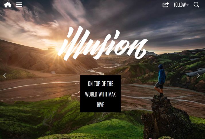
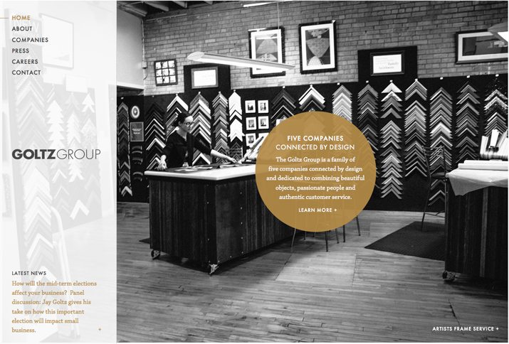
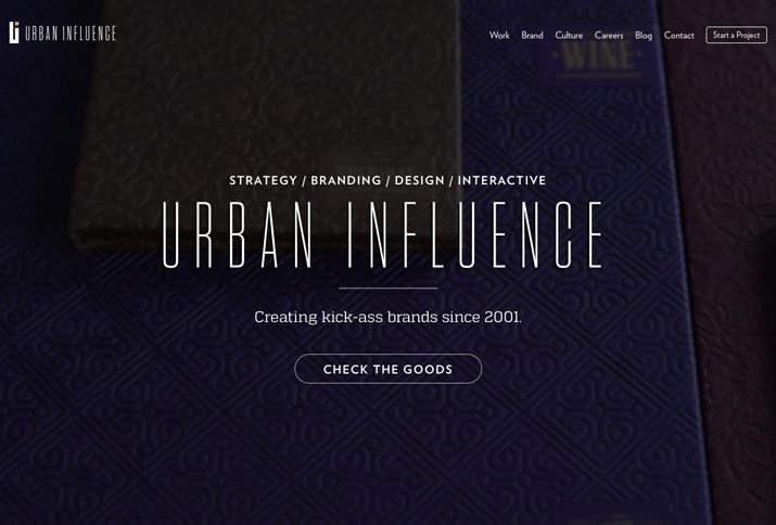
How Color, Type and Space Can Impact Mood
Do you ever think about mood when you are designing? Mood has impact in two ways – the mood of the project itself and the mood of users. Together they create an experience that connects each user to the project.
While you can’t always account for the mood of users, or their good and bad days, you can create an aesthetic that emphasizes the right mood for your project. Three basic design techniques – color, typography and space – are key components for establishing the mood of a project.
Design and Mood
Moods are an extension of emotions. This less defined sort of feeling often falls into the category of good or bad and last for longer periods of time than a specific emotion. Moods can change based on events, environmental factors or even by viewing something, but mood is primarily a feeling that just happens and is less intense than a specific emotion. It can impact how a person thinks about everything he or she comes in contact with.
What makes mood especially interesting and important for designers is that research has shown mood influences advertising and brand attitudes. One common finding is that almost everyone surveyed, regardless of gender or expressed mood, preferred to view information that’s presented in a happy way.
When you think about mood, two extremes come to mind – good and bad (or positive and negative). These moods often emerge from emotional influences such as anger, fear, disgust, happiness, sadness and surprise. Mood can also happen for a group or crowd, resulting in a common mood that creates a shared emotional experience.
So how does all of this impact design? Mood establishes how users will connect to a project. Will they view it in a positive or negative way? How will they process they information presented? Does the mood of the project establish a connection with the mood of users in a way that creates a commonality or group feeling?
Color
Color associations in terms of mood require a lot of context. How the color is used – a dominant color versus accent – and other colors in proximity to it can have great impact.
Design techniques such as tint, tone, saturation and contrast make a lot of difference as well. The warmness or coolness of colors are also directly associated with mood.
- Warm colors are soothing and creative but can feel chaotic or stressful (red, yellow, orange)
- Cool colors are inviting and professional but can feel unfriendly or stark (blue, green, purple)
Positive color associations
- Red: Love, urgency, youth
- Orange: Energy, ambition, enthusiasm
- Yellow: Cheer, joy, energy
- Green: Growth, nature, luck
- Blue: Peace, trust, security
- Purple: Wisdom, respect, wealth
Negative color associations
- Red: Warning, war, annoyance
- Orange: Anxiety, aggressiveness, nervousness
- Yellow: Insecurity, distraction, panic
- Green: Envy, apprehension, uncertain
- Blue: Grief, remorse, dispassion
- Purple: Boredom, loathing, disgust
Adding black any color give it a more negative association, while adding white creates a more positive feel. This applies both to the actual color mix of each hue and surrounding colors and contrast.
Typography
Typography can present an interesting case study in mood. There are two primary considerations – aesthetics and readability.
Typography can be used primarily as a visual element and in this regard offers more opportunity to create different kinds of feeling. Moreover type is used to convey information and needs to be readable. Type that is not easy to read, regardless of context, will create a negative association.
Readable type includes every word on the canvas from headlines to body text. When thinking about type for readability, designers often opt for a serif or sans serif style. Serifs are considers to be a little more professional and serious while sans serif typefaces are associated with more modern, clean and informal designs.
Typography used for purely aesthetic purposes can fall into almost any category. Connecting type to the overall context of the design can greatly impact the mood it conveys as well, especially if your typefaces are fairly neutral. (Helvetica, for example, is thought to take on the properties of surrounding typefaces.)
Positive type associations
- Serifs with thin strokes
- Rounded lettering
- Novelty typefaces
- Type styles with log tails or flourishes
- Fancy scripts
- Open lettering
- Modern typefaces
Negative type associations
- Thick strokes
- Letters with harsh strokes or lines
- All caps lettering
- Messy handwriting or shaky strokes
- Ransom lettering style (using mixed typefaces)
- Tight lettering
- Blackletter or old-style type styles
Space
Just a physical space can make you feel a certain way and create a mood, so can design space. And the concept parallels physical space in that generally open spaces are more positive and inviting while closed or tight spaces are more negative in association.
Space is the connecting element in a design project that gives users a visual break. Space creates a flow from element to element, telling people where to look, what to read first and what’s important in the information they are processing. Space can also make you feel at home in the design or lost in the chaos of it.
Designers often use space to imply an overall mood for the project. Simple spacing and organization can bring together color and typography to create a positive mood or lack thereof can have the opposite impact.
Positive space associations
- Open space
- Consistent leading for type
- Common text wrap and element spacing
- Organization of elements/use of a grid
- Plenty of margins
- Contrast between open or negative spaces and other elements
Negative space associations
- Tight space
- Poor alignment of objects
- Broken spaces between text that make reading difficult
- Elements that are too small or large in context of other items
- Overlapping elements or elements that bump against one another
- Lack or organization or order
Conclusion
The great thing about understanding design techniques and mood is that you can impact the mood of your audience. While you can’t make everyone have a good day, a design that uses groupings of elements that have associated positive or negative feelings can “rub off” on people looking at a project.
Use a combination of color, typography and space to design a mood that fits your brand and is most appealing to users. (It’s important to note that positive associations often get the best responses.)
Image Source: joyousjoym~Blessings.