Creating Visual Hierarchy With Typography
Visual hierarchy is an important element in any design project. It tells people where to look and what things on the screen or printed page are most important. Hierarchy gives readers a sense of how to actually read material from start to finish with visual cues and flow.
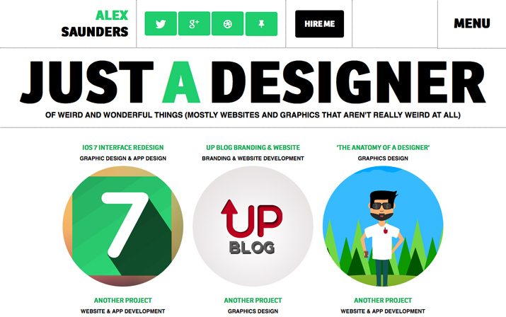
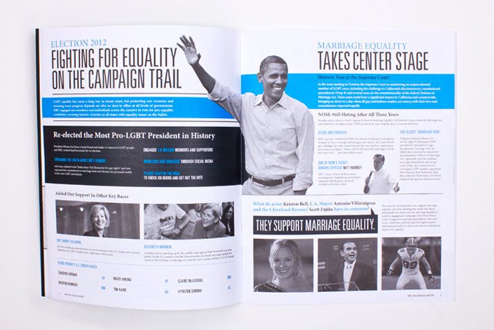
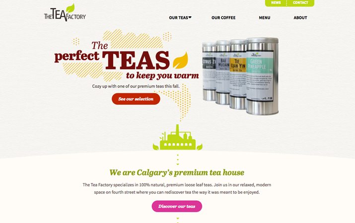
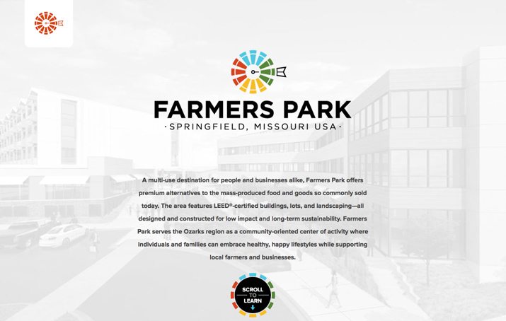
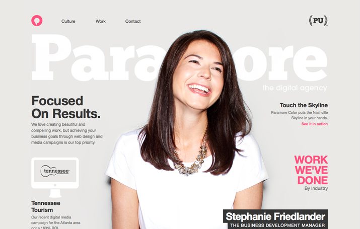
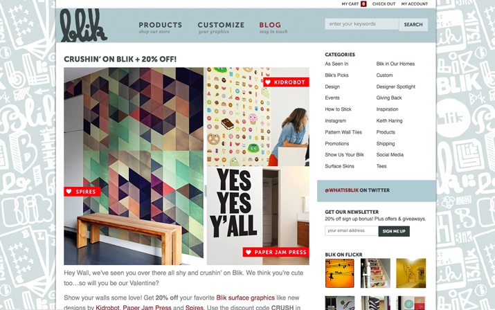
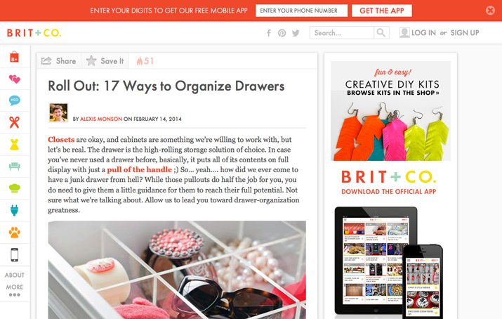
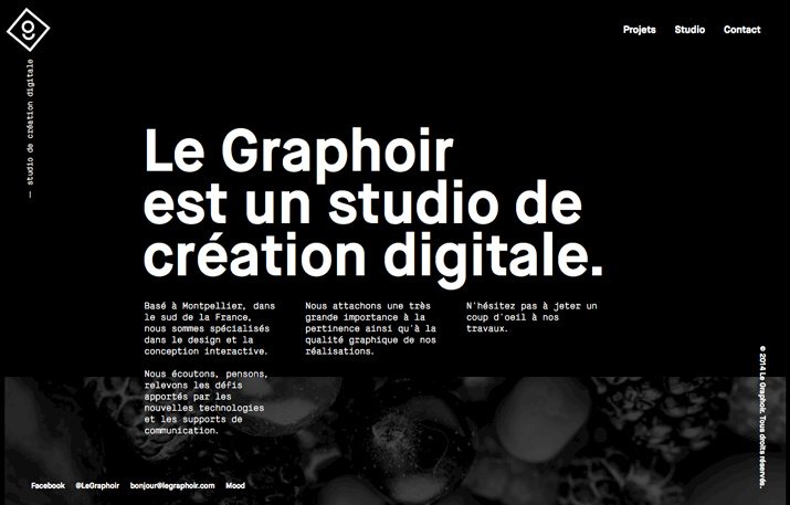
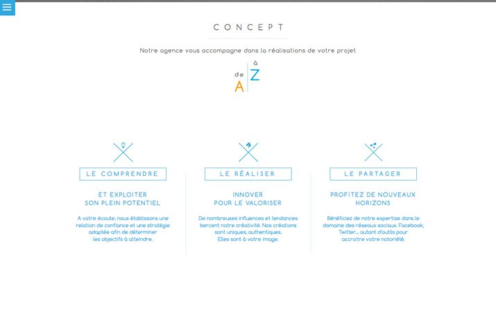
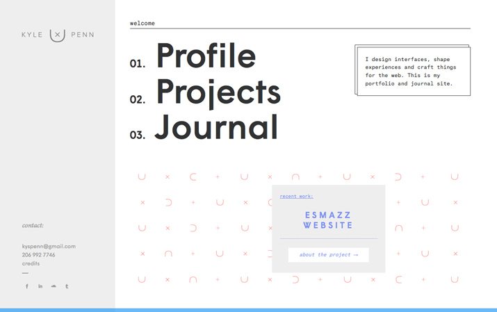
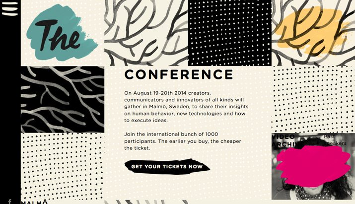
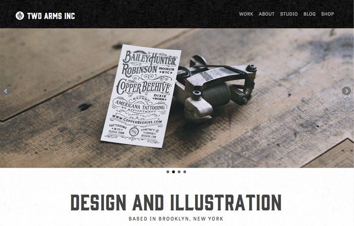
While you can create visual hierarchy using a number of different tools, today we are going to look at ways to create structure with just typography. (And take a look at the images used throughout this post; they are all examples of great type hierarchy in action.)
Why Hierarchy is Important
Type hierarchy organizes and gives order to the text elements in your design. Just as web designers and developers use header tags – h1, h2, h3 and so on – to organize the importance of text, visual hierarchy uses visual cues. In addition, type hierarchy helps readers scan text, reading bits of type faster in chunks that look alike.
Generally, English language readers start at the top left and read across and down. Type is often organized to mirror this behavior. But what if the biggest and boldest text is midway down the page? Often a reader will start there and then go back to the top of the page and continue with normal reading behavior.
Hierarchy is important because it allows the designer to determine what someone will likely read first, second and so on. Because of this, the designer can create type in such a way that he or she knows what information is likely to be received and in what order.
As creating hierarchy is important to designers, it is equally important for readers. Good visual hierarchy tells us what is important, making reading much easier. For example, you know that the headline is the most important (or attention-grabbing) part of a story or article because it is the biggest, followed by subheads and then the body text. For scanability purposes, you could read the big text to get an idea if the article would interest you before investing a lot of time in the copy.
How to Create Hierarchy
There is no one-step solution to creating visual hierarchy with text. It can be created with size, weight, color, texture, typeface choices and combinations, orientation and space, or a combination of those tools.
Size
One of the simplest ways to establish hierarchy with type is through size. Readers will often see the biggest type first and start reading from there.
In relation to size, scale is equally important. To create distinct hierarchy, sizes must have significant variance in relationship to other type on the page. The thing to keep in mind is that different typefaces may scale differently, so just changing the point size may not be enough; you need to look at how typefaces work together to ensure the size and scale are properly balanced.
So how do you get started with creating the right size and scale of type for a project? Start with the main body text and go from there. And for text elements that are used to really draw people in, go big.
Here are a few percentages to help you get started:
- Main body copy (14 points)
- Main headers: 250 percent more than main body copy (35 points)
- Secondary headers: 175 percent more than main body copy (25 points)
- Navigation elements: 165 percent more than main body copy (23 points)
- Secondary navigation or menus: 140 percent more than main body copy (20 points)
Typefaces
After size, typefaces are the most used element in terms of creating typographic hierarchy. The key is to have contrast between typefaces. (This is one reason that designers often select one serif and one sans serif typeface for a project.)
For the best combinations, look for typefaces that are different in weight by have a similar tone or feel. If you are using rounded typefaces, stick to letterforms with similar shapes in the o’s, for example. Opt for typefaces with similar x-heights if the styles will be used in line with one another throughout the project.
Weight
The thickness of strokes in the type you select for a project can create hierarchy as well. The thicker the typeface, the more bold and bigger it appears. Light, condensed and thin typefaces often appear smaller than they actually are. Bold, ultra and hammerhead typefaces can appear larger than the point size may represent.
How large or small a typeface appears by weight is also relative to the other typefaces used in the project. Pairing thick and thin typefaces immediately creates a sense of hierarchy with the thick style carrying the look of greater importance (often even if it is actually smaller on the display).
Color
Using color can also add emphasis and increased weight to type. Think about some of the color rules you learned as a child – warm colors (reds, yellows, browns) will have more pop while cool colors (blues, purples, grays) will fade.
When using color to establish hierarchy, consider the hues used for the foreground, type and background. Color contrast will also play an important role. The most saturated or brightest colors will often “lift” off the screen against more muted tones.
Orientation
How test rests in a layout next in relationship to other text can impact the overall hierarchy. Typically, most text is oriented horizontally in s straight line across the screen. But what you place text vertically?
This change in orientation will bring the focus to those words or block of text, making it appear to be the most important element. Tilting, twisting or otherwise altering the shape of text in any way can achieve the same effect. (It should be noted that most designers often avoid these type “tricks” except for a few circumstances.)
Space
White space can make type appear bigger and more readable. Lack of white space can make it feel tighter and smaller. Use space to your advantage when creating a sense of hierarchy.
Think about the space you use between lines of text. Think about kerning for the biggest type styles. Think about the spatial relationship between letters and the edge of the canvas. Think about the relationships between type of different sizes, styles and colors.
Every single space can impact your hierarchical scale. Keep similar type grouped closer together and with less space than unrelated items. And design your space so that text falls into a distinct order. Bigger, bolder, brighter text elements often need more space than smaller, simpler text blocks.
Texture
Texture is a loose concept in terms of type. No, we are not talking about putting a texture inside of lettering; we are referring to creating a pattern of texture with the way letters and words rest on the page or screen.
Within blocks of text, you end up with a patterned look. To establish more hierarchy, break the pattern. This can be accomplished using one of the tools already mentioned or by changing something as simple as the alignment of a single block of text.
This change to the overall texture of text can have a real impact on how it is perceived. Be careful though of too many textural changes, because they can get distracting when used frequently.
3 (or 4) Levels of Type
While some projects call for complex hierarchies, most designs can be successful with three levels of typography hierarchy. Those levels are primary type, secondary type and tertiary type. (In this scale I do not include banners or logo type; they would be considered a fourth “art” level of typography.)
Primary type is often the typography on the page with the most visual weight, such as main headers or display quotes. The purpose of primary type is to bring readers into the overall design.
Secondary type is everything else that is not the main content. This can include captions, subheads and navigational or static type elements.
Tertiary type is the main body copy. There is one thing to remember about tertiary copy: It must be readable. Little else matters when it comes to the design style of this type level.
Art type is type used as a graphic element. It falls outside the actual realm of type and is much more visual. This can include banners or logos. It can include images composed of lettering or any other ornate of heavily-designed typographic element. Typically art type consists of only a single word of letter and is not part of what people are expected to “read” in the overall design.
Conclusion
Organizing type can be both fun and challenging. By combining techniques and different type effects and styles, you can easily achieve a flow with only type.
Remember to consider the relationships between size, weight, color, texture, typeface choices and combinations, orientation and space when creating an outline. Think about how people read and digest information when using these techniques so that copy is organized and flows in a logical format for the most usable typographic design.