That’s Arial Hot Shot: 5 Tricks for Spotting Helvetica in the Wild
So you think you’re a pro at spotting typefaces eh? You’re a real type lover with at least one clever t-shirt dedicated to the cause of teaching the world to kern. You’ve seen the Helvetica documentary eight times and you love to walk around a crowded city with a superior smirk on your face, pointing out all the instances of Helvetica that you see.
The big problem with this, aside from the fact that you seem a little full of yourself, is that Helvetica can actually be pretty tricky to identify if you haven’t done your homework. I’m willing to bet that you’ve even pointed at Arial (gasp!) a time or two and boldly proclaimed it to be Helvetica! Save yourself the embarrassment and learn some great tricks for spotting the most ubiquitous font on the planet.
Don’t Believe Me?
The real pros are chuckling to themselves at this point. There’s no way that you could ever mistake Arial for Helvetica right? You’ve been a designer since before computers even came on the scene and you’re perfectly capable of telling two of the most popular sans-serifs apart. Well hold on to your descenders because this image may just prove you wrong.

One of these is Helvetica and one is Arial. Can you confidently say which is which? If you’re that sure, leave a comment at the end of this article and let me know because I’m not telling!
Tip #1: The Straight Dope
Let’s start with what I find to be the most helpful initial giveaway that a typeface might or might not be Helvetica. Even when the letter shapes are largely identical, you can usually tell a lot from the end of the strokes, particularly the angularity.

As you can see here, these two uppercase Cs look very different at this size. The curves and weights are very similar, but the way the letter comes to an end is telling you a lot about what you’re seeing. So which one is Helvetica?
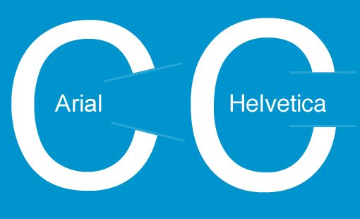
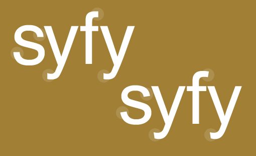
As you can see, Arial slants the end of its strokes while Helvetica keeps them straight. As I said above, this is going to be one of your greatest tools for Helvetica spotting. This will come in handy on several letters, especially those that are lowercase.
With this knowledge in mind, you should be able to instantly tell which of the samples below is Helvetica and which is Arial.

Tip #2: What’s Up G?
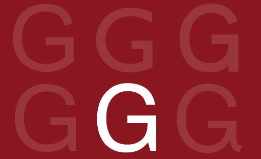
I’ve made it easy on you so far, only comparing Helvetica to Arial. Arial isn’t the only sans-serif around that looks like Helvetica though. In many cases it’s not even the closest. Here’s a much trickier test, can you find Helvetica in here?
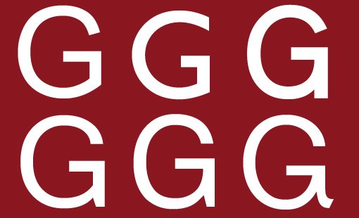
The way to begin your search in this case is to check out the bottom right of the G. Many sans-serifs, such as Arial, have a single stroke that flows from the bottom of the curve up into a sharp angle. The Helvetica G though is comprised of what appears to be two separate strokes, with the right side of the G containing a vertical line that extends down to the letter’s baseline.
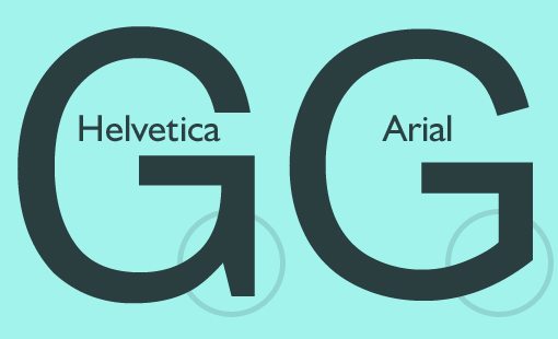
Some typefaces, such as “Microsoft Sans Serif,” more closely mimic the shape of the Helvetica G. However, another thing to look for is the curve on the inside of the letter.
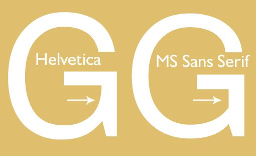
Notice how Helvetica makes the transition with one smooth curve while MS Sans Serif has a hard angle. With these hints in mind we can easily spot Helvetica in the gaggle of Gs that we had before.
Tip #3: The Tell Tail
If there is a Q available in your sample of type, then you’ve got another good potential hint for whether or not its Helvetica. Consider the following:

As you can see, the tails on the Qs can differ pretty significantly even in otherwise similar fonts. Once again, we see Helvetica staying on the straight and narrow path, letting the others attempt to differentiate themselves with little quirks.
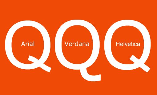
Arial takes the squiggly approach while Verdana marches off on its own with a curvy tail that doesn’t encroach upon the counter of the Q.
Tip #4: A Pirate’s Favorite Letter
Let’s face it, Qs are hard to come by if you’re looking at random signage. Rs on the other hand, are quite plentiful and can be just as helpful in your Helvetica spotting journey. Check it out:
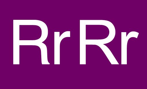
Given what we’ve already learned about Helvetica typically utilizing straighter strokes, you might be tempted to think that the uppercase R on the right is Helvetica, but you’d be wrong. Helvetica is actually the typeface with the more pronounced curve this go around.
However, when we look at the lowercase r, the opposite is true. The bend at the shoulder of the Arial r is a bit more pronounced than that of the Helvetica r.
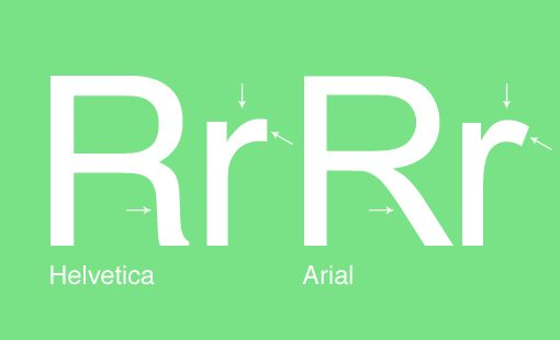
The easy giveaway here that we already discussed is the end of the strokes. Notice how the Helvetica r ends with a straight line while the Arial r has a slant.
Tip #5: Fonzie’s Favorite Letter
The letter A is another letter that you can use to help you spot Helvetica. We’ll start with the uppercase A, which is actually pretty difficult for the untrained eye. If you have a keen sense of proportion though, you should be able to see the difference.
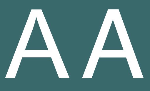
As you can see, these two letters are extremely similar. There are some differences though. For starters, the one on the left has a slightly wider base. The thing that my eyes are always drawn to though is the fact that the apex of the Arial A is quite ugly. The little negative space triangle at the top extends just a tad too far, making it feel pinched when compared to the Helvetica version.
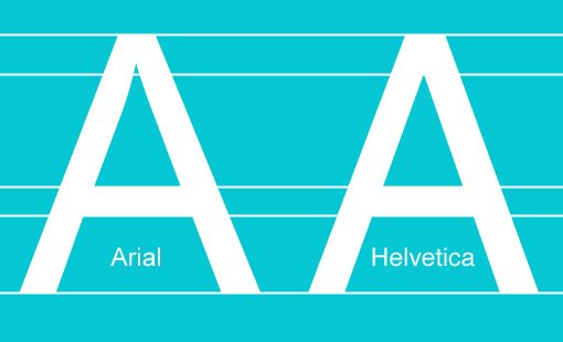
While the uppercase As might be very similar, the lowercase versions are so different that even an amateur should be able to see where they vary.
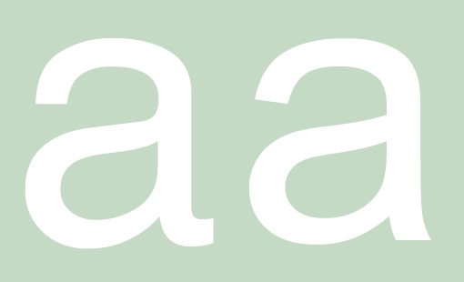
As you can see, there are quite a few points of interest here. The one on the left curves out at the bottom while the one on the right points downward. There are some other key differences as well, can you see them?
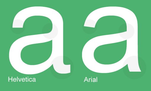
Once again Arial is giving itself away with those slanted lines. Also of note is the smooth curve above the bowl in Helvetica where Arial has a sharp corner.
Conclusion
Congratulations! You are now qualified to be “that guy.” You know, the incredibly annoying one who goes around pointing out Helvetica while his friends roll their eyes and wish he would go back to his desk and continue to silently scoff at the use of Verdana in the IKEA catalog. I have given you incredible power, do everyone a favor and try to use it for good and not evil.
If you have any other great tricks for spotting Helvetica in the wild, we want to know! Leave a comment below and share your wisdom.