Typography 101: Understanding the Anatomy of a Letter
Every designer, whether you’re in print or web, should possess a basic understanding of fonts and type. Using the right typeface and understanding how a font will impact your design can add that extra pop to print and digital projects and will set them apart from all others.
One important area to understand is the anatomy of type. Ascenders, descenders and serifs may sound like words from another language but are the basis for understanding the style of a typeface and how if relates to your project. Today we’ll take a brief run through of some terminology that you should know.
Anatomy Of a Font
Think back to your early childhood and learning to write. The paper you used to form those first letters is the same grid used to identify the parts of a font.
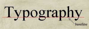
The baseline is the bottom grid on which each letter rests. Baselines are used for a variety of purposes from keeping type on a single plane to lining up multiple columns of type together. A baseline for type creates a clean line with an organized feel. A lack of a baseline allows letters or words to sit out of alignment and creates a feeling of chaos.

The tops of letters also create a horizontal grid line called the x-height. This line is created by the vertical space used by lowercase letters. The name is derived because the letter “x” exemplifies this principle, according to “Type Idea Index: The Designer’s Ultimate Tool for Choosing and Using Fonts Creatively.” The larger a typefaces’ x-height, the larger a font will appear, even when compared to a font of the same point size.
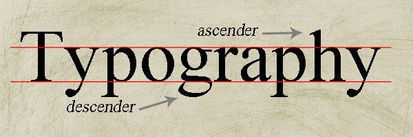
Some parts of certain letters fill the space above and below the baseline and x-height, these are referred to ascenders and descenders, respectively. Ascenders are the stems that rise above the x-height. (Think of the letter “d.”) Descenders are the parts of a letter that extend below the baseline. (Think of the letter “g.”) The size and weight of ascenders and descenders vary by font and should be considered in your design. Fonts with long decsenders, for example, could invade the space of other letters depending on how tightly the lines are spaced.
Ligatures
A ligature combines two letters into a single character. This is an attribute of certain fonts, and an option with even more, but designers should be wary of using ligatures both in print and digital design. Ligatures should be avoided altogether in projects where adjustments will be made to the spacing of letters, because ligatures do not allow for internal spacing changes. F-ligatures are the most common. When a lowercase “f” is placed in front of another letter with a center ascender, the letters merge. Think words with the “fl,” and “fi.” In each instance the “f” takes away part of the second letter — the top of the “l” and the dot over the “i.” The “Th” letter combination also creates a ligature in some typefaces.
To Serif or Not?
What kind of feel are your trying to convey? Modern or classic? Your font can help. The style of a font can add meaning to your project.
More classic serif fonts, those with short strokes extending from the upper and lower ends of each letter, are commonly used to create the body type in books, newspapers and other printed media. This traditional type style is also commonly used in digital communications — think Times New Roman, which is used from everything from sending emails to the default font in many word processing software applications.
Sans serif fonts, those without any strokes extending from the letters, have become the standard for body type in digital design. Sans serif fonts are typically easier to read in digital projects, especially those where the typeface is small, because the strokes on serif fonts can get lost on screen. Clean lines make for easier web reading, which is why sans serif font use has become so popular.
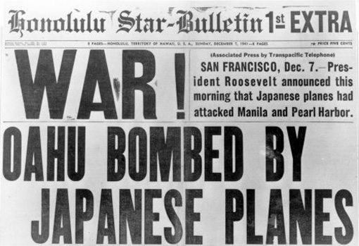
Sans serif fonts are also commonly used in print design for the big words, such as newspaper headlines. “WAR!” would not have the same impact with fancy detailing on each letter. In contrast, many website designers use serif fonts for headlines in digital design.
Cursive, fantasy and monospace fonts are styles that are less commonly used in design projects. Each of these three styles are best used in decorative applications and not for reading. Cursive fonts, such as “Monotype Corsiva or “Lucida Handwriting,” have lines that connect letters that also tend to have a distinct slant. Fantasy fonts, such as Comic Sans MS, are a mix of font types that have a playful feel and may not include a full character set. Some typographers do not make a designation between cursive and fantasy fonts. Monospace fonts, such as Courier, have a set width and are commonly used in computer coding applications.
Can You Read Me Now?
In addition to selecting a font that as the right feel for your project, font selection must also work with your printing or digital medium.
Big vs. Small Type
In print projects, consider sans serif fonts with a lower x-height for items that will use very small point sizes (typically 8 points are less). The more round, horizontal font style, without extra detailing, is easier to read at a small size. It will likely reproduce more accurately as well across a variety of mediums. For projects using bigger type (9 points or higher), look at a mix of serif and sans serif fonts. Consider a traditional body type style paired with a sans serif headline.
Mixing Styles
For projects with only a few words (posters or business cards) also consider a mix of the font styles. Make sure the style of the primary font matches your project – serif for more traditional uses and sans serif for a more contemporary feel.
Use Standard Fonts Online
In digital applications, a designer must take standard font sets into consideration. Web browsers only use the fonts installed on each computer to view websites, not necessarily the fonts used to build the site. To ensure that your site maintains a consistent look, opt for standard fonts.
Some of the most common standard cross-platform (Windows and Macintosh) fonts include Arial, Comic Sans MS, Courier, Impact, Times New Roman, Trebuchet MS and Verdana. If you want to break outside of standard fonts, consider using @font-face or a related solution like Google Fonts.
Conclusion
Understanding and thinking about fonts in the early stages of a project can help you get off to the right start. Think about the size and shape of the fonts for each project. Follow the rule of your baseline for projects that should have an organized feel. Stray from the baseline to create disarray. Remember that fonts with a more vertical x-height will look larger than those with a shorter x-height.
Select and test a few fonts in the initial design phase and imagine how type selection will work across different mediums. Remember to also think about readability and feel when making font selections. For digital projects, select fonts from the standard set to ensure that your project has the look you intended.