Web Design Critique #2
Today we’ll be continuing our new series of web design critiques where we take an in-depth look at a live website and point out both its strong points as well as the areas that could use improvement.
Top Test Prep, the site we’ll be viewing today, was our very first customer but the requests have been pouring in so be sure to get on the list soon!
The Ultimate Designer Toolkit: 2 Million+ Assets
Envato Elements gives you unlimited access to 2 million+ pro design resources, themes, templates, photos, graphics and more. Everything you'll ever need in your design resource toolkit.
If you’d like to submit your website to be featured in a future Design Critique, it just takes a few minutes. We charge $24 for critiquing your design – considerably less than you’d pay for a consultant to take a look at your site! You can find out more here.
Top Test Prep
Meet Top Test Prep, a private tutoring company that boasts of having some of the best and brightest tutors around. Their home page design is fairly simple; a centered layout clearly divided into several sections.
Before we get into what could be better about the design, let’s take a look at a few things that have been done well.
Slider & Photography
I’m a sucker for jQuery image sliders. They add a dynamic level to a design and just enough motion to bring a static page to life without creating too much of a distraction.
The photography used in the slider is really nice. The smiling faces grab your attention immediately and the bright colors with a shallow depth of field indicate a professional photographer. The third image of the three graduates looks a bit stock photo-ish but it strongly communicates the message you’re going for so it works.
In fact, I would like to see a version where the image slider takes up the entire space occupied by the horizontal box at the top. The “talk to an expert” info could be moved immediately below it. This might hack off a few off the usability folks but I think it would bump up the aesthetic appeal a bit.
Alignment
The layout could use a little work but most of the items on the page are clearly aligned and the sections are quite visually distinct. This may sound minor but you’d be surprised at how many professional designers know little to nothing about proper alignment techniques.
Improvement
Now let’s take a look at some changes that could be made to strengthen the visual appeal of the site.
Logo & Page Frame
First of all, the logo is a bit of an eyesore and could use a visual refresh. If you’re not looking to rebrand your image right now, at the very least give some attention to the current logo. The kerning needs to be tighter after the capital letters and the two lines of text should be left aligned. The current center alignment leaves the tagline stranded in no man’s land and is a little awkward.
As far as the page frame, it seems a bit inconsistent. I like the bold color used in the navigation, but it seems weird that this stretches all across the page and the footer doesn’t. My advice it to drop the shadows creating the faux frame completely and stretch both the header and footer all the way across the page.
Further, to give the site an even stronger point of contrast and a clear header, I would stretch the navigation gradient to the top of the page and reverse out the logo/copy. Here’s a simplified mockup of what I mean:
Eliminating the page frame could provide lots more space to space things out a little and give the design some breathing room by increasing the white space.
The “Talk To an Expert” Box
I felt that this area could use an overhaul. I really like the style and design of the button as a stand alone piece, but it just doesn’t seem to fit in well with the rest of the site. I would consider lessening the radius of the rounded corners (or just making them 90 degrees) and pulling down the darker color from the header.
Further, the floating head is a little weird. I can understand conceptually why a face needs to be here, but design-wise, it’s just not working. I think this is mostly due to the corner style cutoff that is happening on his right and bottom side. It gives this otherwise seamless area a superficial frame that only exists in that one spot. Either go all out and create a visible frame or nix the floating head completely.
The Three Columns
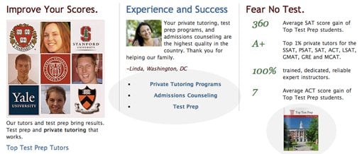
I see two primary problems with this area, highlighted in the picture below.
First of all, a bulleted list should never be center-aligned. It separates the bullet and the content and is a violation of what a bulleted list is meant to accomplish: easy and quick readability. Further, as all the other text on the page is left-aligned, it’s a good idea to keep with the trend.
Finally, the little book image on the far right seems to be floating in space. There is no explanation of what it is, why it’s there or why I should click it. Right now it screams afterthought and really needs to either be properly worked into the page layout or tossed completely.
Your Turn!
To sum up, Top Test Prep is off to a good start but the designer should consider creating a stronger header, ditching the faux page frame and resolving the layout issues mentioned above.
Now that you’ve read my comments, pitch in and help out by giving the designer some further advice. Let us know what you think is great about the design and what you think could be stronger. As always, we ask that you also be respectful of the site’s designer and offer clear constructive advice devoid of any harsh insults.
Interested in having your own site critiqued? You can find out more here.


