Web Design Critique #50: Vert Studios
Welcome to our 50th Web Design Critique! Every week we take a look at a new website and analyze the design. We’ll point out both the areas that are done well in addition to those that could use some work. Finally, we’ll finish by asking you to provide your own feedback.
Today’s site is Vert Studios.
2 Million+ Digital Assets, With Unlimited Downloads
Get unlimited downloads of 2 million+ design resources, themes, templates, photos, graphics and more. Envato Elements starts at $16 per month, and is the best creative subscription we've ever seen.


If you’d like to submit your website to be featured in a future Design Critique, it just takes a few minutes. We charge $49 for critiquing your design – considerably less than you’d pay for a consultant to take a look at your site! You can find out more here.
About Vert Studios
Born out of a love for quality web design and superior functionality, Vert Studios was founded by Justin Edwards in 2009. Identifying the need for a higher design standard in East Texas, Justin opened shop – bringing years of web development experience for a multi-billion dollar energy corporation with him. But he didn’t stop there. Good design becomes great when paired with top-notch web programming, and co-founder Joseph McCullough tailors his development skills based on the business goals you’re looking to achieve.
Here is a screenshot of the homepage:

Initial Impression
Right away I really liked this site. It has a very unique look and feel that’s clean and attractive while avoiding the layout of your basic design template. The dark color palette here really grabbed my attention, it feels slick and classy.
Another thing that really stands out is the strong copy throughout the site. A lot of designers simply don’t know how to make a sales pitch. Sometimes it works to let your work speak for itself, but it’s pretty rare that strong copy won’t help you win more clients.
Right off the bat, you see the following headline: “Your website is your company’s first impression. Together, we can make it a lasting one.” This is a super simple statement that really resonates with the reader. They go on to convince potential clients of the importance of solid web design: “Your homepage is more than just a virtual business card – it represents who you are and what you stand for.”
All over the site you can find equally strong headlines and paragraph copy. Web designers aren’t always the ones hired to write the copy, but if this is the case, remember to take your time on it as if it were its own dedicated project, not merely something you throw together quickly once you’ve got the design ready to go. In fact, it’s a good idea to start with the messaging so you have a clearer idea of how to structure the design to highlight it.
Now that we’ve gone through my overall impression of the site, let’s take a look at the main components to see what works and what could use a little improvement.
Navigation
The navigation for this site is pretty interesting. I’m not sure that I’ve ever seen so much text on this particular section of a site.

I think this route definitely has some pros and cons. It’s nice to get a little preview of what’s behind the link before you click it. However, I feel like all this text is a bit overwhelming when I’m just looking for the link to your portfolio page.
There are a few ways you could address this. I would experiment with making the description text only appear on hover, that way the information is there if you want to read it, but doesn’t clutter up this section. Alternatively, you might try reducing each little paragraph to a single tag line. “About: A small company with big ideas”.
Ultimately, it’s not a huge issue and I wouldn’t fault you for leaving it exactly how it is. I would however definitely suggest that you increase the size contrast between the links and the descriptions. Just bumping it up a few pixels would go a long way. This is perhaps too much but I intentionally exaggerated the effect so that you easily grasp the idea:

Background Graphic
Lots of people over-think the background for their website. They browse the web for hours trying to find the perfect photo or texture only to come up with something that’s busy and distracting.
Ideally, you’ll want something that affects the mood and effectively draws your attention to the content, not away from it. Check out how simple the background for this site is:

It’s a blurry mess of colors that look like overgrown pixels, and it looks fantastic. Notice how muted and subdued the colors are, this is key for making your site colorful without giving users a headache just from looking at it. The lesson here is that, when in doubt, go with something simple. For more on this topic, check out our article, 5 Quick and Easy Photoshop Textures You Can Make From Scratch.
Content Slider
The primary section of the page has a really cool double content slider effect. The big picture has three different states that it cycles between and as it changes, so does the big text bubble next to it.
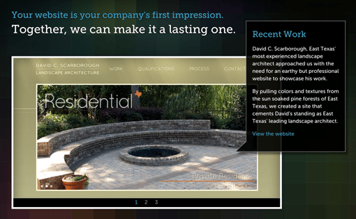
Overall, it’s a really nice touch that makes the site feel much more dynamic. This one element looks and acts so unique that I’m sure it has impressed a few clients enough to contact Vert Studios about working with them.
What We Do
Any time you’re offering a service, you simply can’t go wrong by explaining exactly what it is that you do and why potential clients should hire you to do it. So many people leave this step out but it’s critical for winning someone over.
Also, notice that the description isn’t too technical but is instead focused on the results that you can expect. Too many web designers use this section for showing off their knowledge of web design jargon, none of which means anything to a client!

Conclusion
To sum up, there’s very little about this page that I would change. I love the way it looks and the obvious emphasis that has been placed on writing good copy. Looking around the site, you’ll find some nice repetition with the main image and word bubble format. Be sure to check out the Work page where this is executed particularly nicely in conjunction with scrolling.
Your Turn!
Now that you’ve read my comments, pitch in and help out by giving the designer some further advice. Let us know what you think is great about the design and what you think could be stronger. As always, we ask that you also be respectful of the site’s designer and offer clear constructive advice void of any harsh insults.