Web Design Critique #78: Katy Cain
Every week we take a look at a new website and analyze the design. We’ll point out both the areas that are done well in addition to those that could use some work. Finally, we’ll finish by asking you to provide your own feedback.
Today’s site is the portfolio of Katy Cain, a wedding photographer in Chandlers Ford. Let’s jump in and see what we think!
22+ Million Digital Assets, With Unlimited Downloads
Get unlimited downloads of 19+ million design resources, themes, templates, photos, graphics and more. An Envato subscription starts at $16 per month, and is the best unlimited creative subscription we've ever seen.


If you’d like to submit your website to be featured in a future Design Critique, it just takes a few minutes. We charge $49 for critiquing your design – considerably less than you’d pay for a consultant to take a look at your site! You can find out more here.
About Katy Cain
“I am a Hampshire wedding and portrait photographer based in Chandlers Ford. I travel widely throughout Hampshire and the surrounding counties including Oxfordshire, Wiltshire, Surrey, Sussex and Dorset. Please take a look at my work and If you feel I would fit perfectly into your day then I would love to hear from you.”
Here is a screenshot of her homepage:
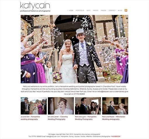
First Impression
The very first thing that I notice about Katy’s site is that it’s clean and minimal. This particular design style works well for photographer sites because it allows the photos to clearly stand out as the most prominent items on the page. Since photos are what the business is all about, this is a perfect strategy.
I also notice that it’s not a Flash site. Photographers in general have an over dependence on 100% Flash based sites and I’m always happy to see individuals who have taken a more standards-friendly approach.
The bottom line is, the site is off to a really strong start. It’s simple, but effective. There are however, a few areas where I would suggest considering a change or two. Let’s jump in and see how we could improve the site.
A Little More Wow
For all the negative aspects that you get with them, Flash sites do have one strong thing going for them: they tend to be fairly engaging. Often the attempt to be engaging runs so far that it becomes annoying and distracting, but it’s at least an attempt to make things interesting.
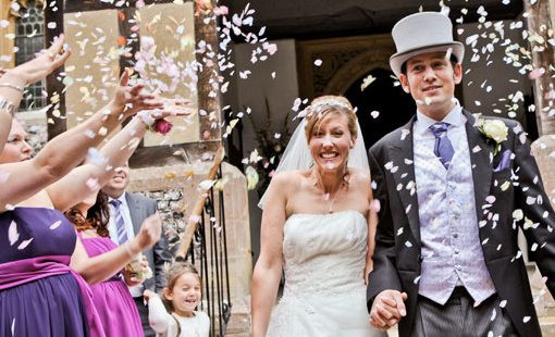
This site perhaps runs too far in the other direction: it actually seems quite boring. Everything about the design suggests a “safe” approach that stays far away from anything that could be considered bold. The main image is a good size, but not too large, the text is all fairly homogenous sans-serif type, the page is completely static; I just think we need to give it all a nice little boost to make it more interesting.
For starters, I’d suggest making the main image a JavaScript slideshow that cycles between three to five photos. When I come to a photographer’s page the first and often only thing I want to see is what type of photos they take and I’d love to get a larger taste for that right from the home page.
I’d also like to see the content width stretched out by at least 100px, more if it’s possible. I want that main photo to be big, bold and in your face.
Logo
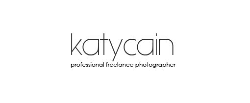
The typography for the logo isn’t my favorite. The thin font is acceptable because it suggests a feminine appeal and since Katy is indeed a female, this idea works. However, I’m not sure if it’s something with the resolution of the image or the way that the actual typeface is rendered, but the curves come off as jagged and pixelated instead of nice and smooth. My eye is continually drawn to this distraction and I recommend an attempt to address it.
Further, the second line of the logo is pretty tiny and hard to read. I know what it says immediately, but if I really look at it, the effect makes my eyes hurt a little. I suggest dropping the word “professional,” there’s simply no need for it here. Let the work tell them you’re a professional, verbally insisting that you are one ironically makes you sound like a beginner. Removing this word will free up some horizontal space for the rest to be slightly larger.
Navigation
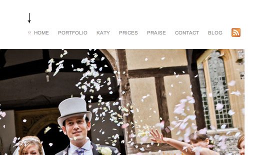
I thoroughly appreciate subtle design touches, but that tiny tiny tiny house icon (shown above at actual size) is pushing it. It’s so incredibly small that it’s probably more of a distraction than something that improves the aesthetic of the page on any level. It’s seriously the itty bittiest icon I’ve ever seen.
Aside from this, I think the navigation works well. I do suggest bumping it over a few pixels to the right though so it’s perfectly flush with the image below it. It’s almost there, but not quite. I have an entire article dedicated to how “almost” is a dirty word for designers.
Let’s Rethink The Layout
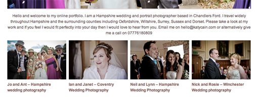
I find the current layout to be a little awkward, particularly where it concerns the type. The big chunk of center aligned text under the main photo definitely needs some work. First of all, wide columns of center aligned text are the mortal enemy of readability, avoid them at all costs. Left aligned paragraphs are the way to go in a situation such as this and the justified alignment for the page as a whole lends itself perfectly to this.
Further, this is your primary welcome message, but it doesn’t stand out in any way. It’s just there; plain old boring text that isn’t differentiated in any significant way.
I propose that you revamp the layout of the entire page. It won’t be a major undertaking, only a few shifts and changes. The overall aesthetic will be retained as well. However, these tweaks will make it feel like a whole new site, bursting with personality and driven by an inviting atmosphere.
Let’s start with that big paragraph. What we need here is some contrast, in both size and boldness. I created a three tiered solution that is much more attractive than one monotonous paragraph.
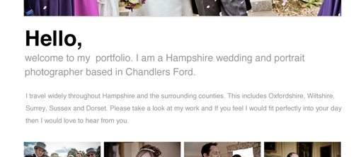
As you can see, it starts with a big, bold “Hello”. It then moves to a main introductory paragraph that’s large enough to be a headline, but not so large that it competes with the initial hello message. Finally, the rest of the supporting text gets thrown into a smaller paragraph.
I combined this with a reformatting of the overall layout so that it’s much more anchored to the left side. This leverages the “F” pattern that many readers tend to follow when browsing the web. Here’s the big picture:
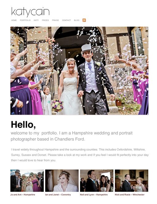
This new layout is clean, modern and professional, while still making Katy seem like the kind of friendly person that you’d be excited to work with.
Other Pages
The other pages on the site could use a similar overhaul. Several are pure text with some of the same issues as the paragraph on the home page. I recommend topping off some of these pages with a nice, large photo to keep things interesting.
Also, take the text differentiation lesson from above and apply it on these supporting pages: Bigger, bolder headlines and clearly tiered communication that places emphasis on the most important aspects of the message.
Your Turn!
Now that you’ve read my comments, pitch in and help out by giving the designer some further advice. Let us know what you think is great about the design and what you think could be stronger. As always, we ask that you also be respectful of the site’s designer and offer clear constructive advice void of any harsh insults.