Web Design Critique #81: Amilova
Every week we take a look at a new website and analyze the design. We’ll point out both the areas that are done well in addition to those that could use some work. Finally, we’ll finish by asking you to provide your own feedback.
Today’s site is Amilova. Let’s jump in and see what we think!
2 Million+ Digital Assets, With Unlimited Downloads
Get unlimited downloads of 2 million+ design resources, themes, templates, photos, graphics and more. Envato Elements starts at $16 per month, and is the best creative subscription we've ever seen.
If you’d like to submit your website to be featured in a future Design Critique, it just takes a few minutes. We charge $49 for critiquing your design – considerably less than you’d pay for a consultant to take a look at your site! You can find out more here.
About Amilova
Since 2010, the Amilova project has been a platform for artists from all around the world to present their comics to a worldwide audience, in all possible languages. Amilova project is growing more and more with each day. Our international community includes more than 23,000 members and we have over 350 artists.
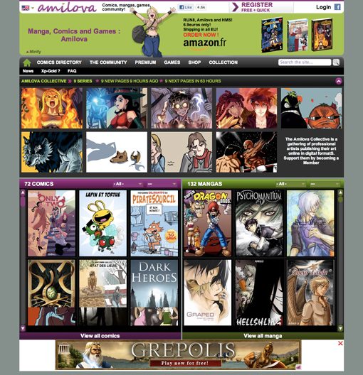
Here is a portion of the homepage:
First Impressions
As soon as the page loads, there’s absolutely no doubt that this site is dedicated to comics. The homepage is chock full of great, eye-catching artwork and I think that ensures that the target market is nailed immediately. If you’re into comics, you’ll definitely want to look around, if not, you’ll know right away that this site isn’t for you.
This is no small thing. It sounds obvious, but it’s very important that, no matter what type of website you’re designing, the users can always get a feel for what’s going on as quickly as possible.
Now, all of that being said, beyond the fact that it’s obviously some sort of comic site, I really have no idea what’s going on during my first few seconds looking at the page. Is it a comic store? Are these free stories? I feel like some sort of bold, clear statement about what I’m getting into is necessary. If there was a huge headline at the top of the page that said something like “Read Hundreds of Free Comics” then I think the page would be much more enticing.
With this in mind, let’s dive in and take a closer look at specific sections of the page.
Header

As I just mentioned, the site’s header could definitely much more clearly state the purpose of the site, but even beyond that, I’m really not thrilled with the entire header design.
The main reason for this is that it actually just looks like a big ad. Our eyes have been trained to spot and skip over ads without a second look and I immediately looked past this section of the page thinking that it was just a third party banner. I think a complete header redesign is necessary to really make this look like a piece of the site.
Not only does the header look like an annoying ad, the site actually tells you that it’s an annoyance that you should want to go away:
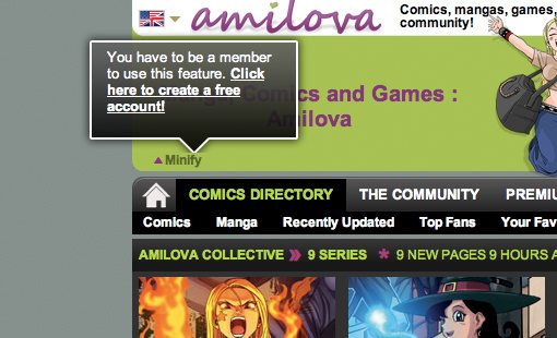
As you can see, there’s a “minify” button that collapses the header, but as soon as you try to press it, you get a message about how this feature is only for members. I find this to be a bizarre strategy that I simply don’t agree with.
I would never even think about collapsing a site’s header normally. It’s not something that I really feel the need to do, at least until I see that minify button. That link makes me think there’s a feature there so I can’t resist checking it out, but then I get told that I’m a second rate citizen and therefore can’t access this advanced functionality. However, it’s not advanced functionality, it’s not a great feature and I simply don’t think that it’s really something that entices most people to sign up. It’s far more likely to just piss off your users.
The Flow of the Page
The primary portion of the visual part of the page when you first load the site is occupied by a grid of thumbnails showcasing the various comics. This is perfect and really gives the sense of having access to a large library of content.
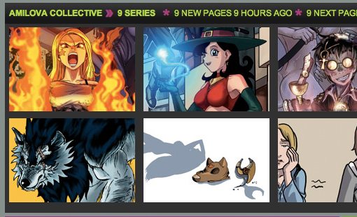
I think what the page is missing though is a full width image slider that really showcases the content and perhaps even serves as a fix for the header problem. The site obviously has access to a very talented group of illustrators and their artwork and I think a big slider is the perfect way to show that off and draw users into the experience.
After the thumbnail section, you reach a real time activity stream that tells you what users are up to on the site. In my opinion, this is way too huge and really dominates the vast majority of the home page.
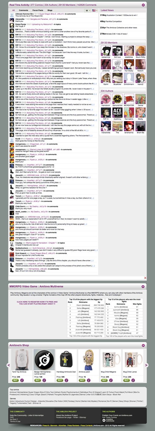
As you can see, this section goes forever. The problem with this is that there is important content after this section, such as a nice little store widget, but I’ll bet that most users never even make it that far because they simply give up on scrolling.
The solution here is simple, show ten recent lines of activity at the most on the home page. If users want to see more, they should be redirected to another page dedicated to this material. Otherwise it seems like a giant waste of space.
The Reading Experience
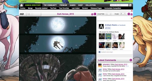
Given that the site’s primary purpose seems to be the discovery and reading of comics, this experience needs to really be as good as possible for the site to succeed. If there are resources to be spent, they should be spent in this area.
Sadly, I found it to be quite a cumbersome and work intensive process to read through a comic on the site. The pages are so large that they don’t fit on my MacBook’s screen, so lots of scrolling is necessary and the page turning buttons are inconveniently located.
Further, I think just about everyone’s first reaction upon picking up a comic book is thumbing through it to see what you’re getting into and to generally appreciate the artwork. However, this site doesn’t seek to replicate that functionality in any way.
Here’s my suggestion. I need three or four different view options for the reading experience. The first is a thumbnail grid that lets me quickly and visually scan through the contents of the entire story. You don’t need some fancy page flip animation to replicate browsing, a thumbnail gallery will do the job perfectly. The next views should be dedicated to gradually making the content larger. Perhaps a two up view with that allows illustrators to utilize a full spread and then finally the large view that currently exists for close up reading of small speech bubble text.
I know this would be a huge pain to implement, but I really think it’s a necessary step that needs to be taken before the site can really claim to offer an enjoyable reading experience.
Summary
Amilova has obviously done a great job of building an impressive community and library of content, now it’s time to mature the experience and refine what’s currently clunky. Rethink the homepage introduction to the site, give me a big beautiful image slider on the top, cut out that giant activity stream and offer alternative viewing options for comic reading.
These changes are not small, they’re major overhauls that will take time and effort but I really believe that the site will be much better for them.
Your Turn!
Now that you’ve read my comments, pitch in and help out by giving the designer some further advice. Let us know what you think is great about the design and what you think could be stronger. As always, we ask that you also be respectful of the site’s designer and offer clear constructive advice void of any harsh insults.
