Building a Custom CSS3 Pagination User Interface
Website pagination is a crucial aspect to any layout with repeating content. Blogs are often a consideration, but also portfolio listings or related news/feed links or any other types of archive. Organizing a blog post into many pages helps to cut down on reading time – especially with particularly in-depth articles.
In this tutorial I want to demonstrate a collection of CSS techniques for designing pagination. Once you combine these designs with content systems like WordPress you can see how the interfaces really work in action. To get an idea of the final product take a look at my live sample demo below.
Getting Started
This tutorial will not require any JavaScript code, so there are no file dependencies at all. I’d like to start by outlining the simple page layout. Each paginated link goes to a different HTML page with a list of 5 in total.
  <ul class="paginate pag1 clearfix">
    <li class="single">Page 1 of 5</li>
    <!-- <li><a href="#">prev</a></li> -->
    <li class="current">1</li>
    <li><a href="index-2.html">2</a></li>
    <li><a href="index-3.html">3</a></li>
    <li><a href="index-4.html">4</a></li>
    <li><a href="index-5.html">5</a></li>
    <li><a href="index-2.html">next</a></li>
  </ul>
You’ll quickly notice the commented line which displays a previous button to move between pages. I have only displayed this link within the other layouts because on the first page we have no way to navigation back to a previous page. Also the first list item .single has no anchor link, it just displays the current page number and the total number of pages.
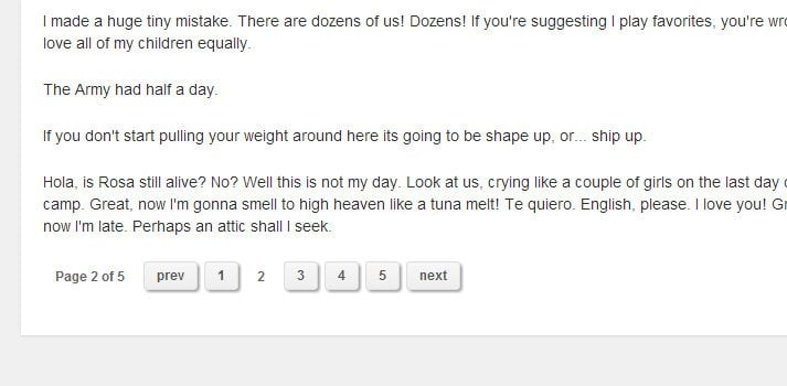
  <ul class="paginate pag2 clearfix">
    <li class="single">Page 2 of 5</li>
    <li><a href="index.html">prev</a></li>
    <li><a href="index.html">1</a></li>
    <li class="current">2</li>
    <li><a href="index-3.html">3</a></li>
    <li><a href="index-4.html">4</a></li>
    <li><a href="index-5.html">5</a></li>
    <li><a href="index-3.html">next</a></li>
  </ul>
The example above is copied from index-2.html which displays the second page. You will find each individual numeric page does not have an anchor leading back onto itself. Instead we apply a class of .current onto the list item for a different appearance.
General Page Styles
I have split up the stylesheet into segments along with the typical page resets. This makes it easier to copy and paste the exact style of pagination links you want to work with.
/** page structure **/
#w {
  display: block;
  width: 750px;
  margin: 0 auto;
  padding-top: 30px;
  padding-bottom: 45px;
}

#content {
  display: block;
  width: 100%;
  background: #fff;
  padding: 25px 20px;
  padding-bottom: 35px;
  -webkit-box-shadow: rgba(0, 0, 0, 0.1) 0px 1px 2px 0px;
  -moz-box-shadow: rgba(0, 0, 0, 0.1) 0px 1px 2px 0px;
  box-shadow: rgba(0, 0, 0, 0.1) 0px 1px 2px 0px;
}

.paginate {
  display: block;
  width: 100%;
  font-size: 1.2em;
}
Nothing too different here in comparison to my other tutorials. Using the outer .paginate class on the unordered list means this will apply to every UL on all the pages. It increases the generic font size while ensuring the list will span a full width of the parent container.
/** First Design Pagination **/
.paginate.pag1 { /* first page styles */ }

.paginate.pag1 li { font-weight: bold;}

.paginate.pag1 li a {
  display: block;
  float: left;
  color: #717171;
  background: #e9e9e9;
  text-decoration: none;
  padding: 5px 7px;
  margin-right: 6px;
  border-radius: 3px;
  border: solid 1px #c0c0c0;
  box-shadow: inset 0px 1px 0px rgba(255,255,255, .7), 0px 1px 3px rgba(0,0,0, .1);
  text-shadow: 1px 1px 0px rgba(255,255,255, 0.7);
}
.paginate.pag1 li a:hover {
  background: #eee;
  color: #555;
}
.paginate.pag1 li a:active {
  -webkit-box-shadow: inset -1px 2px 5px rgba(0,0,0,0.25);
  -moz-box-shadow: inset -1px 2px 5px rgba(0,0,0,0.25);
  box-shadow: inset -1px 2px 5px rgba(0,0,0,0.25);
}

.paginate.pag1 li.single, .paginate.pag1 li.current {
  display: block;
  float: left;
  border: solid 1px #c0c0c0;
  padding: 5px 7px;
  margin-right: 6px;
  border-radius: 3px;
  color: #444;
}
Directly underneath this code you’ll find the other 5 blocks for each of the pagination sections. This is an example from my first design idea. The container .paginate.pag1 has no default styles, but if you wanted to apply something directly onto this unordered list you can do so by targeting individual pagination styles.

The links use a flat color background along with some box shadows which update when clicked. It’s a simple design which can genuinely fit into any website layout, provided that you update the color scheme a little bit.
Further Pagination Styles
Looking at my second design you may notice this was built around the Minimal Pagination PSD released on Pixels Daily. I gave the shadows more length and kept the font sizes smaller. But it’s a fantastic template you can start customizing very quickly.
/** Second Design Pagination **/
/* resource: http://pixelsdaily.com/resources/photoshop/psds/minimal-pagination/ */
.paginate.pag2 { /* second page styles */ }

.paginate.pag2 li { font-weight: bold; }

.paginate.pag2 li a {
  display: block;
  float: left;
  color: #585858;
  text-decoration: none;
  padding: 6px 11px;
  margin-right: 6px;
  border-radius: 3px;
  border: 1px solid #ddd;
  background-color: #eee;
  background-image: -webkit-gradient(linear, left top, left bottom, from(#f7f7f7), to(#eee));
  background-image: -webkit-linear-gradient(top, #f7f7f7, #eee);
  background-image: -moz-linear-gradient(top, #f7f7f7, #eee);
  background-image: -ms-linear-gradient(top, #f7f7f7, #eee);
  background-image: -o-linear-gradient(top, #f7f7f7, #eee);
  background-image: linear-gradient(top, #f7f7f7, #eee);
  -webkit-box-shadow: 2px 2px 4px -1px rgba(0,0,0, .55);
  -moz-box-shadow: 2px 2px 4px -1px rgba(0,0,0, .55);
  box-shadow: 2px 2px 4px -1px rgba(0,0,0, .55);
}
.paginate.pag2 li a:hover {
  color: #3280dc;
}
.paginate.pag2 li a:active {
  position: relative;
  top: 1px;
  -webkit-box-shadow: 1px 1px 3px -1px rgba(0,0,0, .55);
  -moz-box-shadow: 1px 1px 3px -1px rgba(0,0,0, .55);
  box-shadow: 1px 1px 3px -1px rgba(0,0,0, .55);
}

.paginate.pag2 li.single, .paginate.pag2 li.current {
  display: block;
  float: left;
  padding: 6px 11px;
  padding-top: 8px;
  margin-right: 6px;
  border-radius: 3px;
  color: #676767;
}
Another cool release from Pixels Daily named Slick Pagination Links includes a PSD and CSS copy. My third demo is based on this design, but I’ve written all the CSS code myself. I tried to match similar colors in the gradient but used a thicker border around each link.
It’ll probably look best on a lighter background or wrapped in a light UL container. But updating the border and background gradients wouldn’t take much work using a color scheme designer. Active and hover states simply update the background and I’ve kept away from changing the box shadows.

/** Third Design Pagination **/
/* resource: http://pixelsdaily.com/resources/photoshop/psds/psd-slick-pagination-links/ */
.paginate.pag3 { /* third page styles */ }

.paginate.pag3 li { font-weight: bold; }

.paginate.pag3 li a {
  display: block;
  float: left;
  text-decoration: none;
  padding: 6px 11px;
  margin-right: 6px;
  border-radius: 3px;
  color: #fff;
  text-shadow: 0px 1px 2px rgba(0, 0, 0, 0.5);
  border: 1px solid #43505e;
  background: #556270;
  background: -moz-linear-gradient(top, #556270 0%, #444d57 100%);
  background: -webkit-gradient(linear, left top, left bottom, color-stop(0%,#556270), color-stop(100%,#444d57));
  background: -webkit-linear-gradient(top, #556270 0%,#444d57 100%);
  background: -o-linear-gradient(top, #556270 0%,#444d57 100%);
  background: -ms-linear-gradient(top, #556270 0%,#444d57 100%);
  background: linear-gradient(to bottom, #556270 0%,#444d57 100%);
  filter: progid:DXImageTransform.Microsoft.gradient( startColorstr='#556270', endColorstr='#444d57',GradientType=0 );
  -moz-box-shadow: inset 0 3px 0px -2px rgba(255, 255, 255, .3);
  -webkit-box-shadow: inset 0 3px 0px -2px rgba(255, 255, 255, .3);
  box-shadow: inset 0 3px 0px -2px rgba(255, 255, 255, .3);
}
.paginate.pag3 li a:hover {
  background: #556270;
  background: -moz-linear-gradient(top, #556270 0%, #5b6774 100%);
  background: -webkit-gradient(linear, left top, left bottom, color-stop(0%,#556270), color-stop(100%,#5b6774));
  background: -webkit-linear-gradient(top, #556270 0%,#5b6774 100%);
  background: -o-linear-gradient(top, #556270 0%,#5b6774 100%);
  background: -ms-linear-gradient(top, #556270 0%,#5b6774 100%);
  background: linear-gradient(to bottom, #556270 0%,#5b6774 100%);
  filter: progid:DXImageTransform.Microsoft.gradient( startColorstr='#556270', endColorstr='#5b6774',GradientType=0 );
}
.paginate.pag3 li a:active {
  background: #414952;
  background: -moz-linear-gradient(top, #414952 0%, #555e68 100%);
  background: -webkit-gradient(linear, left top, left bottom, color-stop(0%,#414952), color-stop(100%,#555e68));
  background: -webkit-linear-gradient(top, #414952 0%,#555e68 100%);
  background: -o-linear-gradient(top, #414952 0%,#555e68 100%);
  background: -ms-linear-gradient(top, #414952 0%,#555e68 100%);
  background: linear-gradient(to bottom, #414952 0%,#555e68 100%);
  filter: progid:DXImageTransform.Microsoft.gradient( startColorstr='#414952', endColorstr='#555e68',GradientType=0 );
}

.paginate.pag3 li.single, .paginate.pag3 li.current {
  display: block;
  float: left;
  text-decoration: none;
  padding: 6px 11px;
  margin-right: 6px;
  border-radius: 3px;
  color: #fff;
  text-shadow: 0px 1px 2px rgba(0, 0, 0, 0.5);
  border: 1px solid #616c78;
  background: #838d98;
  -moz-box-shadow: inset 0 3px 0px -2px rgba(255, 255, 255, .3);
  -webkit-box-shadow: inset 0 3px 0px -2px rgba(255, 255, 255, .3);
  box-shadow: inset 0 3px 0px -2px rgba(255, 255, 255, .3);
}
All of these designs could be extended to include different types of fonts, icons, padding, and other CSS features. All of my code is written to the lowest common denominator, so that hopefully these styles can perform nicely with any webpage.
Rounded Nav Links
My final two pages use the same type of design, but simply reverse the color scheme from light to dark. I’m only showing the darker CSS codes because they have more changes. All of the display properties should match perfectly aside from the colors.

This particular design is based off a premium PSD called Flat Pagination Interface, also from Pixels Daily. By looking at the screenshot you’ll see it has a smaller list and it uses the ellipsis to range between pages. This is common when you have 10+ pages in the list and don’t want to display them all at once.
/** Fifth Design Pagination (dark) **/
.paginate.pag5 { /* fifth page styles */
  font-size: 1.4em;
  padding: 9px 8px;
  background: #373943;
  -webkit-border-radius: 3px;
  -moz-border-radius: 3px;
  border-radius: 3px;
}

.paginate.pag5 li { font-weight: bold; }

.paginate.pag5 li a {
  display: block;
  float: left;
  color: #5ea25a;
  text-decoration: none;
  padding: 9px 12px;
  margin-right: 6px;
  border-radius: 16px;
  background: #fff;
  -webkit-transition: all 0.3s linear;
  -moz-transition: all 0.3s linear;
  transition: all 0.3s linear;
}
.paginate.pag5 li a:hover {
  color: #4f664e;
  background: #c9dec8;
}
.paginate.pag5 li a:active {
  -webkit-box-shadow: 1px 1px 3px -1px rgba(0,0,0, .55);
  -moz-box-shadow: 1px 1px 3px -1px rgba(0,0,0, .55);
  box-shadow: 1px 1px 3px -1px rgba(0,0,0, .55);
}

.paginate.pag5 li.navpage a {
  padding: 9px 13px;
  background: #c8eac6;
  color: #4f664e;
}
.paginate.pag5 li.navpage a:hover {
  color: #414e40;
  background: #a4c6a2;
}

.paginate.pag5 li.current { background: #505362; }
.paginate.pag5 li.single, .paginate.pag5 li.current {
  display: block;
  float: left;
  padding: 9px 12px;
  margin-right: 6px;
  border-radius: 16px;
  color: #fff;
}
I mentioned earlier that we can target the outer unordered list by using its class name such as .paginate.pag5. It helps for demoing links, but it probably won’t be useful on a live website unless you plan to utilize different styles of pagination.

Each of these final two styles include CSS3 transitions for hover states. It’s a nice additional feature you may choose to keep, but it doesn’t always look good in all instances. Both the light and dark color schemes include highlights of green to match the page layout. If you like this design, toy around with the colors and see if the light or dark interface looks better for your project.
Closing
Many of these techniques can be adapted with your own styles to build unique website pagination. It is not a crucial aspect to every website, but immediately becomes important if you’re dealing with a substantial amount of content.
Feel free to download a copy of my source code and use these CSS styles for any website pagination. Also if you have questions or related suggestions you can share with us in the discussion area below.