How to Build a Minimalist User Profile Layout With Content Tabs
Dynamic content is a big part of modern web design. Whether this is hidden in the page or pulled out of a database, you can improve space in your layout by reorganizing important content elements. This is true of many situations and it works great on user profiles. Oftentimes users will have a myriad of information presented on their page which can be easily digested through the use of tabbed navigation.
In this tutorial I want to demonstrate how we can build a minimal user profile layout design. This is mostly centered around a small set of navigation links, which dynamically change the display between bits of content.
Depending on the purpose of your website, these content sections may be split to include photos, videos, followers, and other related information. To get an idea of what we’re building take a peek at my live sample demo.
Getting Started
We’re only using a small amount of jQuery — to switch between inner content sections on the page. It would be possible to connect into a database and pull the results via Ajax using an intermediary script written in PHP or Rails (or something similar). For my example we don’t have a database so each content area is held within the page body.
<div id="w">
<div id="content" class="clearfix">
<div id="userphoto"><img src="images/avatar.png" alt="default avatar"></div>
<h1>Minimal User Profile Layout</h1>
<nav id="profiletabs">
<ul class="clearfix">
<li><a href="#bio" class="sel">Bio</a></li>
<li><a href="#activity">Activity</a></li>
<li><a href="#friends">Friends</a></li>
<li><a href="#settings">Settings</a></li>
</ul>
</nav>
<section id="bio">
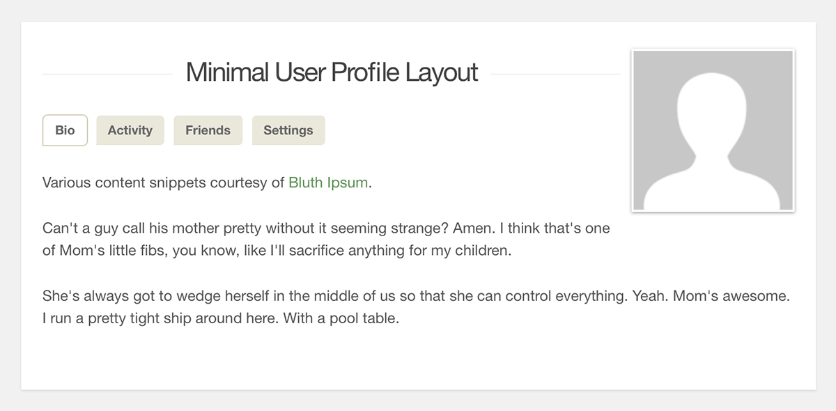
<p>Various content snippets courtesy of <a href="http://bluthipsum.com/">Bluth Ipsum</a>.</p>
<p>Can't a guy call his mother pretty without it seeming strange? Amen. I think that's one of Mom's little fibs, you know, like I'll sacrifice anything for my children.</p>
<p>She's always got to wedge herself in the middle of us so that she can control everything. Yeah. Mom's awesome. I run a pretty tight ship around here. With a pool table.</p>
</section>
<section id="activity" class="hidden">
<p>Most recent actions:</p>
<p class="activity">@10:15PM - Submitted a news article</p>
<p class="activity">@9:50PM - Submitted a news article</p>
<p class="activity">@8:15PM - Posted a comment</p>
<p class="activity">@4:30PM - Added <strong>someusername</strong> as a friend</p>
<p class="activity">@12:30PM - Submitted a news article</p>
</section>
The above code includes the nav menu along with the first two sections, which slightly differ by comparison. Notice the very first section using the ID #bio is also displayed on the page by default. Once the page finishes loading you’ll see this content along with a selected class appended onto the menu link. An extra class of .hidden is applied to the other sections on the page.
By including all of the HTML in the page at once it will cut down on extra HTTP requests going to the server. If you wanted to duplicate this effect in your own web application it may be worthwhile to just load everything at once, instead of using Ajax requests back to the database. This entirely depends on the amount of information being transmitted and how long a user would wait around for a page to load.
  <section id="friends" class="hidden">
    <p>Friends list:</p>

    <ul id="friendslist" class="clearfix">
      <li><a href="#"><img src="images/avatar.png" width="22" height="22"> Username</a></li>
      <li><a href="#"><img src="images/avatar.png" width="22" height="22"> SomeGuy123</a></li>
      <li><a href="#"><img src="images/avatar.png" width="22" height="22"> PurpleGiraffe</a></li>
    </ul>
  </section>

  <section id="settings" class="hidden">
    <p>Edit your user settings:</p>

    <p class="setting"><span>E-mail Address <img src="images/edit.png" alt="*Edit*"></span> [email protected]</p>

    <p class="setting"><span>Language <img src="images/edit.png" alt="*Edit*"></span> English(US)</p>

    <p class="setting"><span>Profile Status <img src="images/edit.png" alt="*Edit*"></span> Public</p>

    <p class="setting"><span>Update Frequency <img src="images/edit.png" alt="*Edit*"></span> Weekly</p>

    <p class="setting"><span>Connected Accounts <img src="images/edit.png" alt="*Edit*"></span> None</p>
  </section>
Additionally in the #settings section I put together a simple list of custom user options. These could be applied into any situation where the user is currently logged into their own account. Major networks like Facebook and Pinterest use a similar design. The pencil icons are meant to be clicked in order to edit the text inline with the page itself.
Page Layout
Naturally I am using the same typical resets and page styles for the core design. In place of the title you might change this to read the actual user’s name, or their specific account username. I placed the avatar image floating off to the right side above everything else, so that it won’t interfere with the menu or the inner content.
/** page structure **/
#w {
  display: block;
  width: 750px;
  margin: 0 auto;
  padding-top: 30px;
  padding-bottom: 45px;
}

#content {
  display: block;
  width: 100%;
  background: #fff;
  padding: 25px 20px;
  padding-bottom: 35px;
  -webkit-box-shadow: rgba(0, 0, 0, 0.1) 0px 1px 2px 0px;
  -moz-box-shadow: rgba(0, 0, 0, 0.1) 0px 1px 2px 0px;
  box-shadow: rgba(0, 0, 0, 0.1) 0px 1px 2px 0px;
}

#userphoto {
  display: block;
  float: right;
  margin-left: 10px;
  margin-bottom: 8px;
}
#userphoto img {
  display: block;
  padding: 2px;
  background: #fff;
  -webkit-box-shadow: 0 1px 3px rgba(0,0,0,0.4);
  -moz-box-shadow: 0 1px 3px rgba(0,0,0,0.4);
  box-shadow: 0 1px 3px rgba(0,0,0,0.4);
}


/** profile nav links **/
#profiletabs {
  display: block;
  margin-bottom: 4px;
  height: 50px;
}

#profiletabs ul { list-style: none; display: block; width: 70%; height: 50px; }
#profiletabls ul li { float: left; }
#profiletabs ul li a {
  display: block;
  float: left;
  padding: 8px 11px;
  font-size: 1.2em;
  font-weight: bold;
  background: #eae8db;
  color: #666;
  margin-right: 7px;
  border: 1px solid #fff;
  -webkit-border-radius: 5px;
  -webkit-border-bottom-left-radius: 0;
  -moz-border-radius: 5px;
  -moz-border-radius-bottomleft: 0;
  border-radius: 5px;
  border-bottom-left-radius: 0;
}
#profiletabs ul li a:hover {
  text-decoration: none;
  background: #dad7c2;
  color: #565656;
}

#profiletabs ul li a.sel {
  background: #fff;
  border-color: #d1cdb5;
}
Each profile tab within the smaller navigation is comprised of a single anchor link. The entire menu is built around an unordered list of links with an href value matching the content section ID. This is a very easy method for obtaining the new section value within JavaScript.
/** profile content sections **/
.hidden {
  display: none;
}

.activity {
  border-bottom: 1px solid #d6d1af;
  padding-bottom: 4px;
}

.setting {
  display: block;
  font-weight: normal;
  padding: 7px 3px;
  border-top: 1px solid #d6d1af;
  margin-bottom: 5px;
}
.setting span {
  float: left;
  width: 250px;
  font-weight: bold;
}
.setting span img {
  cursor: pointer;
}


#friendslist {
  display: block;
  font-size: 1.1em;
  font-weight: bold;
}
#friendslist li { line-height: 30px; }
#friendslist li a {
  float: left;
  height: 30px;
  padding: 3px 6px;
  line-height: 22px;
   margin-right: 15px;
  border: 1px solid #c9d8b8;
}

#friendslist li a img { float: left; margin-right: 5px; }
Some unique custom styles are used to design the other inner pages. These designs include the fully-featured settings and of course the friend list. Depending on your website features it will be worthwhile to update each content section accordingly. But you shouldn’t feel stuck to design around a certain pattern or page layout.
Minimalism can often work in your favor if you stick to what you know. Keep the information light, but organized and easy to skim. Make sure that you remove any excessively distracting elements from the page. I have tried to keep the CSS as simple as possible to make this demo an easy template for your own project.
Updating Content Sections
Back in the main index file I have written some jQuery code for handling the switch between content areas. The basic premise is to check whenever a user clicks one of these links and see what is currently being displayed. We can then hide everything with the .hidden class and only remove it from the content we wish to display.
$(function(){
  $('#profiletabs ul li a').on('click', function(e){
    e.preventDefault();
    var newcontent = $(this).attr('href');

    $('#profiletabs ul li a').removeClass('sel');
    $(this).addClass('sel');

    $('#content section').each(function(){
      if(!$(this).hasClass('hidden')) { $(this).addClass('hidden'); }
    });

    $(newcontent).removeClass('hidden');
  });
});
The selector will target each anchor link in the menu and trigger whenever a user clicks one of these links. We pass in the click event and use e.preventDefault() to stop the href value from loading into the address bar. When jQuery is turned off this might be helpful to instead display all the content openly in the page.
Otherwise we then pull out the href value into a new variable called newcontent. The formatting is written exactly like a jQuery selector, so now we can use this to display new content on the page. But first I’m simply removing the .sel class from every menu link and then applying it back onto the link being actively clicked. If the active link is already selected then we don’t notice any changes.
Finally the last bit of code loops through each inner content section using jQuery .each(). If the content element does not have a class of .hidden then we need to apply this so every section is hidden. Afterwards we target this newcontent selector and remove the hidden class, making it the only visible content on the page.
The reason I’ve chosen to use classes instead of jQuery methods is for compatibility. Granted the simpler functions like .fadeIn() do have some nice effects – but they also use inline CSS styles. I find this more annoying and CSS classes are widely recognized across all typical web browsers.
The ongoing push to get visitors interacting with your website has been gaining speed rapidly. But with these trends becoming normal on practically every site, you will need a way to easily display their information, and allow them to update it. Consider building an incredible user profile experience which captivates visitors to signup and give your website a try.