Master Responsive Web Design With Gridset
Let’s face it, responsive design is hard work. Web design was difficult enough when we were only considering desktop platforms, but the challenge of seemingly infinitely varying screen and viewport sizes has really added to the complexity of website layout.
Whether you’re completely new to responsive design or consider yourself an expert in the area, the tool that we’re going to look at today will blow you away. It’s called Gridset and it’s amazing.
What is Gridset?
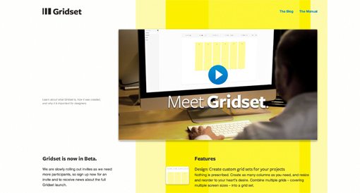
Gridset is a Mark Boulton project that’s currently in beta, and it’s aimed at drastically simplifying the responsive web design and development process.
You’ve no doubt seen plenty of tools that make this promise. The thing is, most are little more than glorified grid calculators. Gridset is different. It actually gives you a robust toolset that enables you to build and apply a number of different grids that are optimized for any number of devices.
It’s difficult to describe how and why Gridset is so awesome, so why don’t I show you with a sample project?
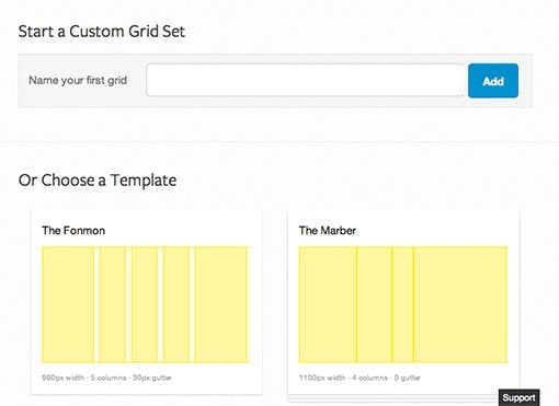
Create a New Grid Set
When you first log into the app, you’ll be shown a list of grid sets that you’ve built in the past (you’re not just building one grid but several). You can either choose to edit one of these or create a new one, I’ll create a one from scratch. To do this, hit the “New Set” button and apply a name of your choosing.

After this, it’s time to jump in and start building your first grid. You’ll see the screen below, which gives you the option of choosing between a few handy preset grid templates and building your own. We’ll start building our own in the next step.
Set Up Four Grids
Using the basic controls on the left side of the screen, we’ll bust out four different grids: Desktop A, Desktop B, Table and Mobile. Keep in mind that these are really arbitrary selections for this tutorial, feel free to go your own way on the decisions that we make throughout the article. You should still be able to follow along just fine.

This will create four different blank slate grids in the primary center section, each of which we’ll want to go in and customize for our purposes.
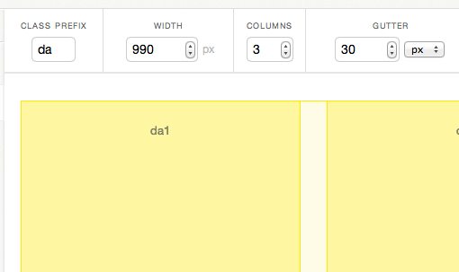
Customize Your First Grid
Now it’s time to really dig in and see how this thing works. By default, you should see something like the example in the screenshot below as the default state of a given grid:

This isn’t really a grid at all yet, rather it’s simply one large column. To customize the grid, we use the series of controls along the top. Let’s say that I wanted a three column grid with 30px gutters that activates at 990px wide and above. All I have to do is type these values into the fields.
What’s The Prefix?
There’s a little field here that asks for a “class prefix,” what’s that all about? The answer is that, once you set up your various grids using Gridset, applying them is as easy as slapping on a few class names in your HTML.
Gridset allows you to choose exactly what these classes will look like, though they do limit you to three characters so semantics are likely going to be sacrificed a little here. The typical example is to use “d” for desktop, “t” for tablet, and “m” for mobile. I’m going to build two desktop grids, so I’ll be using “da” and “db” to keep them separate.
Ratio and Refresh
Now, just because I used three columns doesn’t necessarily mean that I want them split up evenly. Luckily, Gridset allows you to adjust the ratio with a little dropdown menu. Incidentally, I do want mine split up into thirds so we’ll go with that option.

Once you’re finished tweaking all of the settings, just hit the refresh button to see your grid update.
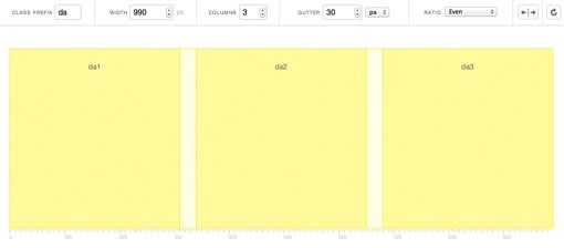
As you can see, the preview now shows a three column grid that reflects the settings that we chose. There’s a lot of added flexibility here if you need it. Try clicking on a column to see and tweak its settings individually or clicking and dragging to rearrange columns.
Set Up Your Other Grids
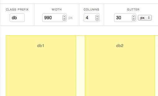
Now that we’ve see how to set up one grid, let’s blast through the other three. To illustrate just how flexible Gridset can be, let’s set up another desktop grid, “db”. This one will be virtually the same, only split into four columns in case we want to divide the page’s content into halves or fourths. We’re not setting up a new width that needs to be accounted for, just another grid within the same range.
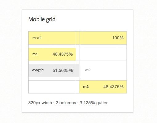
To finish off, we’ll set up a tablet grid that’s 768px wide with 20px gutters and four columns, then finish up with a mobile grid that’s 320px wide with 10px gutters and two columns.

Once again, pay attention to the prefixes because they’re going to be important soon. We took the standard route and used “t” for tablet and “m” for mobile.

Also notice that each individual column is labelled throughout all of the grids: da1, db3, t2, etc. These represent specific slots that we’ll be able to use in our code.
Using the Grids
Up to this point, Gridset has approached “neat,” but not indispensable. It’s nice to have some visual representations of our grids, but what good is that without some implementation help?
This is where Gridset really blows away the competition. To see why, click the “Use” button on the top of the left-side toolbar.

From here, make sure you have “Embed” selected and you’ll see a simple stylesheet link that you can pop right into your code. In my case it was the following:
<link href="http://get.gridsetapp.com/1715/" rel="stylesheet" />
This means that Gridset has taken the work that I’ve done on the grids, generated the necessary CSS file and is hosting it so that I can run tests. This file will automatically update as needed, so if I go in and make a change to the grid, I don’t have to touch a single line of code. How cool is that?
Other Goodies
There are three other tabs in the “Use” section as well. “Download” allows you to download the generated CSS so you’re not depending on the site to host your file after the testing stage is complete. “Cheat” shows you all of the measurements for the grids that you built so you can easily code your own layout using the same numbers. The formatting here is really nice and they encourage you to print a reference PDF.
“Access” allows you to enter the email address of another user who you’d like to also be able to use the grid. This is great for when you’re working with a team.
Coding an Example
Now that we’ve got all of our grids set up, it’s time to throw that style sheet link into an HTML file and give the layout a test drive. The implementation here is extremely easy, just utilize the grid classes that we set up before.
Let’s say, for instance, that we had two divs, each containing a headline and a paragraph. Like so:
<div>
  <h2>Design Shack</h2>
  <p>Lorem ipsum dolor sit amet...</p>
</div>

<div>
  <h2>Gridset</h2>
  <p>Lorem ipsum dolor sit amet...</p>
</div>
Now imagine that we wanted to split these up so that they were in the same row, but the first div took up 2/3 of the page width, leaving 1/3 for the second. Using our “Desktop A” grid, we would grab the “da” prefix.
Our first div would stretch across both the “da1” and “da2” column, so the class we want to apply is “da1-da2”. We only want the second div to occupy the third column, so here we would simply type “da3”.
<div class="da1-da2">
  <h2>Design Shack</h2>
  <p>Lorem ipsum dolor sit amet...</p>
</div>

<div class="da3">
  <h2>Gridset</h2>
  <p>Lorem ipsum dolor sit amet...</p>
</div>
Adding The Other Grids
Easy right? So how do we make this sucker responsive? That’s what this whole thing is about, so let’s get to it! All we have to do is add in classes for the other grids that we set up.
Start with the mobile grid, then work your way up. I want the content split evenly on both the mobile and tablet versions, so I set div one to “m1” and “t1-t2” and div two to “m2” and “t3-t4”.
<div class="m1 t1-t2 da1-da2">
  <h2>Design Shack</h2>
  <p>Lorem ipsum dolor sit amet...</p>
</div>

<div class="m2 t3-t4 da3">
  <h2>Gridset</h2>
  <p>Lorem ipsum dolor sit amet...</p>
</div>
This means that each div will occupy one column in the mobile view, then jump up to two columns in the tablet view, then jump up again to a 2:1 split in the desktop view. That’s some fancy layout voodoo with very little work!
<div class="m1 t1-t2 da1-da2">
  <h2>Design Shack</h2>
  <p>Lorem ipsum dolor sit amet...</p>
</div>

<div class="m2 t3-t4 da3">
  <h2>Gridset</h2>
  <p>Lorem ipsum dolor sit amet...</p>
</div>
Let’s Do This
All right, so now that we’ve got the gist of how this works, let’s code up a full example page with seven different divs.
<!DOCTYPE html>
<html>
<head>
  <meta charset=utf-8 />
  <meta name="description" content="description">

  <title>Gridset Example</title>
  <link href="http://get.gridsetapp.com/1715/" rel="stylesheet" />

</head>

<body>

    <div class="headline">
      <h1>Gridset and Design Shack</h1>
    </div>

    <div class="m1 t1-t2 da1-da2">
      <h2>Design Shack</h2>
      <p>Lorem ipsum dolor sit amet...</p>
    </div>

    <div class="m2 t3-t4 da3 ">
      <h2>Gridset</h2>
      <p>Lorem ipsum dolor sit amet...</p>
    </div>

    <div class="m1-m2 db1">
      <h2>One</h2>
      <img src="http://lorempixum.com/800/400/city/1" alt="">
      <p>Lorem ipsum dolor sit amet...</p>
    </div>

    <div class="m1-m2 t1-t2 db2">
      <h2>Two</h2>
      <img src="http://lorempixum.com/800/400/city/2" alt="">
      <p>Lorem ipsum dolor sit amet...</p>
    </div>

    <div class="m1-m2 t3-t4 db3">
      <h2>Three</h2>
      <img src="http://lorempixum.com/800/400/city/3" alt="">
      <p>Lorem ipsum dolor sit amet...</p>
    </div>

    <div class="m1-m2 db4">
      <h2>Four</h2>
      <img src="http://lorempixum.com/800/400/city/4" alt="">
      <p>Lorem ipsum dolor sit amet...</p>
    </div>

</body>
</html>
Just so everything doesn’t look hideous, we’ll code this up with some basic CSS as well. Notice that there’s virtually no layout code here beyond centering the body and reducing its width, most of the rest is purely aesthetic code. The one exception is that the images need a little help to stay in their parent containers. Again, this is just a quick test so don’t see this code as highly polished.
body {
  width: 90%;
  margin: 0 auto;
}

h1 {
  font: bold 50px/1 Helvetica, Verdana, sans-serif;
  text-align: center;
  text-transform: uppercase;
}

h2 {
  font: 30px/1 Helvetica, Verdana, sans-serif;
}

p {
  font: 12px/1.5 Georgia, Times, serif;
}

img {
    max-width: 100%;
    vertical-align: middle;
    border: 0;
    -ms-interpolation-mode: bicubic;
}
All Finished!
With that, our demo page is finished. Here’s what it looks like in the desktop view, with each section abiding strictly to the two desktop grids that we set up.

As we reduce the viewport width, the other grids kick in. As an example, here’s the tablet view.

Isn’t that amazing? Those are two drastically different layouts and we put hardly any effort into achieving this effect. Gridset truly lives up to its promise of making responsive design more fun and less of a pain in the neck for developers.
Demo Page
If you’d like to see the demo in action, click the link below. Be sure to resize your browser and watch how the changes affect the layout.
Demo: Click here to launch demo.
This is Revolutionary Folks
I’m not sure if you noticed or not, but we performed the entire site layout in Gridset. It wasn’t just something that we used to take a normal design and magically transform it into something responsive, instead it was an invaluable and integrated piece of the entire layout process.
Tools like Gridset have the power to dramatically overhaul your development process. As much as I typically loathe WYSIWYG web design apps of any sort that attempt to take development out of my hands, this one really changes the game. Responsive layout is tricky and if an app can do it for me this easily, then I might just give in.
The great part is that I’m still in complete control of the aesthetics of the site. This isn’t an all in one framework that does everything from grids to button styles, it’s strictly a layout tool that enables you to spend more time making visual changes rather than wrestling with media queries.
What Do You Think?
As you can tell, I love this tool and my hat is off to the team behind it. Seriously, well done. If you’ve had the opportunity to jump on the beta and give Gridset a try, let us know what you thought in the comments below.