25 Beautifully Designed Web Agency Sites
Getting noticed in an industry as competitive and overcrowded as web design is no mean feat. In order to stand out, first impressions need to be both targeted and executed to perfection.
To provide an insight into how it should be done, we’ve compiled a list of 25 of the most beautifully designed web agency sites. These amazing sites all have that “wow factor”, displaying cutting edge design alongside marketing savoir-faire. They are conscious of their target clientele, whether it’s large corporations or personal clients, presenting an understanding of their needs.
Love Creative

Love Creative has struck a perfect balance between visual impact, user-friendly layout, and interactive features on their site. Using so much flash and audio can often be distracting, but the simplicity of their navigation page helps to introduce it in both a fresh and bite-sized manner.
Grafikonstruct

As one of the top developers of flash sites in Brazil, Grafikonstruct are a valuable addition to this list. Specialising in sites for the fashion industry, they are the go to designers if you’re looking for sophisticated graphics to engage your audience.
Sapient

As you would expect from one of the big boys in innovative and interactive marketing, Sapient’s website is an example of absolutely beautiful web design. Their site had to be included in this list because of it’s faultless targeting of their clientele.
Marek Levak (Designme)

Marek Levak, a freelance web designer from the Slovak Republic, has produced a simple and very usable site to display his portfolio of work. Though arguably not the most creative of pages, “it does what it says on the tin” so to speak, and from the look of his past clients, the functional approach has won him lots of work.
Fat Man Collective

The popular minimal approach has been implemented with a touch of class by the Barcelona and London based Fat Man Collective. Included in the ‘The Creative Agency Awards’ list of the top 99 creative agencies of 2009, they are a great example of innovation in the industry.
AB+C

Inventive, intelligent and bold are just three ways you could describe Australian agency AB+C’s site. The minimal use of colour makes navigation a breeze whilst maintaining the visual impact so important for new visitors.
The World of Merix
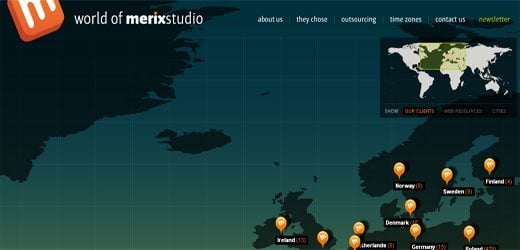
Waiting for complicated flash sites to load can often be a deterrent when browsing the web, but this site developed by The World of Merix makes the short wait worthwhile. Their unique navigation system is not only pleasure to use, but also a great display of their programming muscle.
hillmancurtis

Founded in 1998, Hillmancurtis emphasizes the combination of simplicity with elegance to create sophisticated and intuitive designs. Nominated for the Cooper Hewitt National Design award in 2009, and with a client list including Yahoo, Adobe, Hewlett-Packard and eMusic, their inclusion in this list is a given.
Fudge

Fudge has taken an original approach to its homepage that most web designers will be able to relate to. They’ve used a layout which simulates the Photoshop workspace. Nice touches include the flashing cursor and transparency grid background.
Huge

Huge boasts an impressive 150 million monthly visitors to sites they have developed. Add to that annual revenue of $8.3 billion taken by online businesses they created and you start to understand why they are called Huge.
Orange Label

The Czech Republic based Orange Label has been designing web sites since 2001. As with all successful web design agencies, they have a number of strings to their bow, from logo design to iPhone apps. Their site has been chosen as a great example of a simple and understated portfolio page.
TOY

Bold, simple, and perfectly executed, the TOY website is a prime example of minimal web design. Operating since 2005, it has quickly become one of the top 10 most award-winning agencies in the world.
Gravica Design

Michael McDonald at Gravica Design has presented another excellent example of the minimal approach on his website. The site displays a masterful use of Flash combined with a simplistic layout.
Studio No. 1

Studio No.1 in Los Angeles has created an excellent holding page in anticipation of their new site. Examples of past work, an easily downloadable PDF portfolio and clear contact information make this a truly functional page.
Cobra Creative

The San Francisco based Cobra Creative is a husband and wife team that has a unique ability to complete projects like a larger agency, with high end professional solutions, complemented with perfectly conceived branding. Their portfolio presents work so amazing; it’s hard to believe that it was created by a boutique agency. Oh, and their site isn’t too bad either!
StudioWEBER

Romanian design agency StudioWEBER has used a classic layout which displays past work in a clear and effective way. This operates perfectly in drawing potential clients through the portfolio and straight down to the contact area.
Analog

Analog is a company made up of a group of friends who make websites. Using a classic grid based approach, their site is simple, well-planned, and oozes experience. Click Alt+G to see their grid, a very nice touch.
Yugo Nakamura

Yugo Nakamura is a creative director, designer and engineer, who explores various forms of interactive systems in digital and networked environments. Works viewable on his site were recently displayed at the Center Pompidou in Paris and the Design Museum in London. Creativity is key.
Schematic

Schematic values the ability to excel across various fields within the new media industry. Specializing in everything from copywriting to technology and user experience, this enables it to stay ahead of its rivals.
Critical Mass

This list wouldn’t be complete without a mention of Critical Mass’s animated portfolio, which caused some serious shockwaves in the industry back in 2008. A slick, Flash-injected redesign of their old site, made this firm cool and desirable in an instant.
Ricardo Landim

Working across several different mini sites, games, and flash sites, Ricardo Landim creates conceptual designs that involve and immerse the user through expert use of color. His online portfolio is so thorough; you needn’t leave his site to view his work in all its glory.
Ultraviolet Design

Ultraviolet Design has been bold in its choice of colour, but pulled it off extremely well. Purple, normally associated with frustration, somehow becomes quite relaxing. The addition of an interactive banner at the top of the page is subtle, but works as a great example of programming prowess.
Tolleson

While Tolleson may be better known for its identity systems and work to push the boundaries of print manufacturing, they also produce clean and interactive websites. Their homepage is a perfect example of their first-rate work.
Delete London
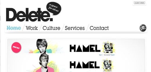
Delete London crafts powerful and fresh digital user experiences. An agency that is aware of the kinetic nature of the new media industry, they have an enviable top-level client list which reflects their ability as designers.
Ultra16

Ultra16 uses a layout that can be seen in several of the sites in this list, but it does so with real finesse. Specialising in web design for the entertainment and fashion industries, its high profile clients will undoubtedly set them up to become one of the future major players in the industry.
Conclusion
From the minimal to the complex, aesthetically focused to functional; our list of 25 of the most beautifully designed web agency sites has come to an end. If there are any that you think we’ve missed, please use the comments below to share your suggestions.