How to Spot Overused Templates and Avoid Design Fatigue
Stock templates can be a lifesaver when you’re working on a tight deadline or juggling multiple projects.
Whether it’s a presentation deck, a social media graphic, or a flyer layout, using a ready-made design helps speed things up and keeps your workflow moving.
But there’s a trade-off. When everyone uses the same templates, designs start to feel generic, repetitive, and forgettable. This is where design fatigue sets in.
You’ve likely seen the same style of Instagram carousel, pitch deck layout, or YouTube thumbnail pop up over and over again. And so have your clients and their audiences.
The more familiar a template becomes, the less impact it has.
In this post, we’ll explore how to spot overused template designs, why it matters, and what you can do to keep your designs fresh and original, even when you’re using stock resources.
Why Overused Templates Are a Problem

Stock templates are meant to be helpful, but they’re not supposed to do all the work for you.
The biggest issue with overused templates is that they can strip a project of personality. When dozens, or even hundreds, of brands are using the same design with only slight tweaks, it becomes hard to stand out.
This not only weakens visual identity but also contributes to what audiences experience as “design fatigue” or “visual fatigue”.
Things start to blend together, and users stop paying attention. For businesses, that means lower engagement, fewer clicks, and less brand recall.
Using templates isn’t the problem—it’s using them as-is, without customization, that causes issues.
How to Spot an Overused Template
Overused templates tend to follow similar patterns, and once you know what to look for, they’re easier to recognize.
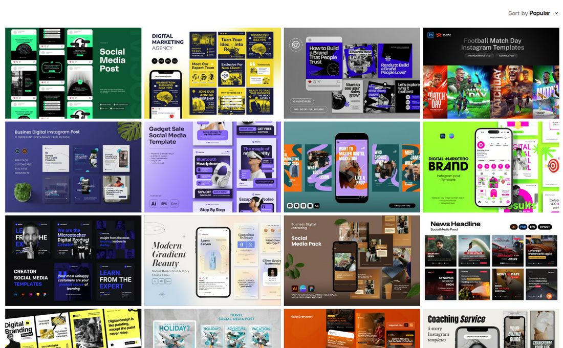
1. It Shows Up in Trending Searches
Templates that appear on the front page of marketplaces like Canva, Envato Elements, or Creative Market are often downloaded the most.
While they’re usually high quality, they’re also seen and used by a huge number of people. If it’s labeled as “most popular,” expect to see it reused frequently across industries.
2. It Uses Default Placeholder Content
Templates that still feature lorem ipsum text, generic image placeholders, or default icons with no styling often get reused without much customization.
If you spot the same sample text or common layouts in multiple brands’ content, the template likely hasn’t been adapted much, which is a red flag for overuse.
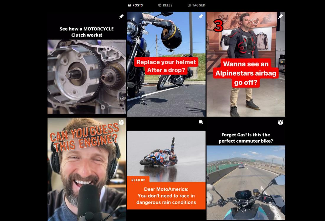
3. You’ve Seen It on Multiple Brands
One of the easiest ways to spot an overused design is when it starts popping up in unrelated places, like a digital agency and a SaaS company, all using the same hero layout or Instagram carousel.
Once a template crosses industries, it loses its sense of uniqueness.
4. The Design Feels Too Familiar
Trust your instincts. If you look at a design and feel like you’ve seen it dozens of times before, chances are your audience has too.
Familiarity can breed disinterest, especially on platforms like Instagram or LinkedIn, where users scroll quickly and are constantly exposed to similar visuals.
5. It’s Based on a Repetitive Format
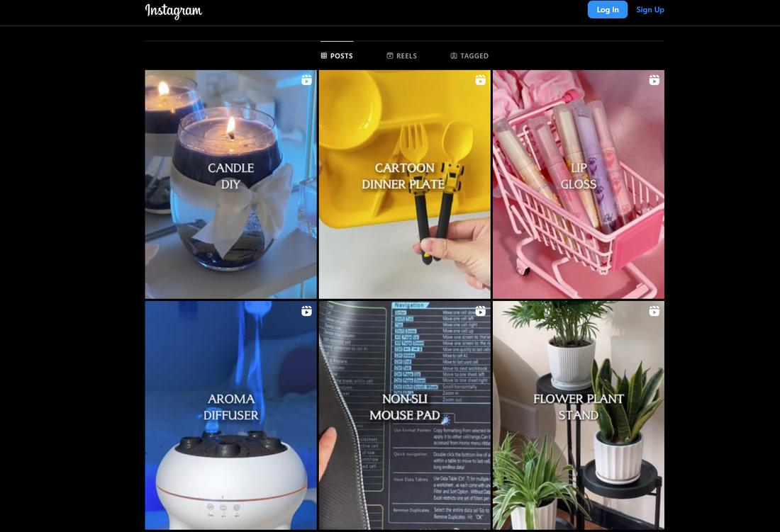
Templates that follow predictable patterns, like a four-icon feature grid, alternating image-and-text blocks, or numbered list carousels, can feel stale if not customized properly.
These formats are widely used because they’re easy and effective, but without unique visual styling, they lose impact.
6. It Relies Heavily on Trend-Driven Visuals
Trendy design elements like soft blobs, Memphis-style shapes, exaggerated shadows, or glassmorphism effects can quickly become dated.
If a template leans heavily on these trends and lacks flexibility, it risks feeling like a design time capsule after just a few months of use.
7. It Has Minimal Customization Options
Templates that don’t give you room to adjust layouts, change typography, or swap out visuals can be limiting.
If it looks great only when used exactly as intended, that’s a sign it wasn’t built for originality, and that others are likely using it the same way.
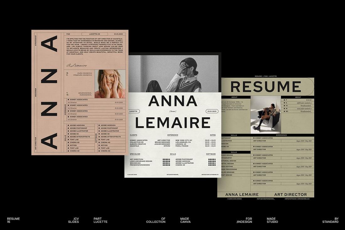
8. It’s Used in Official Demos and Tutorials
If you see a template featured in design tool tutorials, marketplace previews, or educational content, it’s likely become a go-to for a lot of new users.
While it might work well for learning, you’ll probably want to avoid using it as-is for professional or client-facing work.
9. It Prioritizes Style Over Substance
Some templates are built to look good in previews but don’t offer much flexibility or usability. These often become popular quickly but lack long-term value.
If a template looks great but doesn’t really fit your content needs, that’s a signal it may have been chosen more for trend than purpose.
How to Avoid Design Fatigue (Even When Using Templates)

Templates don’t have to be boring or predictable. With a few adjustments, you can take a popular base and turn it into something that maintains design originality and is tailored to your brand or project.
Customize the Layout
Treat the template as a starting point, not a final product.
Rearrange sections, adjust the grid, or move elements around to create a structure that better fits your content. Small layout changes can make a big difference in how fresh a design feels.
Swap Fonts and Colors
Many templates rely on the same safe combinations, bold sans-serifs, and muted palettes.
Changing the font pairing or applying your brand’s color system immediately makes the design feel more personal. It also reinforces visual consistency across your other materials.
Add Original Imagery or Illustrations
Stock photos and icons are convenient, but they’re often part of what makes templates feel recycled.
Try swapping in your own product images, branded illustrations, or even AI-generated visuals to give your design a custom touch.
Mix and Match Template Elements
If you’re using templates from the same pack or across different projects, try pulling elements from one and combining them with others.
Use the headline style from one slide, the icons from another, and the layout structure from a third. This hybrid approach helps avoid cookie-cutter results.
Use Templates to Build a New Foundation
Once you’ve used a template a few times, study what works about it—then try building your own variation from scratch.
This lets you keep the structure you like while adding more personality and flexibility moving forward.
Keep Track of What You’ve Used
If you work across multiple brands or projects, it’s easy to repeat templates by accident.
Keep a simple record of what you’ve used for each client or campaign. This helps avoid repetition and encourages you to explore fresh layouts next time.
In Conclusion
Templates are valuable tools, but they’re not one-size-fits-all solutions. Using them effectively means going beyond the drag-and-drop and adding your own creativity.
The goal is to speed up your process, not flatten your ideas.
By learning to spot overused designs and knowing how to customize them, you can keep your work feeling sharp, on-brand, and uniquely yours. It’s not about avoiding templates—it’s about making them your own.


