Black and White Design: 10 Stunning Examples (+ Tips)
A black and white design scheme can be one of the most striking combinations for a project. The deep contrast and simplistic nature of these colors (or lack thereof) provide plenty of opportunities to explore other techniques to make the most of the design.
Black and white designs have always been pretty popular, shifting most recently to more minimalist styles with a mostly white background and black elements. But as you’ll see from this collection of stunning black and white design projects, there are so many other options to explore.
1. Black and White Photography

Black and white photography can be a great way to create a colorless design with a lot of visual impact. There’s just something about a black and white image that makes you stop and look. (Maybe because they aren’t very common.)
Imagista uses a beautiful collection of black and white images – as well as headshots below the scroll – for the main design of the website. Even the pop-up ad on the homepage features the same black and white aesthetic. Even without color, you just want to look at the images and understand exactly what the design is trying to communicate.
You need to carefully plan the use of black and white photography—it’s not just a case of throwing on a photo filter. The best uses of this style of photography happen with a photographer involved in a project from the start.
2. Black & White Above the Scroll
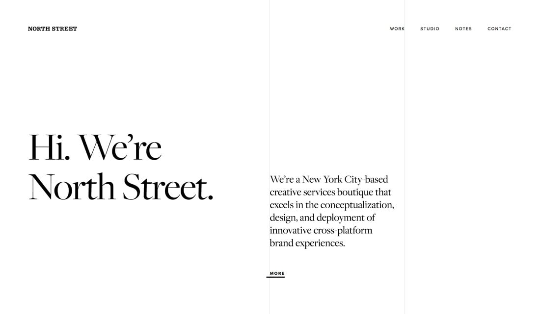
Not all black and white designs are only black and white. Many feature a pattern of black and white versus color elements.
North Street Creative does this well with a black and white header and footer and color elements scattered in between. This creates a sense of what is the branding for the agency (black and white) and what is project work (in color).
This technique is an effective way to create separation between elements and messaging throughout a design. It helps users understand where they are in the content and how elements do, or do not, relate to one another.
3. Rich Black
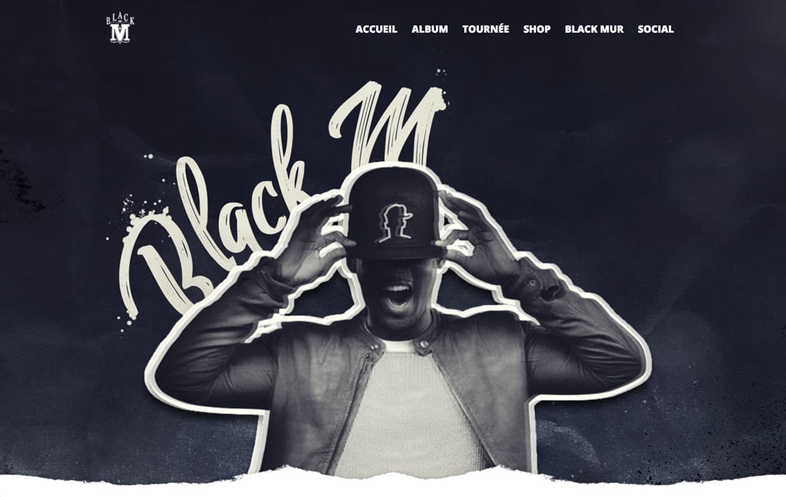
A black and white design does not have to be black. Designers that work in print might be used to working with a K (or pure) black to ensure better end quality. That limitation doesn’t exist online.
Choose a rich black to create cool or warm associations and provide a more engaging black and white palette.
Black M does this with his website. The background and image use a rich black with plenty of blueish undertones and a more creamy white. This modern spin on true black and white is a little more visually engaging and is just the thing that can set a black and white design apart from every other design using this color scheme.
4. Mostly White
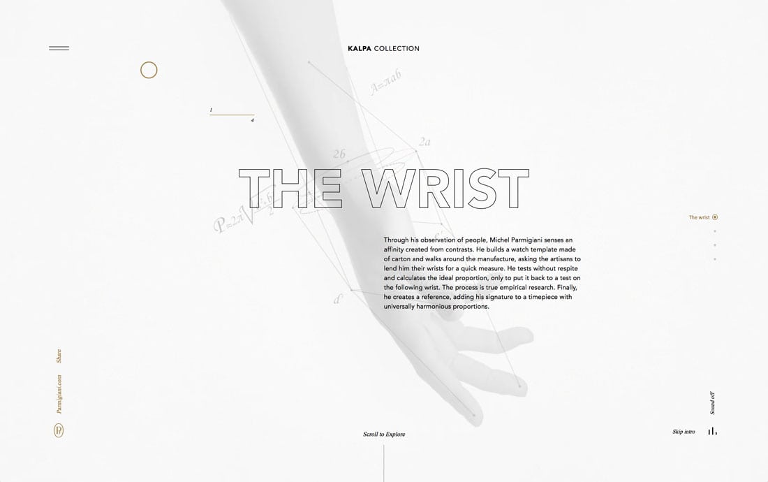
When designing in black and white, apply the same principles as you would with any other color palette and pick one of the options to be the dominant color. You can also think of it as background and text and element color options.
But most of the best black and white color schemes could actually be black or white.
The Kalpa Collection site is nice because the white is more of a “light” option and not pure white. This can be a lot easier on the eyes – especially with the backlighting from screens and devices – making the mostly white design pretty easy to read. The background and main image are subtly different but almost fade into each other. The text stands in stark contrast.
5. Mostly Black

On the other hand, you can go mostly black with the design and use white accents and text for emphasis.
The first thing you might notice when looking at these examples back to back is how different they “feel.” Black and white palettes can communicate sharply different things. It’s important to make sure you are creating the desired emotional connection with users in relation to the color palette.
Dubois is nice because the simple black background is lightened with polka dots and beautiful typography with plenty of space around it.
6. No Secondary Color

While most black and white designs do include some of the colors, you can pull off a project without a tertiary accent.
Printworks is purely black and white. The only element with some color variation is the black and white image in the middle of the screen. The result is absolutely stunning.
7. Hint of Accent Color
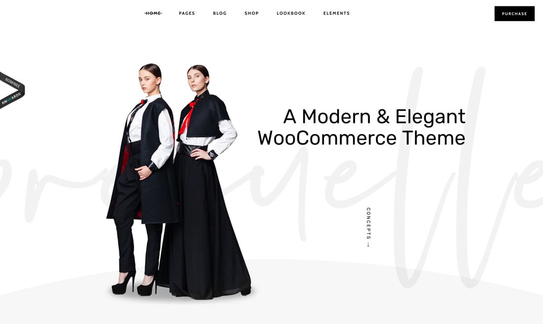
A hint of color in a black and white design is just the thing to draw the eye to a specific detail or element in the design. This technique is popular in many colorless design projects.
The challenge is finding just the right accent color and to use it in a pointed way so that it actually means something. Too much of an accent color in a black and white design can actually dilute the meaning of the accent, rending it less important.
The demo site for a Wolf Themes project uses a distinct black and white color palette with a hint of red. This color draws users to that part of the image first and then directly across the screen horizontally to the messaging. The accent color is a visual entry point into the design.
8. With No Art

A black and white design pattern can be the solution when you don’t have any art elements to work with. A stunning color pair (and accent) can create a focal point even without true art.
Violet does a nice job of this with a simple design pattern with a single color button for the call to action. The design creates depth using multiple black shades in an angular shape to separate elements and keep the flow of the design moving down the page.
9. Hints of Animation

Many of these designs are minimal by nature. (There’s only so much you can do with a black and white design before it starts to get cluttered.)
Adding a hint of animation can provide a more complex visual presence for the design. Try something subtle so that users don’t have to work too hard to understand what’s happening and create an animation that serves some purpose.
Airnauts uses a simple shift in the text plus a moving line to draw users to the scroll directive at the bottom of the screen. Thanks to all the space, the eye immediately moves to the animation, which provides a distinct point of interest in what could otherwise be an almost boring black and white design.
10. Create Intensity
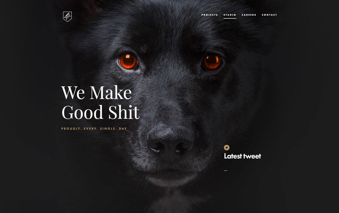
A black and white design has a certain sense of intensity by nature. There are sharper and crisper than some other design patterns.
Make a point to emphasize and create even more intensity with the elements you use in the design. The striking image of the dog – with amber eyes, no less – is hard to look away from. The white text says something. It almost gets in your face. That intense design can either keep users moving and want to see what other mysteries and surprising elements are to come.
Conclusion
While most people immediately think “minimal” when they hear black and white design, that does not have to be the case. As the examples above show, a black and white design can be minimal in nature or complex and intriguing.
Most designers like to add some hints of color to a black and white design project for extra elements of interest. Look for colors with sharp contrast for maximum impact.