Design Banner Ads That Don’t Suck: 15 Design Tips
There’s been a lot of recent chatter about banner ads. Are they fading? Are users actually clicking them? Are they dead? Are there better options available?
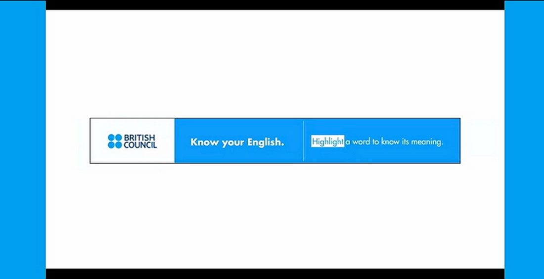
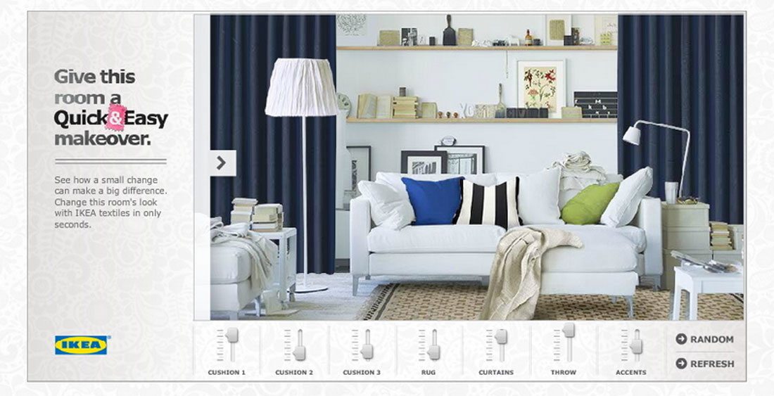
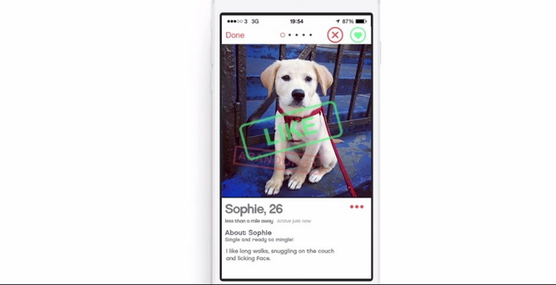
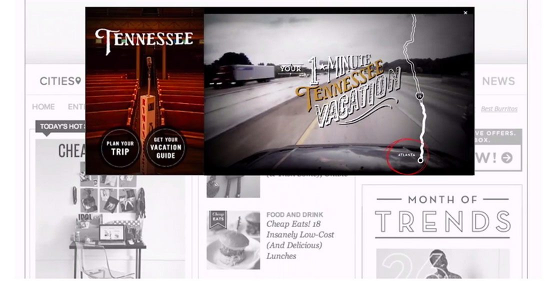
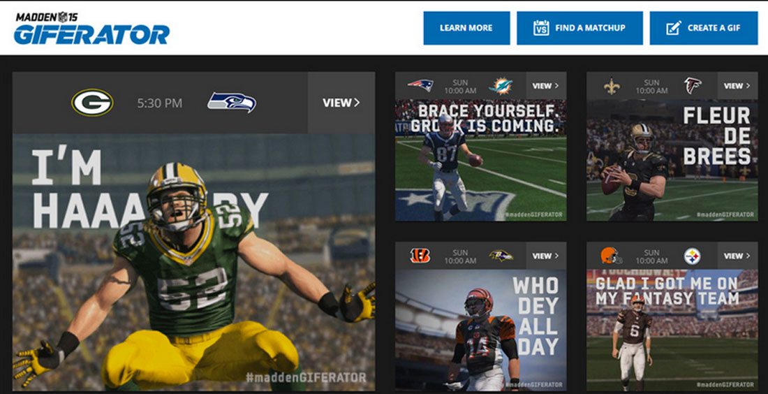
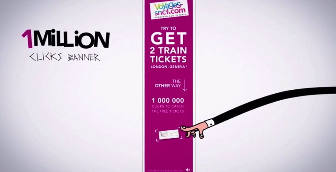
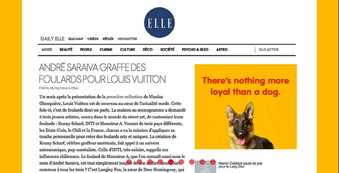
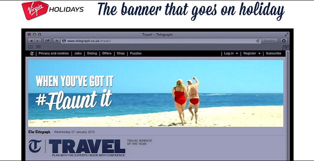
While it is true that banner ad clicks are in decline, that’s not the end of the popular online advertising format. While you can’t measure it, just seeing an ad helps create a user preference for that item, product or service. (Remember, ads have appeared on TV and in printed materials for decades without clicks to prove their success rates.) Today, we’ll look at 15 ways you can create banner ads that simply don’t suck. Take a look at the examples as well. They are 2015 winner of The Webby Awards for ad and website design. You can click through the images to learn more about each one.
1. Stick to Standard Sizes
Banner ads are not one-size-fits-all type of project. You’ll have to create within the specs of the site where you plan to advertise, and most sites use a set of common sizes. (This also includes e-mail newsletters, which often follow a similar framework.)
Google AdWords, one of the biggest servers of banner ads on the web, keeps up with the most popular sizes. “As a rule of thumb,” according to Google, “wider ad sizes tend to outperform their taller counterparts.” Much of this may have to do with placement above the scroll and because it is more comfortable to read from left to right, rather than lots of stacked text. h
So here are the sizes you should consider first:
- 728 pixels by 90 pixels leaderboard (often at the tops or bottoms of pages)
- 300 by 250 medium rectangle (often floats on the right side or is embedded in text elements)
- 300 by 600 half page
- 320 by 100 mobile banner
2. Create Hierarchy
Every banner ad needs three elements: Branding, message and encouragement to click. The challenge is that you don’t have much room to do this.
Create a simple hierarchy of elements. The message should be succinct – two to 10 words is ideal. What are you offering and why should people want it. Then include a logomark or identification. It only has to be readable and does not have to be large. Then finish the ad framework with a reason to click. Do you have a sale? Coupon code? Email signup?
Each of these levels should be sized using basic design theory with sizing, space, weight and color to guide the user from element to element.
3. One Ad Equals One Message
Banner ads are not a never-ending rotation of messages. While you can use techniques such as animated gifs to scroll multiple messages in ads, this is not always the best solution.
Start with a concept that works as a static ad first. Only then should you try to add features or function. Moving elements in an ad should not be the one thing people see. Your messaging should be the most important thing on the screen.
4. Think About Placement
Where are you planning to place these banner ads after they are created? If you are using a service such as Google, you might not have a lot of control over placements, but if you are buying direct for specific websites, apps or e-newsletters, you should look at the design of these things before starting on your ad.
Use colors that stand in stark contrast to the location and surrounding background. This will help your add pop out from the scenery. Go for bold colors and strong typography as well. Even if you are in a similar field or product line as the site where the ad is placed, choose strong visuals that are drastically different for maximum impact.
5. Include a Call to Action
Even though most ads will never get clicked, that is the ultimate goal right? Create a call to action for every banner ad you design. What are users supposed to do next?
This can include signing up for an email list, viewing your website, getting a discount and so on. But you have to tell users to perform this action. (Yes, sometimes we are still a pretty impressionable bunch that needs direct instruction.)
6. Forget Flash
It almost goes without saying these days, but don’t let anyone talk you into a flash ad. You are wasting time, effort and cash.
Use HTML5 instead. If you need help with converting some of your older ad designs and want to salvage them, Google has a short tutorial that can help.
7. Include a Button
When it comes to somewhat dense users – we all fall into that category at some point – easy-to-follow instructions are vital. While most users know they can click ads, sometimes including an actual button is what makes them actually move the mouse. (Yes, we know the entire ad space is clickable, but the button is a great visual cue.)
So include a button. It does not have to be fancy. But a simple “shop now” or “find out more” can go a long way when it comes to getting users to make the switch from viewer to conversion.
8. Focus on Fonts
The smaller the space you are working with, the more important fonts become. Banner ads are typically forced into small spaces and are up against a lot of competition for eyes. Make the most with strong typefaces that are easy to read.
As a rule of thumb, two typefaces should be enough.
- Go big with the headline. Use something that’s bold, a little unusual or colorful to grab attention from users.
- Stick to a simple sans serif for everything else. You can use two sizes or bolding – one for main text and another for buttons or calls to action. Just make sure it is easy to read.
9. Use Simple In-Ad Animation
One of the bigger trends in banner ads is simple animation. Is there a fun character running across the ad? Does a pretty girl wink at you from across the screen?
What we are not talking about are the bright yellow and orange flashing displays from ads of the past. You do not need neon glowing text to grab a user’s attention.
What we are talking about is little surprises that you might have to look at twice to really notice. Simple animation can be just that little divot that makes someone take notice.
10. Save Properly
This is a big one. No one is going to want to serve your ads if the files are too large or if they are not formatted properly. Optimize your content for the smallest file size possible. The target file size should be somewhere around 150 kb, depending on the size of the ad.
Then make sure to save in a format that works across the web. Common file types for banner ads include PNG and JPG for static displays, and GIF for animated displays. As the popularity of SVG increases, this format is becoming more widely accepted as well.
11. Focus on the Copy
Before you say this is someone else’s job, copy is a key part of the design. Since there is not much room to work with here, you will need to work closely with the copywriter to create a message that sells.
You don’t want to get 100 words to cram in that ad do you? Then work with the copywriter. Consider asking questions of the user or creating a tease that piques user attention without providing answers.
12. Maintain Brand Consistency
Banner ads are an extension of every other marketing campaign you have running. And they should look like it. While the shapes and sizes may present some design challenges, it is important to maintain visual consistency.
This can require thinking about banner ads in the initial part of your marketing strategy. (You would not design a logo these days without a social media appropriate square version, would you? Same goes for banners if website advertising is part of your overall plan.)
To maintain consistency, user the same colors, typefaces and imagery across all marketing materials. For smaller elements, you might consider dropping a formal logo or using an interesting crop of an image that appears full-size in other mediums. That’s OK. You might have to great creative to make it all come together.
13. Use Strong Imagery
If you are afraid of cropping, this is the time to get over it. The images in banner ads are small – often very small – and you will have to use tight images and detail shots to make the most of the space.
When using images of people, opt for faces. If you are a clothing retailer, show an item instead of an entire wardrobe. Stick to simple placements as well, with images next to text, rather than as a part of it. Users will only have a few seconds to see what you are trying to say. A strong image next to a strong message is your best bet.
14. Link Appropriately
There’s nothing like a well-thought out ad campaign. If you click a banner because you see a shirt you want to buy, the link should go to that item. Users will thank you.
This might require a little more work on your part. Landing pages that directly relate to ad campaigns are a good option for this. Match ads to imagery on the related page so that users don’t feel tricked or lost after the click. (This is an effective tool for helping you to measure conversions as well.)
15. Keep it Simple
We say this a lot at Design Shack – keep it simple. If you over-stimulate users with messaging and animation and color and facts, it will dilute what you are really trying to accomplish. Keep it simple.
When it comes to banner ads, one of everything is enough.
- One image
- One message
- One call to action
- One brand mark
Conclusion
So the banner ad is not dead yet. (And it’s probably not going away anytime soon.) These placements can be an effective way to help reach your target audience with researched buys and design that helps users connect with your brand.
If you need more tips for creating ads for the web, check out these resources: