Designing With an 80s Trend: Memphis Design 101
Every trend eventually makes a comeback. Sometimes that even applies to trends that are more difficult to understand.
Memphis design – exemplified by an 80s aesthetic with bright colors and lots of shapes and lines – is one of those concepts that has come back around again. Not many people have ever said they love the 80s design style. Love it or hate it, the bright design pattern can be a lot of fun and direct attention to the design. Here’s everything you need to know about Memphis design.
Identify Memphis Design
Memphis design is a funky style with a definite modern look that has a history in textiles. (Most people find the style to be an acquired taste and either love it or hate it.)
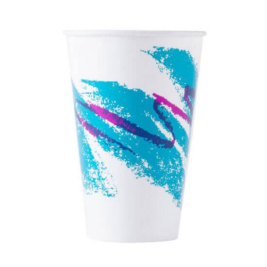
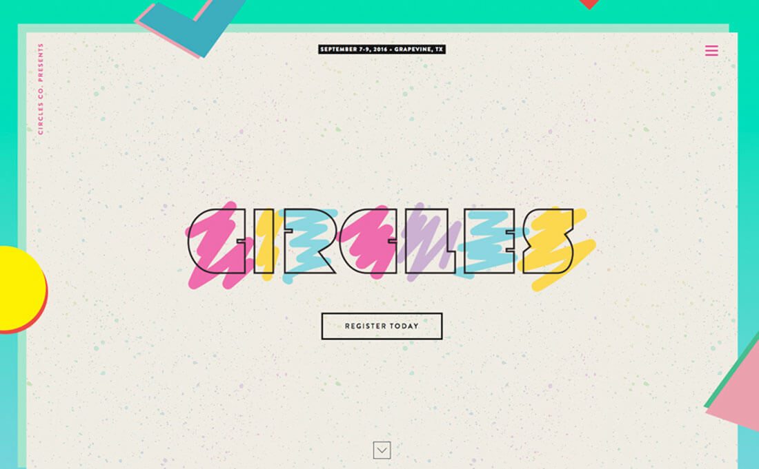
The trend has roots that originated in the 1980s with the Memphis Group, a collection of Italian interior designers. Other names for the design aesthetic include pop art, art deco and 80s retro. A classic example of Memphis design includes the logo for MTV or the Solo “Jazz” cup design (above).
It’s made a bit of a comeback in circles outside of website design. It’s been seen on runways and in fashion shows recently. (And designs in this style can be somewhat hard to miss.) Memphis styles can also work exceptionally well for posters or packaging design, particularly because they need to grab someone’s attention from afar.
The Memphis style is identified by a few key characteristics:
- A flat, vectorized style that is often accented with bright, saturated color choices.
- Geometric shapes are the primary art element and few actual photos are used.
- Designs are accented with plenty of strokes and squiggled lines to provide navigation cues or points of reference.
- Highly visual sans serif typefaces are the popular choice, often in block or bubble styles.
Color Choices
Yellow. Teal. Orange. Lime. Magenta. These are some of the color choices that you might find in a Memphis design. (You might even find them all in a single project.)
Every color used in Memphis design is typically bright with an almost neon quality to it. There aren’t many tints or tones. Colors are used to evoke strong emotions of joy and happiness for users and encourage interaction and engagement.
If nothing else, the colors used in Memphis design are supposed to be cheery and happy.
In addition to bright color, Memphis design can also follow a more minimalist color pattern, featuring black and white as the primary colors with bright accent options. The more minimal option is particularly popular with certain lines and geometric shapes.
Geometric Shapes
Memphis design is packed with little geometric divots, from sharp elements in the foreground to intricate patterns. Either way, these elements are often free-flowing in nature and don’t seem to have a defined grid or pattern.
Shapes include squares, circles and triangles and can have sharp edges or a more hand-drawn look. Patterns might include these same shapes or the popular “pill” shape or combinations of paired shapes.
For added emphasis, many of these shapes often included heavy, fully saturated shadows for an offset outline look. (When it comes to Memphis, all the “rules” you are accustomed to seem to go out the window.)
For a modern twist on using patterns and geometry in Memphis design, try layering elements a la Material Design. This tactile effect can add a degree of pop and modernism to a design style that is totally 80s in every other way. (Many older Memphis design styles used some layering but the effect is often flat or has that “fake 3D” visual component.)
Strokes and Squiggles
Thick strokes and squiggles might be one of the key identifying factors when it comes to Memphis design. Almost every example includes a series of strokes and lines that seem to freely fill the design. Computer or hand-drawn designs are equally represented.
Coloring for these elements is the one real variant. Black, white or in full color, the design is created so that these little divots have a lot of contrast and draw users through the design.
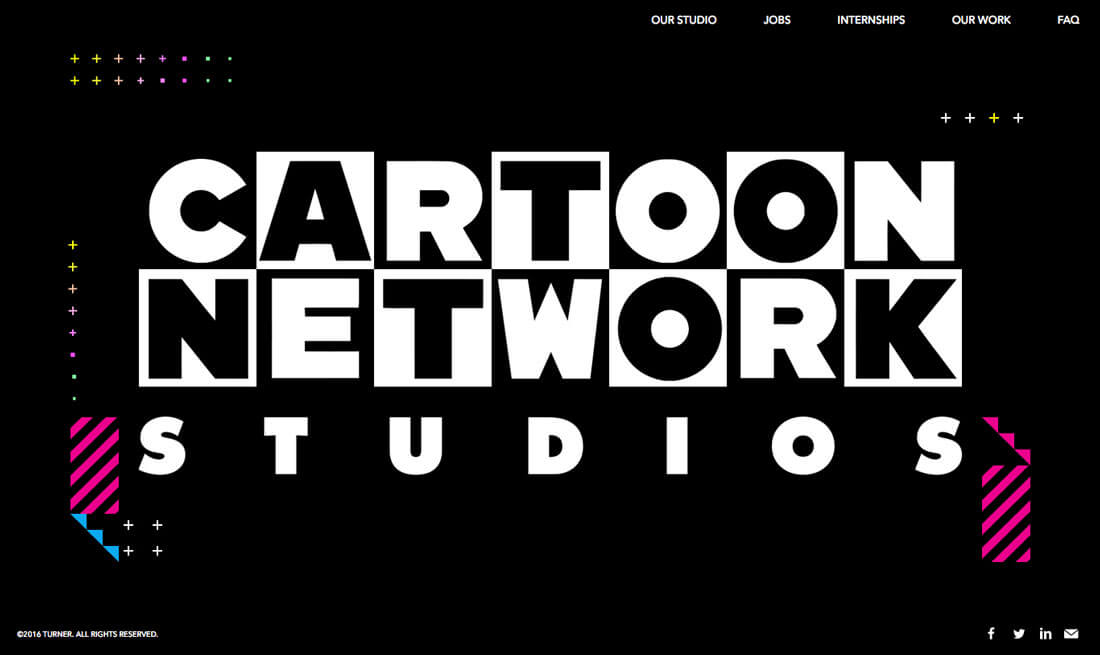
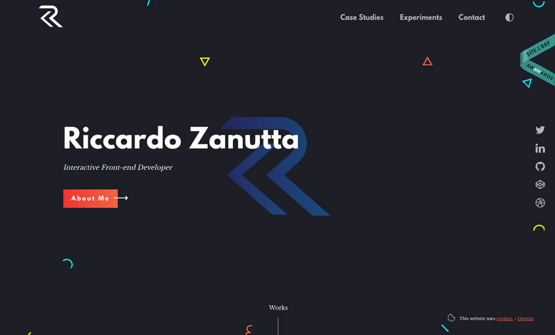
The way to keep this old-school pattern looking fresh is with animation. Both examples above, Cartoon Network and Riccardo Zanutta’s websites, use touches of movement to draw the eye. Subtle animation is interesting and keeps the design from looking too flat or dated.
Block and Bubble Fonts
One of the most fun elements of Memphis design is typography. With this style, you might get to use typefaces that you never imagined possible for most projects.
Opt for styles with an 80s flair, such as bold, blocky sans serifs or handwriting style bubble lettering. Go for high drama with type styles that have either super smooth or super sharp edges. (This design style is all about drama.)
Typography should mimic the other elements of the design, so any typeface that has letterforms with as almost geometric look are appropriate, as well as styles with stroke widths that are similar in shape and size to the patterns in the design.
And when it comes to the typography, don’t be shy about color. This is the time to go crazy with colored lettering. Pick a bright color with plenty of contrast to pop it off the background. Black or white can also be effective choices, particularly with busier backgrounds or patterns. Either way, opt for something with lots of contrast and a bold overall appearance.
Conclusion
If you are looking for a design style with whimsy, Memphis is a good place to start. It’s a good technique to help stretch your design skills and work with colors, type choices and even shapes and lines that might not be part of your normal design palette.
When experimenting with Memphis design, the most important thing to keep in mind that it can evoke strong emotions from people. (Some have even called it tacky.) Make sure the aesthetic matches the messaging and tone of the project – often a fun or retro vibe – before taking on a project featuring Memphis design.