How to Create an Emotional Connection With Design
Every project you complete connects with users in some way. The design communicates a message and a tone. The emotional tone is what we are going to take a deeper look at and try to better understand.
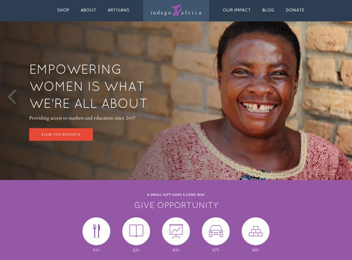
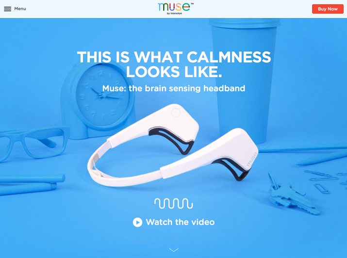
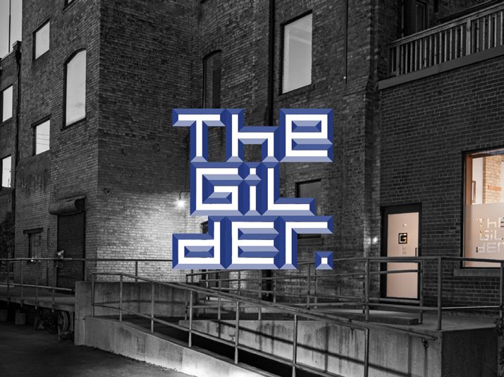
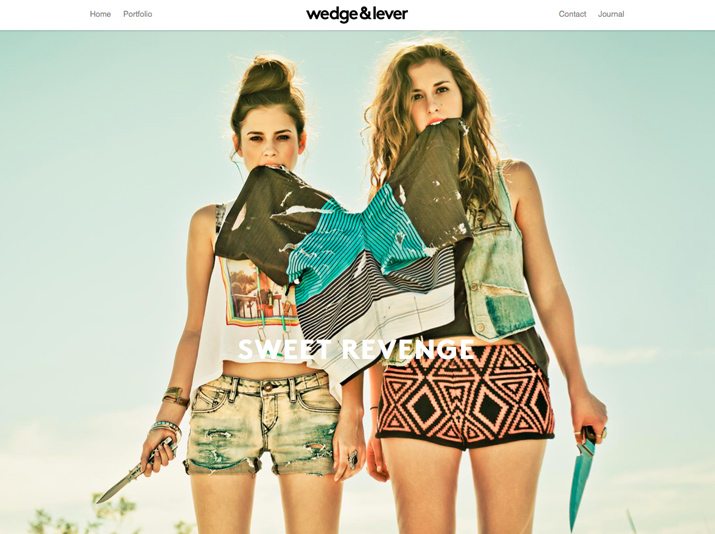
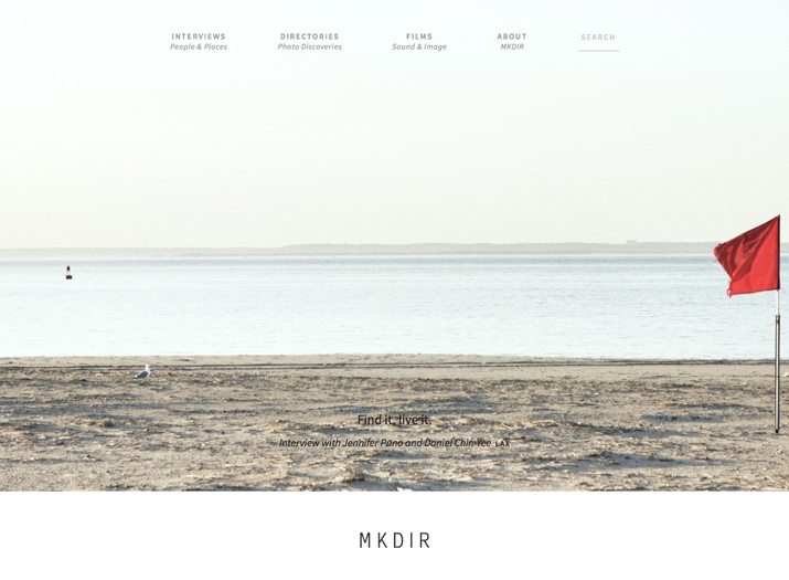
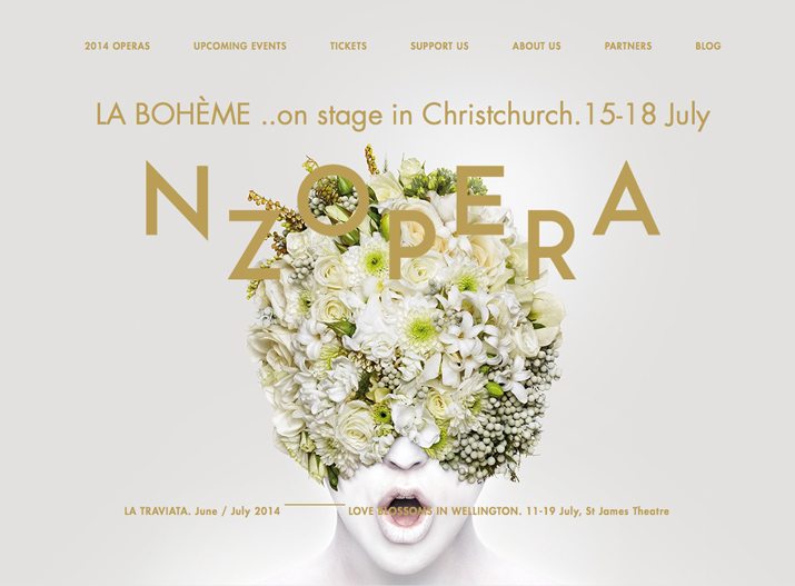
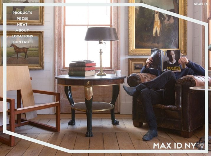
Emotional connections fall into four basic category pairs – joy and sadness, trust and disgust, fear and anger, and surprise and anticipation. Understanding this range of emotion and how it relates to a visual message is important so that your design projects are received as they are intended. As you read through this post, take a look at the featured websites and think about how each one makes you feel and what parts of the visual aesthetic contributes to that emotion.
Wheel of Emotions
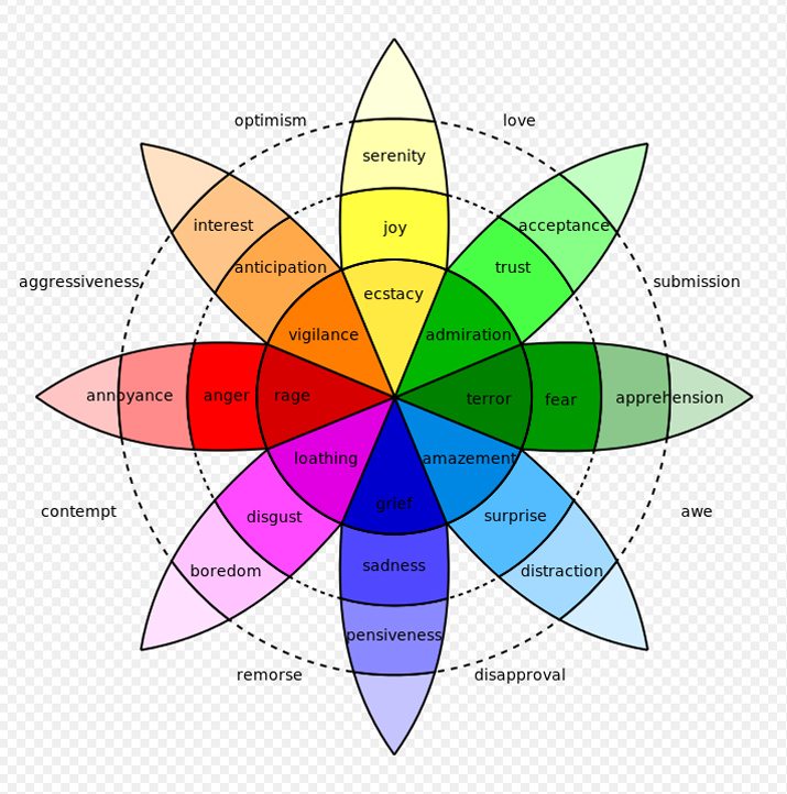
Much like the color wheel in every designer’s tool kit is a similar – and similarly designed – wheel of emotions. Robert Plutchik, a psychologist and educator, developed the wheel in 1980. His wheel is based on four basic emotions and their opposites.
The emotion a person feels when interacting with a design results in a corresponding feeling. This feeling can determine how a person views and interacts with your design or even company or brand overall.
Joy and Sadness
Happiness is contagious. What that means for your design is that people will want to share it with others, on social media, person-to-person or in other ways. People connect with happy aesthetics in a way unlike many other options because it is something that makes them feel good with a positive emotional association.
Sad visuals connect with users in an almost similar way, surprisingly. Because sadness creates a sense of empathy, which most users will react to. They may trust the subject more or share what they’ve seen to help out.
Trust and Disgust
Trust and disgust go hand-in-hand and the line between the two can be crossed easily. You want to create a visual that seems real and believable for users to find it relatable. But this does not mean it can’t be fantastical. It just needs a hint of trustworthiness.
Without that trustworthiness, the emotional connection to trust can turn to disgust quickly. This can make it difficult for users to relate to your message or connect to the visuals you have presented.
Fear and Anger
Using fear or anger in design can be one of the trickier emotions to work with. For some people the emotional response to fear is to run away – you don’t want this happening when people see your design. But for others fear, makes a person more secure in their present situation, maybe even better connecting him or her to the information you are presenting.
Anger and negativity have a lasting effect. These visual emotional cues to lead to aggression or stubbornness and have an overall unpredictable nature when it comes to predicting how angry or negative images will impact someone.
Surprise and Anticipation
Surprise can entertain and help create a connection with a user. An interesting visual element or action can accomplish this. Surprise often comes with either fear or happiness to create an overall emotional association.
You’ve seen the “coming soon” teasers. This draws on our sense of anticipation. Sparking the curiosity of people as to what comes next. A well-designed coming soon page, for example, will be remembered – and hopefully users will return multiple times – so they can find out what is coming or happening.
3 Levels of Visual Design
The emotional connections and feelings associated with your design come from a variety of places and things. Sometimes these emotions are within your control with elements such as color and tone and other visual cues. Sometimes they are not. (Consider a customer who hates the color red or who is afraid of a monkey and that’s your brand logo.)
What you should focus on are the things you can control. In Donald Norman’s “Emotional Design: Why We Love (Or Hate) Everyday Things,” he explains three levels of visual design — visceral, behavioral and reflective. These concepts can explain how we relate to a visual element and how to create something that is more appealing, effective or well received.
- Visceral level: This is the first impression someone has with a design. It’s a purely instinctive reaction to something. This level of design can make users feel something (the desired reaction) or leave a neutral and unmemorable impression. A good visceral design leaves you feeling something and wanting to interact with the design again.
- Behavioral level: This level relates to the user experience. What do you do with the design? How does it work or function? While you may think this only applies to digital projects such as apps, it has wider reach. At the simplest level, the design of a business card implies a behavior – to take it and file the information away for later.
- Reflective level: The “highest” level of the emotional-visual thought process is reflective. It’s the interpretation and understanding of a visual element combined with feelings about it. At this stage of thought, a person determines and creates a lasting impression of something. Is the visual memorable? Does it leave a lasting impression? Will he or she reference it later?
Visual-Emotional Cues
What elements can you incorporate into your designs that are associated with different emotions? The answer is almost anything. Every visual element will create some type of connection to users. And this is vitally important. Aaron Walter in “Designing for Emotion,” explains emotion creates “an experience for users that makes them feel like there’s a person, not a machine, at the other end of the connection.”
Think about the emotional impacts any of these common visual elements can be associated with, positively or negatively:
- Color
- Sound
- Big words
- Texture
- Usability
- Readability
- Photo style
- Shape
In addition to these visual cues there are specific types of emotional engagements you can create with the overall aesthetic. Determining the right tone and emotional impact should be one of the first discussions at the start of any design project.
- Entertainment and engagement
- Humor and lightheartedness
- Patterns and dissonance
- Recognition and familiarity
- Relationship and tone
Conclusion
In almost every design, the goal is to get users to connect with your work. While the desired emotions may vary most do have common themes. A good design has elements of appeal, effectiveness, and is pleasurable and memorable for the user.
By combining these ideas and working to use strong visual cues that tie to the right emotions for your project, you can develop a design that works in the right way. It will have visual appeal and evoke emotional connections.