How to Design an Awesome Presentation (Even if You’re Not a Designer)
There’s nothing worse than sitting through a presentation filled with poor visuals. This is especially true when you are pitching to a client. If your presentation looks bad, how will your design look?
The problem with presentation design is often more about time than actual design. But you must take time in crafting stellar presentations. This might include building a template that you use for presentations or honing in your public speaking skills. Here, we’ll walk through a few ways to design a great presentation that will engage your audience. (While most of these tips are structured around creating a digital presentation, using software such as PowerPoint, the concepts can also be applied to posterboard style presentations as well.)
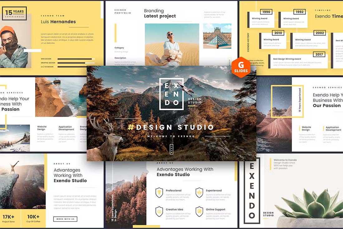
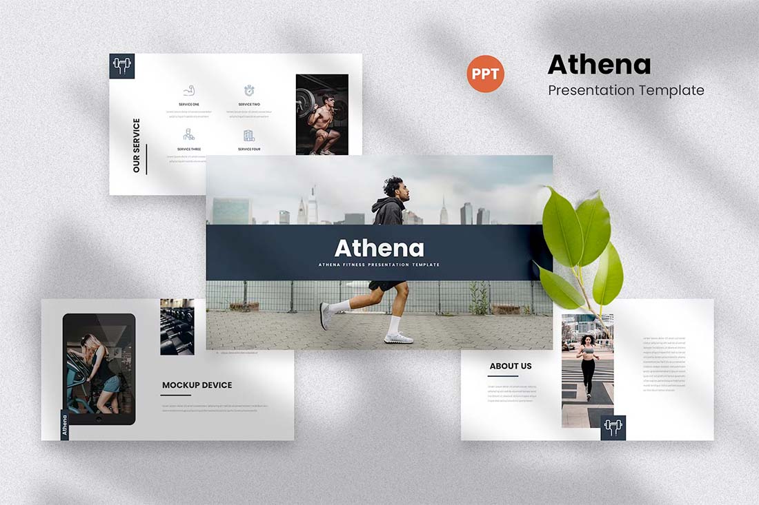
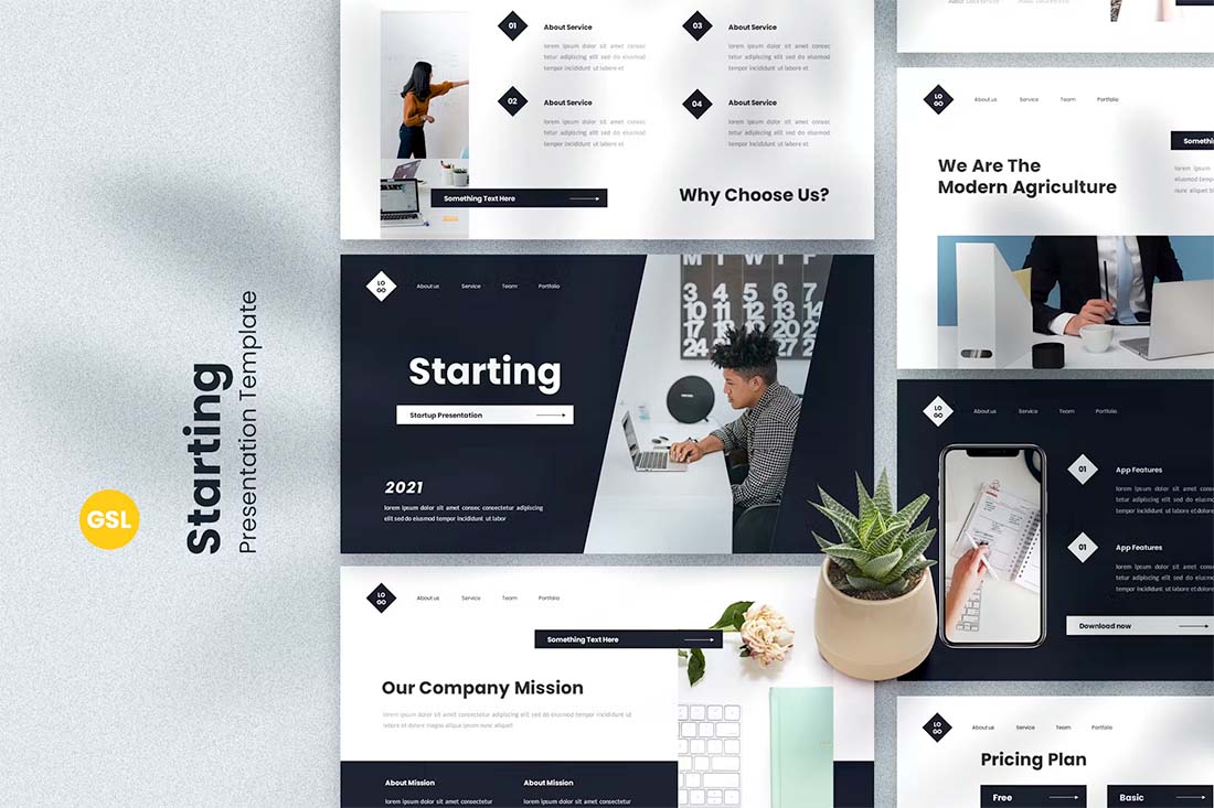
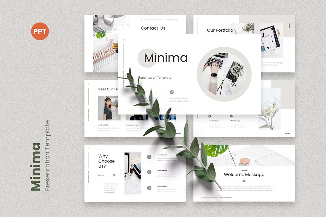
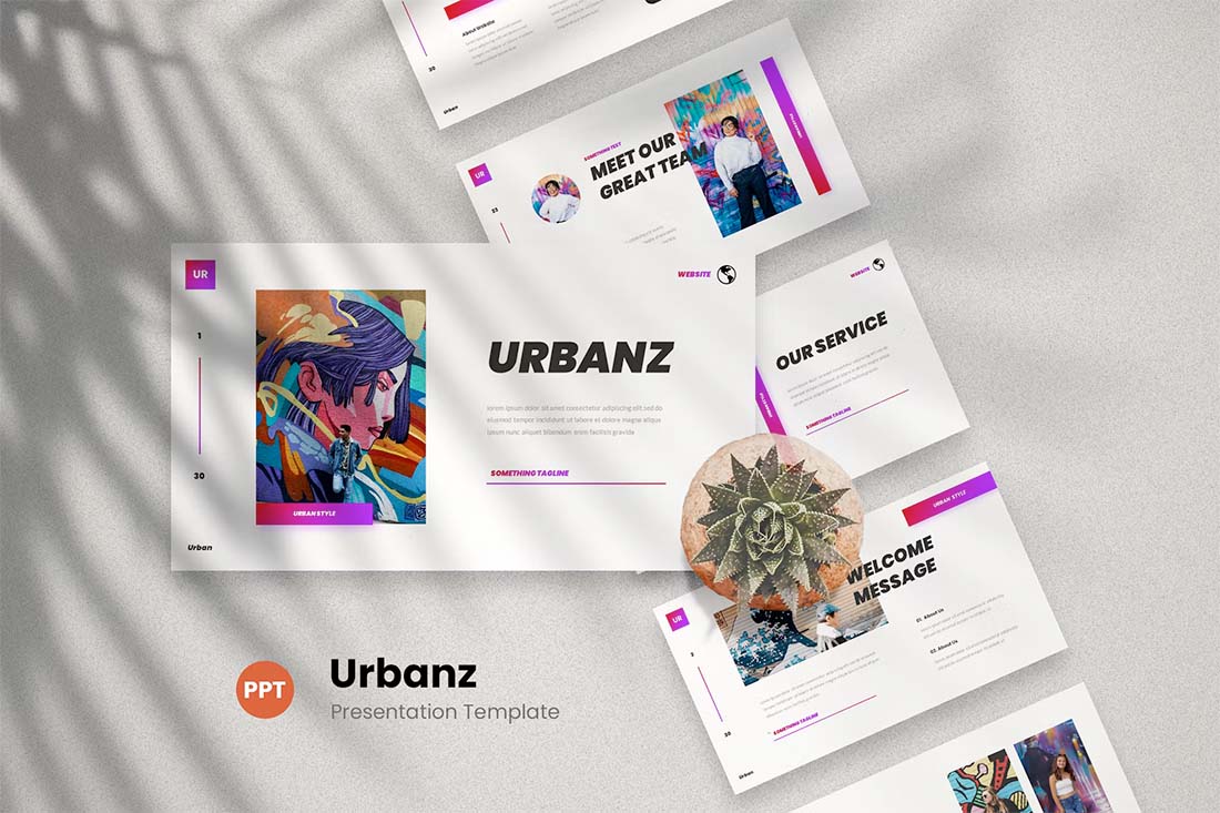
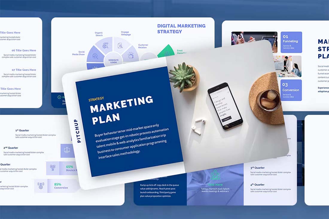
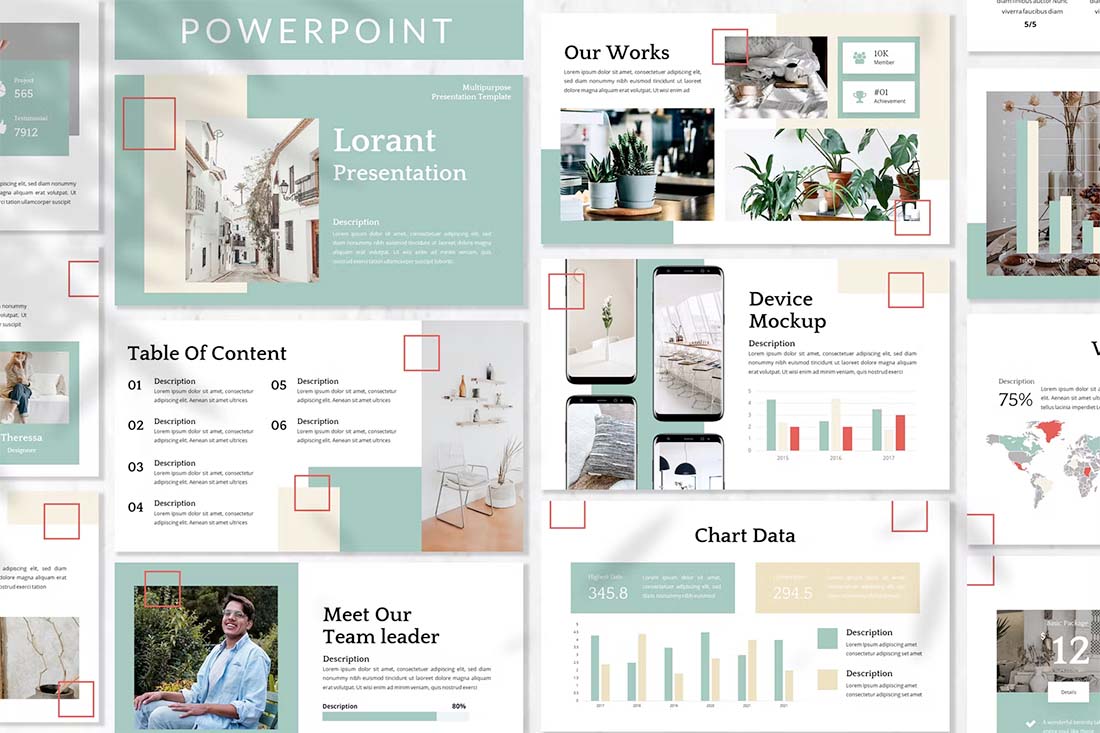
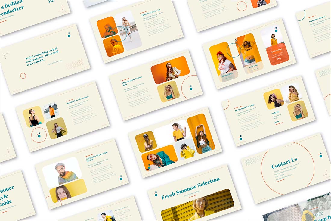
Want to jumpstart your presentations? All of the examples here are templates that you can download and use.
Build Your Own Template
You might already be thinking: How can I build a template before you’ve given me any tips for success? Well … you can’t. But you need to think about creating a presentation design template from the start.
And you are not going to use one of the ones that come with the software. (They scream “boring!”) After you have a design or style you like in terms of color, text, and basic framework, you’ll want to turn it into a template. This will save you an incredible amount of time in the long run and give you something that’s easy to work with on the fly.
When it comes to creating your template, make sure to include branding. This can be on every slide or screen or just one screen at the end. Branding should include your logo (if you have one), business name, and website or phone number.
Select Photos with Impact
A picture really is worth 1,000 words (and when it comes to presentations it needs to be since you won’t have much room for lettering). Even if you can only use images on a few slides, make sure they are good. Surprise and delight the audience with your photo choices.
For places where you don’t have great photos consider a photo background that relates to your industry or your presentation topic to keep the visuals interesting.
Think About Readability

One of the biggest issues with presentations is a lack of readability. The text is either way too small or does not contrast with the background.
If the audience can’t read the words, then why bother putting them on the screen? The other common issue with on-screen presentations is environmental conditions. The room might not be dark enough or there could be a glare on the screen from windows, making the text even more of a challenge to read.
You can combat this in advance by designing presentations with high contrast text and backgrounds every time. Start with black or white text and then match the background to it. (Not the other way around.) If you have to add shadows or color to text for it to stand out, then choose a different background image.
Build a Monotone Color Palette
Simple is better when it comes to presentations. If you are feeling stuck in terms of image choices, consider a flat-style single-color design.
Select a background color – start with something dark – a lighter version of that color for text accents and white as the text color. The simple monotone framework is easy to apply to almost any design and will have a polished, easy-to-read look.
Keep Text to a Minimum
Too much text is a design killer when it comes to presentations. While you may actually say a lot while the audience is looking at the screen, all those words don’t need to appear there.
Presentation text should be kept to a minimum and appear in a short format, such as a bulleted list. You do not need to use sentences. The text should also have the same feel as your talk. If you are high-energy, the text should reflect that. If the presentation is more formal, the language should be as well.
Select Stylish Typefaces
Have a little fun with the typography, but don’t go overboard. Think about designing a presentation slide as if it were a hero-style header for a website or a miniature poster. Each new visual is a new opportunity to provide a good impression of that point.
Consider a novelty typeface or oversized lettering for impact. Stack multiple type styles (bold, regular, italic, black) to build emphasis with key words. Just remember not to go too crazy with fun typefaces because it can get overwhelming. Keep this technique to only a handful of slides such as the title page or your main talking point.
Build Text Flow
As with any other design project, you need to build hierarchy and text flow. This is based on the placement of elements on each screen and how the elements connect to one another.
Start with the words. You will have one or two levels of text per screen — headline and body text. The headline should be no more than five words. The body text should be kept to a minimum. Headlines should be large. Think 60 or more points. Other text should be at least 30 points.
Consider how the text elements “stack.” Headlines should appear to the left of and above the main body copy. Otherwise, it can be jarring for the audience to ready quickly.
Then consider the placement of other elements. Include plenty of spacing between items. (Often the display for these presentations is not super sharp and you’ll need to account for this possibility with what might feel like too much space.)
Collect Related Pieces
For designers, in particular, one of the things you might have to present is a design preview of other projects. You’ll need to create a realistic view of what the design is and how it renders. Create a collection of mockups and parts to make this easier.
If you design websites, for example, find a good set of computer, tablet, and phone mockups to insert your design into. This is better than just a screenshot because the audience (which might not be as well versed in the project as you) can see how it would actually look to them.
Forget the Tricks
It can be tempting to add colored words or underlines or dancing polar bears to your presentation. Please don’t do it.
Simplicity rules when it comes to presentation design. The goal of what’s on the screen is to accent what you are saying during the presentation. Too many visual elements or effects can keep the audience from actually listening to you.
Conclusion
Designing a presentation is just like any other project. Think of a presentation like multiple pages within one website design or multiple pages in a brochure. Use everything you know about design theory to help form an aesthetic plan and move forward.
Once you have something you like, don’t forget to build your template so you have a starting point next time. It will save you some stress (and time) when you have to showcase your design without a lot of preparation time.