The Science Behind Design Color Theory
Color Theory has been a subject of interest for years in the art community. The rules and guidelines hold true when working on digital projects just as much as physical items.
There is a lot to learn in the subject of color so I’m going to cover just some of the key points. Terminology is something many designers get caught up on which really shouldn’t scare you or hold you back. The science behind color theory is brilliant yet elegant. It should be a topic of interest to every digital artist.
Color Terminology
Terms are very important when it comes to working as a designer. After all, how will you communicate your knowledge to your teammates or client(s) if you don’t understand it yourself? Below I’ll go into descriptions of a few terms every designer should know.

Hue is one I’m sure most have at least heard of before. Put simply a hue is the color used in any pixel in a design. These can include reference names such as “Red” or “Purple” but generally we describe hues by other means.
Most web developers are familiar with RGB values for hues. The 2 default ways to write out colors would be in RGB value pairs (such as “255, 0, 0” for pure red) or hexadecimal code (#FF0000). If you’ve ever worked with a design mockup in Adobe Photoshop or Illustrator chances are you’ve worked with the color wheel and set a color value. That is the same thing as setting a hue, we just like to complicate things.
Saturation is another buzz word designers have probably heard of but never truly defined. We refer to saturation as the amount of intensity a color displays, either very bright or dim. You can also look at saturation as how intense the hue of any single color is – the more saturated the purer the color.
Color sets with less saturation work best as background elements in a website. This is because they are generally closer to pure white than their original hue, making them fall back behind deeply-saturated elements. One such example can be found in Digg’s old design (pictured below).

Their light-blue background is the perfect level of saturation to fit in a background setting. This is only true in comparison to the rest of the site’s features, namely the intense greens and blues found throughout the header and page content.
Tone or value is a term most haven’t heard of. It refers to the amount of lightness in a color placed along a spectrum of black (no tone) to white (highest tone). This is different from saturation since we’re not dealing adding/subtracting more of the base hue, but instead working with adding values of black or white into a color.
As an example you’ll find more tone in a bright yellow or red than with navy blue. Just by picturing each of these colors you can tell how a bright sunflower yellow is more rich in its original hue (primary yellow) compared to navy blue which is deeper and darker than it’s original hue (primary blue).
Shades and tints are polar opposites of each other and fit in similar to tones. Shades are created by taking a hue and adding pure black to create a new deeper color. Tints are similar except you add pure white to create a new color. Many designers confuse these terms and consider them the same as lightening/darkening a set of colors.
The main difference we see here is the creation of completely unique sets of color. For example, pure hues with an addition of white tints can create colors referred to as pastels. These are often used to add femininity and softness into a color scheme (you’ll frequently find pastels on children’s toys and baby websites).
Relationships for Color Theory
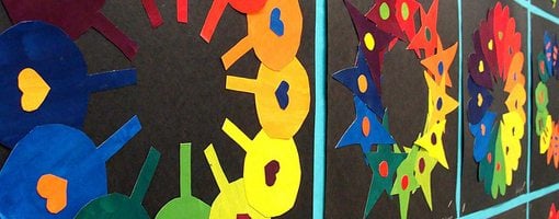
The science behind color relations are directly connected to the color wheel. I’m sure most of us can remember hearing about this back in high school art class but have since pushed it aside. The relationships demonstrated in a color wheel are actually very important when it comes to designing schemes.

Colors can be broken down into 3 containing groups of primary, secondary, and tertiary. Primary colors consist of red, blue, and yellow. These are the 3 most basic colors that can be combined to create (quite literally) every other color in our spectrum. When you mix these colors together you get our set of secondary colors. Namely these are orange, green, and purple.
Tertiary colors are made by mixing together primary and secondary colors to create entirely new sets. An example could be creating orange by combining red and yellow together. You can also get really unique mixes such as off color blue-green or deep browns.
Along with relationships for forming colors we can also group them into placements based on their emotional ties. Groups of colors are broken up into 3 similar categories for this: warm, cool, and neutral.
As I’m sure you could guess warm colors contain all of the fiery excitable hues. These evoke warmth and energy and can be found towards the top of any color wheel. The most prominent examples are red, yellow, and orange.
Cool colors are just the opposite. These evoke a relaxed relationship and promote ease, calm, and loosened tension. Examples here include blue, green, and purple.

Neutrals are non-emotional colors used to fit into color gaps. They are set with shades of black, white, grey, and sometimes deep brown. Although these forms of colors don’t evoke any sense of emotional connection they can be useful to delineate elements on a page or section. Commonly we will use neutral colors for our paragraphs and page content.
Color Theory in Practice
The entire point of utilizing color theory is to evoke a set of emotions from any set of prospective colors. Developing a scheme can be difficult at first but it’s an important part of the design process (this is especially true in web design and branding design).

Many will argue stating that colors don’t penetrate any type of mental barrier and carry across emotion. This turns out to be false on most accounts and when used properly certain color schemes can actually help your website interface with more signups and orders.
In general warmer colors will bring about a sense of happiness and energy. These colors are frequently used to display a call to action for your visitors. You can bestow a sense of excitement and sensory requirements just by placing warmer colors around regions you expect visitors to interact with.
Cooler colors bring to mind a sense of peace and resemblance. Often times cooler schemes are used on blogs or digital corporations to ease the eyes of their readers and keep them “stuck” on their page for longer. Deep blues and purples keep emotions at ease and set to a type of passivity when it comes to content absorption.
You’ll also find cool colors represent potential power and authority. You’ll see these colors used in the foreground on many corporate businesses and banks to promote reliability to their customers. For example both Microsoft and Blackberry use deep blues and greens to keep a calm, respectable, corporate feeling throughout their pages.

Conclusion
These are just a few of the concepts useful to designers when it comes to color theory. Colors are everywhere and when used correctly can promote any type of emotion or action you’d like from your visitors. There are many articles all around the web related to color theory and color management. Check Google if you’re interested in delving deeper into the science.
Keep in mind that colors may be an important part of design work, but they are not the only key to a perfect layout. Color theory is just a tool in the gamut of countless tools we use as web designers. Breaking out of the norm and playing with new rules for color can only help you grow as both a digital and relational modern artist.