Tips for Designing Sleek iPhone App UI Layouts in Photoshop
Graphic design for the web has been a popular trend for ages. And with the invent of Apple’s iPhone back in 2007 the app store has grown a tremendous amount. Now we have iOS app designers and developers coming together to build some really fantastic conceptions into reality.
But if you’re not fond of learning Xcode and programming Objective-C, Photoshop may hold more interest. Below I’ll offer some of the tips I’ve picked up for designing killer iOS app mockups. And since there are always new trends emerging the design community is constantly redefining how to create apps. Think of this as more of a beginner’s resource guide to designing for Apple devices.
Proper Document Settings
Before even considering elements on the page, you should understand how the iPhone graphics are created. In the newer retina display on iPhone 4/4S models the screen is still physically measured in the same size. However the display in pixels is actually doubled from the original – meaning we use 640×960 at 326ppi resolution.
Additionally the iPhone 3/3GS icons were generally 57×57 pixels. iPhone 4 and 4S screens use 114×114 by default (but will scale up for older resolutions). Thankfully the icon design process is fairly detached from creating a UI layout. But as a designer it never hurts to build both skills.
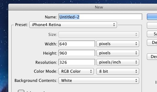
If you’ll be using these settings a lot I recommend saving them as preset document size. In the new document window for Photoshop you’ll see a button labeled “Save Preset…”. Just give it a name and you can select this from the dropdown list every time you create a new doc.
Instead of creating the iPhone UI elements manually a blog Teehan+Lax offers a free UI kit download specifically for Photoshop. This includes an iPhone 4 render, top bars, buttons, keyboards, and tons of other useful stuff. Definitely grab this first and save it to a local directory where you have easy access to these elements.
Customize the Bars & Buttons
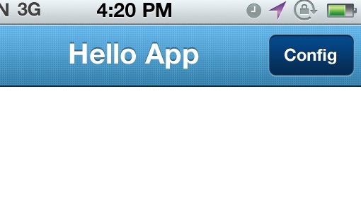
Both the top and bottom area of your app will likely contain menu bars. The top is used for labeling the current view, along with back and edit buttons. The bottom is generally navigation and most commonly uses tabs to accomplish this.
Teehan+Lax uses some really generic examples for these. But they are much easier to customize with your own colors, textures, and whatever other eye-candy you’ve got. So as an example let’s take the Group layer Bar (Grey-Blue) and drag it into a new iPhone-sized document window. Then click the small triangle to the left and open open another sub-group labeled Bar Top. At the very bottom is a background layer with an overlay effect for the gradient.
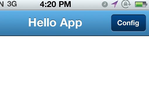
Open FX on this background layer and double-click on gradient overlay. I removed the default colors from Apple and have set (from left to right) #3478a7 to #5eb0e7. Also the two buttons will have to lose their gradients – for these I used the values #052b50 to #044a8e for a rich dark effect.
Fun with Textures
You can tell just by these small gradient changes that customizing your app is a fairly simple task. For just a bit of detail we can add a texture or pattern over the bar gradient area. We’ll go with some slanted stripes for this demo example.
Start by creating a new document 7×7 pixels with a transparent background. Then set your pencil tool at the smallest scale (1px by 1px) and connect from the top-right corner into the bottom left corner. I’ve used black HEX#000000 but it shouldn’t matter since you can always change the color later. Check out the screenshot below if you don’t follow:
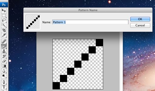
Now hit Edit -> Define Pattern… and give it a name, then hit save. Feel free to close the window now (without saving) since all we needed was the pattern. Now back into the bar top group create a new layer above background. CMD+click or CTRL+click on the vector mask which will select all of the background gradient bar.
But make sure you click back onto the new layer just created so it’s highlighted in blue. We’re going to fill it with this new pattern but we only want to see stripes over the top bar gradient (and below the buttons). In the top menu go to Edit -> Fill and select “Pattern” from the dropdown menu. In the box below you should select the last dotted pattern and hit OK.
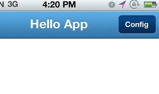
The lines seem fairly rigid at first. So in the layers pallet drop the fill down to about 20% value. Also we could change the blending mode to Overlay so the bars will flow with the gradient colors. Zoom back out to 100% and check out the awesome effect!
You can build another sweet texture by setting up a 3px by 3px doc and filling in a plus symbol. I added an example above of how this changes the look of our top bar gradient so dramatically. You may also try changing the color from pure black to pure white #FFFFFF.
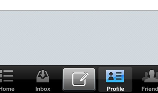
Tab Bar Icons
The navigation buttons found at the bottom of your app are crucial to the overall user experience. Users need to figure out where to edit settings, how to perform tasks and what to do in your app quickly. Otherwise they often grow frustrated or bored and quit trying. So as one more tip let’s spruce up the nav area in the bottom bar.
Using the same iPhone 4 GUI PSD file locate the “tab bar” group. Remember you can do this by CMD/CTRL+clicking on the block in Photoshop. Similar to the top bar we can edit the background FX gradient for some matching styles. But alternatively the black default gradient does go well with most color schemes.
For some icons I highly recommend The Working Group’s retina set which come in 24px, 48px, and 64px. Each of the icons from the GUI PSD have FX layer styles applied – basically a light drop shadow and an overlay gradient. These small bits of detail really add up to a terrific design, so pay close attention to your pixels. Try using this color scheme designer if you’re having troubles.
You should think about how text labels will affect the user experience. If you feel the tab icons are enough on their own then label text may just get in the way. However it is important to keep your options open and play around with a few different ideas. Try to get the opinions of friends and co-workers to see which method is best for your app.
Another fairly popular technique is for app designers to create a center button splitting the tab bar into 5 slots. I have seen a lot of really creative applications using this design to save space and add some elegance into the navigation. Formspring is one example, I added the screen below.
Helpful Links
- Glyphish Icon Set
- Design an iPhone Bank App in Photoshop[Tutorial]
- Design iPhone Applications in Photoshop[PDF]
- Useful Collection of iPhone/iPad App Developer Tools and Resources
- iOS Usability Tips and Resources for iPhone and iPad Apps
- How To Create Your First iPhone Application
Conclusion
These strategies for working with iOS apps and Adobe Photoshop will come in handy as you further develop your design senses. Mobile applications are a whole different ballgame compared to websites and logos. Keep this in mind throughout the process since you’ll constantly be learning new techniques.
Along with the links added above you should feel much more comfortable moving forward with app interface design. Layout mockups are always difficult and require time to build and study. But if you have enough dedication the mobile market is possibly the most prosperous area to be. If you have additional questions or comments please let us know in the discussion area below.