How to Build a Website With Adobe Project Rome
Adobe recently launched a project called Rome that is meant to be a sort of all-in-one content publishing platform. You can use this innovative application to build websites, print projects, interactive PDFs and more.
Today I’ll give you a super basic beginner’s introduction to Rome so you can see what it is, how to use it and whether or not it’s right for you.
Rome
In Adobe’s own words, Project Rome is “Simple, powerful, all-in-one content creation and publishing for virtually anyone.” If you think this is a little vague, you’re right. But then again, the entire project is a little puzzling. Is Rome the future of Photoshop? Is it competition for Dreamweaver or InDesign?
The answer is really “none of the above.” After playing with it a bit, it becomes obvious that Adobe is attempting to target a different market than with the Creative Suite. While CS is an incredibly expensive set of powerful, professional applications that can take years (decades?) to learn thoroughly, Rome is meant to be a user-friendly way for just about anyone to create rich content.
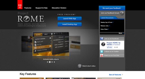
Before we get started, you’ll want to stop by the Rome website and either download the desktop application or launch the web app (I’ll be using the desktop version).
How Much Does It Cost?
Rome is currently available in a free preview. Adobe apparently hasn’t yet decided their pricing strategy and wants to see how users respond before proceeding. You can download a copy now but just know that one day it will likely deactivate it and make you either purchase a one-time license or perhaps even a subscription.
Getting Started
Once you’ve downloaded the application, firing it up should make a vertical strip of buttons appear on your desktop.
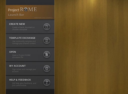
From here you can browse the default templates or even a nice gallery of user-submitted templates, but these already have a lot going on so it’s better for learning purposes to start from scratch.
Click the “Create New” button to open a rather large gallery of possible document sizes. From here go to “Blank for Screen” and select something in the “Browser Sizes” folder. I chose 960×550.

Meet Rome: The Interface
When you first get a look at the Rome interface, it looks like an extremely simplified version of Photoshop. Rather than an endless sea of palettes, there’s only a couple. In fact, there might seem to be far too few. This is because Adobe seems to be experimenting with some new ideas that only show you what you need to see when you need to see it, rather than giving you the whole enchilada all at once.
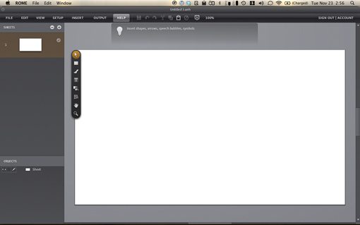
The image above shows just how bare the screen is compared to what we’re used to in the Creative Suite. We’ll take a closer look at each section below as we dive into our simple project.
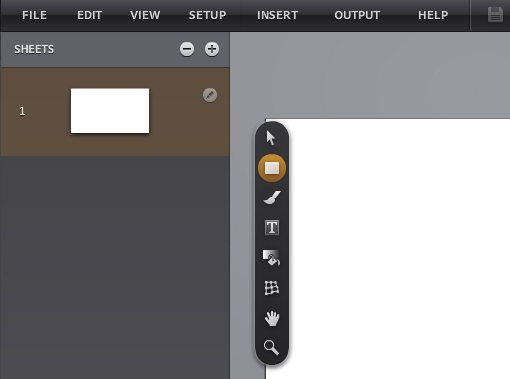
Sheets
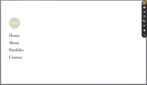
The site we’re going to build will have several pages. Rome refers to these as “Sheets” and displays them in the upper left with thumbnail previews.
The first thing we want to do is create a “Master Sheet.” This will allow us to set up a few basic items that will appear on every page. Rather than placing items manually on every sheet, items in the master sheet will automatically be carried over to your other sheets. This can be confusing at first because you’ll often see an element on a sheet that you can’t seem to edit. This is because, though the item may appear on that sheet, it’s a master element and therefore requires you to select the master sheet before editing.
To create a master sheet, click on “Show Master Sheets” in the “View” menu. This should separate your sheets menu into two sections: Sheets and Master Sheets. Click the little plus button to add in a few extra regular sheets. Next to the thumbnail of a sheet is a little Rome icon, you’ll see these scattered throughout the interface indicating that there’s a hidden, context-sensitive menu here.
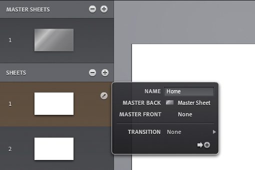
Use this little flyout menu to name your sheets Home, About, Portfolio and Contact.
Navigation Menu
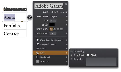
Since we’re keeping this as a simple introduction to the app, we can show off many of the basic features by building a navigation menu. To start, grab the text tool and draw a box. Then type “Home” and use the menu shown below to select a font that you like.
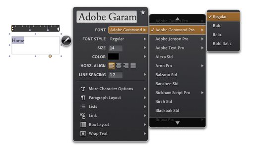
Here you really see that menu magic in action. There’s a ton of menu options here, each with a set of submenus. What you get is a lot of functionality without all the clutter. It definitely takes some getting used to, and can be time consuming, but once you figure it out it’s not so bad. I do really like the little sliders that can be used to adjust various properties like font size.
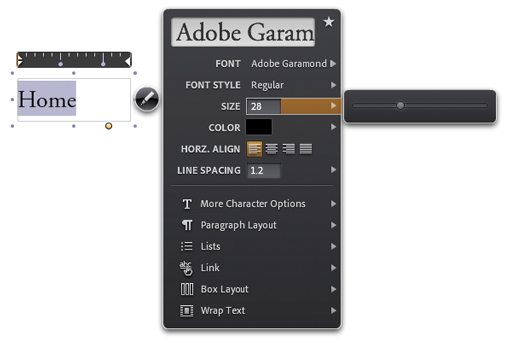
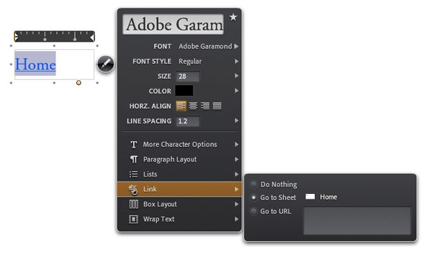
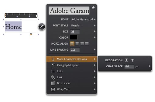
Once you’ve got the size and font figured out, go down to the “Link” menu and set the link to the “Home” sheet.
This will automatically change the appearance of the link to blue with an underline. Since we don’t want either of these, we’ll have to fix it. Changing the color back to black is easy enough but the underline was harder to find. This option is found under the “More Character Options” menu shown below.
Hover Effect
Next we want to change the appearance of the link when the user is hovering over it with the cursor. This isn’t exactly an intuitive process and took me a few minutes to figure out.
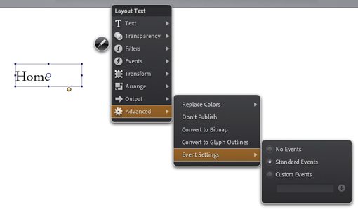
With your text box selected, go to “Event Settings” in the “Advanced” menu and activate “Standard Events.”
You should now have an “Events” option in the main menu. From here, go to “Mouse Enter” and “Set Property.” Next, select your text object and set the property to Opacity. Finally set the value to 50%.
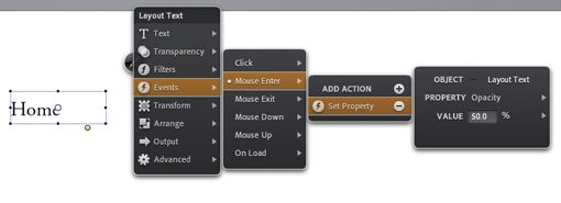
This will dim the text to 50% of its original opacity when someone hovers over it. I would’ve like to have simply set the color, but that option doesn’t seem to appear in the events menu.
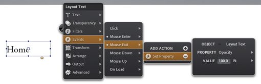
The problem that we now run into is that the text will change color on Mouse Enter but will stay that way permanently. To solve this, we need to add another event on Mouse Exit that sets the opacity back to 100%. See the image below for a reference.
Duplicating the Home Link
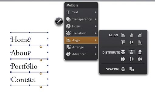
Now that we’ve got our first link set up just the way we want, copy and paste it three times to create the About, Portfolio and Contact links. Remember that you’ll have to select the text for each, then go in and change the links to point to the appropriate sheets.
You’ll also want to distribute the objects vertically to make sure they’re spaced evenly. To do this, select all of the text boxes and go to the Align menu.
Previewing Your Work
To see if your navigation menu is functioning properly, click the little monitor button with a play button near the top of the screen. This should give you a live preview of your site in action.
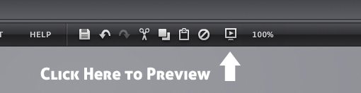
Hover over the links to make sure they’re working and click around to see if the sheet is changing.
The Objects Palette
Now that you’ve got a few elements on the page, let’s take a look at the Objects palette. This is equivalent to the Layers palette you’re used to seeing in other apps and is essentially just an interactive list of all the elements on the page.
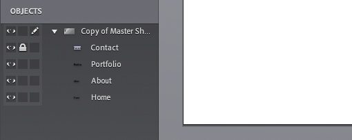
Note that it’s much simpler than the Photoshop layers palette. There is no masking, layer effects, etc.
Finishing the Master Sheet
Since every good minimalist site has a cliche circle logo, ours simply cannot remain without one. Mocking up one quickly will give you a feel for the shape tool. Notice that the shapes are completely resizable with no image degradation. Rome is perfectly suited to work with both vector and raster objects.
And with that, we’re finished with our Master Sheet. These elements will appear on every page without any additional effort.
Finishing Up The Site and Exporting
As I mentioned before, the navigation allowed us to cover most of the features that I wanted to show off. We set up links, positioned and distributed objects and created hover effects.
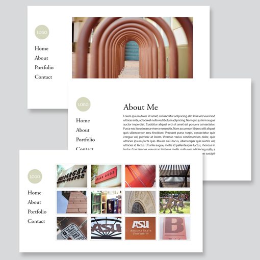
From here you should play around on your own and finish up the other pages. Try pasting in an image, working with paragraphs of text and maybe even building a grid. Be sure to select the appropriate sheet before adding content so that you don’t keep adding to the Master Sheet.
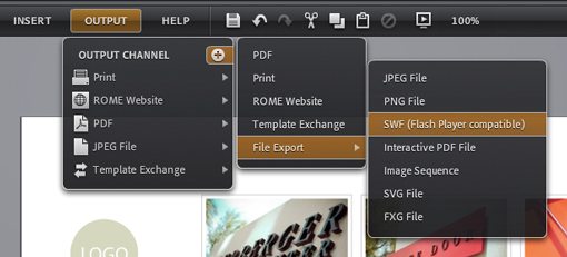
When you’re finished with the site, you have two basic options for exporting it. The first is as a Rome site. This uploads your site to an Adobe hosted server using your Adobe ID (free for now). However, you can’t do anything with it this way so I prefer exporting it to an SWF and selection the option to build an HTML file.
This will give you a live, functioning website built all by yourself without an ounce of code!
My Thoughts on Rome
Now comes the part that you’re really interested in, can you use Rome for actual projects? In order to answer this question, let’s look at the pros and cons.
First, let’s look at the positive side. Rome is an innovative WYSIWYG that is by no means perfect but feels quite polished and powerful. The learning curve is much smaller than the CS apps and should definitely appeal to anyone intimidated by that suite. Further, it achieves the ever illusive goal of allowing non-developers to actually build a functioning website without a single line of code.
However, despite these benefits, I don’t see myself ever using Rome in a professional context for web projects. The biggest hurdle for me is that it is so dang dependent on Flash. I’m not going to launch into a Flash-bashing rant, but this is simply an impractical use of the technology whether you love or hate it. The site we just built featured only a few links and images. There’s absolutely no reason the resulting files should be anything but pure HTML and CSS. I can understand Adobe wanting to build in Flash support, but don’t claim that I can build websites with this tool if you don’t even have an option for a basic web output.
Keep in mind that this article only looked at Rome from a web point of view. It might still be great for developing print materials and interactive PDFs. In fact, it’s actually a really awesome tool for the latter.
Conclusion
To sum up, if you are a complete stranger to web development and need to build a quick site yourself without hiring anyone or reading 15 books, check out Rome. It’s fairly easy to pick up and run with no matter what your level of expertise.
However, if you’re in the market for a robust and user friendly WYSIWYG that actually creates professional level websites, check out our tutorial on Flux 3. If you understand CSS, Flux is a killer application and I have found no worthy rival.
Leave a comment below and let us know what you think of Project Rome. What did Adobe do right in this experiment? What did they do wrong? We want to hear from you!