10 Free Color Palettes From 10 Famous Paintings
If you want to learn a thing or two about color, why not look to the true masters whose artistic work has stood the test of time? Great painters almost always possess a keen understanding of color that is truly impressive when you stop to appreciate it.
Follow along as we pull color palettes from ten of my favorite artists and paintings and learn a thing or two about art history in the process. You’ll be able to see each palette as an Adobe Color CC swatch, and drop it right into Photoshop!
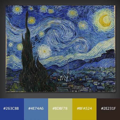
Starry Night
Starry Night was painted in 1889 by the infamous Vincent Van Gogh, a Dutch post-Impressionist painter who cut off his left ear, wrapped it in newspaper and handed it to a prostitute (and you thought your Friday night was wild). The painting supposedly depicts the view from Van Gogh’s sanitorium room window in Southern France.
He may have been a wee bit eccentric (ok, nuts), but the man certainly had a feel for color. The bold, cool color palette that occupies most of the canvas is nicely violated with the intense, warm tones of the lights and stars.
Download from Adobe Color CC
Click here to view and download the palette from Adobe Color CC and save it to your library.
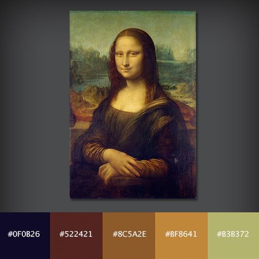
Mona Lisa
Sfumato and chiaroscuro: two funny words that help describe the interesting style of Leonardo Da Vinci’s most famous work, Mona Lisa. Sfumato describes a method of blending colors together in a subtle fashion, this is what gives the painting its almost smoky look. Chiaroscuro refers to the contrast of light and dark, which gives the painting a sense of depth in areas such as the eyes and hands.
The color palette here is dark and rich, perfect for a mature, sophisticated feel. Fun fact, this painting is way smaller than you expect it to be. I was blown away by how tiny it was compared to many of the massive works around it in the Louvre.
Download from Adobe Color CC
Click here to view and download the palette from Adobe Color CC and save it to your library.
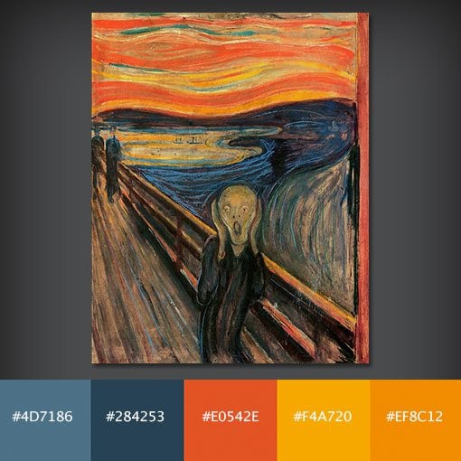
The Scream
The Scream is a particularly haunting piece of art painted by expressionist Edvard Munch somewhere between 1893 and 1910. This painting’s history has always fascinated me as it seems to be a constant target for thieves. It was successfully stolen (and later recovered) in both 1994 and 2004. It was feared that the painting might be too fragile to survive the latter ordeal but luckily it was obtained with only minor damage.
It’s amazing to me that such a friendly and soothing palette can result from such an intense and disturbing image. Inspiration comes from the most unlikely places!
Download from Adobe Color CC
Click here to view and download the palette from Adobe Color CC and save it to your library.
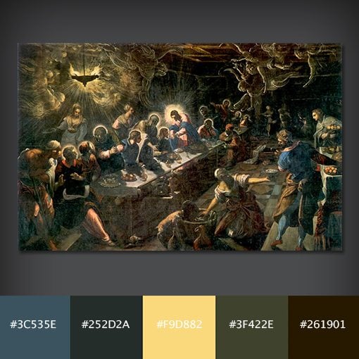
Last Supper
I can hear you now… “Wait! That’s not the Last Supper that I know!” Da Vinci’s Last Supper is far more popular than this piece by the Venetian painter Tintoretto from the late 1500s, but I’ve always liked this one better. Tintoretto has a way of using intense colors, interesting perspective and crazy lighting illusions to portray scenes that are absolutely beautiful.
Download from Adobe Color CC
Click here to view and download the palette from Adobe Color CC and save it to your library.
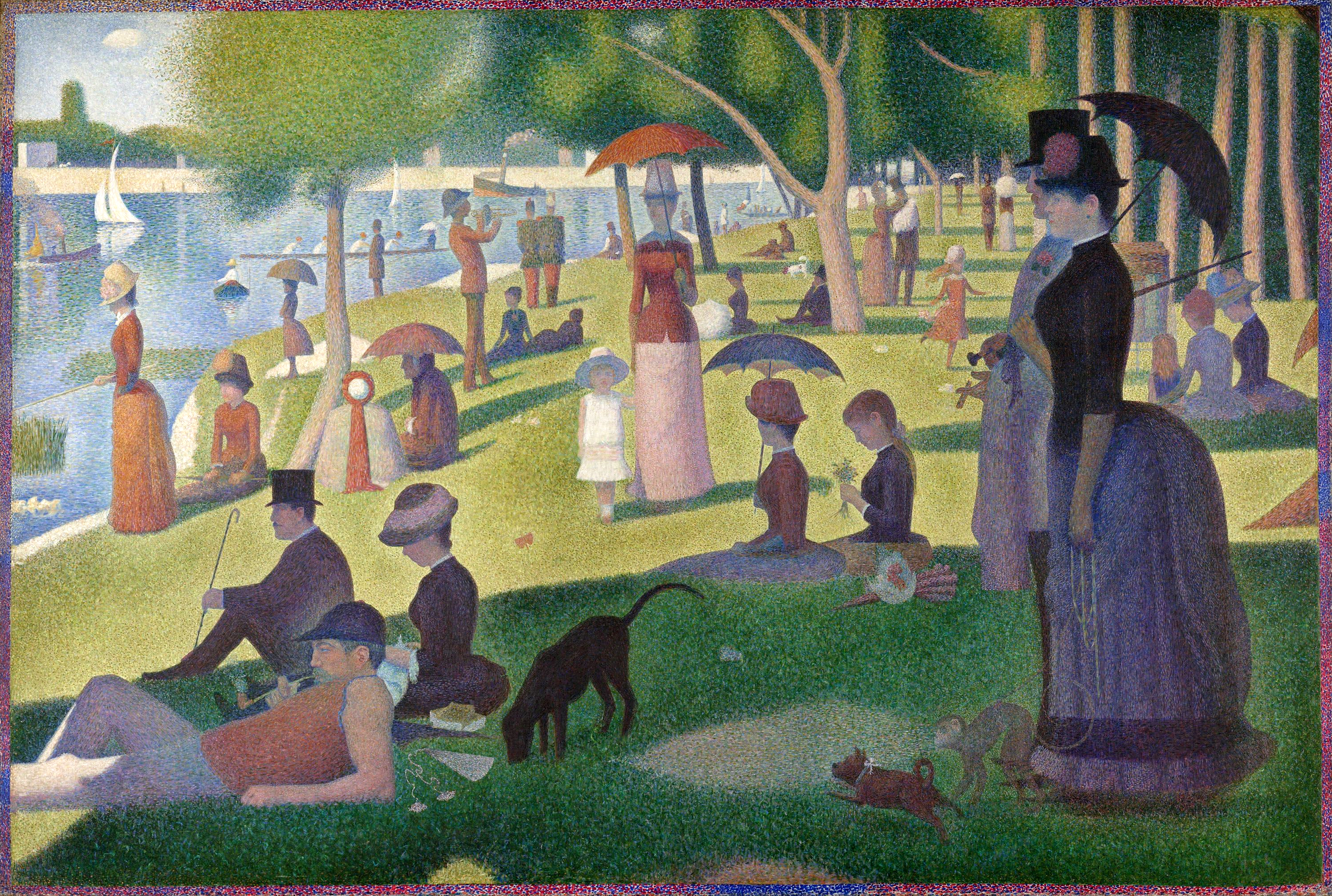
A Sunday Afternoon on the Island of La Grande Jatte
To really appreciate this painting, you have to look up close. George Seurat painted this beauty in 1884 utilizing a style now known as pointillism, which uses thousands of tiny dots of pure color that come together and form a cohesive image when viewed at a distance. Think about how much work must have gone into creating an image of this scale!
Obviously, Seurat was a master of color, so you could definitely stand to take a few pointers from him by picking up some of the colors used in this impressive painting.
Download from Adobe Color CC
Click here to view and download the palette from Adobe Color CC and save it to your library.
The Optometrist
Normal Rockwell is perhaps the most iconic American painter who ever lived. All through the early to mid 1900s, he portrayed every day American life in a way that continues captured the hearts of millions (he produced over 4,000 original works!). My grandparents had Rockwell’s art plastered over all of their walls when I was growing up, looking at any of his work instantly takes me back to long, perfect summers in rural Missouri.
Rockwell’s color palettes have always fascinated me and were the original inspiration for this post. I chose “The Optometrist” specifically because I think it perfectly captures the way he used color to tell a story and precisely peg a time period.

Download from Adobe Color CC
Click here to view and download the palette from Adobe Color CC and save it to your library.
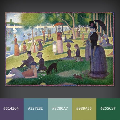
The Great Wave off Kanagawa
Often referred to simply as “The Great Wave,” this beautiful piece of work is technically a woodblock print, produced somewhere between 1830 and 1833 by the Japanese artist Hokusai. This is part of a series that focuses on the area around Mount Fuji, which is shown here in the background, and is one of the most famous Japanese works of art to date.
I love the way the shape and color of the waves is mirrored by the mountain in the background; a fascinating example of a sort of natural symmetry.
Download from Adobe Color CC
Click here to view and download the palette from Adobe Color CC and save it to your library.
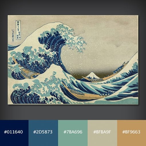
The Kiss
“Der Kuss” is an intimate moment portrayed by austrian painter Gustav Klimt in 1907. The digital images of this one never do it justice as the actual painting uses gold leaf to really create a brilliant effect.
Still, we can pull some really nice colors from the digital version. The palette here is wonderfully earthy, perfect for an old world feel.
Download from Adobe Color CC
Click here to view and download the palette from Adobe Color CC and save it to your library.
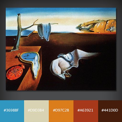
The Persistence of Memory
The surrealists were a heady bunch who were always coming up with art that was meant to portray some deep concept. This incredibly popular 1931 painting by Salvador Dalí is supposedly either meant to portray the relativity of space and time… or cheese melting in the sun (seriously).
Either way, with its high contrast landscape full of shadows, it’s a great study in color!
Download from Adobe Color CC
Click here to view and download the palette from Adobe Color CC and save it to your library.
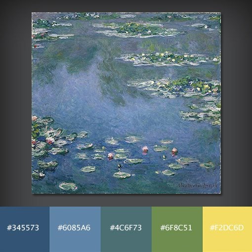
Water Lilies
French Impressionism was a 19th century art movement characterized by thin but visible brush strokes, and it coincided with advancements in synthetic pigments and a forsaking of varnishes that were typically used to tone colors down. The result was bright, beautiful color and lots of it.
If you can name one impressionist, it’s probably Claude Monet, and if you can name one of his works, it’s probably Water Lilies. The interesting part is, Water Lilies is not actually a single piece but instead is a series of around 250 paintings!
Download from Adobe Color CC
Click here to view and download the palette from Adobe Color CC and save it to your library.
Tell Us Your Favorite Paintings!
Now that you’ve seen my favorite paintings and the color palettes that I pulled from them, its your turn. Head to Twitter and tell us about your favourite painting palettes @designshack. If you have time, hit up Adobe Color CC and create a palette from your choice.