10 Tips for Delicious Menu Design
Have your ever thought about the way food items were presented to you on a menu? Can something as simple as a menu design determine what and where you will eat? Creating a design for a restaurant menu – paper copies for the table and online versions – is a vital part of the food industry because the way things look can impact sales.
The topic got recent attention thanks to Brian Wansink, who wrote “Slim By Design” and a recent paper for the International Journal of Hospitality Management, asserts menu design can impact exactly what someone orders. And it is all based on simple elements that we use every day from bold lettering to images to creating hierarchy on the canvas. Here are 10 ways you can use some of that information and other techniques to create an absolutely delicious menu design.
1. Every Placement Matters
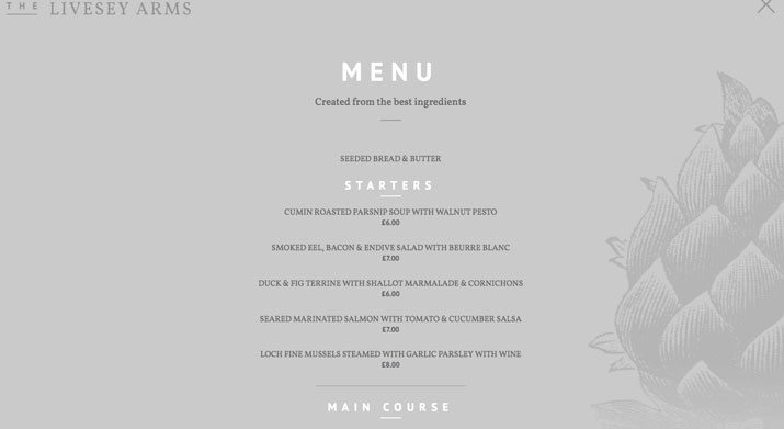
The location of each food item on the menu can impact sales of that item. Think of it as food hierarchy. But where do people look first?
- Top center. Whether your menu format is vertical, horizontal or includes multiple pages, the prime position for any menu item is the top third of the canvas in the center.
- Top right directly across from item No. 1. Remember people generally ready from left to right, so if the eye is first drawn to the center item, the logical next step is directly right.
- Top left in line with item Nos. 1 and 2. After looking at the prime spots a menu reader generally tends to shift back into more of a normal reading pattern, starting at the top left of the menu and reading down the column.
- Back of the menu. One of the first things many people do when handed something printed is look at the back. (This can be a key location for specials.)
- Under large headers. Menu scanners will also hop to items that fall directly below large headers such as “entrée,” “appetizer” or “drinks.” You can almost think of each of these sections as a mini-menu design in itself in terms of item placement.
In terms of placement also think about the natural progression of courses. The menu should follow a flow that mimics the courses people will order and eat in the chronology that is most common.
2. Use Images with Care
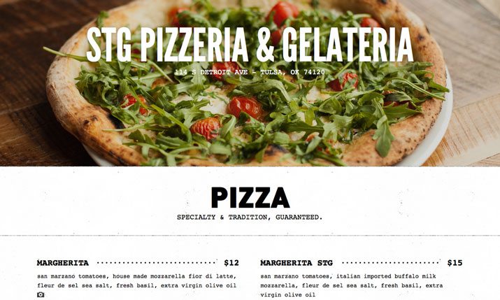
There are two real schools of thought when it comes to images – those that really like big, bold images and those that avoid images altogether. Either way can work, but only if you invest in phenomenal photography.
You need to hire a professional photographer to take images of your dishes if you want food items on the menu. Each image should be well lit and photographed so that it looks tasty. Grayish food items will not sell. If you plan to use food photography, stick to one or two photos of marquee items.
Also be wary of using stock images for menu design. The item on the menu when represented visually needs to be exactly what you offer.
Another alternative to food images are photos of your establishment (or historical photos if you have them) or illustrations. There are plenty of alternatives to food photography on the menu on terms of visuals that might be a better option.
3. Bold Typography is a Good Thing
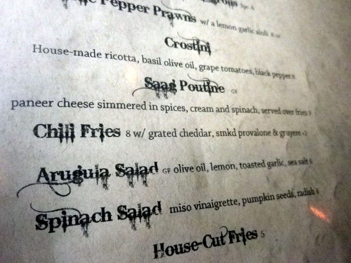
Typography is the element that will help you sell items from the menu. Go bold. And maintain readability.
Bold typography can serve as your main “art” element. Incorporate your logo into the menu design or select a great typeface to carry the menu. Remember that people will need to read the words to make choices as you factor in type selections.
Consider a fun pairing of a novelty or script typeface for big headers or marquee menu items and something a little more standard for everything else.
And remember to use bolding and italics strategically. These typographic techniques will draw people to specific items on the menu first. Highlight items that your restaurant is known for or that are good for your bottom line.
4. Create a ‘Special’ Element
It is likely that your menu will contain some form of notes or standard information. This includes notations about dietary concerns – vegan, gluten-free and so on – or can denote the amount of spiciness or flavor of a specific dish. Create a set of special elements and key to note these items to save space on the menu and serve as a visual cue.
Design an icon stack that has a common feel and works at small sizes. Mimic the overall style of the menu design in terms of color, weight and placement of the special elements. And think outside of menu clichés; you don’t have to use an outline of a pepper to note a spicy item. Custom icons are acceptable as long as you note what they mean.
5. Beware of Price Alignment
One of the tricks to menu design is pricing. Most restaurant owners don’t want patrons to scan the menu for the least expensive items to order.
Here are five ways to avoid the price scan:
- Don’t use $ symbols on the menu.
- Don’t align prices vertically or horizontally.
- Use nontraditional pricing. Consider using price points that include one decimal instead of two for cents (10.5, instead of $10.50).
- Opt for subtle colors and typography for pricing. For example, if menu text is black, consider a gray price so that it has less visual importance.
- Don’t rank items on the menu in price from high to low or low to high. Mix them up.
6. Use Color
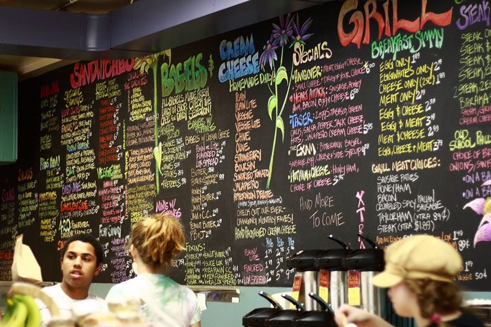
This may sound simple, but use color. Opt for hues that match your overall branding and style.
Then think about color meanings. Red is thought to stimulate appetite, for example. Green is commonly associated with healthy options. Blue is thought to suppress the urge to eat. As a general rule, bold and bright colors are the preferred option, but color selection can really depend on the type of restaurant.
7. Organize with Boxes and Lines
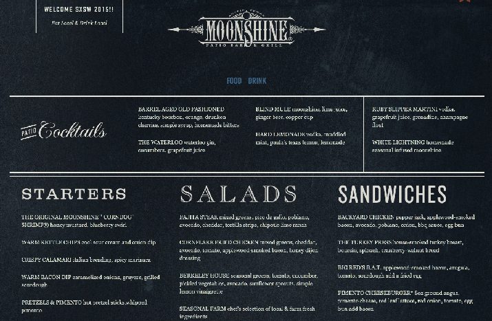
There can be a lot of information on a menu, so keeping it all organized is a priority. Using rules and boxes can help keep like items together on a menu that includes a lot of options.
These design elements should be use to denote sections that are logical for consumers. While the common idea may be things such as appetizers, entrees, desserts and drinks, other restaurants might group by meat dishes versus veggie-only or by a specific type of food. As long as the groupings are connected, design tools such as boxes and lines can be incredibly useful.
8. Set the Tone with Typography
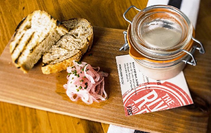
Typography is the driver for every menu (that’s why it is the subject of two separate tips). The typeface and style you choose will set the tone for your restaurant. It should be one of the first elements you decide on.
Think about the atmosphere of your establishment and the style of type that fits it:
- Old English or blackletter: Traditional, old-style, elaborate
- Old style serif: Traditional, classic, formal
- Modern serif: Authority, impact
- Transitional serif: Modern, plain, standard
- Square or slab serif: Bold, strong, impactful
- Sans serif: Modern, boldness varies by thickness of stroke
- Script: Classic, fancy, important
- Novelty: Varying mood depending on letterform, custom feel
9. Write Descriptive Copy
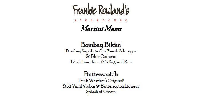
Descriptive or interesting copy will help restaurant-goers better understand their orders, save time for wait staff and maybe even provide a little entertainment. The trick is to write simple and engaging copy that describes each menu item, but is still short and to the point.
The tone of all copy should match that of the establishment. If you have a lighthearted business, be fun with the words, but a more upscale restaurant should stick to a more formal style.
When writing copy, also think about the kinds of questions patrons might ask. Include information about potential allergies to common foods such as nuts, or note foods that are incredibly spicy. Entice eaters with menu item names: Would you rather eat a cheeseburger or a ¼-pound char-grilled Angus cheeseburger?
10. Create Multiple Menus
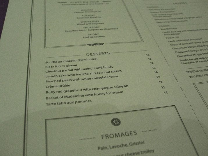
One menu design might not be enough. You will likely need a physical menu for people in your restaurant – this could include something on paper, a billboard behind a counter or digital screen for ordering. Many places also include menus on their websites as well; some others also include a menu in app format.
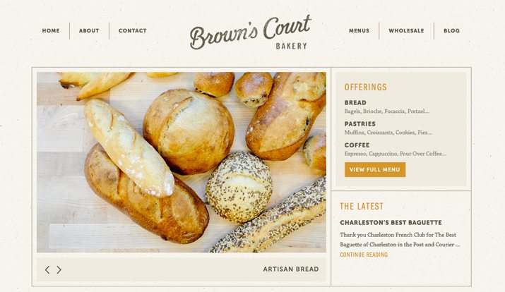
The biggest thing to think about when it comes to menu design across platforms is images. While you should be careful with image selection and use on a printed menu, images are an excellent tool for website and mobile menu options. This is true simply because a website or app menu is designed to get people to visit your establishment. The more enticing the images, the more likely you are to draw someone in.
Another digital tip: Don’t include prices. A price range is sufficient for online menus. This will help you avoid awkward price issues when changes happen but still gives people an idea of what to expect when they arrive.
Each is a viable option. But more than just menus for multiple platforms, you should to think about multiple menus for each of the platforms. Most restaurants do not include desserts on the main menu by design and have a second after-dinner option. For specials or themed occasions, there may be another menu that you use. Each of these alternative menus will likely have the same look and overall feel as the main menu design, but might be more compact or printed on a different type of paper.
Conclusion
Are you hungry yet? Designing a menu can be a great challenge and a lot of fun. The most important factors to consider with menu design are readability and the appetizing nature of visuals.
Put these together to help draw eaters in with digital options and encourage ordering with printed in-house menus. Create them in concert for a menu experience that has synergy and brings people back for dinner again and again.
Image Sources: Basheer Tome, Sage Ross, Alpha and Cory Doctorow.