25 Amazingly Bizarre Minor League Baseball Logos
Being familiar with my love of logos and tendency to point out crazy design, a friend of mine recently showed me a fascinatingly bizarre niche of design of which I had, up to now, been entirely ignorant: Minor League baseball team logos.
When I tell you to prepare yourself for some of the zaniest examples of professional logo design that you’ve ever seen, I’m using neither exaggeration nor hyperbole. Buckle your seat belts, you’re in for quite a ride.
Delightfully Wacky Logos
I’ve divided this post up into two categories: “Wacky” and “Quirky But Cool”. The former is where you’re really likely to find a few chuckles, the latter holds some genuinely good design with a twist. Let’s start with the wacky category.
Montgomery Biscuits
This is the logo that inspired this entire post. Some clever soul decided to break that tired tradition of naming teams after something tough and instead went with a fairly random breakfast food.
The logo of course lives up to the unique nature of the name by coming across as the sort of creature that you’d see on Sesame Street, encouraging you to eat up for the most important meal of the day.
Ogden Raptors
The Raptors! Now there’s something tough, this guy would swallow that biscuit whole. At least he would if he weren’t completely paralyzed, which is kind of how he looks in this impressively crude drawing. To be fair, I couldn’t draw a raptor to save my life, but I have the good sense to admit it! And what’s with that baseball?
Everett Aquasox
My wife grew up mere miles from the home of this team, so she’s apparently completely blind to just how ridiculous the name “Aquasox” really is. I guess it sounded better than the Everett Frog Feet.
Lakeland Flying Tigers
Flipping awesome Napolean! It’s a mother freaking flying tiger! Even creepier, as the logo clearly shows, it’s actually a dismembered tiger’s head that has sprouted a pair of wings. A solid choice of intimidating creatures, no man can stand tall in the face of such horrors.
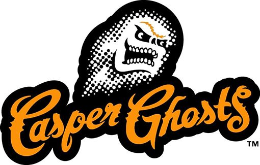
Casper Ghosts
Apparently Casper the friendly ghost was either closely trademarked or just too dang friendly to be a team mascot. I’m pretty sure I saw this guy on a monster truck one time…
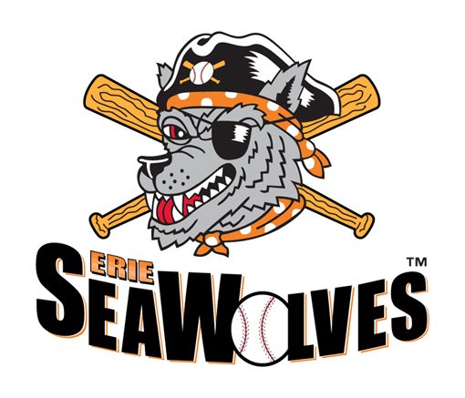
Erie Seawolves
No one really knows what a seawolf is, so let’s just draw a pirate with a wolf’s face (maybe a nuclear sub just looked to phallic). I can see how this one could’ve actually turned out pretty cool, but the execution looks amazingly similar to something that would come from an Applebee’s coloring contest.
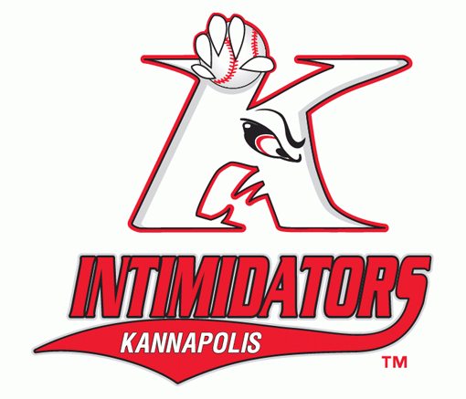
Kannapolis Intimidators
That “K” is pissed, but if you were cursed by god to have a hand growing out of your head without even the courtesy of a wrist, you’d be angry too.
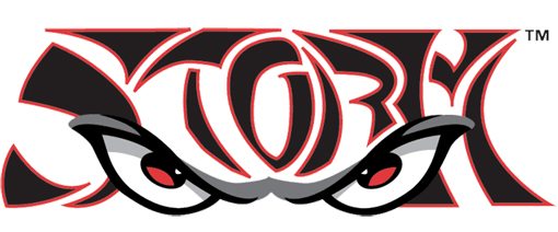
Lake Elsinore Storm
I’m not sure why they didn’t go with an image of a storm here, but I guess they were thinking outside of the proverbial box. This one might be cool if it weren’t so dang difficult to read. I’m not really sure why either, are the letters supposed to be forehead wrinkles? Is it some sort of tiger storm? They should definitely call the team Tiger Storm and have them battle the Flying Tigers.
Normal Cornbelters
The bottom two thirds of this logo turned out pretty well, but his eyes and scraggly hair just make it look like this corn has been smoking a few of the other plants nearby.
Lansign Lugnuts
You gotta love a team called the Lugnuts. I’m amazed at how much this illustration reminds me of something from an NES game. My six year old self would’ve totally played that.
Lynchburg Hillcats
Move over Seawolves, you’ve got some coloring contest competition here.
Portland Sea Dogs
This one distinctly reminds me of some creature that Popeye would’ve found and then spent twenty minutes trying to protect from various unforeseen woes.
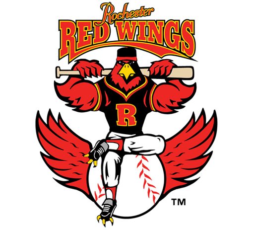
Rochester Red Wings
This bird doesn’t take any crap from anyone. He’s tough and even kind of cool looking, but the claws in the shoes are just creepy.
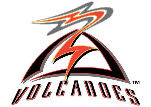
Salem-Keizer Volcanoes
Interesting interpretation of a volcano. I see what you did there. Actually, I’m lying, I have no idea what’s happening with this one.
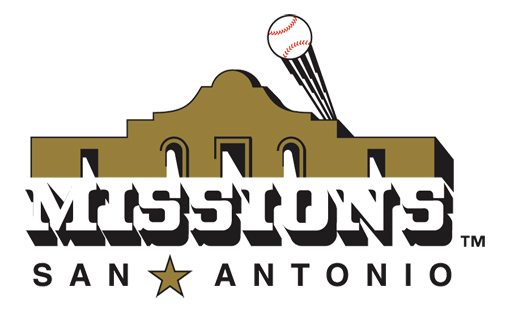
San Antonio Missions
This one has it all. Cliché southwest lettering, a baseball with motion streaks, even a star thrown in just to make sure all the bases are covered. Bazinga.
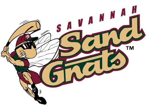
Savannah Sand Gnats
Sand Gnats? Kudos for the unique choice of pest. The legs on this one really freak me out though, put some pants on Mr. Gnat, you’re scaring the children.
Tri-City Dust Devils
I’m 90% certain this logo was made using Mario Paint.
Akron Aeros
Not content with a single theme, this amazing logo packs in two entirely disparate ideas: space and… a leaping cat! Thundercats HOOO!
Albuquerque Isotopes
I swear that lettering is straight out of Toejam & Earl. Or is it Earthworm Jim?
Quirky But Cool
The logos in this section are actually pretty good! That being said, they still have that undeniable Minor League flair that made the previous section so enjoyable. This is mostly due to the bizarre nature of the team names.
Modesto Nuts
Don’t make me out to be the child here, you know you’re thinking it too.
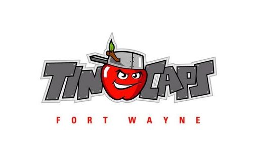
Fort Wayne Tin Caps
I’m not sure why this team is called the Tin Caps or why the best way to represent that was with an angry apple, but I kind of dig it. Go get ’em apple tin man.
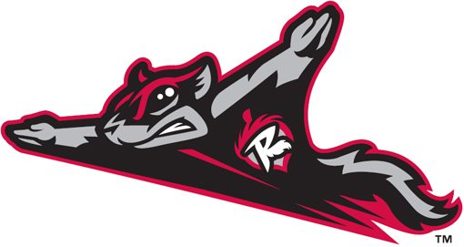
Richmond Flying Squirrels
This one makes me laugh. I don’t really know why, but something about a super intense flying squirrel is just plain funny. Still, he’s drawn really well in that edgy mascot style.
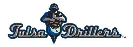
Tulsa Drillers
I’m not a fan of the lettering but the burly guy drilling through the baseball is actually pretty awesome.
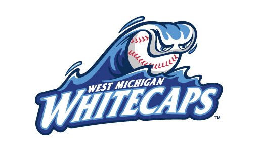
West Michigan Whitecaps
This one looks like a monster with his mouth full, but I can see how it also looks a lot like a hand gripping a baseball. Well done I say.
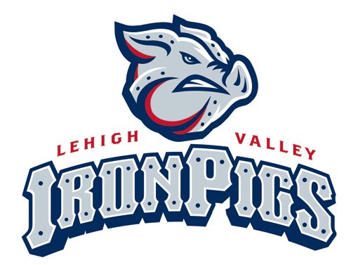
Lehigh Valley IronPigs
What’s better than a pig? An iron pig! You really can’t argue with that logic.
Which Are Your Favorites?
Just to be clear, all of the statements above are meant to be good natured ribbing. Minor League teams don’t have multi-million dollar budgets and therefore often can’t afford to spend a ton of money on fancy logos. I’m sure they did they best they could with the resources available.
Now that you’ve seen my take on these logos, leave a comment below and tell me which ones were your favorites! Have you seen any other wacky sports team logos? Tell me about them!