5 Tips for Creating a Fun Summer Color Palette
The official start of summer is just around the corner. Longer days, warmer temperatures and splashing in the lake or pool are just a few of the things that come with the change in season. When it comes to design, a change in seasons can create the urge to update your color palette as well.
With warmer days, warmer colors, brighter hues and even the use of more color are popular. And while you may not want to change the color scheme of an existing project — although you can – this season can be a great inspiration for designing a project with a summer-inspired color palette. Here are five tips for creating a great color palette with a few swatches to try based on each concept. Happy summer!
1. Go to Nature
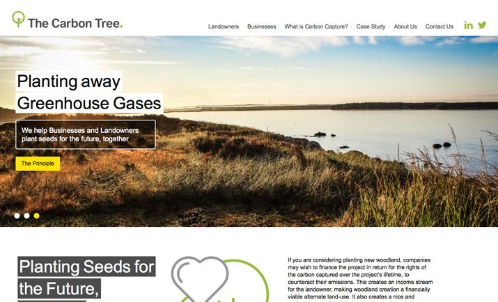
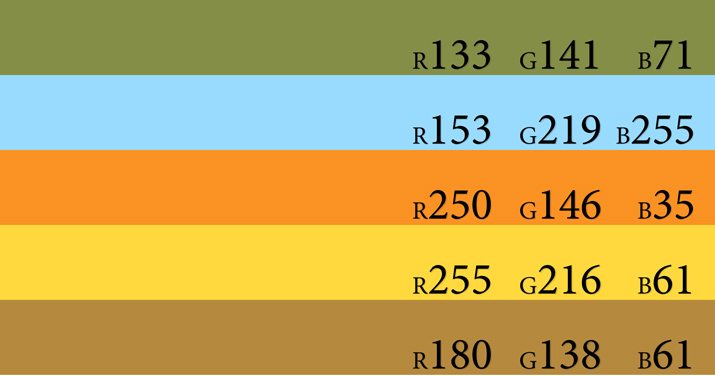
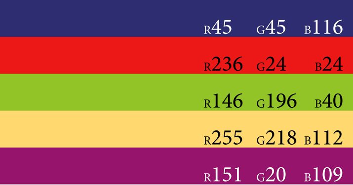
One of the first signs of summer is color in nature. Flowers are in bloom, trees are full and people spend more time on the water. Pull from these colors to create a palette.
Bright and vibrant greens with sharp crisp color are a good option. Blues in this natural summer combination would be paler and lighter to mirror the summertime sky. Then for a pop of contrast look to oranges, yellows or reds to accent the palette. These hues come from the most popular summer flowers such as lilies or roses.
Balance a natural color palette with a little softness so that groupings of bright or saturated colors won’t be too overpowering. Look for a neutral beige or deep tan to pair with any of the above choices.
The end result of a summer-based color palette based on nature is often one that includes plenty of hues that are close to primary colors – red, yellow and blue. Plan color choices with care so that the palette has the right balance of warmth and contrast.
Colors to Try
2. Follow Fashion

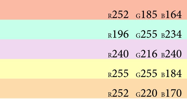
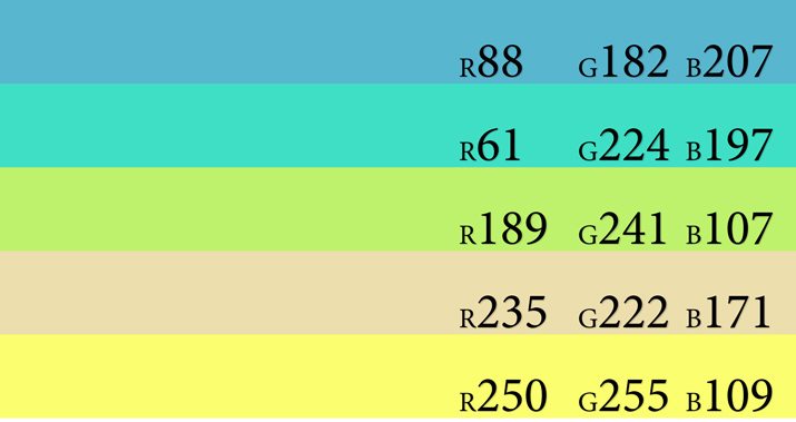
When in doubt as to what’s trending, look to the runway. Fashion and makeup trends can be a great indicator of what colors are popular now. And this summer pastels are the “it” thing.
From pale corals to mints, light and almost sheer hues are what everyone is talking about. Makeup trends are following much of the same pattern with lots of pastels and neutrals with texture.
The nice thing about mixing pastels is that you can create a soft, easy to digest design. Color will fall to the background somewhat and will give plenty of room to elements such as text. The downside of pastels can be a lack of excitement when it comes to color. Plan a brighter accent color when opting for a pastel palette.
When working with pastels, designer often use white or off-whites to keep the overall look and feel of the palette soft. But pastels can work against darker backgrounds as well for a completely different effect.
Colors to Try
3. Borrow from Seasonal Photography
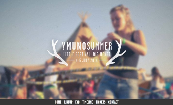
One of the most interesting ways to create a seasonal color palette is to flip through photographs of seasons past. Pull a stack of images from summer adventures and mimic some of the colors.
Inspiration can come from a variety of images – a colorful salad or meal, the clothes you wore to an event, toys at a park or picnic. Depending on the part of summer when the photo was taken might affect the color palette as well. Early summer hues are often warmer, lighter and more influenced by the spring. Late summer colors are often more saturated, darker and evoke some feelings of fall and winter. Mid-summer hues, particularly in the United States, focus on a distinctly primary color palette with the Fourth of July holiday featuring red, white and blue.
Colors to Try
4. Think Exotic
The word “summer” is enough to make people thing of vacation season. While those destinations can vary widely, many people will agree that summer vacation connects to a visual image of a bright, sunny beach in an exotic location. Use that to create a great palette.
That palette has color that evokes the feeling of warm sand, crystal clear blue to turquoise waters and the warmth of the sun. The palette is bright and friendly, with color variance and contrast across a limited palette.
These exotic colors may not be super saturated and fall somewhere between a distinctly pastel palette and one that is super bright. Often black text works will with this type of palette (consider a fun or lightweight typeface) for just enough contrast to pull it all together.
Colors to Try
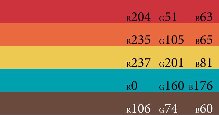
5. Keep it Warm and Bright
Summer is typically associated with heat. Heat is often associated with fire or the sun. Put those elements together for a warm palette filled with reds, oranges and bright yellows.
This warm palette will feature colors that are deeply saturated and are combined with other bright hues. This warm palette can be paired with fairly saturated neutrals, such as a deep brown, or white for a more colorful feel.
A palette that makes you “feel hot” can also be paired with a cool deep blue to associate a feeling of contrast – the heat of the reds or yellows with the cooling off of blue as it relates to water.
Keep the palette bright and lively. Colors without black tints – opt for whites – will feel brighter, warmer and more open. Bright colors are often associated with openness, happiness and fun.
Colors to Try
Conclusion
Building a summer color palette can be a lot of fun and work for a wide range of projects. The key when thinking about a summer color palette is to help people who see the design feel an emotional connection to the season, and almost feel warmth on their skin.
Play with color. (A site such as Colour Lovers is a great place to search for inspiration.) Remember to consider the importance of other elements as well. Images, text and other elements in the design should evoke the same emotions for a completely summer project.