50 Creative and Inspiring Thumbnail Galleries
Thumbnail galleries are one of the most common solutions on the web for showcasing multiple images. The efficiency of this tool can’t be beat, it allows for quick browsing and closer inspection when desired.
Whenever I build a thumbnail gallery, I like to look around the web to see what other designers are doing to make theirs unique. Today we’re collected fifty great galleries for you to check out. Along the way, we’ll also discuss some ideas that you can use in your own galleries.
Like the article? Be sure to subscribe to our RSS feed and follow us on Twitter to stay up on recent content.
Ditch the Margins
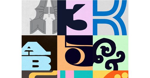
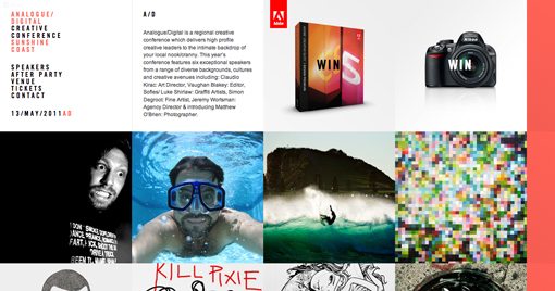
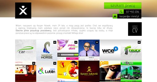
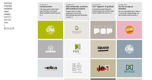
Whoa says thumbnails have to be spread out? These sites decided to embrace closeness and squish the pictures all up against each other. The result is an impression of a single object made up of many parts. It’s not only highly space efficient, it’s quite attractive.
This technique is obviously best to use if you don’t need to add a lot of contextual information to each image, though the hover event does provide a good opportunity for some additional text or graphics.
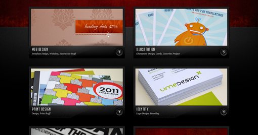
Shankar

Egopop

Free Faces
Analogue Digital
Elliot Lepers
xMind
Vary the Vertical Height
When you vary the vertical height of the images in the gallery, the result is a much more organic looking page. Though the is still governed by uniform rules, the layout doesn’t feel as rigid as with a typical grid.
This is obviously the perfect solution for displaying images that just happen to have different heights, but should also be a consideration whenever your overall page theme is relaxed or free flowing.
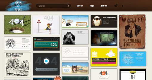
404 Not Found
Paul Mitchell Kelly

Just Sean

Vertical Grain Design

Don’t Be Square
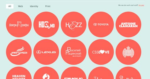
Squares are boring! If you want your gallery to break the mold, try experimenting with different shapes for your thumbnails. The typical second option is circles, as you’ll see below, but as the first example shows, it’s definitely effective to go even further and do something all your own.
Arnaud Beelen

Sellected
Center of Attention
Passion About Design

Keenan Wells

Crooked Pictures
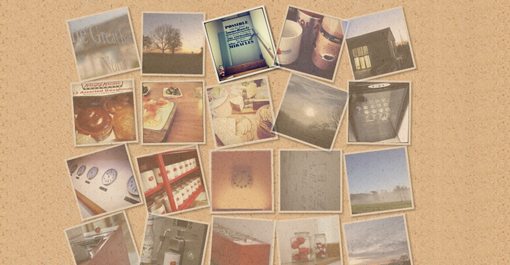
CSS3 makes it easy to create lots of great visual effects. One recently popular image treatment has been to use CSS transforms to rotate the images in a gallery, an effect that’s often partnered with an animation on hover.
The result looks a lot like pictures hanging crookedly on a wall or polaroids spread out on a table. Here are a few different variations of the effect.
Mooreish

Broke Design
Born In the Barn
Shadow Games
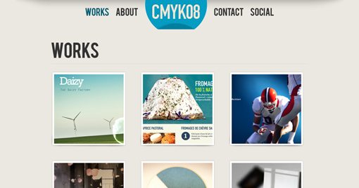
CSS box shadows are a fairly simple property to work with. Just set your position and feathering and you’re ready to go. Many developers have discovered recently though that by combining shadows with transforms and pseudo selectors, you can achieve a ton of different and impressive results.
The shadows that you apply to your gallery can change the overall feeling of your entire page. Check out the shadows below and how they give the illusion of actually reshaping the image.
CMYK08
Signature Creative

Bronco
Calabriae Studio

Chase Farnum
Dribbble

Atelier

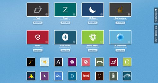
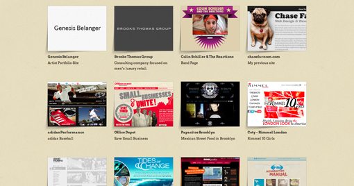
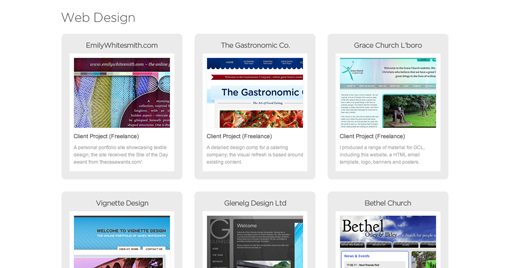
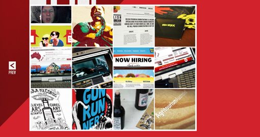
Other Inspiring Galleries
Toni Digrigio
Andrea Ives
We Are Mostly Serious
Blacktie
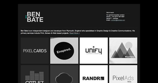
Ben Bate
Andre Kreft
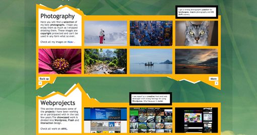
Leeds Graphic Designer
Anderson de Paulo

Barnt & Arnst
James White Smith
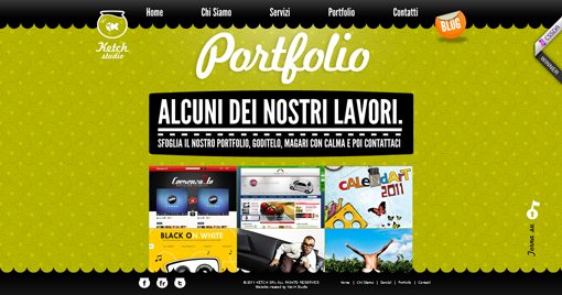
Ketch Studio
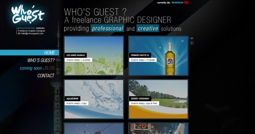
Who’s Guest
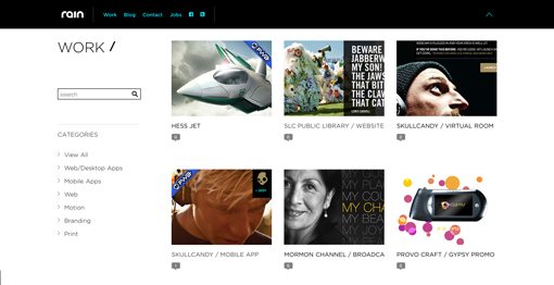
Media Rain
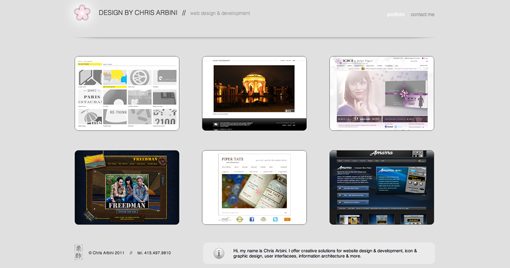
Chris Arbini
Sumit Paul

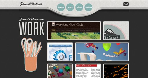
Found Colour
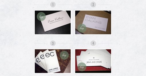
Hoban Cards
Split
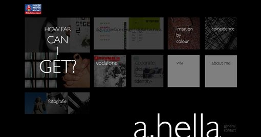
A Punkt Hella
Kubi Media
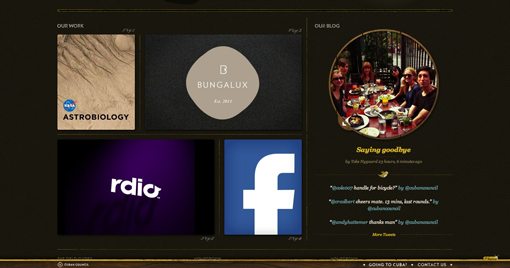
Cuban Council
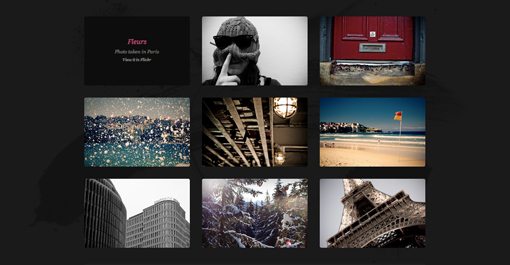
Elegant Seagulls

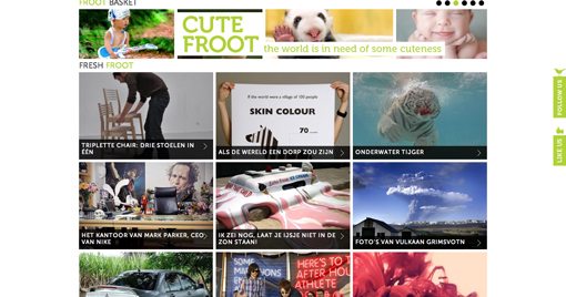
Froot
Arts Code
Mathieu Clauss

Show Us Yours!
Now that you’ve seen our collection of some of the most interesting galleries around, it’s your turn to share. Leave a comment below with a link to any galleries that you’ve either built or simply found inspirational.