Airline Logos: The 20 Best and Worst Examples
The best way to learn logo design is to learn from the very best and the worst. In this case study, we explore some of the best airline logos as well as a few terrible logo designs, to help you learn the right way to design a logo and the mistakes to avoid.
Why airline logos? Well, it’s all about branding. Incorporating a brand identity into a logo design is the main part of logo design. It plays a key role in making the logo more appealing to its target audience.
Airlines usually target and serve various audiences. As a result, they are also challenged with designing a logo that appeals to all audiences around the world. This makes airline logos a great source for learning how to properly craft a logo that effectively promotes the brand.
Let’s start by checking out some of the best logos made by airlines.
Virgin Airlines
The logo for Virgin airlines is one of the best and most iconic logos for many reasons. Mainly because it’s not a logo made specifically for an airline. It’s a logo that represents an entire corporation of multiple brands.
When Sir Richard Branson was working on the Virgin logo he had a vision of something “stylishly simple”. He ended up choosing a signature-style logo that was originally scribbled on a paper napkin.
Today the logo represents a multi-billion-dollar industry and soon to be headed into space as well. This goes to show that you don’t always have to make logos that look similar to your competition. Or even make special logos just for subsidiary brands.
Lesson: Keep it simple but always make sure the logo represents the direction where the company is headed.
British Airways
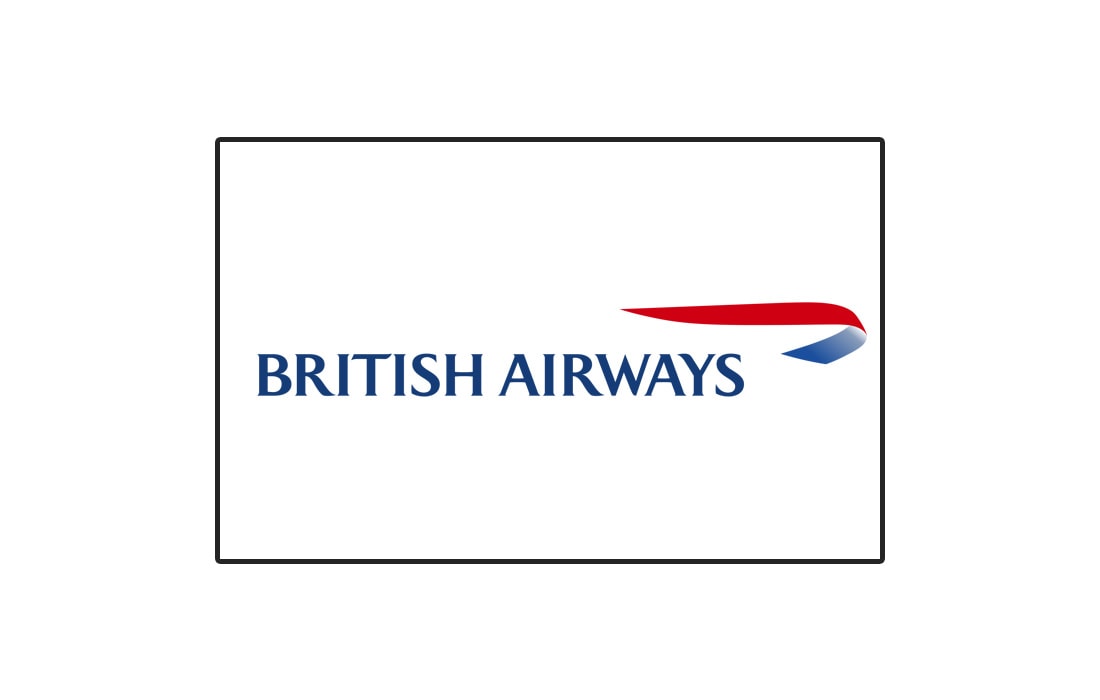
Simplicity is always the best way to show off authority and class. British Airways proves this with its simple yet classy logo design. British Airways has been in business for more than 100 years. And its logo resembles the timeless service done by the company.
The logo uses a classic font with a ribbon symbol, which is used to represent the speedbird symbol used by Imperial Airways back in 1932.
Lesson: Keep it simple. Minimalism never goes out of style.
Singapore Airlines
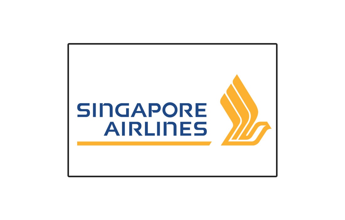
The logo for Singapore Airlines has a uniquely elegant look that’s quite unmatched by others in the industry. The stylish gold color used in the logo aims to represent a luxurious experience for all passengers. Given that the logo is commonly used with a blue-colored background, the gold symbol looks even better no matter where it’s displayed.
Lesson: With the right color combination, you can easily create a logo that grabs anyone’s attention.
Qantas Airways
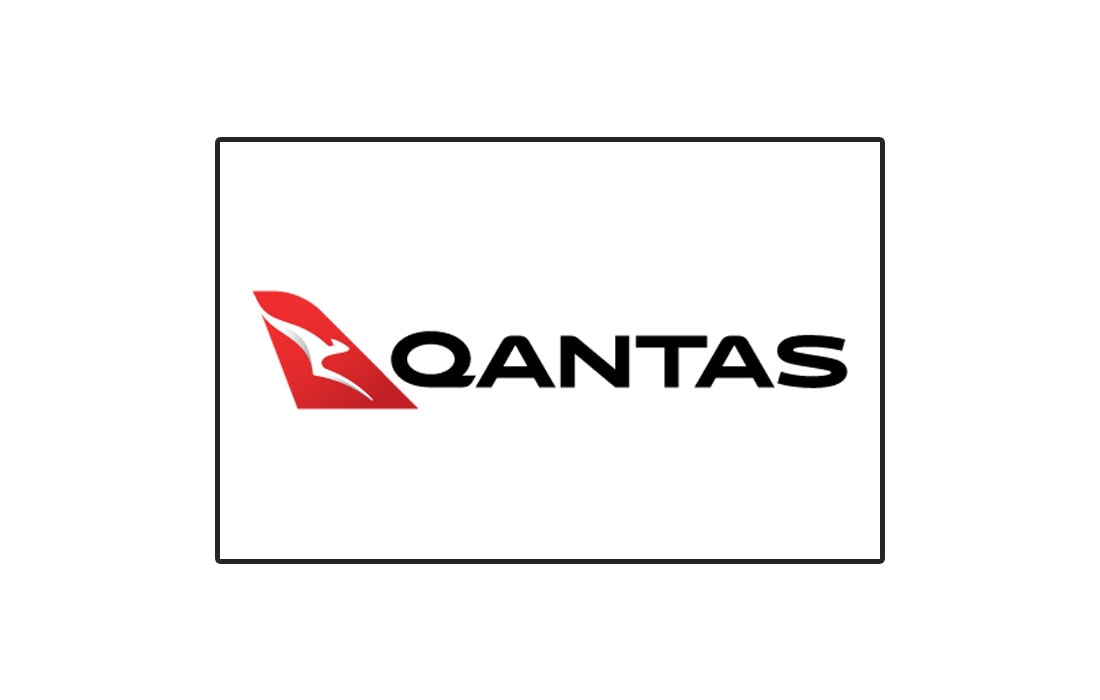
Qantas Airways, Australia’s biggest airline has been around for nearly 100 years. The brand made sure to represent the country with a symbol of a kangaroo throughout the years.
Instead of using a simple drawing of a Kangaroo, the company now uses a colored background to make the symbol appear more highlighted on the tail of an airplane.
Qantas logo went through a series of changes since 2007 while it struggled to find the right typeface for the text. In 2016 it finally settled for a clean and more professional font design.
Lesson: Get creative with symbol designs and don’t be afraid to experiment with typefaces.
Malaysia Airlines
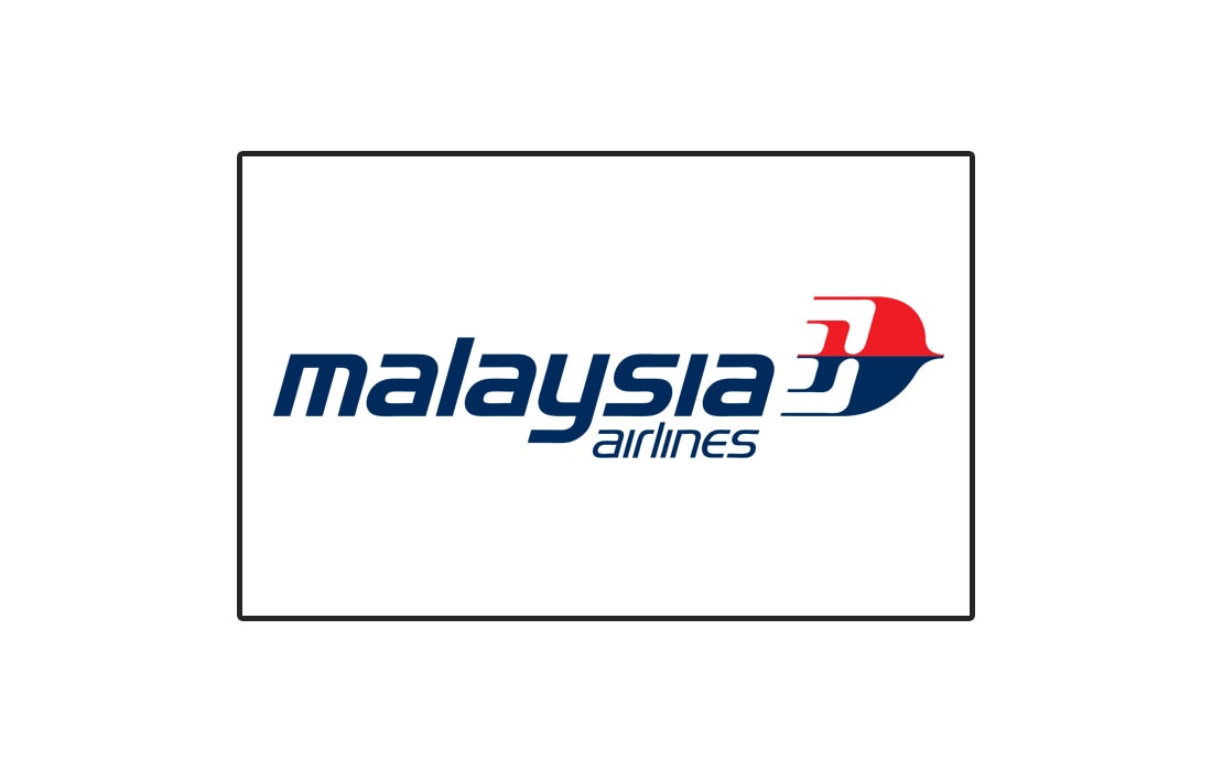
Malasia Airlines, or previously known as the Malaysian Airline System, has a quite beautiful logo that has a long history dates back to the 1970s. The company went through a few different logos since its rebranding. The latest one has a colorful and an attractive design. The symbol represents a Kelantan kite, which was kept from the original logo from the early MAS days. It’s the perfect symbol to not only represent the country but also for air travel.
Lesson: Instead of using common and national symbols, come up with a unique design.
Thai Airways
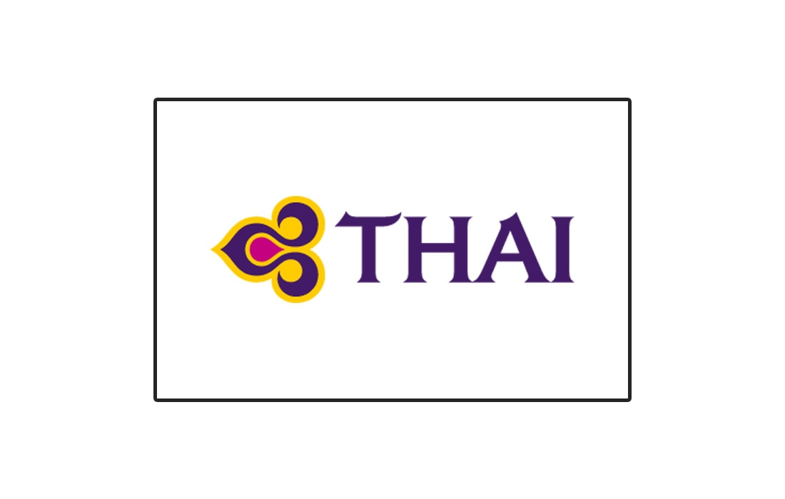
Culture and tradition mean everything to some brands. They would break standards and usual design strategies to make logos that scream originality. A great example of such a brand is Thai Airways.
The logo for Thai Airways is a simple four-letter word accompanied by a symbol that represents the culture and traditions of Thailand.
Thailand is a country well-known for its traditions and its airline preserving it in its logo should be enough to tell the world about the country and its people.
Lesson: Include and convey your cultural traditions in your logos. It’ll make your designs stand out from the crowd.
Emirates
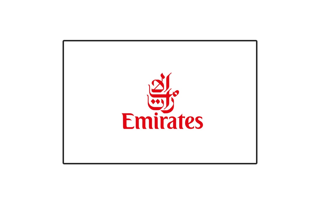
When talking about airlines, Emirates is a company we can’t ignore. Emirates made a name for itself in the industry as a high-quality and luxurious airline. Despite its logo being a simple wordmark, it’s quite easily recognized around the world.
The wordmark logo features the name Emirates written in both English and Arabic. However, most people recognize Arabic wordmark as a symbol. That’s impressively clever branding.
Lesson: Using multilingual wordmarks can sometimes help create unique logos.
Delta
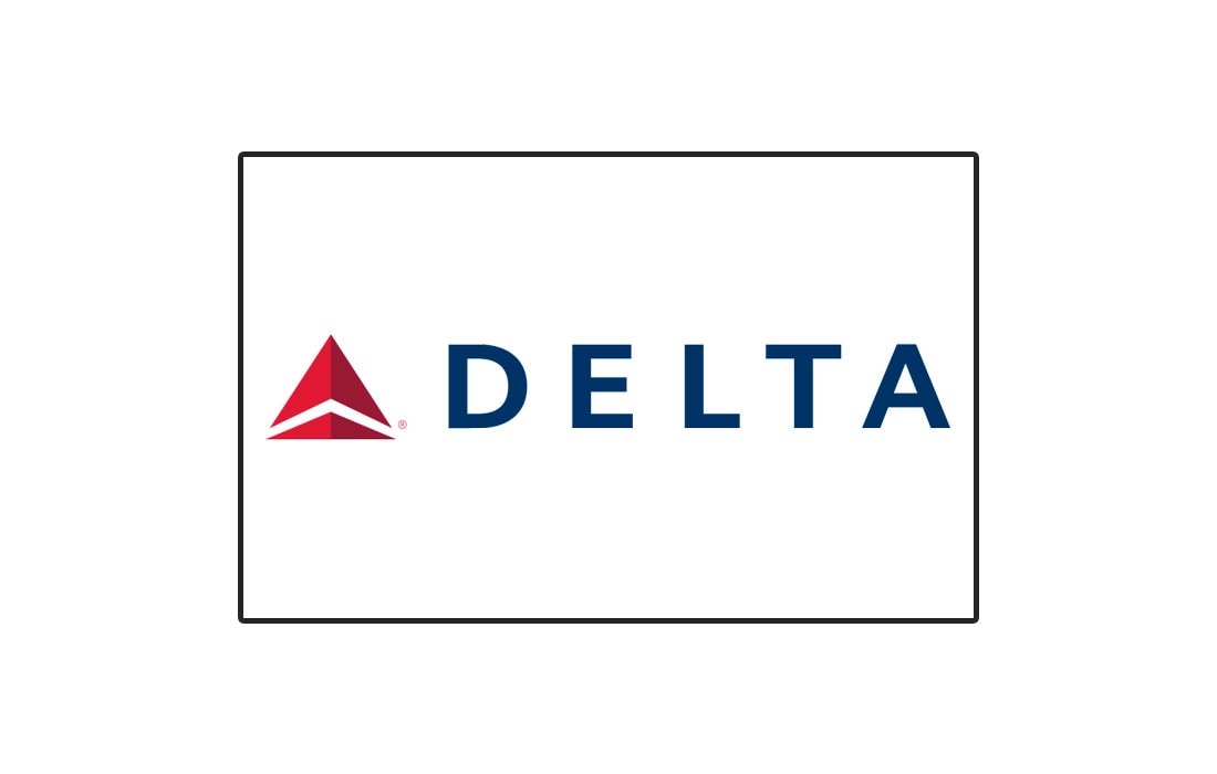
The logo for the US-based Delta airlines features a very bold and stylish design. Similar to the Thai airways logo, this logo also features just a five-letter logo with a symbol. Interestingly, the triangle shape of the symbol actually represents the Greek letter for Delta. It’s the fourth letter of the Greek alphabet.
Lesson: Bold designs often pays out. But only when used for the appropriate brands.
EgyptAir

The logo for EgyptAir will instantly give you an idea about where it found inspiration. It features a symbol inspired by ancient Egyptian culture and mythology. It depicts the Egyptian god Horus, who represents power and is also known as the “Sky God”. This makes it more than appropriate symbol for an airline.
Lesson: Dig deep into history, you might find things to help represent your brand more effectively.
Lufthansa
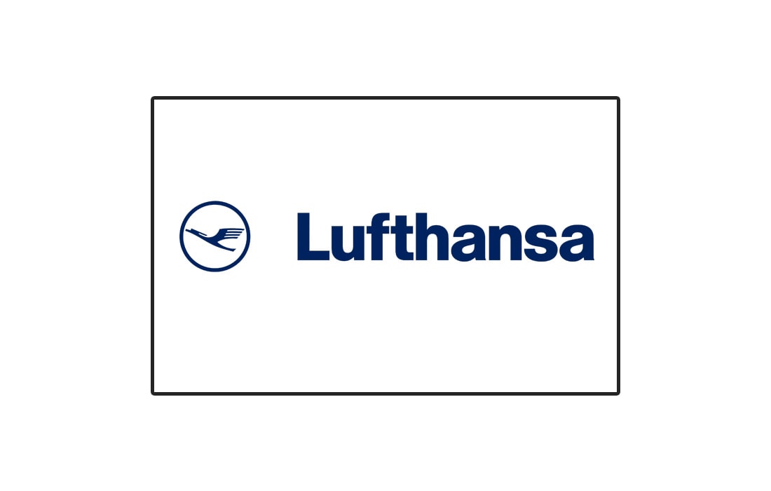
Lufthansa is Germany’s biggest airline. The brand used to have one of the most beautiful logo designs in the airline industry featuring a golden color design. However, the company recently revamped its logo to feature a more simple and clean design. Mainly to make it more convenient for the digital world.
Lesson: Make sure your logo designs convert well in both online and offline.
Swiss Air
Swiss Air used a very simple logo design that directly represents the country by taking inspiration from the country flag. It was simple and admirable.
Unfortunately, the company went bankrupt in 2002 and the fleet was taken over by Lufthansa. The company now operates as Swiss International Air Lines, or simply Swiss.
Lesson: Sometimes, a simple symbol can make your logo design look more unique.
Aeroméxico
Aeroméxico is the official airline of Mexico. The symbol used in this logo is what makes it quite unique. It represents a man wearing an eagle headdress. It was used by Native Americans to represent respect and honor. The company may have had the same concept in mind when using this symbol in its logo design.
Lesson: You can make your logos more meaningful with the right design.
Sri Lankan Airlines
As you may have noticed, many airlines use a common color palette in its logo designs. It’s usually a combination of red and blue colors. But the Sri Lankan Airlines logo is not afraid to show more than a few colors.
This logo features multiple colors that work quite well for the branding of the airline. The symbol of the peacock is meant to represent the beauty of the island and the colors represent the multiple cultures of the country. In addition, it looks great on the tail of an airplane.
Lesson: When used properly, colors can help make a logo appeal to multiple cultures and audiences.
Making the distinction between a good airline logo and a bad one is fairly easy. Take a look at the logos below and you’ll see why.
PNG Air
Don’t be surprised if you haven’t heard of this airline before. PNG Air is a small airline based in Papua New Guinea. And it has one of the wildest logos you’ll ever see. Not just in airlines, but also in modern brands.
Apparently the logo represents diversity and uses ancient patters from its culture. Needless to say, people will have a hard time recognizing a brand that uses a pattern as a logo.
Lesson: Never use a pattern as a logo.
Korean Air
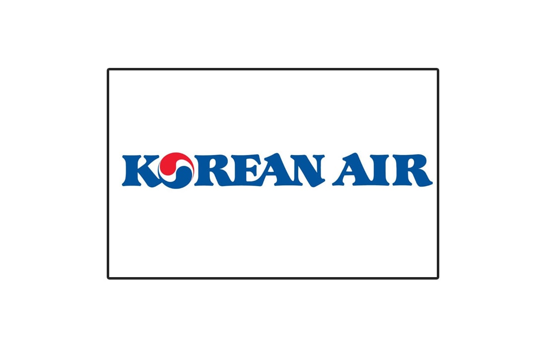
The official Korean Air logo has one of the worst designs ever made. In addition to the symbol that closely resembles the Pepsi logo, Korean Air also uses a typeface that’s quite hard to read and even look at.
However, it’s worth noting that the symbol used here is a traditional symbol used in Korean culture. Although, when creating a logo targeting international audiences, this symbol may not be the most appropriate way to showcase Korean culture.
Lesson: Do research to make sure your logo symbols look unique. And focus on improving readability.
China Airlines
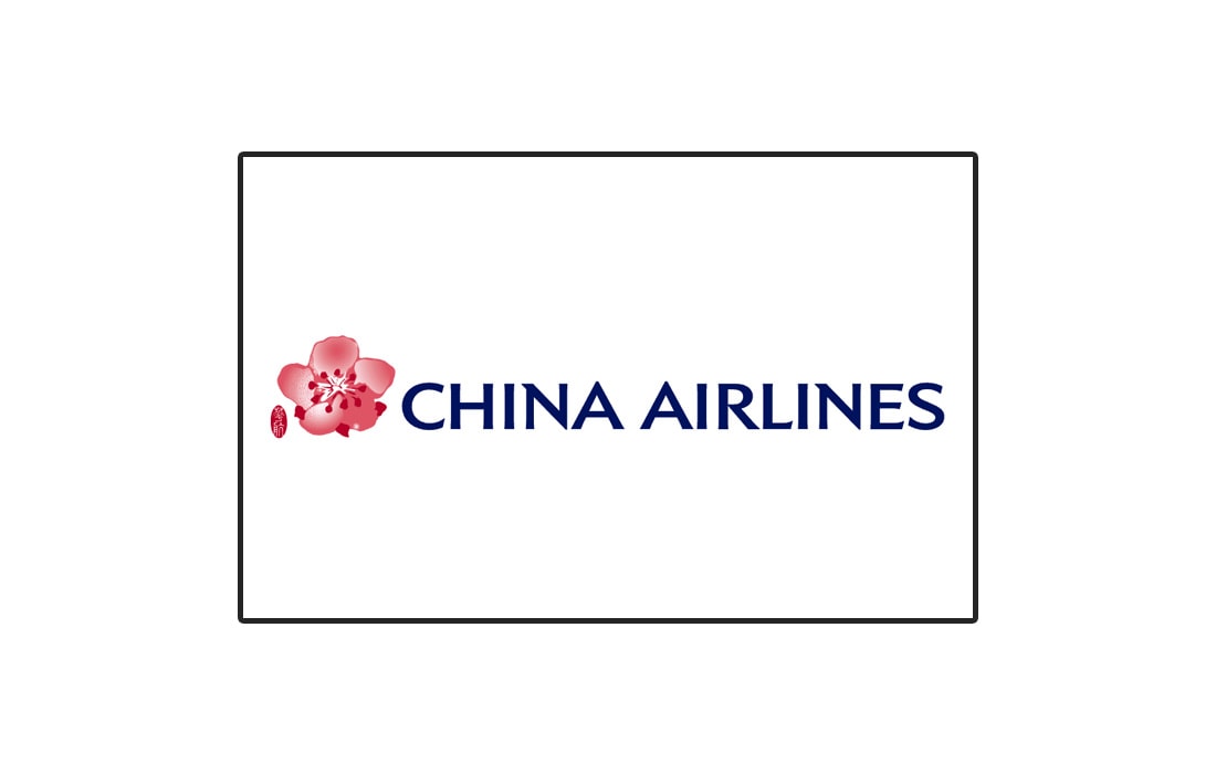
This is the kind of logo design you end up with when the designer procrastinates throughout the project and make the logo at the last minute to the deadline.
It’s a simple design. We can only imagine the thought process the designer went through. Just use a plain font for the text. And then cut and paste an image of a Plum Blossom flower. Don’t even worry about smoothening the rough edges of the flower cutout. Leave it as it is.
Lesson: Don’t copy-paste images into a logo design.
Air Asia
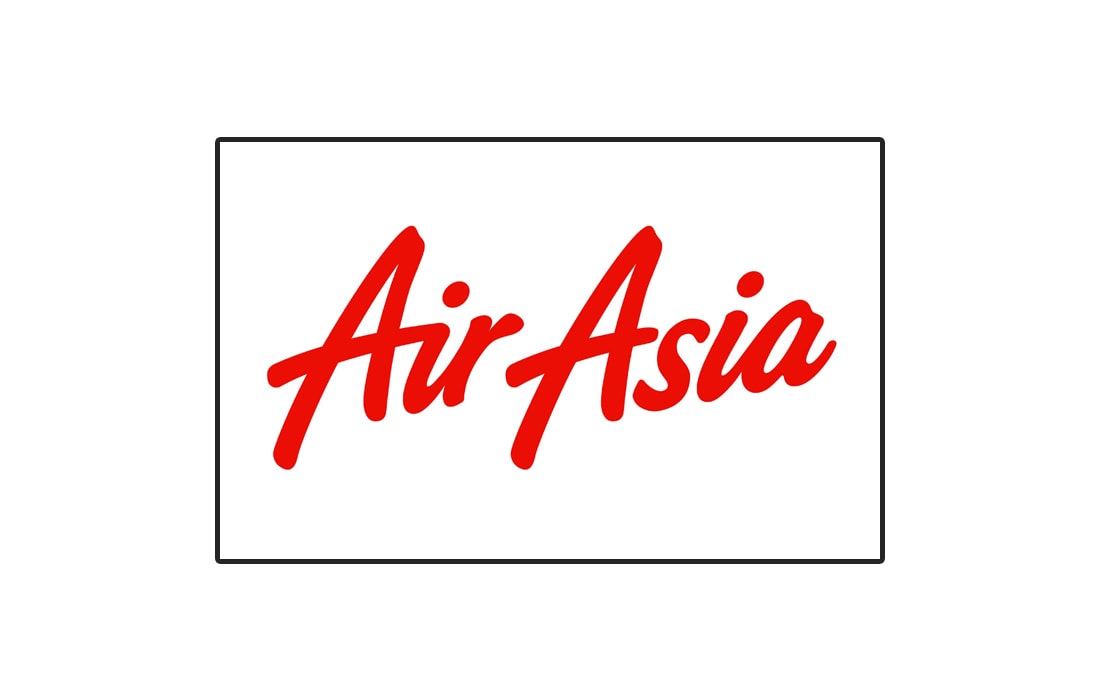
Air Asia made a terrible mistake by making a logo that looks almost exactly the same as the Virgin logo. In the early days, the logo was displayed on the tail of airplanes vertically aligned. Making it impossible to read without tilting your head.
Lesson: It’s okay to copy from others, but make sure to add your own personal touch.
United Airlines
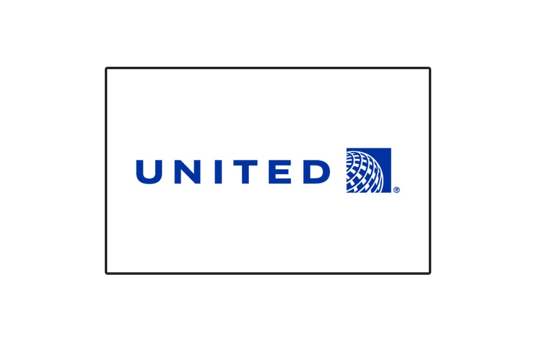
United Airlines is one of the biggest airlines in the United States. The new logo for the brand has quite an interesting story behind it.
If you’re familiar with airline logos, you might think that this logo is a poor Photoshop job done by an amateur designer. Because the logo for the Continental Airlines used to look just like this.
However, when United acquired Continental in 2010, the two companies merged and introduced a new logo that’s quite confusing.
Lesson: Never recycle old logo designs.
Air Canada
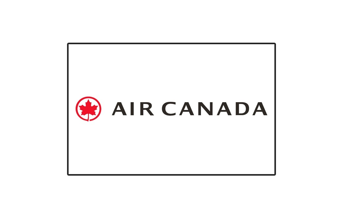
Air Canada managed to modernize its logo over the years but still kept its maple leaf symbol attached. The logo was recently refreshed in 2017, however, the use of the maple leaf symbol seems to make it look quite dated and unattractive. They could’ve used a much simpler version of the symbol.
Lesson: Get rid of symbols if it doesn’t appeal to modern audiences.
Alaska Airlines
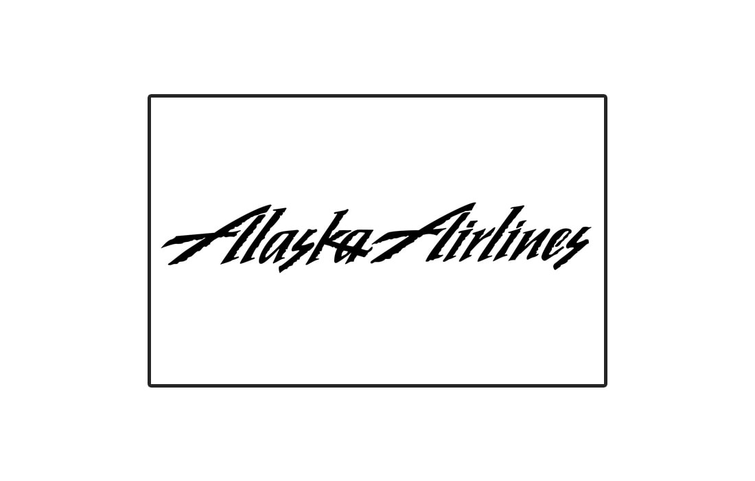
What’s the first thing that you think of when talking about Alaska? It’s the chilling cold weather and mountains. Alaska Airlines wanted to capture that chilly weather in its logo design but failed miserably.
When you look at all other airline logos you’ll notice that they all use non-decorative fonts to make sure the text is readable from a distance. Alaska Airlines forgot about this key element. However, thankfully, the company realized its mistake and refreshed the logo in 2016 with more clean and simpler font design.
Lesson: Consider where and how a logo is used when designing it.
Looking for more logo inspiration? Then have a look at our best minimal logo design templates collection.