Awesome Design in the Wild: Sevenly.org
Every now and then I come across a site that has one or two really inspiring bits of design and UI that are good enough for me to write about them. On even rarer cases, I find a whole site that’s just so overflowing with uniquely awesome design ideas that I have to share it with you. This article is about one such site.
Sevenly.org is a site dedicated to helping charities through the sale of limited edition custom t-shirts. Beyond the fact that I love the organization and what they stand for, I’m blown away by what they’ve done with the site and think it serves as a learning tool for web designers. Let’s take a look!
Meet Sevenly
Sevenly’s mission is simple: “To harness the power of art and community to build sustainable awareness and funding movements that support charities in their efforts to change the world.”
In practice, how this looks is they sell super awesome products (t-shirts, sweatshirts, water bottles, etc.) and donate $7 from every purchase to the charity that they’ve chosen to support that week. To date they’ve raised almost $600,000 for various charities.
Great Design
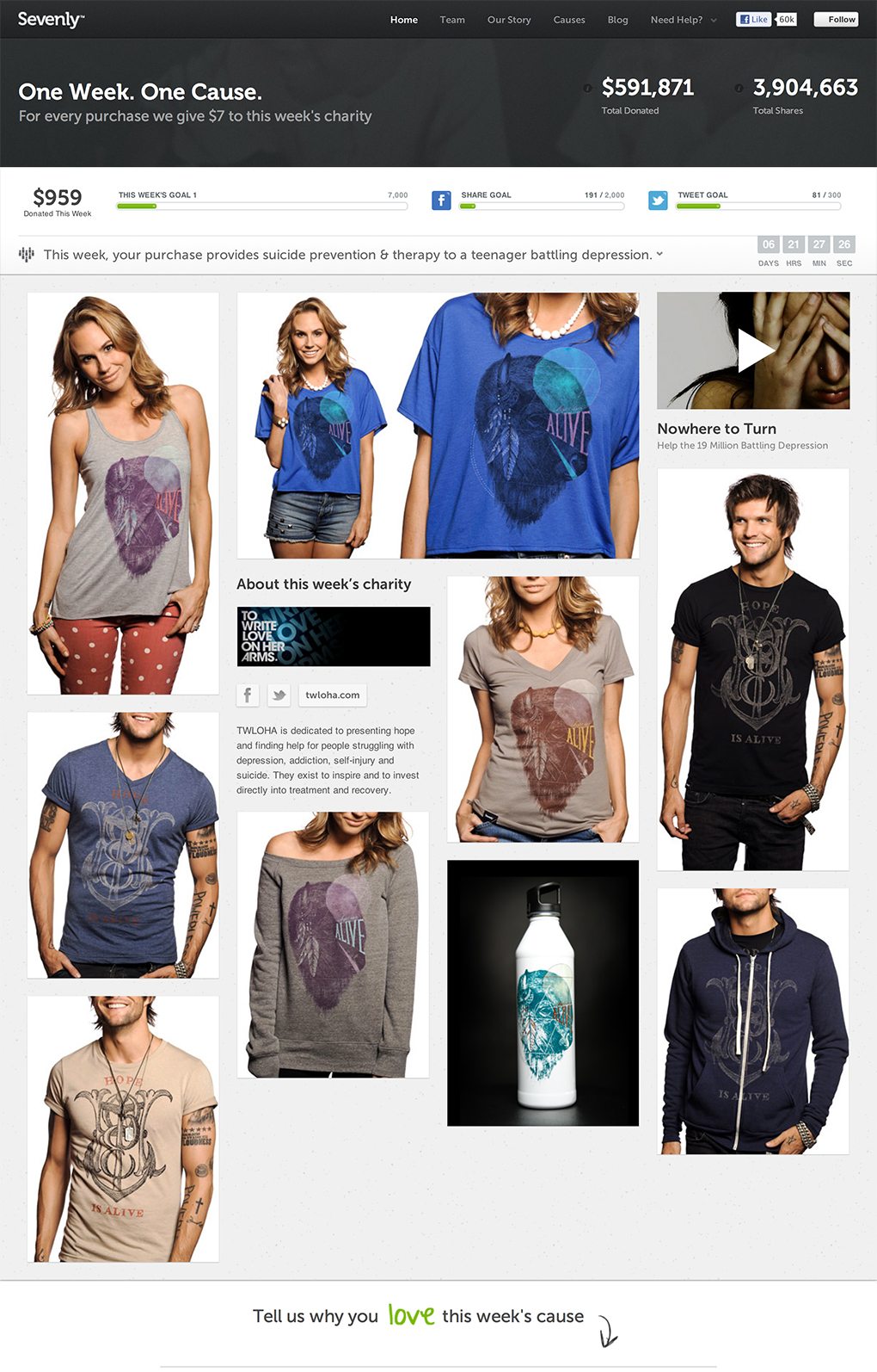
Once again, the cause and strategy earned a click from me on Twitter, but it’s the design that reeled me in and kept me interested. As you can see in the screenshot above, the home page is quite attractive.
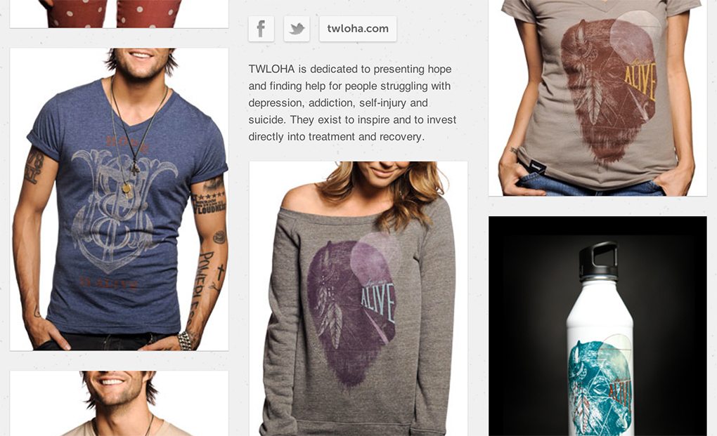
It shows off the products beautifully with nice, large photos of good looking, smiling people wearing very attractively designed clothing. The masonry layout gives the page an organic feel and the minimal design/color scheme really pushes your attention towards those big photos.
The site looks great at a glance, but as you begin to use it, there are just so many pleasant surprises and great little tricks that I found myself lost, playing with every page for several minutes. Let’s take a look at some of the interesting touches.
Hover Effects Galore
I’m a huge fan of hover effects, I know they don’t always translate to touch screens very well, but you can account for that. On a desktop, they’re one of the primary ways that we interact with users on a basic level.
Sevenly is simply overflowing with cool hover effects. Slick little animations await you at every turn. It starts with the home page apparel previews:
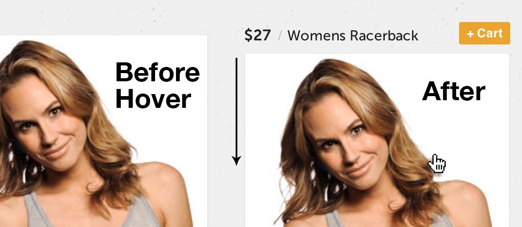
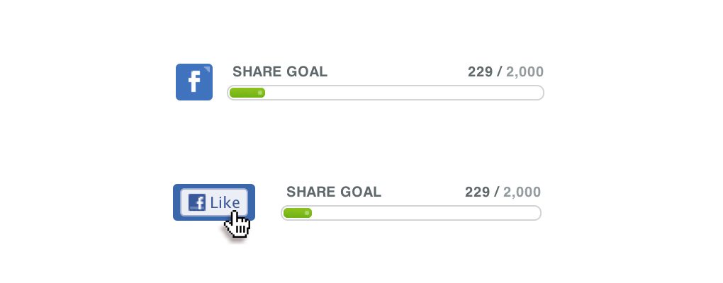
By default, the product name and price are hidden, but as soon as you hover over an image, it slides down to reveal this information. Jumping over to the side of the page, there are three buttons here, each of which expands into a long horizontal bar on hover.
Following the same theme of changing an element’s size on hover, the little sharing bars have also buttons that become wider when you hover over them, encouraging that all important click.
Pure Scrolling Voodoo
My absolute favorite thing about this page is the scrolling magic that happens on the home page. It’s actually a really simple effect but it’s so well thought out that I couldn’t help but be impressed.
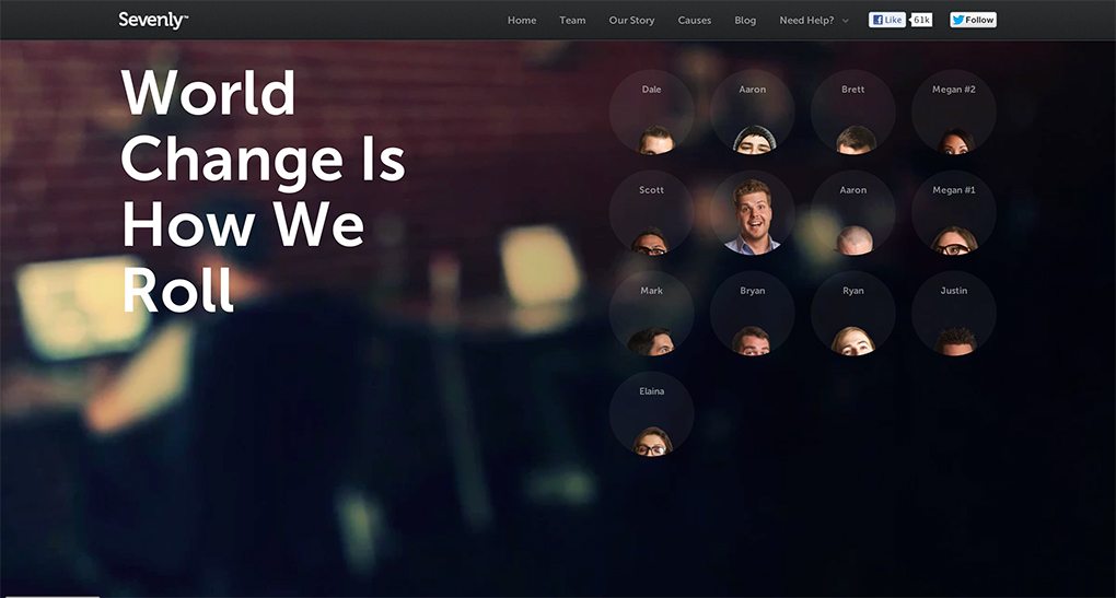
By default, when you load the page, this is what you see:
Odds are, your first reaction will be to scroll down the page. As you do this, the dark section that describes the site gets shorter and shorter until its just a little navigation bar that stays with you as you scroll.
The great part is that it doesn’t stop there. Though you might not think to do it, you can actually scroll up past the original starting position. This does the opposite of what we saw before and expands the darkened section to give you more information about the site’s current charity.
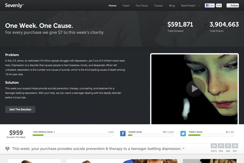
It’s such an elegant way to store a ton of information in a small space and gradually reveal it to users. It’s just hidden enough that it doesn’t overwhelm you when you load the page but just obvious enough that you can’t miss it when you scroll back up to the top of the page after your initial exploration.
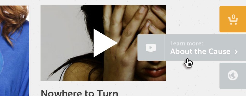
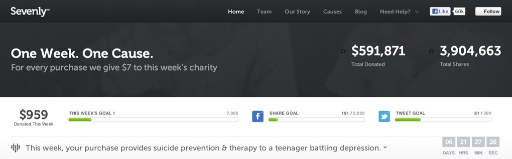
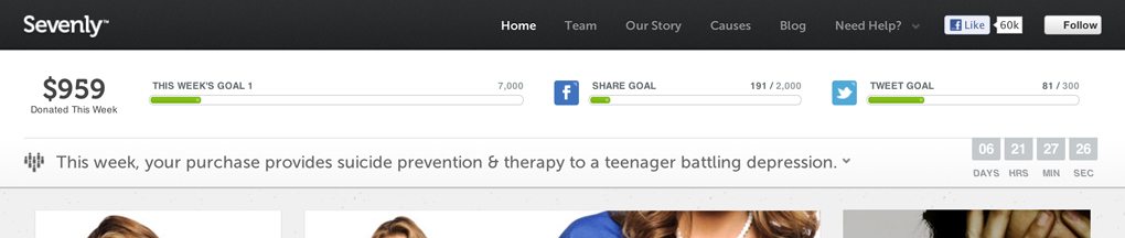
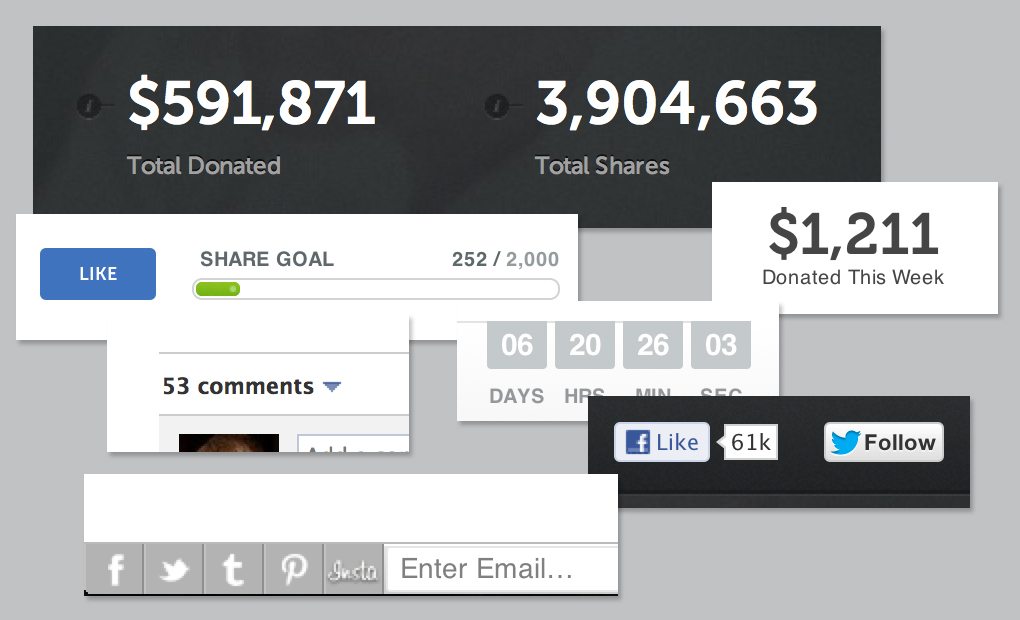
Numbers and Sharing
Given that this site is so focused on charity, there are two goals that were laid out for the design. You can tell because they drive the entire layout. The first is a level of transparency and progress, communicated via statistics. Here’s how much we’ve raised so far, here’s what our target amounts are, etc.
The second goal is to encourage sharing as much as humanly possible through leveraging of social media. There’s a huge Facebook comment section built right into the home page and tons of other social buttons and bars around the site.
A Personal Touch
Moving on past the home page, the amazing design doesn’t stop. Next up is the “Team” page, where you can meet various members involved with the project.
As before, we see some fun hover effects being implemented here. Each team member is shown in a circle with only his/her head peaking out. Once you hover over the circle though, they pop out into view with a silly face.
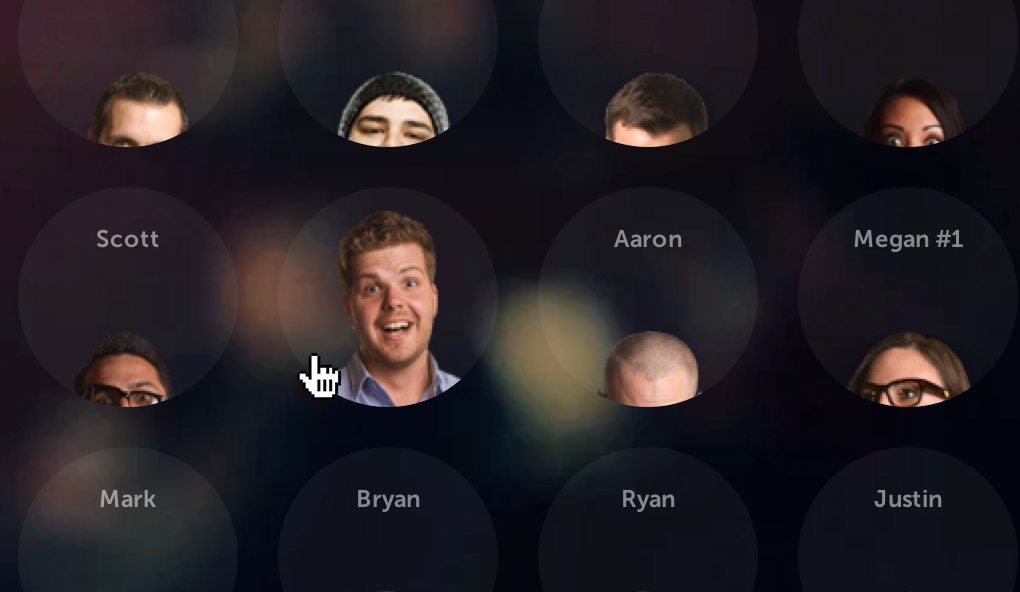
As I looked at this page I realized that it held another surprise: the background is actually a video! It’s very subtle and you might not even notice at first, which it why it’s so dang nice. The video is blurred out and dark so it’s not too distracting.
Storygraphic
The last thing I’d like to show off is the the “Our Story” page, which tells you a little bit about why Sevenly was started. Not content to do anything in the way you’d expect, here the Sevenly team decided to give you an awesome infographic instead of a long, boring story.
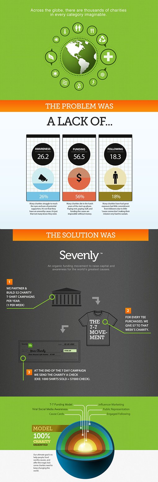
Notice the way that this infographic is structured: problem vs. solution. You see this format used elsewhere throughout the site to convey the story behind each charity. First, they state a problem in very simple terms, then convey how they’re helping to solve it. It’s refreshingly simple and straightforward.
What Do You Think?
I’d like to make it clear that I’ve never talked to the Sevenly people, they didn’t approach me to write this article or reach out to me in any way. I simply really appreciate what they’re doing, both as a human being and as a designer.
Be sure to tour Sevenly.org the next time you’re in need of some solid inspiration. Don’t just look, interact with the site and get a feel for all of the nice little design touches that make it feel so refined. Also, if you’re in the market for some t-shirts fitting of your designer status, you can’t beat the awesome Sevenly designs.