How to Create a Google+ Cover Image: Examples and Best Practices
A Google+ cover image is more than just a photo. It is the first impression you are giving a potential customer or user about your business or website. The photo should represent who you are, what you do, and why users should engage with your page.
It should also serve as a gateway to other actions. Google+ is a business gateway and social media platform. The information you provide and share goes into search rankings and helps more users find you online. It all starts with a great cover photo.
Getting Started
We will start with an admission: There’s a lot of debate about Google+. This often centers around people who use it versus people who don’t. You can take on that debate if you like. Here, we’re only going to focus on the design aspects.
With that in mind, if you don’t have a Google+ page designed, you likely have one anyway. (If you have a Google account, just look around to see if it is there.)
So you have to decide how to use this account:
- As a personal/portfolio landing page
- As a brand page
- As a social network
- As a combination of above elements
Regardless of which option you choose, a good cover photo is a must. It will be the first thing people see when they look for you or your brand. So even if you aren’t sharing or joining conversations on Google+, you might want to create a cover photo and include basic information anyway. And what have you got to lose? This is something you can knock off your to-do list in an afternoon.
Know the Specs
There are two main images in the Google+ profile – a profile photo and the cover photo. Here’s all you need to know about the profile photo – use your standard social media headshot. It’s a square image (minimum 250 pixels by 250 pixels) and is part of your public Google profile.
The cover image takes a little more planning. The cover photo is designed for a wide-screen horizontal format. Google offers three size options:
- 1,080 x 608 pixels (recommended)
- 480 x 270 pixels (smallest available upload)
- 2,120 x 1,192 pixels (largest available upload)
Work within the recommended specifications. You will get a sharp, crisp image that loads quickly across a number of devices. Avoid the small image size; it will render poorly.
Like any other social media channel, specifications for images can change periodically. If your image does not look exactly like you think it should, refer to Google+ help for specification updates. The guide will also walk you through uploading images from a variety of devices if you have trouble.
Think About the Image
Your image is the gateway to your identity online. With social media and brands, the same thing you do with your profile photo – a default image that you use across channels is recommended – can work for cover photos as well. It can be a little trickier since some of the shapes are different from site to site but a similar working concept is nice.
Start there. What image are you using to represent yourself or your brand in other channels? Is it something that can work here as well? (Here’s another tip: Use the main image from your website. A hero header will translate nicely with just a few design tweaks.)
All of the other considerations that come into play when selecting images come into play here. You need something that is of good quality, and is readable at any size. Pick an image that has a strong focal point. It is probably best to avoid massive wide-angle shots.
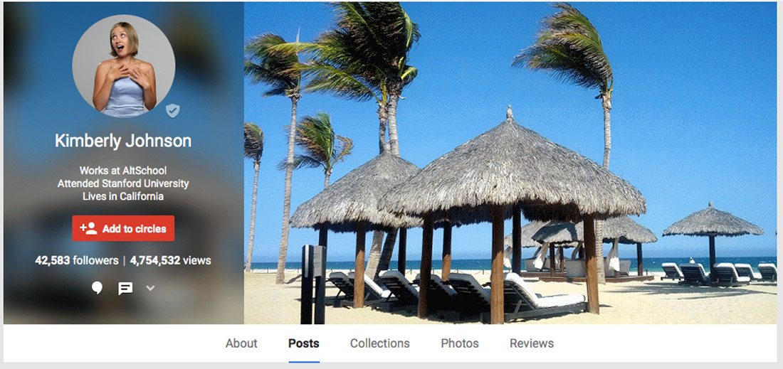
Go for impact with close crops of faces, bright color choices or great action. Google+ covers only support still frames right now (even though a simple gif can help you add an animated trick, such as the profile of Kimberly Johnson in the gallery below). Consider that if you have a video or animated background for your website. Is there a nice moment that can be turned into a still image?
Consider A Little Type
A cover photo can be more than just an image. Consider a nice bit of typography to take the design to the next level. When it comes to cover photo type there are two extremes that tend to work especially well. Oversized and simple or small and informational.
If you do the oversized route, think about the image just as you would if you were designing a hero header-style design for a website. Think about one or two key words that go with the image and integrate the text with visual messaging.
The other option is to go small and include a simple line of text that directs people to your website or other contact information. A bit of subtle text can work especially well when the image is shared because it provides an identifier outside of the image itself.
Be Bold
Don’t be afraid to be different. A bold image is going to stand out. It might help more users find your page or encourage them to engage past Google+. It can also be a fun place to experiment with design techniques you are not ready to put on your website or portfolio yet.
Big color, images and text are a good way to go. Part of the reason for this is the more stark nature of Google+ as a whole. It uses a minimal, card-style interface without a lot of color or clutter. This helps a bold cover image stand out.
Look at Orientation
The configuration of a Google+ cover photo, profile image and other elements is quite distinct because all of the elements are grouped as a unit in the overall site design. (This is pretty different from other social media sites, where elements might overlap but aren’t as integrated with one another.)
Take note of the following elements that might impact the way you design your cover image:
- The cover photo is blurred with the other text on top of it.
- Part of the cover image (center) is replicated in the blur.
- The profile information is always to the left with the image to the right.
- The image is not boxed or in a frame and could bleed into the background without enough color or contrast.
- Profile information appears in white text.
- On most screens, the only fully visible elements above the scroll on Google+ home pages are the cover image and profile information.
Share
Remember the intent of Google+; it is a social network. Any images you post as part of your profile should have some element of share-ability to help spread your reach.
And take that next step and share your images. One more thing to keep in mind when creating a cover photo is to consider creating multiple cover photos that you can switch around. Depending on how you are using Google+, this could be a seasonal change or could be used to reflect popular items on your blog or in your online storefront.
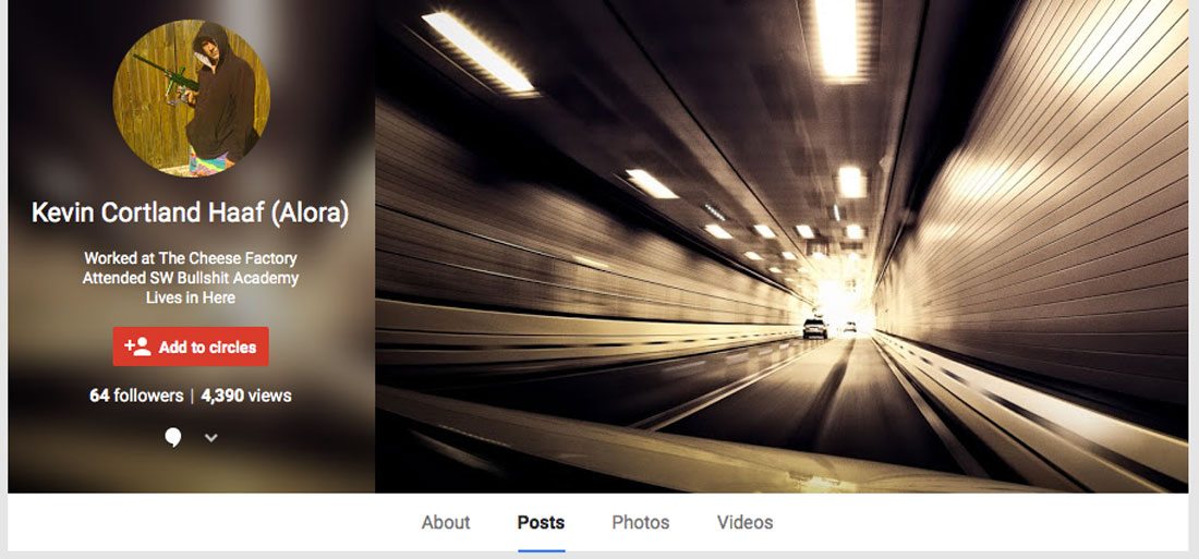
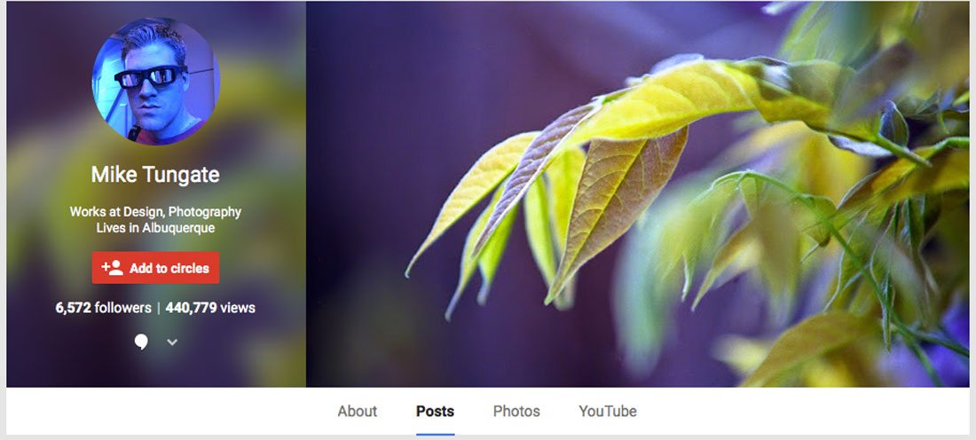
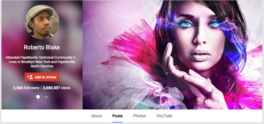
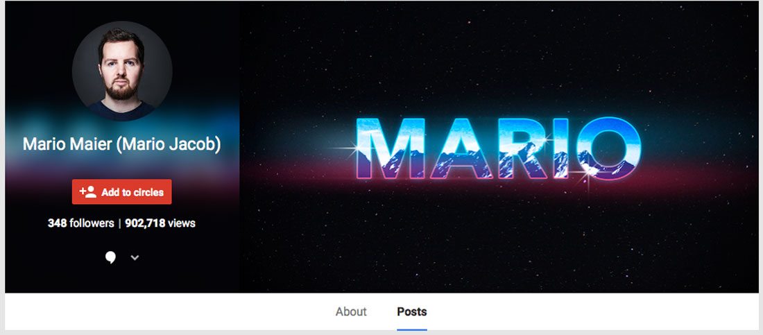
Google+ Cover Gallery
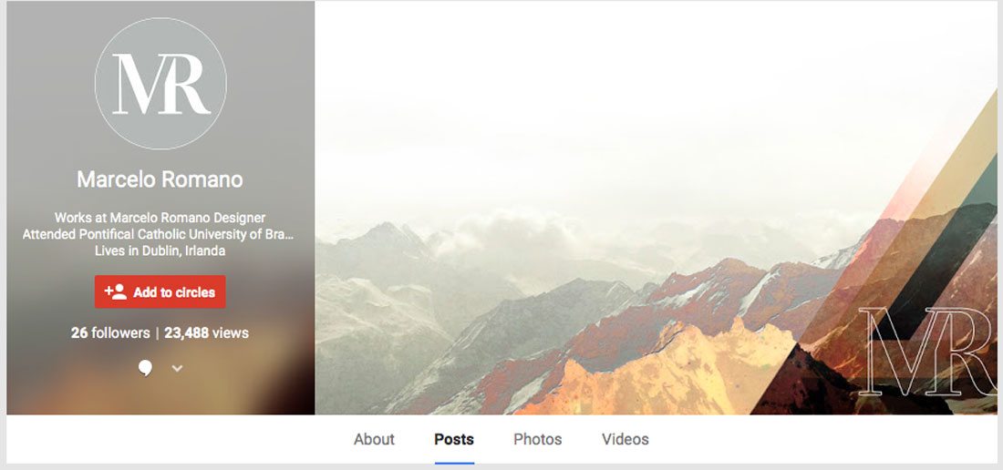
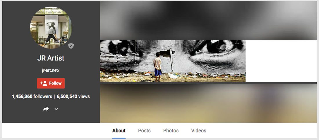
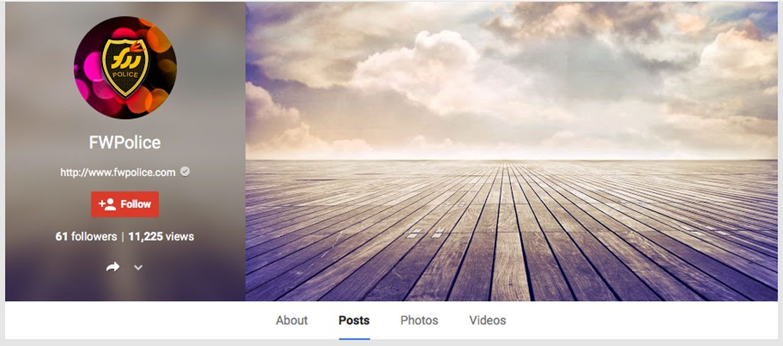
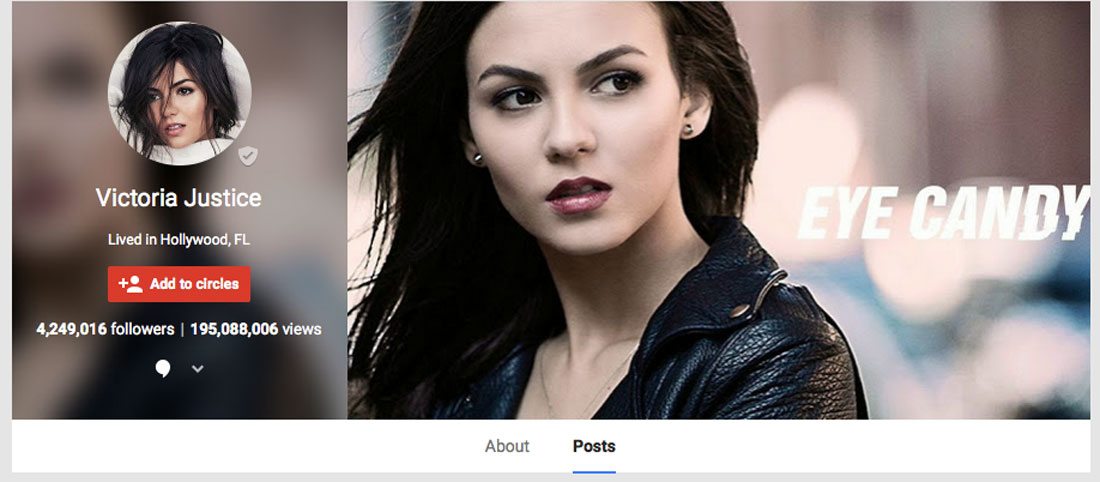
Here is a collection of great cover images from Google+ users. Many of these examples, and others in this post, show a mix of great images, typography and color usage. We hope you’ll find some inspiration in the creation of your next Google+ cover image.

JR Artist
FWPolice
Victoria Justice
Kimberly Johnson
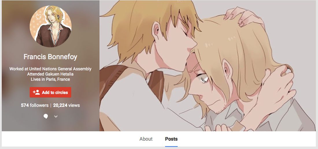
Francis Bonnefoy
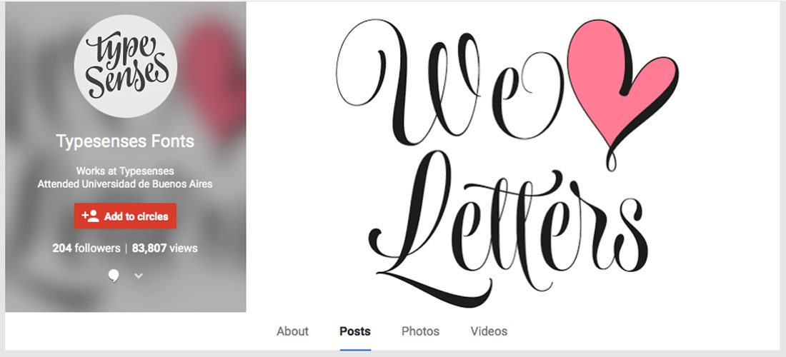
Typesenses Fonts
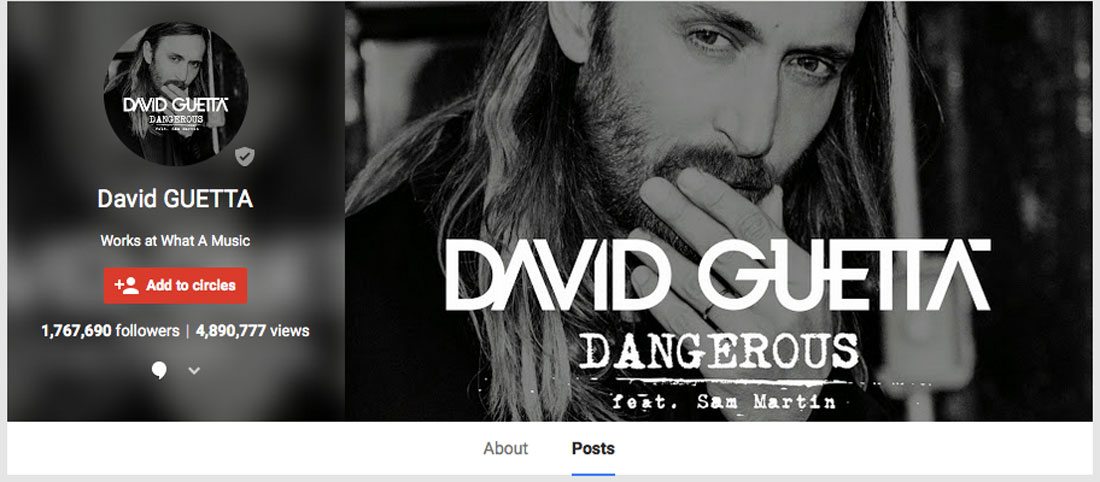
David Guetta
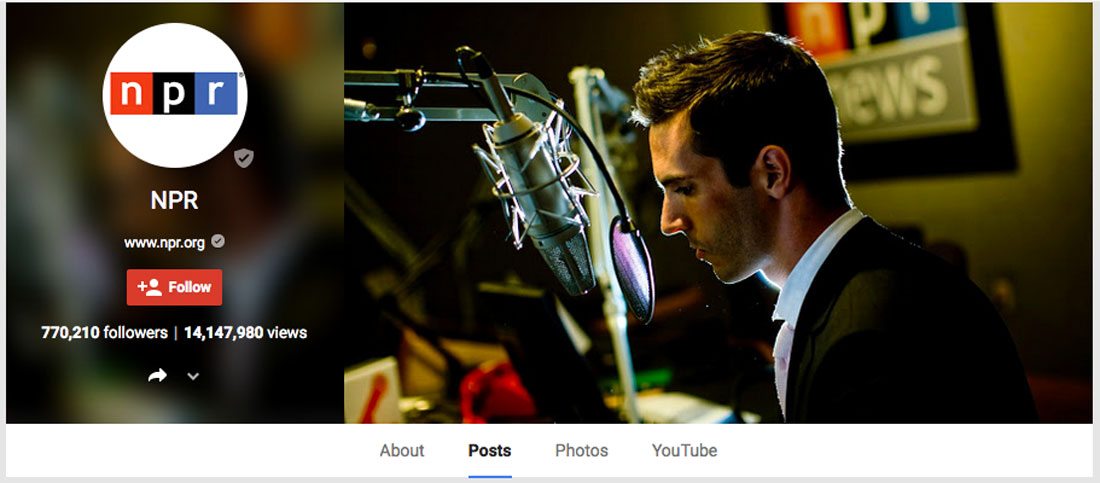
NPR
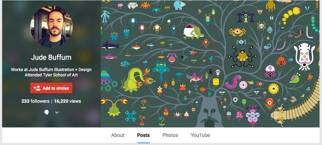
Jude Buffum
Conclusion
Google+ is a network full of designers and web professionals. Show off some of your creative skills with others on the social platform and use it to help boost your web presence. As you can tell from the gallery above, most of the best Google+ user profiles keep it simple with a great image that represents them, their work or their brand.
Design Shack is on Google+. Add us to a circle and join the design conversation. We’d love to have you follow along.