How to Use Warm Color in Design Projects
Warm and cool colors. These descriptions are commonly used to describe hue choices in a variety of conversations – fashion, beauty, decorating and design. But while we commonly talk about warm and cool, do you really know what these terms mean and how to use the colors?
Today, we will look at using warm color in design projects and create a few color palettes with warm hues. We’ll also investigate the theory and meaning behind different choices.
What Are Warm Colors?
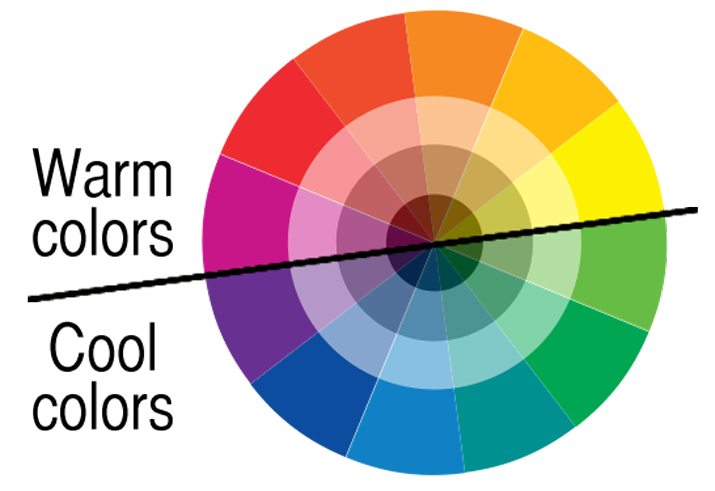
Warm colors occupy one half of the color wheel and are the hues that are reminiscent of the sun or fire. Reds, oranges, yellows and pinks are warm colors.
The actual division on the color wheel can vary slightly but is most often conveyed as from yellow to red-purple. Color theorists believe that the evolution of warm and cool colors came is linked to the color wheel, according to “The Dimensions of Colour” by David Briggs.
“They seem not to have been applied to colours until soon after artists first saw their range of hues laid out in a circle. Charles Hayter’s colour circle of 1813 appears to mark their earliest appearance in a published colour system, but the terms can be traced back in artist’s correspondence as far as 1727,” Briggs wrote.
The terminology – warm and cool – is emotional and psychological. And unlike other color definitions, has nothing to do with their reflective properties or light absorption. The “warmth” of a color has nothing to do with its brightness or color saturation or tint. It refers precisely to where the color falls on the color wheel.
Meanings of Warm Colors
Warm colors are often considered to be vivid and energetic. They advance in space and can make the surroundings seem bigger, more open or more inviting. Warm colors are stimulating and, as the name implies, connect emotionally to warmth.
Because of these associations warm colors are used to convey messages of happiness, sociability and energy. Restaurants and food companies often use the colors red and yellow because of this idea.
A quick breakdown of warm color associations:
- Reds: Love, passion, urgency, anger, hunger
- Oranges: Health, attraction, wealth, youth, attention
- Yellows: Cheer, optimism, childishness, freshness, warmth
- Pinks: Sensitivity, tenderness, romance, sympathetic, innocence
Warm Colors and Design Theory

When it comes to working with warm colors, it is important to understand how they work in space. Warm colors advance, making them appear longer, larger and more open in space. This relationship is parallel to the color wavelengths in the light spectrum as well. (Red light waves, for example, are longer than blue ones.)
A warm color will seem close to you. While cool colors will appear to be more distant.
“Warm color” is often misused in design settings. How often has someone said to make that color “warmer?” But they often mean brighter. Making a color warmer would be to change the color mix, by adding more red or yellow. Making a color brighter means adjusting the saturation or tint.
What are the warmest colors? With two primary hues — red and yellow – in the warm color grouping the warmest color falls between them. (Consequently the coolest color is on the opposite location on the color wheel.) The resulting “warmest” color is orange.
Using Warm Colors
Use warm colors in projects where the goal is to convey a sense of happiness, enthusiasm or energy. While some argue as to whether you should mix warm and cool colors in a single palette, it is a perfectly acceptable use of color. Just make sure you understand how the contrasting hues may work together (or against each other) and how that color choice pertains to your overall message.
While warm colors are popular design choices they can sometimes be difficult to use. Red, for example, can be overpowering or pink can feel too feminine. They key is mixing colors to fit your message and pairing them with other offsetting hues.
When working with warm colors, I like to use simple neutrals or white. The result is a crisp, clean and bright feel to color. The opposite will also work, using a dark scheme and black. Remember to create contrast – super-bright warm colors need a static backdrop as a settling property, otherwise these colors can appear too active, busy or over-stimulate.
Some of the best designs with a focus on warm-only color are simple, direct and even monochromatic. The best option for working with warm and cool color simultaneously is to select colors with complementary tints or saturations. Following the basic concept of the color wheel, start with a warm color and partner it accordingly for the best results.
Start with the 80/20 rule. When working with color, 80 percent of the canvas is neutral (think about things like the background or color of the main body text) and 20 percent of the design uses bold or strong color. Use that same idea with a combination of warm and cool colors. To maintain the warmth of the palette, use 80 percent reds, oranges, yellows and pinks in color locations and 20 percent blues, greens and violets.
When it comes to practical application and color mixing, you can determine warmth or coolness of color by its makeup. In digital projects, using RGB color, warm colors will have the highest red values and lowest blue values. In printed projects, using four-process CMYK color, warm colors will have the highest magenta and yellow values and low cyan or black percentages.
Warm Color Palettes
Now that you are ready to roll with a project that uses a warm color scheme, how do you pick a palette? How bright should it be? Where will the inspiration come from?
Just like with any other color palette, look to things around you as a source of inspiration. Nature, photos, a mood – all can be great sources of color inspiration. Here are five warm color palettes to get you started. (You can find all five from Color Louvers.)
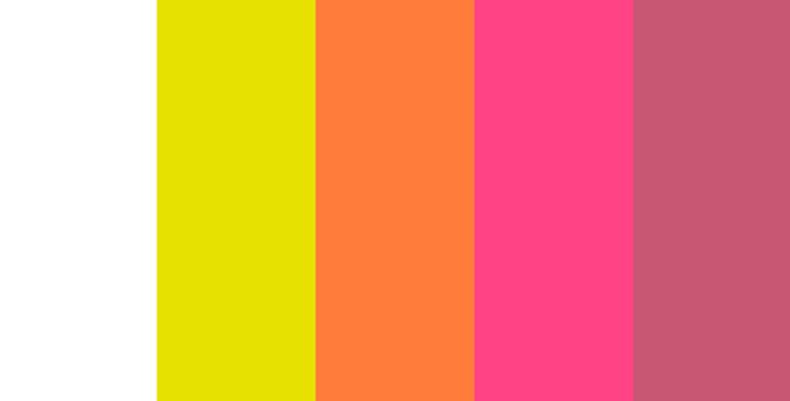
Dance to Forget

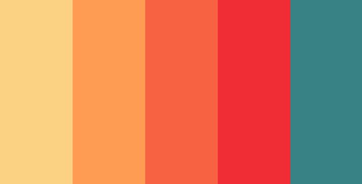
City Sunset
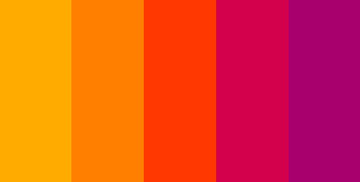
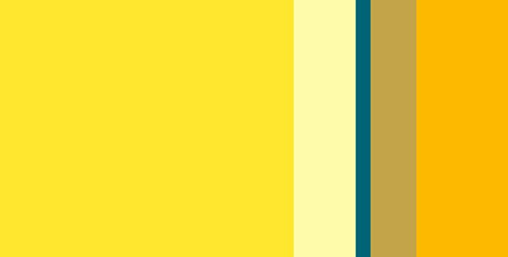
LetMeThinkAboutIt
Maddening Caravan
Here Comes the Sun
Conclusion
Using warm color can be a great way to engage an audience with a design project. The colors are inviting, energetic and fun. Designing with warm color is a great way to evoke certain emotions from people and can provide just the right accent in just the right place.
The key to using warm color is understanding its emotional connections and working with, and not against, it. When in doubt, go with your gut feeling – how does the color make you feel? Is that the right emotion for the project?