What Is Modern Web Design in 2025? 20+ Stunning Examples
What are the characteristics of a modern website design? It’s a pretty common question.
From clients asking at the start of web projects to designers trying to figure out how to incorporate the newest and trendy elements, figuring out what modern web design looks like is one of our greatest challenges.
The reality is that it is easy to say what modern web design is not. You know an outdated design when you see it for sure. Here, we’ve collected 23 examples of modern web designs to help shape a better idea of what it looks like in 2023. Enjoy!
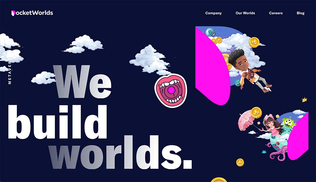
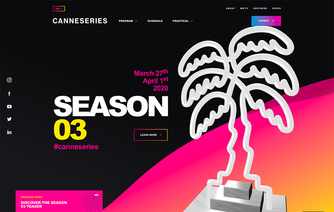
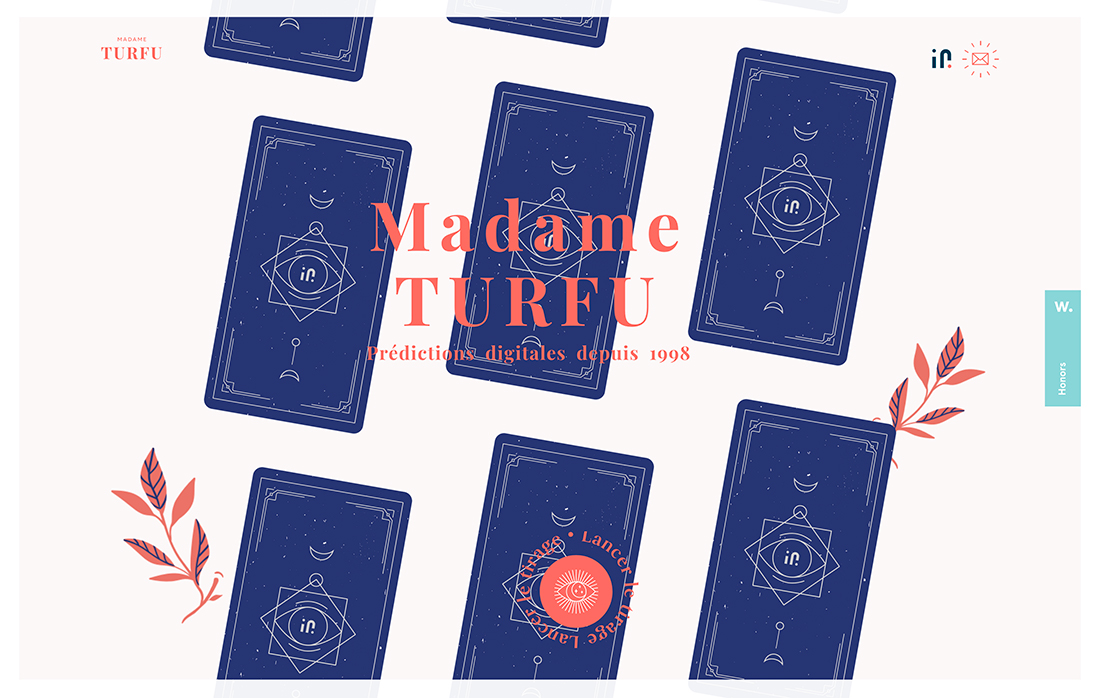
Accessible Interactivity
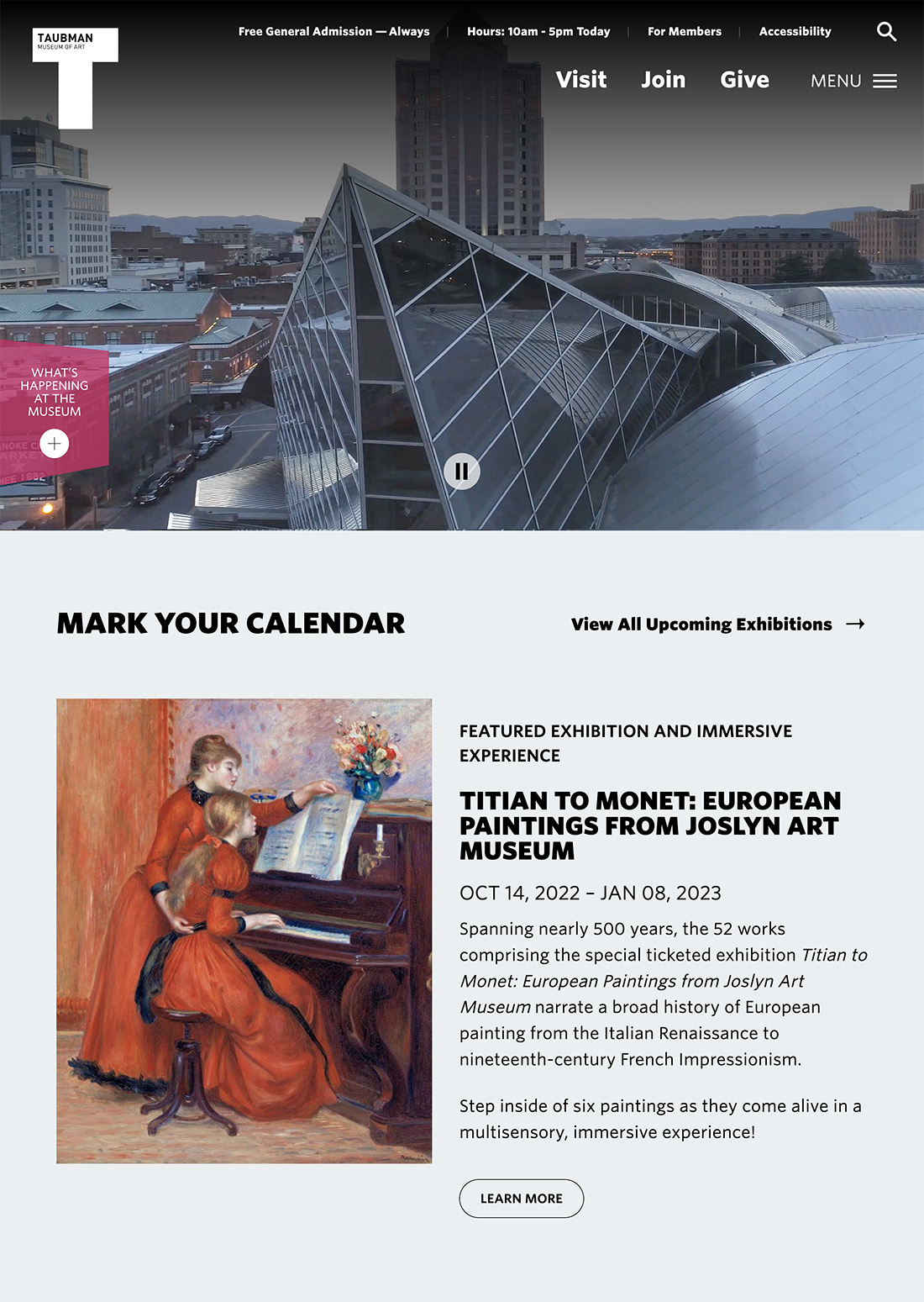
Accessibility will be one of the top design phrases of the year. In almost every design circle and development planning meeting we are talking about how to make websites that look great, have high interactivity and function, and are highly accessible.
You may have to open your mind a bit, but it is a quite doable task.
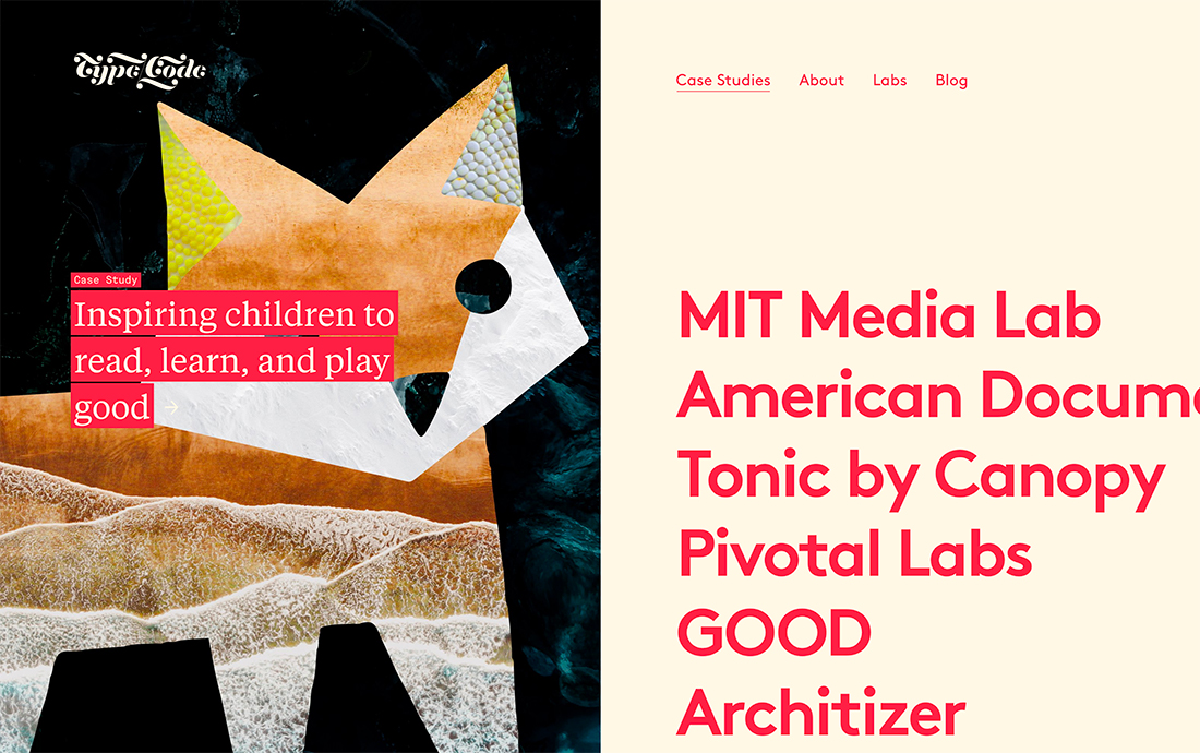
In the example above, you might notice large text first, but if you start clicking through, you’ll notice almost every element of this design helps the user complete a task or leads to another interaction. And as a bonus, screen readers can pick up every element and there’s a high contrast feel – from color to size of elements – that ensure the design is comfortable for users of any ability.
Modern designs will being to look more like this and include a lot less minimal contrast, small typefaces, and read-only designs that have dominated the website design landscape.
Images that Wow
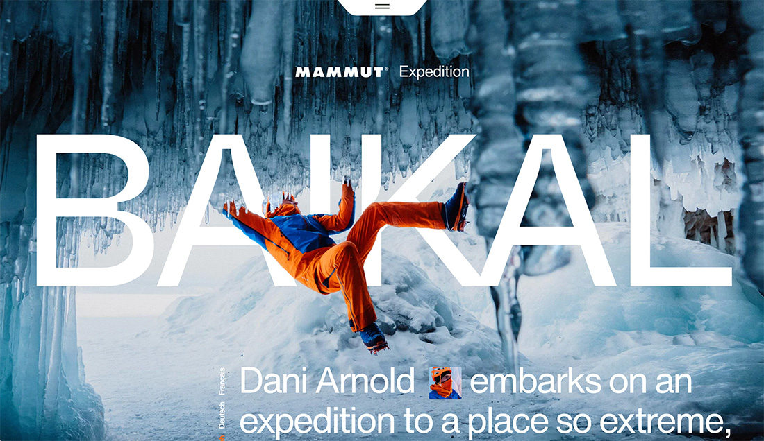
A big bold, and amazing image really is worth 1,000 words.
Pair that with a smart design and you have a next-level “wow” factor that can’t be ignored. It is this kind of design that will stop users and keep them with the site for longer time periods and encourage engagement and interaction.
In the example above, you almost can’t stop looking at the image. Every glance shows another level of depth.
Plus, the design elements layer and connect in ways that make the scene even more phenomenal. And here’s the best part – all the layers of text and imagery actually respond exceptionally well. None of the meaning of the image is lost and it is just as amazing at any size. (That’s a pretty tall order, but one that users have come to expect in a modern website experience.)
Design for Mobile Engagement
A sure sign that a designer is thinking with a modern thought process is a project that is made to view on mobile. That doesn’t mean the desktop site is ignored, but it isn’t the priority.
Examples of mobile-first giveaways include longer scrolling sites, horizontal “screens” on the desktop that condense beautifully on mobile, and even text styles that seem a tad oversized on desktop screens.
Interfaces are fairly simple and made for tap-and-scroll interaction with plenty of things to do and less decoration. It’s a true user-first mentality for websites that have more mobile users than desktop users. (And that’s a significant percentage of web traffic for most industries in 2023.)
Animation
Subtle hints of animation are best, and they show that the designer is balancing a desire to include these interactive elements with your threshold for viewing and dealing with them. Animation can get overwhelming quickly, so tiny animations with intentional movement are ideal.
What does this really mean for your website design?
- Animations that are activate with a hover state
- Animations that are subtle and lead your eye through a design
- Animations that create delight, such as a spinning mouse pointer or call to action
- Animations that you have to look for, such as a wink or blink or spin somewhere in the design
- Animations that make a design easier to use and tell users innately how to interact
Minimalism
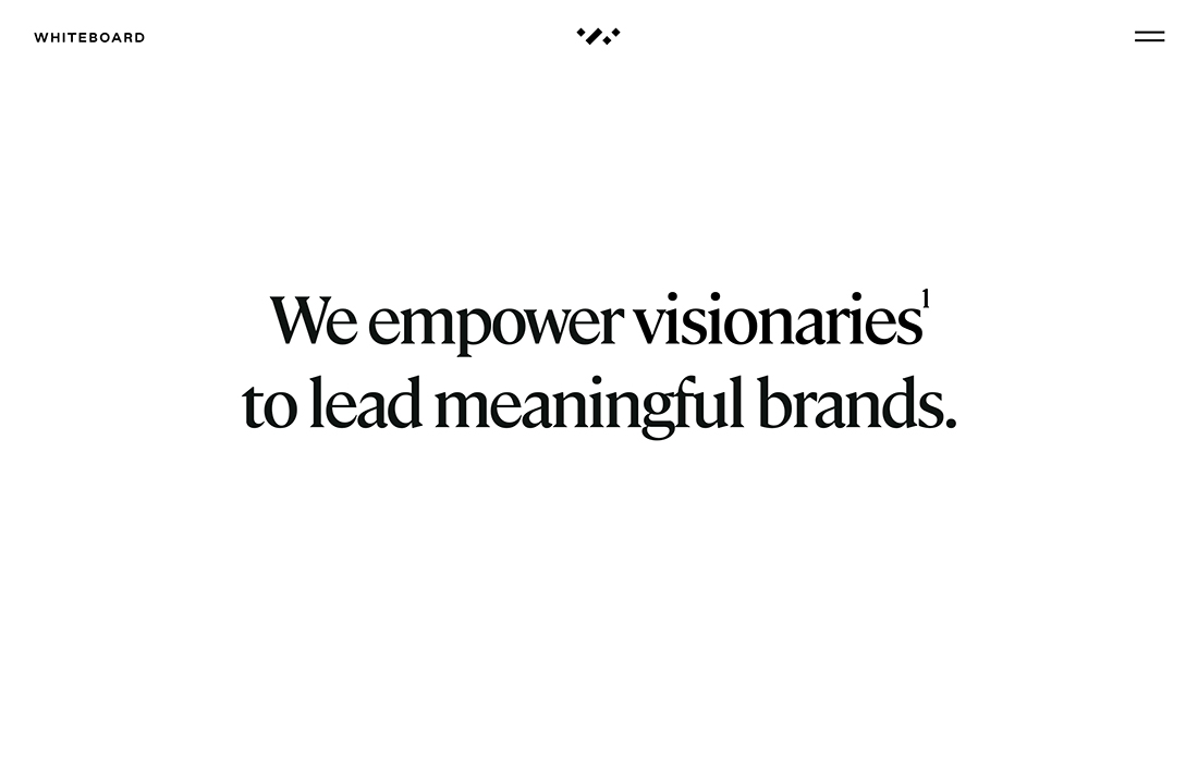
You don’t have to go as minimal as Whiteboard, but you have to admit the minimal design is striking and almost forces you to read every word on the screen.
Minimalism is a great tool for immediately conveying a message. This style provides an obvious focal point for what you are trying to communicate. The trick is to ensure that elements have enough interest to draw people in. Here, it is large typography in an interesting typeface.
Bold Color
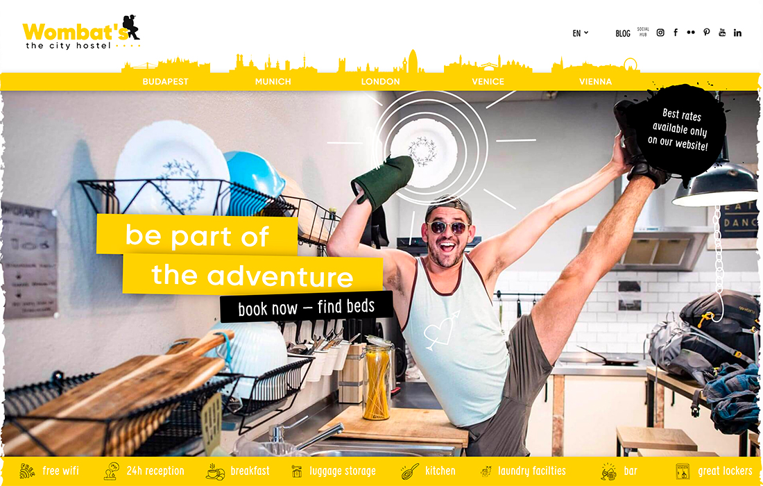
Gone are the plain neutral and gray websites of the past. Modern websites feature a bright, bold color. From the lemon yellow of Wombat’s (above) to great purples, greens, and pinks, almost nothing is off-limits when it comes to building a palette.
The trick? Pick a color and use it well. Don’t feel like you need to draw inspiration from the entire color spectrum.
Daring Typography
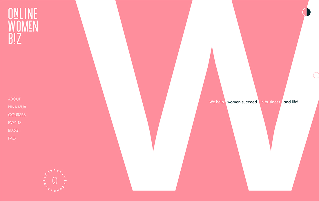
We are in a phase of daring typography in website design. You can already see designs that seem to break all the rules of type and still look amazing.
Online Women Biz is one of those designs. Start with the huge – and I mean ginormous – W that fills most of the screen. The logo uses a funky font with an upside-down letter. The scroll icon is encapsulated in an animated ring of text and there are multiple fonts and styles in use.
All of this is rule-breaking and it still looks great, is easy to understand, and has a vibe that just works.
Streamlined Navigation
Streamlined navigation provides a glimpse of the most important aspects of a website design. It should include the key or most-visited pages. It should not include every page on your website.
Nothing says “old website design” like a mega dropdown navigation menu.
Multiple Entry Points
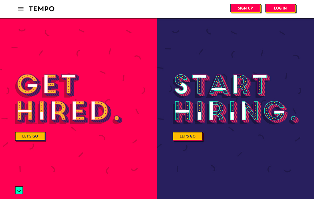
While it is often a best practice to give users a this or that choice with content, multiple entry points can be effective for some content types. We’ve seen a lot of this with split-screen designs, such as the one for Tempo (above).
Note the number of buttons on the homepage. Users get to pick their journey right from the start, and the entry points are each designed for a different person. It’s a good way to handle multiple target groups on a single page.
User Engagement
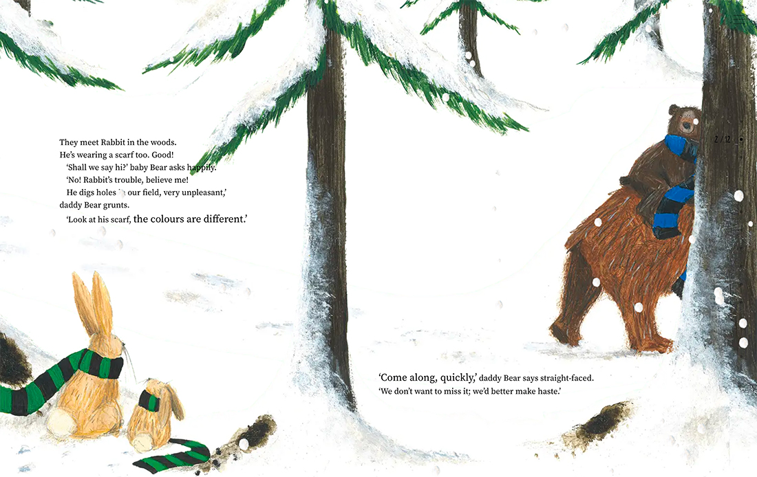
The Bear and His Scarf is an online storybook. The “pages” are designed like traditional book pages with large illustrations and a few words, but also contain animation and interactive elements to keep it interesting.
But it is more than that. This storybook is a fan page for a football (soccer) club in Belgium.
Purposeful White Space
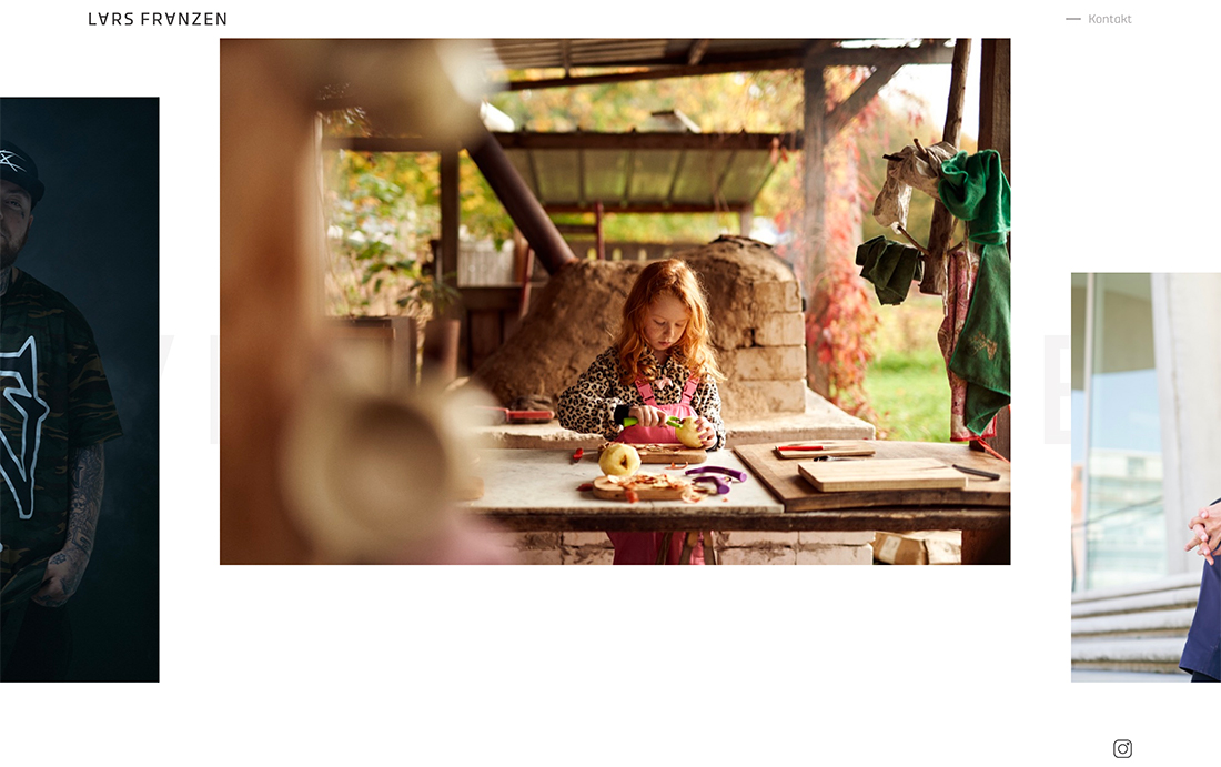
White space should serve a purpose in the design. Lars Franzen purposefully uses whitespace to move users through images in his portfolio.
White space helps frame images and draw the eye across the screen to other images. White space serves another purpose here as well – it’s a navigation tool that encourages side-to-side scrolling.
Actionable Microcopy
Microcopy elements should tell users exactly what happens next. The good news is that doesn’t have to be complicated.
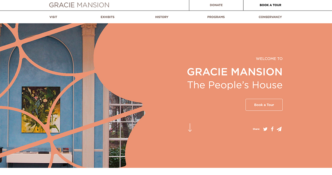
Use actionable phrases that provide a clear explanation, such as the button for Gracie Mansion (above): Book a Tour. It’s direct and provides clean instruction.
Huge Heroes
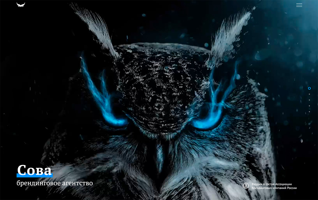
Bigger might be better in modern website design schemes. Larger-than-life hero image areas create a connection with users and draw them into the content.
Here, Owl Design uses a stunning bit of imagery with a bit of unexpected animation to draw you in. (It’s one of those images you could stare at for hours.)
Video (It Might Be Vertical)
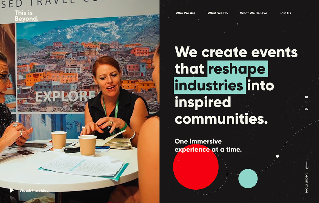
The orientation of video in website design is shifting 90 degrees. (You can thank mobile phones for that.)
From social media “stories” that live in a vertical space to how most users hold their phones to view content, a shift to vertical video is underway. That also applies to website design (although there’s still a lot of horizontal video out there).
Vertical video is exceptionally nice in a split-screen format, such as This is Beyond (above), because it looks great on desktop and mobile devices, where the split “screens” are stacked.
Zippy Load Speeds
The first thing someone will notice about your website is whether it loads quickly or not (mostly if it does not). Slow load times are a drag and will make users bounce quicker than anything else.
A modern website design has to look great and load fast.
Optimized for Search
One of the most important elements of a modern website design is one that you probably can’t see – it is optimized for search.
How else will users find it?
Layered Elements
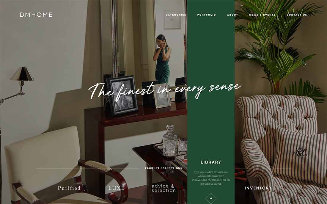
Layers create depth, and motion, and help guide users through the online journey. That’s why layered elements are such a critical part of design projects.
Here, DM Home uses layers as part of the main navigation. A colored bar extends through the image with a description in the hover state. (Make a point to click through, another unicorn in this design is that each color badly matches the accent colors in the accompanying photos.)
Sound
Sound is an increasingly popular modern design element. (Just make sure users can toggle it on and off.)
Audio experiences provide deeper meaning to content and enhance user interaction. The trick is that sound has to be sharp and purposeful if you want people to actually listen to it.
Gradients
Gradients are a trend that just keeps going … and evolving.
From big bold gradients, such as the one above, to subtle gradients in illustrations or text elements, this color trend continues to emerge. Part of the reason? It pulls from other popular elements and can help create depth and visual interest without overwhelming the rest of the design.
Interesting Hover Animations
Delight and surprise users with interesting hover animations. Subtle movement and motion are a shift away from fast-moving everything and provide a calmer, more focused user experience.
Further, these hover states can help direct users on how to interact and engage with content or provide just the right surprise that keeps them from leaving the design. (The text and icon on the example above bounce in an almost hypnotic way, matching the content of the design.)
Serious Storytelling
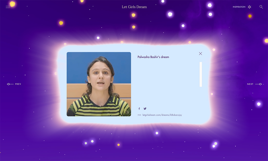
Let Girls Dream uses user-submitted content to tell stories of empowerment. The design is packed with interactive features, from text and video stories to places to upload your dreams and information. There’s also an animated video trailer that will warm your heart.
All of these elements pull users into the design with a great story.
Device Consistency
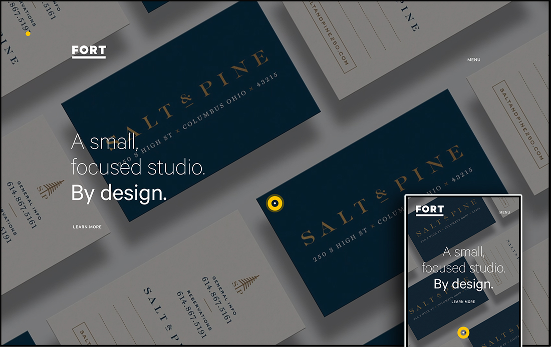
Modern websites are designed to work on multiple device types and sizes. Users expect consistency when they access the design from different devices at different times.
If you don’t create a consistent look and feel, you risk creating user confusion (and that can cause them to leave the website). Fort Studio does a great job with cool animated background panels and typography and placements that create a consistent user experience no matter how you visit the website.
Creative User Experiences
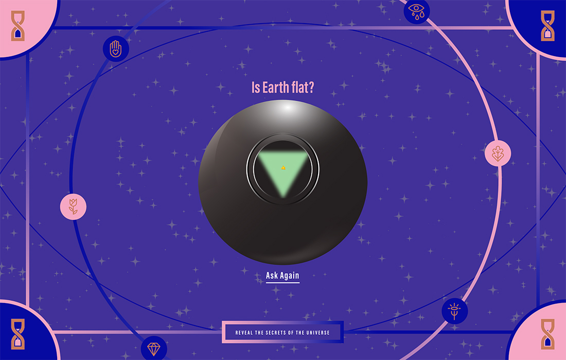
“Ask the AI Ball” builds on trends with something old (a magic 8 ball) and something new (AI) to create an experience that’s different from what you’d expect. If you want users to spend any amount of time with the design, it has to be creative and provide a worthwhile experience.
That magic formula can be tough to find, so think outside the box a bit.
Conclusion
You’ll know one of those circa 2008 websites when you land on them. That’s how not to do modern web design. The examples above all carry a common theme, and you may see many of the elements of modern web design cross over in them.
That common thread is simplicity which enhances usability. Website visitors probably won’t spend a lot of time on your website, so you need to make it visually engaging and easy to understand at a glance. That’s the essence of what modern design looks like today.