Find Design Inspiration for the Web… in Print
Design inspiration is everywhere. There’s nothing like subtle tactile elements that just make you want to drop everything and create something. This is true even for designers that only work on web or digital projects.
Replicating the look and feel of something real can provide stellar inspiration for projects. Just think of some of the ways real or printed design has impacted website design recently – material and 3D design styles have direct links.
Today, we’re going to look at things that can inspire you from print as you embark on your next web design project. (And maybe even teach you a few things about your web design projects.)
Posters
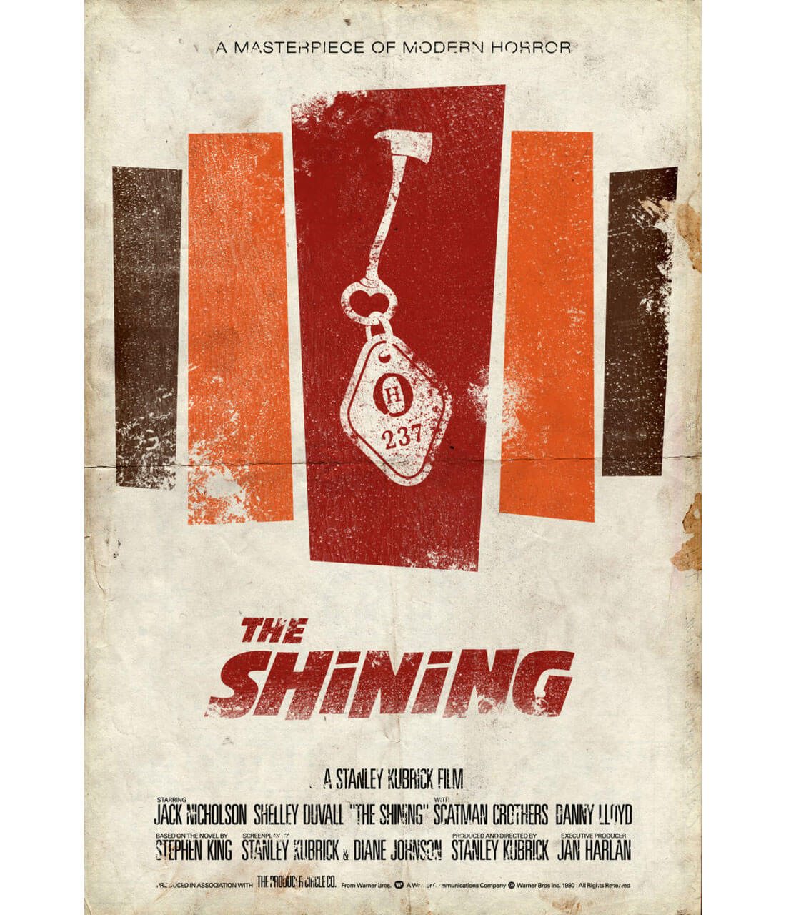
Poster design is an art in itself. You can almost see the evolution in design – and the technology used to create those designs – in different posters. From movies to sporting events, the styles, colors and typefaces used offer a glimpse into the past.
If you want to take on a retro project, posters are a great place to start. And images are easy to come by thanks to a Google search.
It’s not just old-school inspiration, such as the image above, that you’ll find. New style print posters can be just as inspiring. Stop and look at the designs next time you go to catch a movie. Think about all the information they cram in the space – there are a lot of egos to appease when it comes to names (and the size of names) in print – without it being too overwhelming.
Going to this type of design can help you think about a project that includes a lot of part of information when it comes to a website site map. Look at the organizational structure from a poster; you can use that very same hierarchy – big headline, dominant image, secondary text and footer information.
Letterpress
There’s nothing like running your fingers across the grooves and impressions on a great piece of stock that’s been stamped with a letterpress. Great paper and beautiful inks only add to the experience of handling a great design.
Because letterpress is a little on the pricey side when it comes to printing, you don’t see it as often. The technique is most commonly used for invitations, announcements and some business cards.
But when paired with a nice, simple design, it can be absolutely stunning.
When it comes to translating letterpress to the web, it’s a matter of establishing depth. It takes particular care in terms of shadows and embossing to add this element in a way that’s not overwhelmingly cheesy. Keep in mind that what you are trying to do is create something on the screen that users can imagine as a physical element.
Packaging
One of the coolest things about packing design is that it can be almost anything. Packing can take on the super simple, modern look that is associated with Apple products, or it can be full of complex imagery and lettering.
Either can inspire great design.
- The stark “Apple style” translates to the most minimal of frameworks. The website translation likely includes plenty of whitespace, elements with hard edges and simple lettering with as few words as possible.
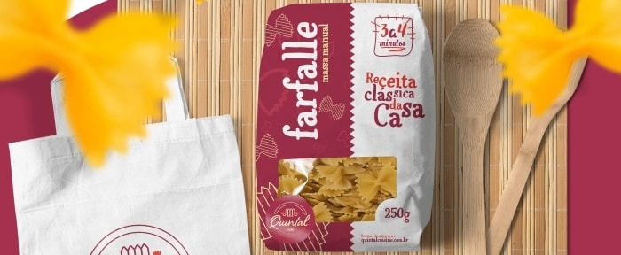
- Busy packaging design, such as the image above from the Design Shack Gallery, is a lesson in combining unexpected elements. Would you have envisioned these color choices for pasta packaging? The concept to take away is that you don’t have to do the expected. The design can be anything and do anything you want. Experiment with it. Have fun. Maybe even go a little crazy now and then.
Signage

There are signs everywhere. But do you ever really stop and think about why they are constructed in the way they are? Or why the lettering and design tends to fall into specific patterns?
Signage can be one of the greatest sources of learning when it comes to lettering and typography. An effective sign is easy to read. And more than that, it’s easy to read at a distance appropriate for the message. Letters have to contrast with the background. Words need to have perfect spacing so that the message is clear. Furthermore, that message needs to be succinct and readable at a glance.
How many of your projects do these concepts not apply to?
Pay attention to the signs around you, from the common green signs along highways – not without controversy over the typeface – to locators at business and other places you visit. Then apply a few quick and dirty rules to see if your lettering passes the test:
- Is it readable?
- Is the typeface simple and reliable? (This is particularly important on the web.)
- Do color choices create enough contrast? The highest contrast options include black on yellow, black on white, yellow on black, white on black and blue on white for exterior signs.
- Is the message or call to action simple?
- Simple imagery sells. Many common signs include simple logos that are identifiable even without words.
Magazines
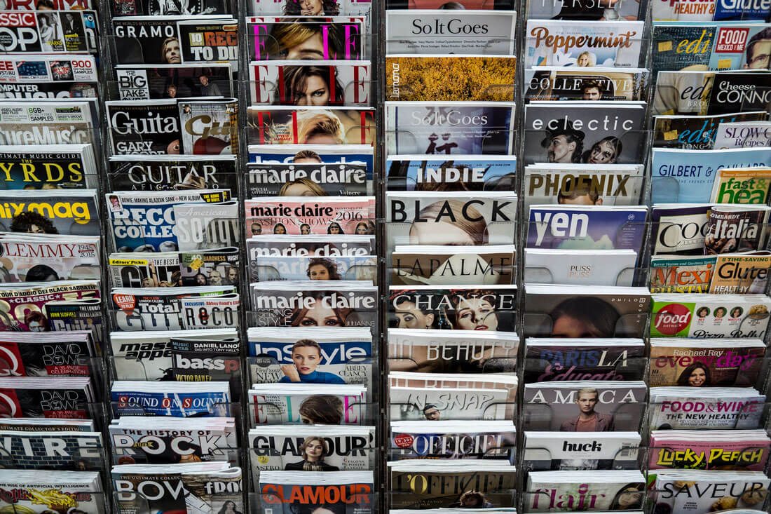
Nothing compares to the feeling of opening a magazine for the first time. There’s an element of anticipation to see the content inside. Whether you know what to expect from the design from an old favorite or you are examining something new, it is an experience unlike any other. Every page has something new to offer and there’s plenty of room to feel inspired.
From the actual content to print advertisements – which can be fun to look at as well – there’s usually at least one design takeaway inside the printed pages.
Some of the elements that are most usable in looking at a magazine and repurposing ideas for the web are the way small content blocks are used. Magazines are often packed with divots of information in tiny containers. This is something we talk about a lot in web design – how to use container elements effectively – and for design purposes, magazines can be a great place to start looking for ideas.
The other thing magazines do particularly well is entice you to go past the cover. Very few of us would ever think about designing a website homepage in the manner of a magazine cover, with so many elements and text and colors and images. But what if you could offer users that many entry points into the content? How would you design it?
Conclusion
One of the great things when it comes to thinking about print design and how it can be used for the web, is the idea of how people digest information. Many of those ideas don’t change because the design is printed versus digital.
Finding inspiration in a type of design that is different from the medium you typically work in can also help you extend your thought boundaries and open your mind to trying something a little different. So next time you find yourself stopped and looking at something, ask the question: How could I take this idea and use it in a website design project?
Image Sources: Joe Wolf, Greg Rodgers, Liz Jones and Phil Roeder.