8 Best Company Rebranding Designs & Examples
In order to stay relevant, many businesses have to reinvent themselves when the time comes. In recent years, we saw even some of the biggest brands making the tough decision to rebrand their identities completely.
Some were successful at rebranding while many failed miserably. Needless to say, it’s a risk you take when changing the face of a company, especially when it’s done for the wrong reasons.
In this post, we take a look at some of the best and successful rebranding stories with the main focus on rebranding designs. If you’re planning on rebranding your own business, you could learn a thing or two from these companies.
1. Siemens
Many big corporations are still following decades-old brand identity designs, even in a time of rapid digitalization of businesses. Which is why Siemens’ rebranding was quite refreshing to see.
Siemens is a corporation with over 170-year history. A company with that big of history knows when a rebranding is due. And that’s exactly what they did in 2018 with a complete brand identity redesign.
Before Rebrand
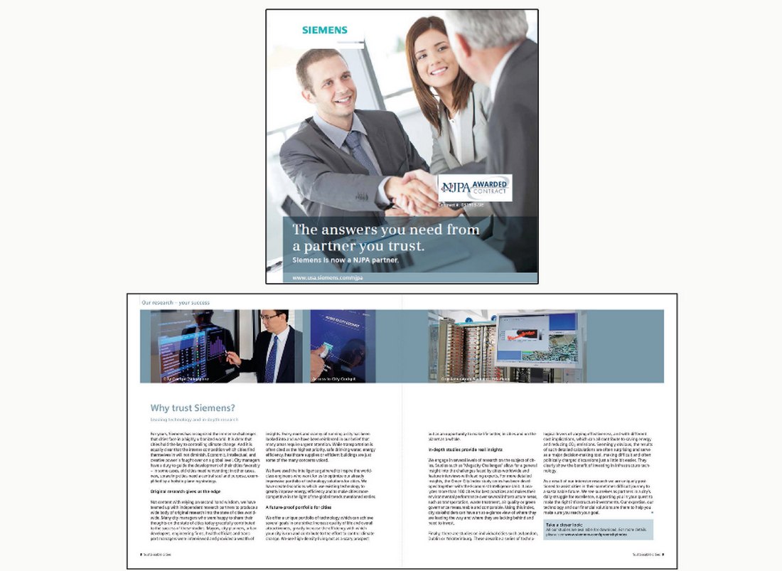
Siemens used a very traditional corporate design for its brand identity. From its logo design to print materials and office designs used classic designs that you usually see in corporate documents from the 80s. It was time for the brand to adopt new design styles and trends.
After Rebrand
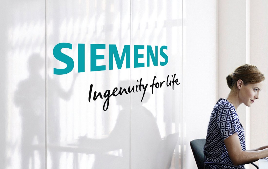
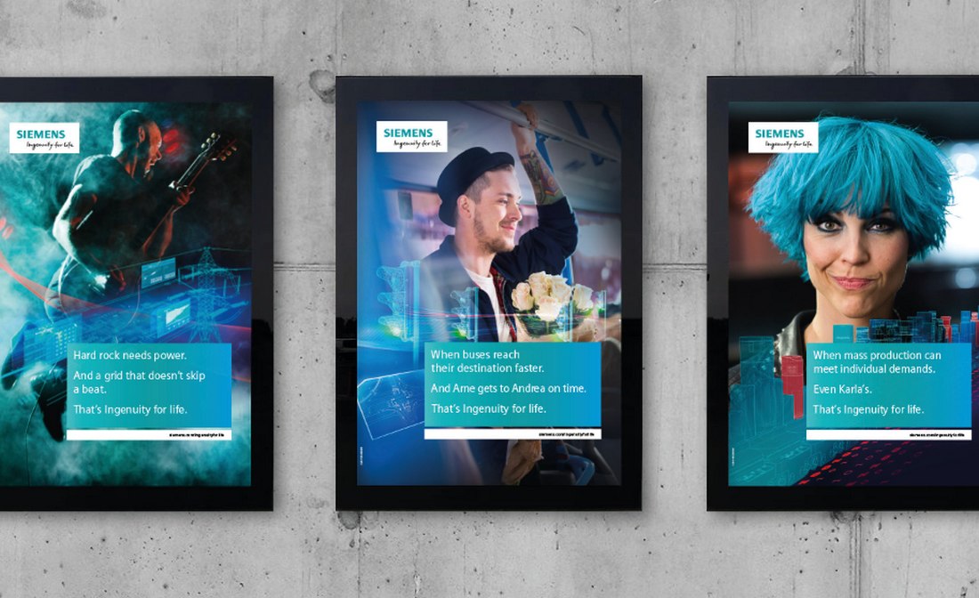
The enterprise rebrand of Siemens involved an overhaul of almost all aspects of its brand identity. Including the logo, website, print publications, posters, and even its brand sounds.
2. Uber
It took multiple tries for Uber to find its ideal brand identity. In fact, it actually rebranded twice within three years, including several redesigns of its logo. Eventually, Uber found the right design for the brand.
Uber went from being a cab-hailing app to so much more. It’s now a service that covers everything from food deliveries to large transports. A rebranding was necessary to unite all these sub-sections in over 660 cities under one roof.
Before Rebrand
Uber struggled with its logo design more than any other aspect of the brand design. They tried several different logos as well as app icons over the years. But, a complete rebranding was necessary to find the right brand identity.
After Rebrand
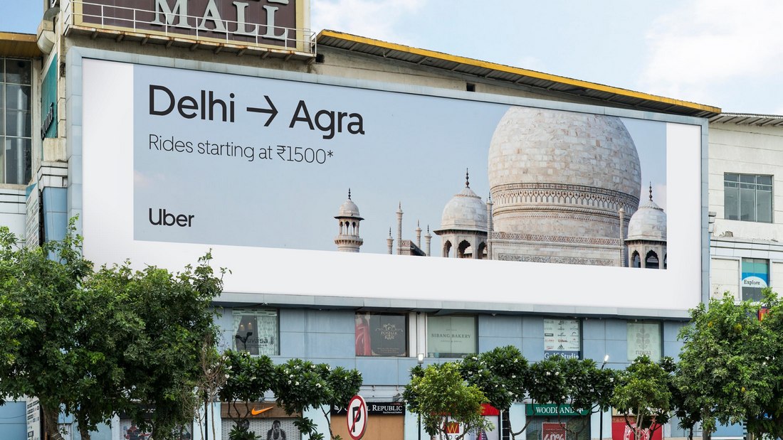
Uber rebranding involved re-designing every aspect of its brand identity. The company even designed its own font, with support for over 13 different languages, so that the designs can look consistent across all platforms and countries.
3. Dunkin’
Dunkin’ Donuts is another big company with a history that goes back to the 1950s. It surprised everyone when the company announced a rebrand. And it was a bit of a weird one.
Dunkin’ Donuts announced its rebrand in 2018 by renaming the company to just Dunkin’. It was done mainly to stay relevant and in an attempt to compete with other brands like Starbucks.
Before Rebrand
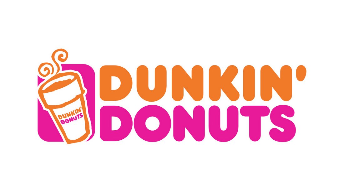
Dunkin’ Donuts was a well-known brand and everyone knew what they can get from its chain of shops. But the company wanted to be known for more than just donuts. And the rebrand was introduced to cover other categories of the business, with a special emphasis on serving coffee.
After Rebrand
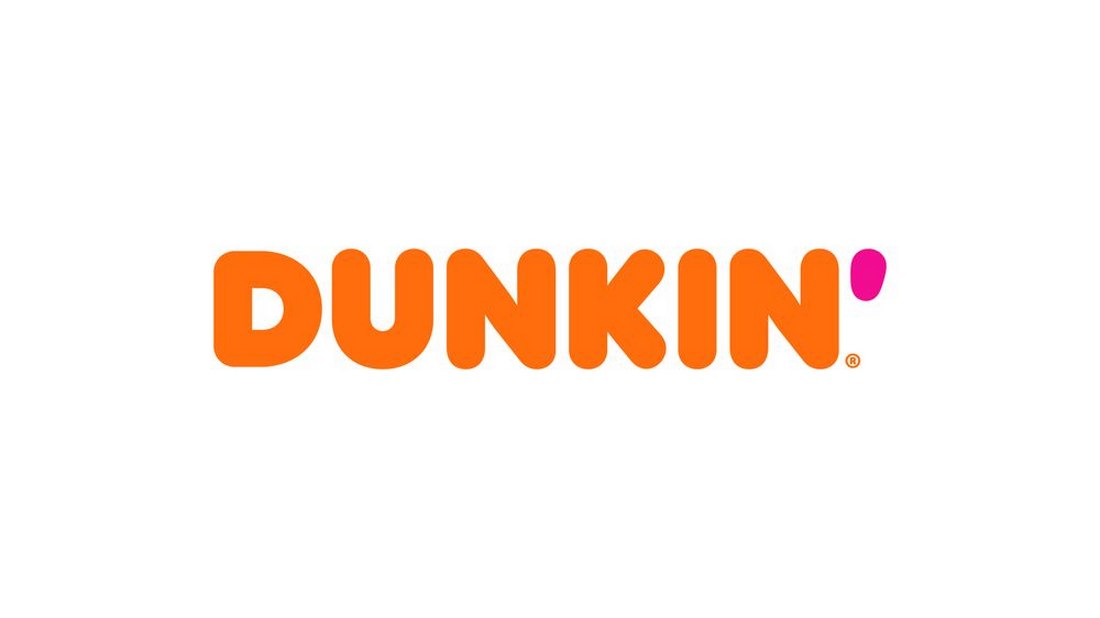
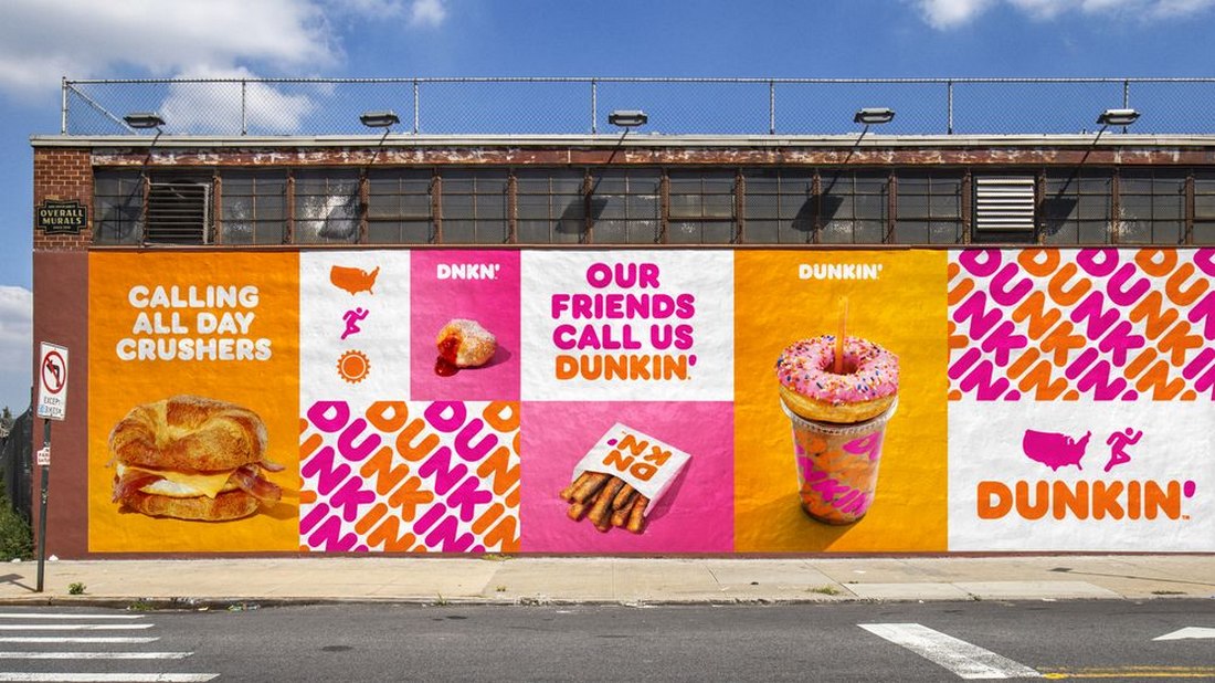
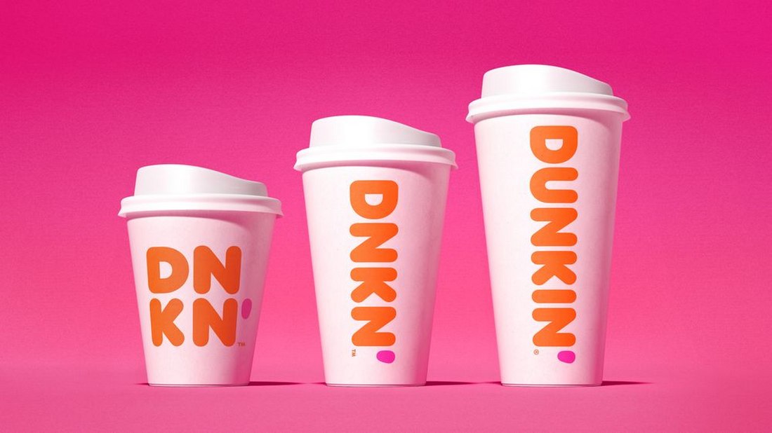
Dunkin’ rebranding involved refreshing all of its logos, packaging, advertising, and even remodeling the store designs. The company also made a fun new advert to promote the rebrand with a tagline that says “Just Call Us Dunkin’”.
4. Coty
Coty rebranding is a great example of how cultural movements affect brands and businesses. Even as a well-known brand in the beauty industry, Coty made a bold move to challenge the way beauty is defined in the modern world with a fresh rebrand.
The main goal of Coty’s rebrand is to celebrate and to represent beauty in a more diverse way. Or in their own words “to celebrate and liberate the diversity of beauty”.
Before Rebrand
Coty had established itself as a luxury brand in the beauty industry. Their logo was a clear sign of that statement. But the times have changed and audiences now look for more meaning in brands than statements. That paved the way for the Coty rebrand.
After Rebrand
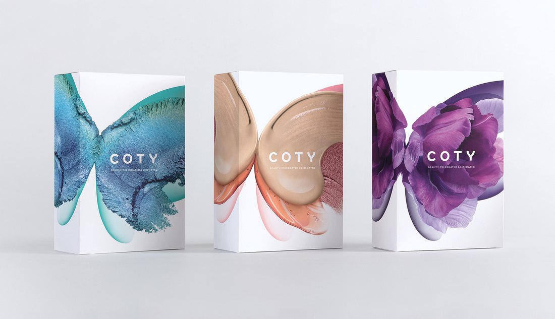
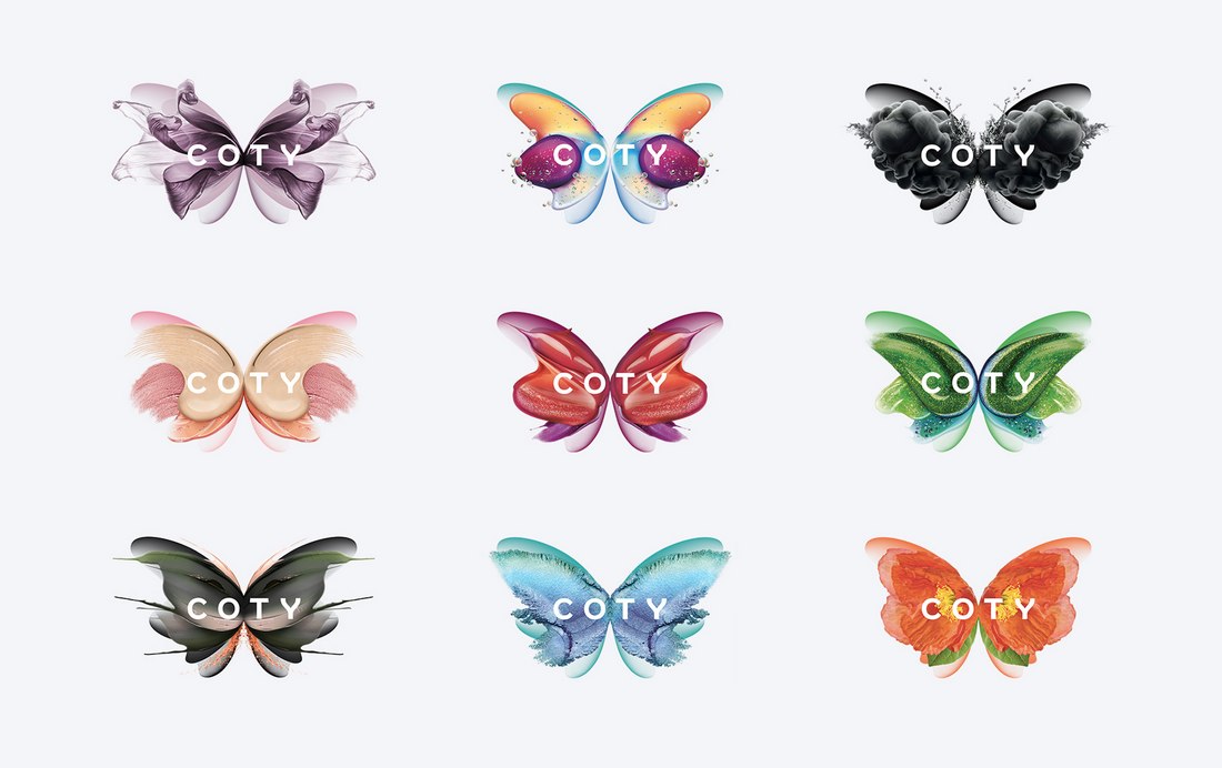
Coty took a very colorful approach in its rebranding process. Especially with its brand symbol and product labels diversity was clearly and proudly represented. And it helped attract new audiences to the brand.
5. Mailchimp
MailChimp is a well-known name in email marketing. Whenever you saw its adorable mascot you knew it’s MailChimp. However, the company is now more than just a platform for email marketing. It’s now a complete marketing platform for small businesses.
As a result, MailChimp introduced a rebranded identity, which featured many different changes with a more serious approach to how the brand is represented. They even changed the lettering of its logo from “MailChimp” to “Mailchimp”.
Before Rebrand
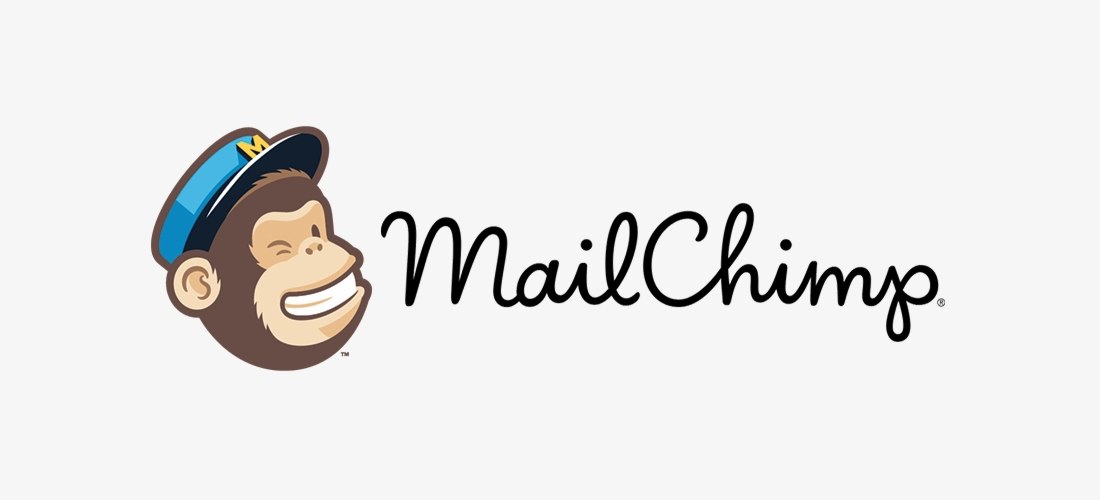
MailChimp used a fun and friendly approach to promoting the brand. The mascot monkey was used everywhere. But, with the improvements in the product features and the shift in target audiences, the company wanted people to take them more seriously.
After Rebrand
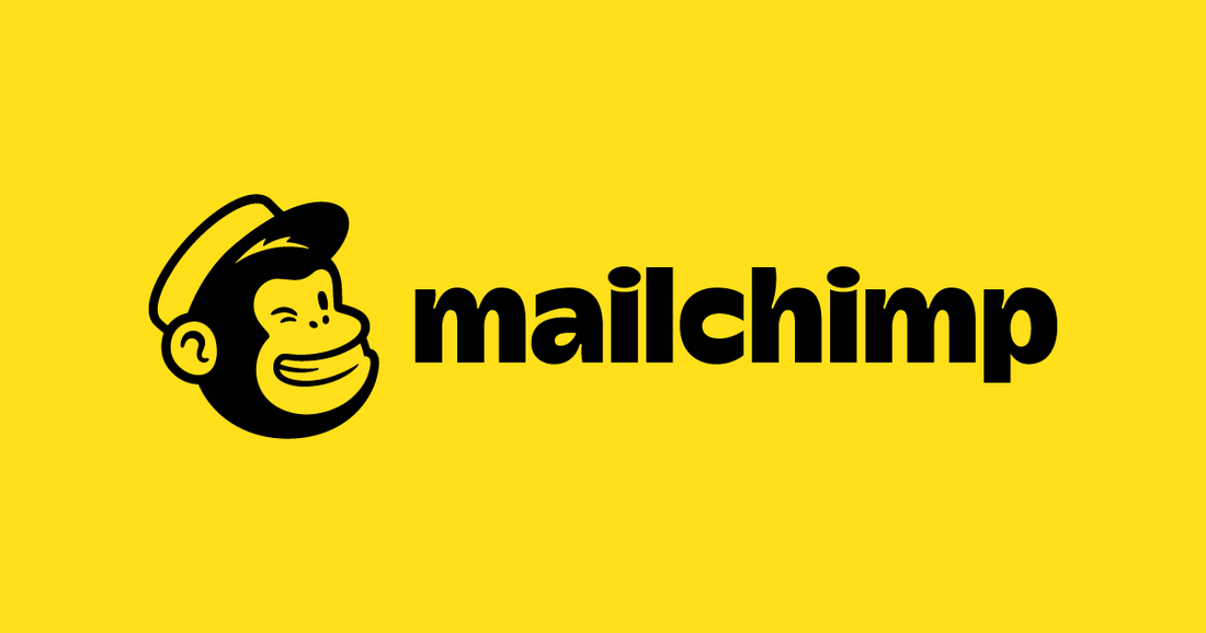
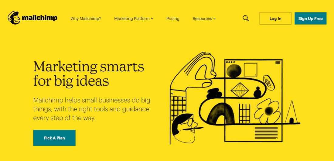
The rebranded Mailchimp uses an entirely new color palette with a new font, logo, wordmark, and a new approach to visuals by using hand-drawn illustrations. This new brand identity gave Mailchimp a bold yet more creative look.
6. Australian Energy Foundation
A shift in a business’s strategic approach is usually the best time for a rebrand. Australian Energy Foundation’s rebrand is a great example to prove that.
Australian Energy Foundation (previously Moreland Energy Foundation) has spent years serving its local communities. Now the company is ready to take on the world. This meant it’s time for a rebrand, including a new brand name.
Before Rebrand
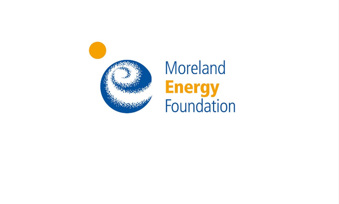
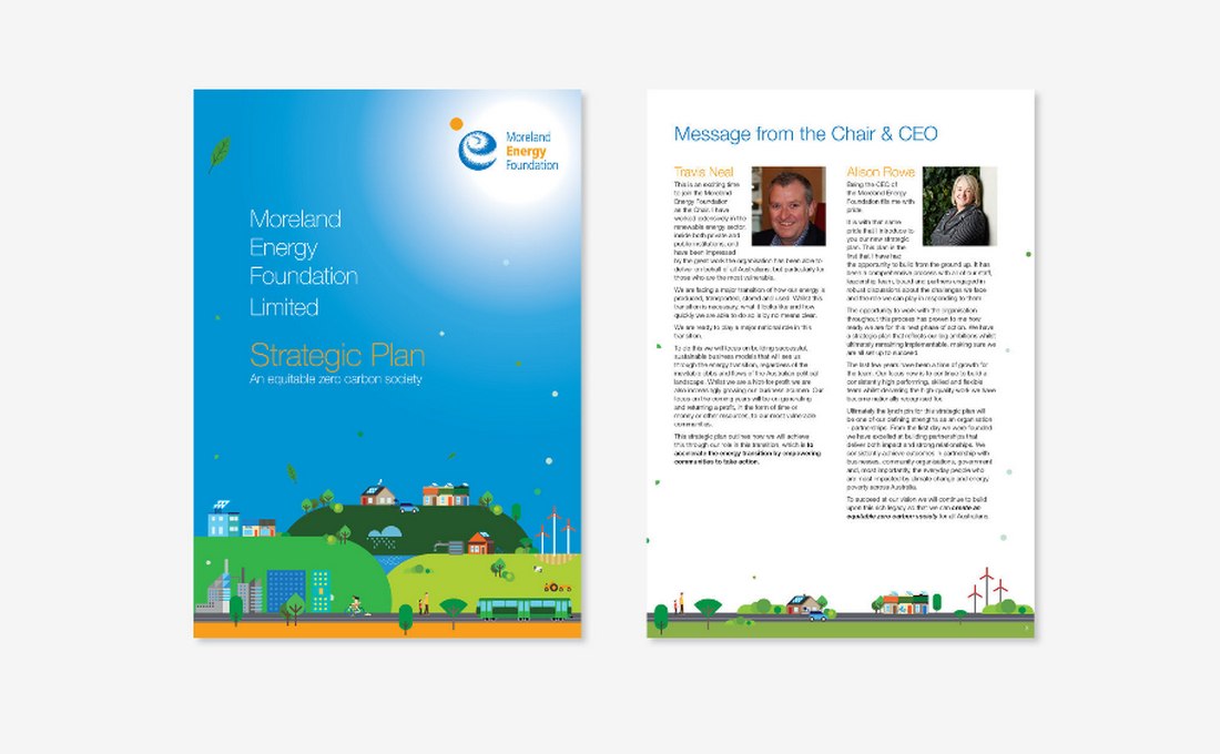
At the time, their brand identity was suitable for its purpose. That is to serve local audiences. But with the new approaches in business strategy and with the ambition to serve global audiences, the brand needed to have a more unifying design.
After Rebrand
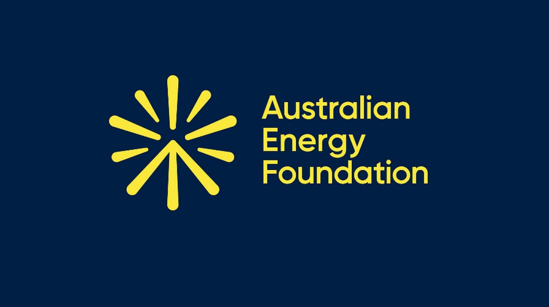
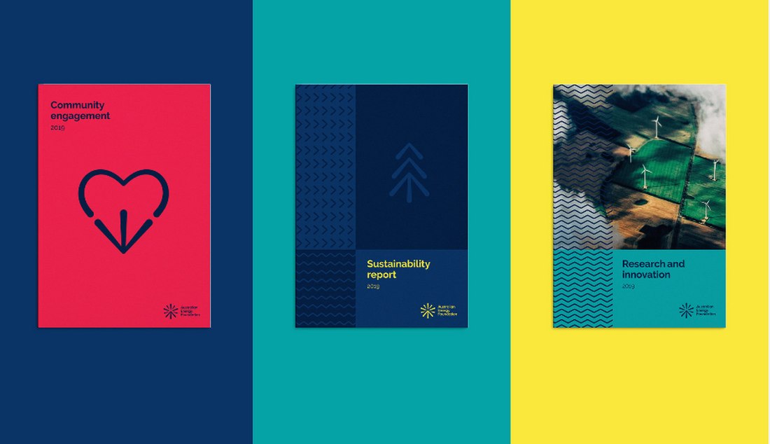
Australian Energy Foundation rebrand involved changing everything from its name to the logo, print publication designs, symbols, posters, and everything in between. The rebrand was a success and it was awarded the best rebrand of 2020 by Rebrand.com.
7. C-SPAN
While celebrating its 40th anniversary, C-SPAN introduced its new rebranded identity. The rebranded design adopted many modern design styles and trends to make the brand more relevant.
C-SPAN is one of the oldest cable news outlets in the US. With the rising digital streaming services, social media, and more competitive channels, the brand wanted to redesign its visual identity to keep its iconic status.
Before Rebrand
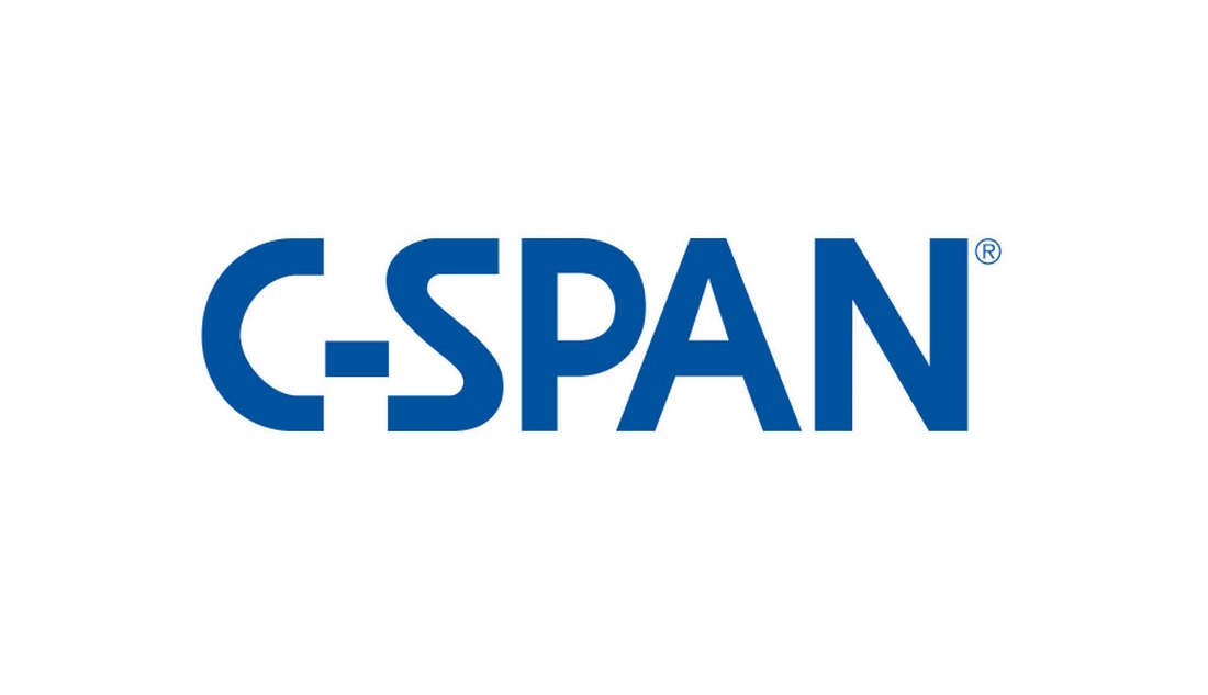
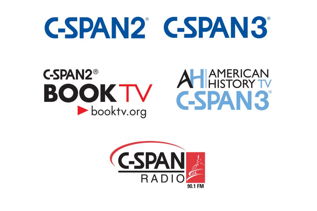
The old C-SPAN branding wasn’t entirely outdated, especially for a cable news network. Although a refreshed look for the brand was necessary to make the channels more attractive to new audiences. As well as to stablish their brand for the future.
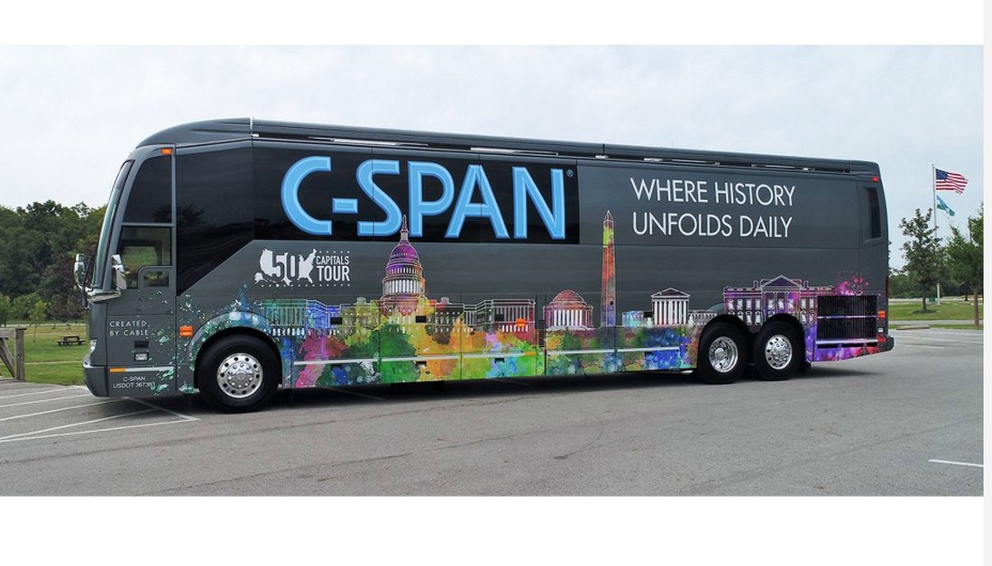
After Rebrand
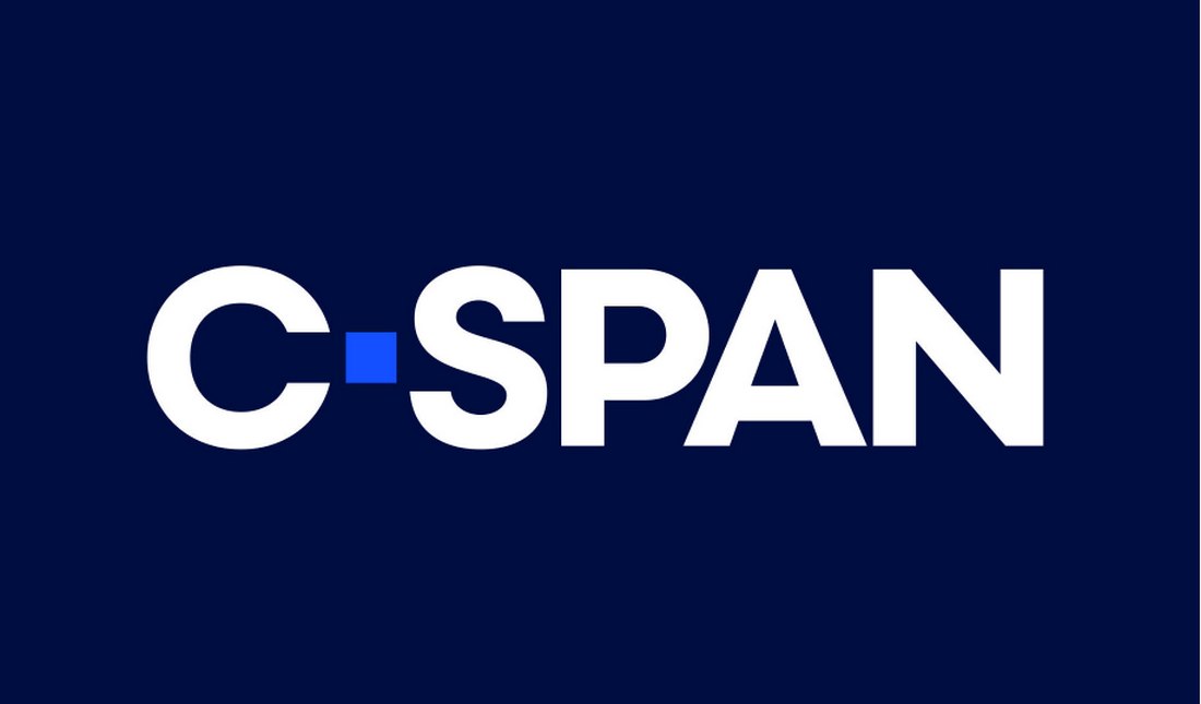
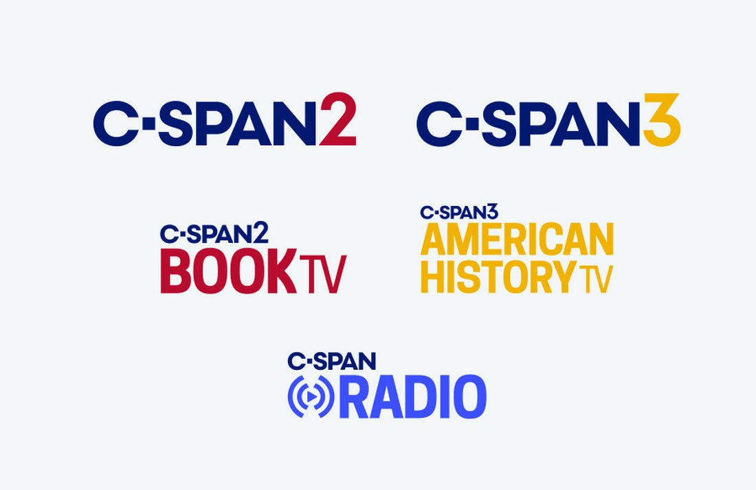
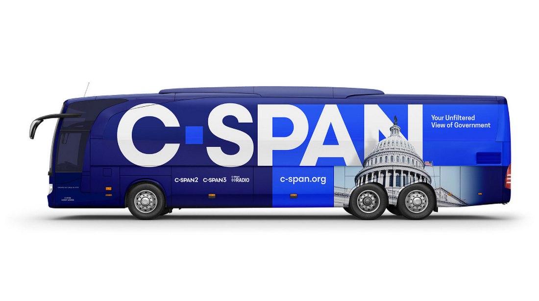
The rebranded C-SPAN included a new logo design with a cleaner typeface. As well as redesigns for its other branches, print media, and even a new design for its transport bus wrap.
8. Dropbox
Dropbox managed to establish its brand long before cloud storages were popular. The startup had quite a success as a personal cloud storage service. Now, they wants to be more than that.
Dropbox introduced a new rebranded visual identity as part of its strategic shift in growth and target audience. Simply put, the company wanted to go from “syncing files to syncing teams”.
Before Rebrand

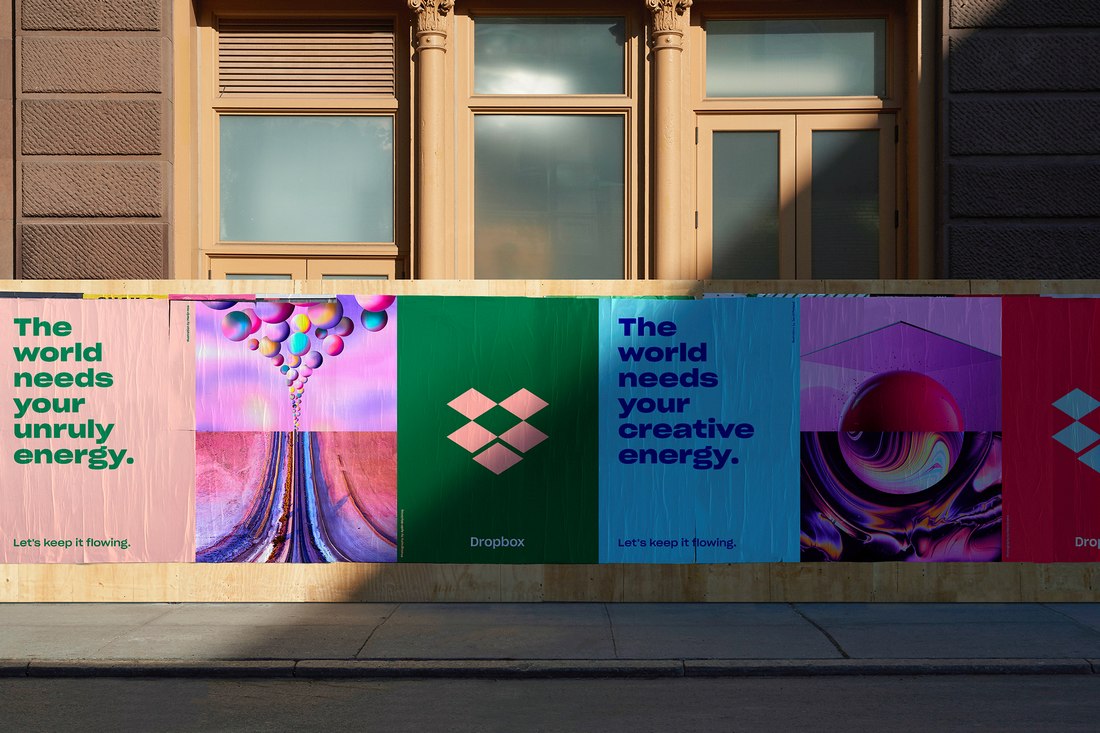
Dropbox used a strict color palette across its visual designs. The color blue was the main attraction. The redesign introduced new colors to the palette, mainly to represent diversity.
After Rebrand
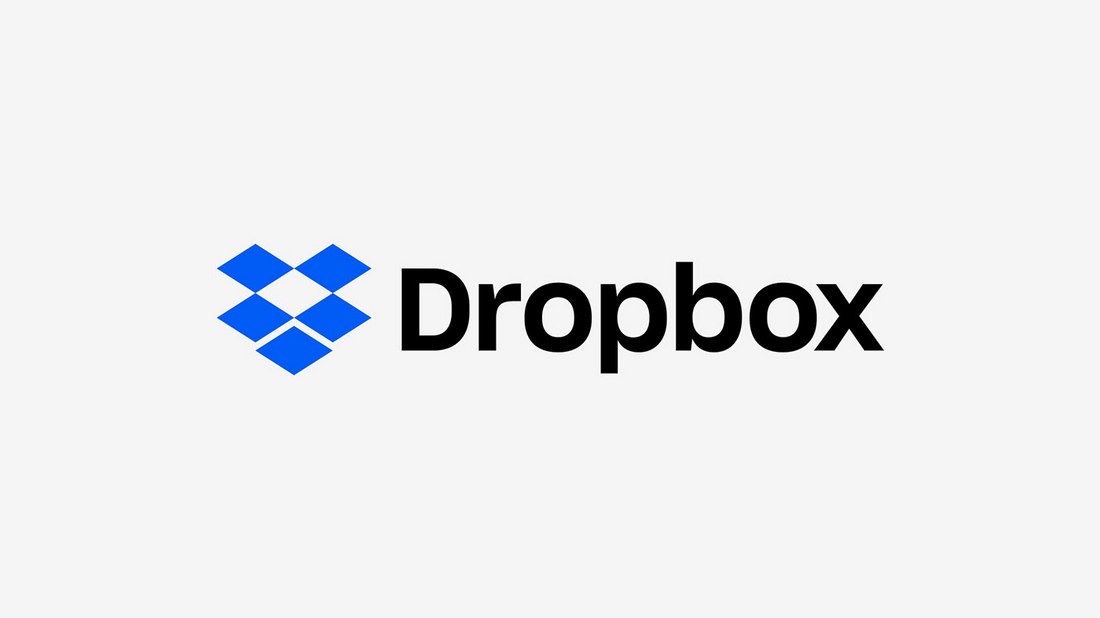
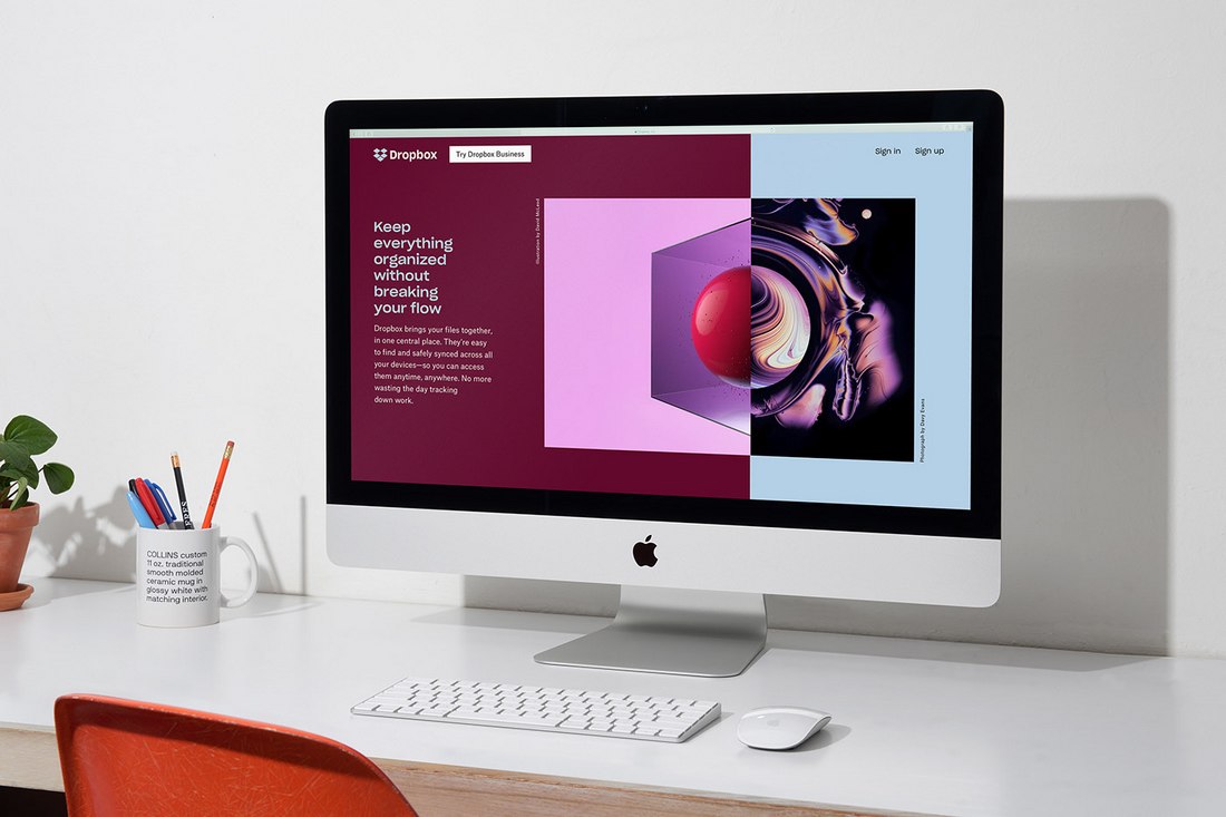
Dropbox has an iconic logo that’s recognized by people around the world. Thankfully, even with a rebrand, the logo symbol remained unchanged. Except with a slight improvement to the symbol and the typeface.
However, the rest of the redesign featured a more colorful approach with weird visuals and animations. That was exactly what the Dropbox had in mind for the rebrand— To celebrate the strange moments of the creative process.
Conclusion
Some new startups go through different rebranding phases as a habit and a way of generating publicity. It’s a mistake that you should always avoid.
Next time, when you’re working on brand identity or even a rebrand, make sure that you make the right decisions. Take inspiration from our best brand identity design example.