Trendy Design: Making Emerald Work for You
Emerald is picking up plenty of buzz this year. The green-blue hue works well in design projects, from backgrounds, to the base color in a palette, to serving as an accent. The color is gaining even more popularity in 2013 because of its designation as Pantone Color of the Year.
Not only are web and print designers jumping on the trend but so are designers in the fashion, beauty and home décor industries. Why? Because Emerald has an almost universal appeal. Here are some ways to make it work for you.
Defining Emerald
The color and term emerald comes from a gemstone of the same name and hue. (The gemstone is a variety of beryl, a mineral, and contains trace amounts of chromium to make it green.)
The basis for emerald — despite the hue, saturation or tone — is green. The name even originates from the Greek “smaragdos” and Latin “smaragdus,” which mean green. The range of emerald as a color can vary widely from a yellow-green hue to a more blue-green one. The blue-green color is the most popular and the basis for Pantone’s color of the year.
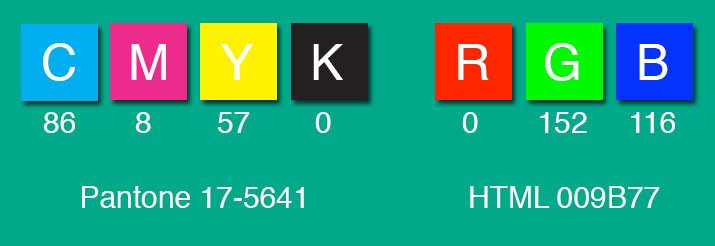
As Pantone’s color of the year, the hue of emerald is much more specific – Emerald 17-5641. This color is of the more bluish-green variety and has a rich, lush color. This shade works well in a variety of applications and easily pairs with other colors.
“The most abundant hue in nature, the human eye sees more green than any other color in the spectrum,” said Leatrice Eiseman, executive director of the Pantone Color Institute, when the color of the year was announced. “Symbolically, Emerald brings a sense of clarity, renewal and rejuvenation, which is so important in today’s complex world. This powerful and universally-appealing tone translates easily to both fashion and home interiors.”
Color Meanings and Associations


Green is one of those colors that it seems that everyone likes. It is a favorite color among both men and women, second only to blue. But why is it so popular? The likely answer is because greens are common. Greens are a dominant color in nature and we are used to seeing it.
On a world scale, green has overwhelmingly favorable associations, making it a color that is less likely to offend clients in other countries. Associations include youth (Japan), fertility (China), luck (Western cultures) and paradise (Islam). The caveat is in South America, where green is the color of death.
Greens, including emerald, have a variety of emotional associations: soothing, relaxing, harmony, calmness and natural. Green is also represents stability, tranquility, healing, balance and affluence.
Add in some of the color meaning linked to blue hues – trust, peace, conservative, loyal – and you get a color that is almost universally-appealing.
All of these attributes make green a good choice for design projects. Use greens with neutrals as a burst of color to contrast with the lack thereof; pair it with other adjacent and bold, hues on the color wheel (yellows and blues) to create a fun, colorful palette; or use emerald with muted tones, such as reds, blues or grays, to create a sense of calm and serenity.
Emerald as a Dominant Color


As a dominant hue, emerald is most often used in a few very distinct ways – to represent nature or money. Unsurprisingly, the color is a popular choice for environmental marketing and branding (think of all the “green” initiatives out there).
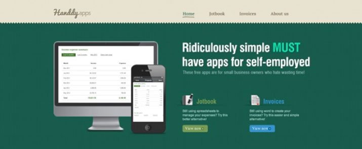
But it can also be used in other ways as well. Green is a popular choice to use as the background of a website – and it works both in more- and less-saturated applications because the color does pair so well with other colors.
Emerald, in the bluish-green hue, as showcased by Pantone, is super-striking when it stands alone. The color, even without flair or flourish, is enough to make you stop and look. The simple Foundora and Henderickson-Maler designs are a perfect look at the color without flashiness.
Green on green design schemes are also quite trendy. By using a dark green background with lighter, brighter accents (or vice versa), designers can create a visually appealing concept monotonally.
Emerald as an Accent Color

Green can be a great color to use for calls to action. “Green means go.” Think of how the color is used as a symbol of progress – from getting the green light at a traffic stop to the arrows in the symbol to recycle.
Use it in the same way when it comes to design. As an accent color, emerald is a great choice for a button that needs to be clicked, from a place to subscribe to making a purchase.
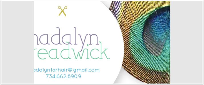
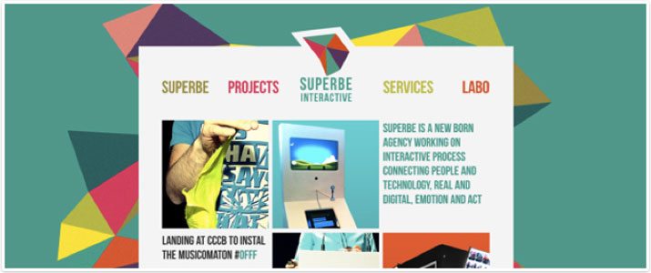
Some emerald hues can also work well for text because of their deep and defined color. The peacock business card design above is an example of a great pairing of emerald as an accent color in the image and for text. The Superbe design also does the same thing but with even more impact, using emerald as an accent color for text and in the background.
Green is also a great choice when it comes to both dark and light color schemes. Pairing green accents with a light background can create a sense of energy and hopefulness; pairing with a dark scheme can feel natural and creative.
Famously Emerald
Emerald was a color used by some highly recognizable companies and as a pop culture reference long before it earned color of the year status:
- “The Wizard of Oz:” Dorothy makes her trek to the Emerald City in hopes of returning home.
- Emerald Nuts: The maker of canned nuts is famous for its colored container.
- The Daily Emerald: Not only is Emerald in the name of the student newspaper at the University of Oregon, but the color is used for headlines on the website.
- The Emerald Isle: The phrase is a common reference to Ireland, which is often symbolized by the color.
- Starbucks: Likely the most well-known coffee logo in the world features a green-emerald hue.
- Groupon: The popular daily deal website uses green as a way to connect with money.
Conclusion
Emerald was a beautiful selection as Pantone’s color of the year. The choice is significant because it highlights a shade that is commonly used, encouraging designers to learn more about it.
When it comes to design, greens are a great choice because of their universal appeal and positive associations. Consider adding a touch of green to your next project and make sure to look through the Design Shack gallery for inspiration (we’ve already grouped the emerald ideas together for you).
Image Sources: Handdy, Goodworksmedia, Easily Amused, Octwelve and Postscript5.