Use Abstract Geometry to Create Stunning Designs
If you’ve ever found yourself in a design rut, wondering how to come up with some fresh ideas, then you’ve no doubt experienced how refreshing it can be to experiment with a new design style that’s completely outside of what you typically produce.
Today we’re going to do exactly that. I’ve been fascinated with a particular style lately and just itching to give it a test drive. We’ll start by analyzing this style’s characteristics through the work of others and then proceed to building something on our own using what we learn. Read on to see the step by step process.
Step One
Image source: Gilberto Taccari
How do you start a design project? You’re looking at a blank canvas and it’s time to put something on it, so what’s the first step? I suppose that just about every designer approaches this challenge uniquely. Some grab a pencil and start sketching what comes to mind, others prefer to start with a typeface and let that speak to them. As a photographer, I often look to great photos as a leaping off point for an overall aesthetic and color scheme. Give me a great photo and I can build a great page around it.
It’s good to have routines that get you off to a fast start and help you develop a unique style, but I personally find that falling into too much of a routine leaves me in a design rut where everything starts to look the same.
If you have encountered similar problems, I can’t recommend enough that you try to put yourself in the mindset of other designers by attempting to mimic their thought processes while ultimately achieving a unique result. Perhaps you always start a job by opening up Photoshop, so to mix things up you might try launching a drawing application on your iPad and picking up a good stylus.
Experimenting With Different Styles
This idea carries over to the entire design process. Experimenting with different beginning points will lead you off into new directions and have you coming up with ideas that are completely outside of the realm of your typical design style.
I often make it a practice to closely observe and analyze different design styles and then experiment with them to stretch my talents and experience.
Shapes Aplenty
In order to achieve the goals outlined above, we’re going to explore a particular type of design that has really been catching my attention lately. It’s not new and in fact has an almost late 70s early 80s appeal, yet it carries with it a timeless, simple aesthetic that I think looks great in a variety of contexts.
Specifically, I’m talking about the school of design that makes heavy use of strong, often random geometric shapes as a primary design feature. Sure, shapes are present in all design, but this style uses them boldly and simply. Here’s a fairly archetypal example from Squat Design.
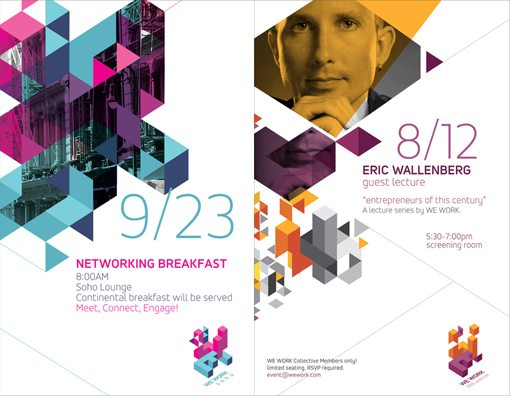
Image source: Squat Design
In looking at this design, one of the first things that I notice is that the entire concept is heavily driven by diagonal lines. We typically tend to use straight lines to define our content so this instantly causes the viewer to see this as something unique and interesting.
Also notice two more interesting features. First, the photography used has been integrated in with the shapes rather than merely appearing alongside them. Further, color and transparency are two more main themes that drive this style.
Here’s another example of something from this style by Sawdust, a design firm in the UK.
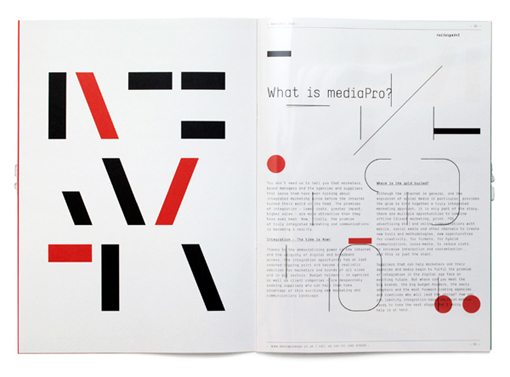
Image source: Sawdust
Once again we see a lot of random shapes being used to add visual interest, heavily driven by the implementation of diagonal lines. I’m also starting to notice a trend in the use of fairly thin typography, which complements the emphasis on simple, clean lines.
This design as well as the next one have introduced some circles into the mix as well, which really stand out among all of those hard angles that you see elsewhere throughout the page.
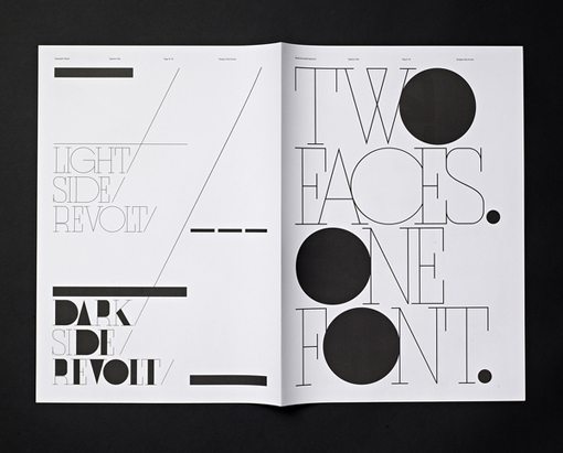
Image source: Ryan Atkinsons & Stephan de lange
Let’s Try It!
Now that we’ve seen a few examples of what this type of design looks like, let’s give it a quick shot to see what we can come up with. Exercises like this are perfect for working out your design muscles. Try setting a time limit, say twenty minutes or so, and then experimenting with a new style within that constricted time frame to see what you come up with.
In an attempt to intentionally stray from my typical design process, I decided to start out by just grabbing some shapes to play around with in Adobe Illustrator. Given that the design style that we’re going for gives such prominence to triangles, I thought I’d start there.
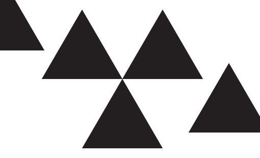
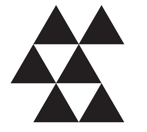
After moving things around for a while, I came up with a sort of tessellation pattern that I thought looked interesting.
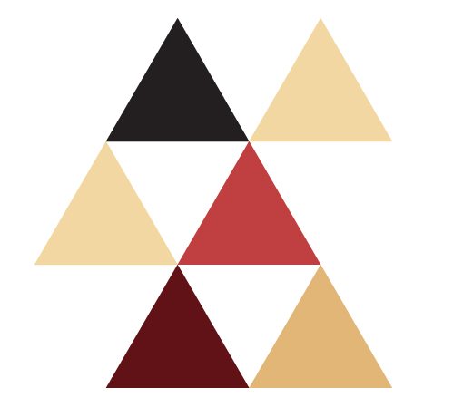
From here, I decided that it was time to add in some color to give those boring black triangles some character. I jumped over to Kuler and literally just grabbed the first color scheme that I saw.

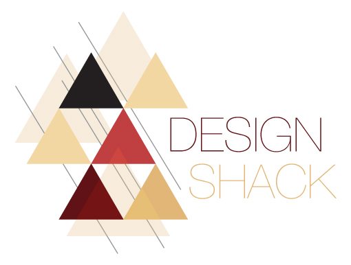
Applying this color scheme to my triangles really bumped up the aesthetic nicely:
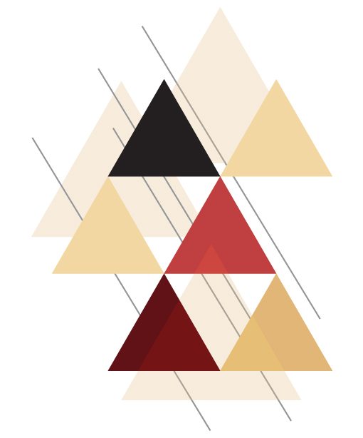
Continuing to follow my observations from above, I added some more triangles, this time with transparency effects and then tossed in some freestanding diagonal lines, which gave the entire thing a sense of motion. By now, the result was really taking on a complex, layered feel that I just loved.
Next I decided to toss in some text. A super light version of Helvetica seemed like a good fit given that thin typography pairs so well with this design style. Notice how I staggered the text to mirror the slant of the triangles. Little uses of repetition really make a design great.
Finishing Touches
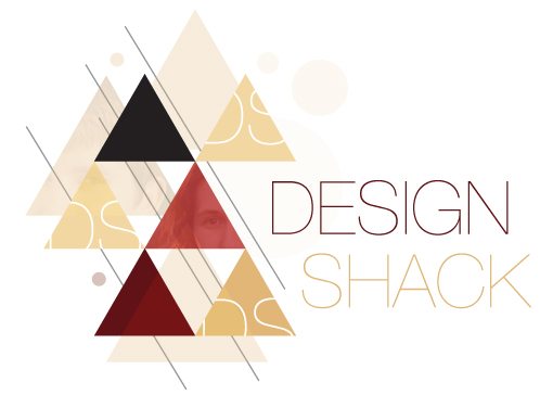
From here I just kept adding and iterating until I landed on something that I thought looked complete. As you can see, I experimented with some photography and added in a few circles like we saw the other designers doing. To make the triangles a little more interesting I masked in the initials of the site.
Ultimately, as a quick experiment, I was thrilled with the way it turned out. I had been wanting to play around with an abstract geometric design style for a long time and it turned out to be every bit as mentally fulfilling as I had hoped.
Download the Desktop!
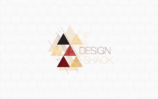
Since I had a cool design and nothing to do with it, I decided to slap it on a desktop wallpaper for your downloading pleasure. Enjoy!
Download: Click here to download.
Have You Seen This Style Elsewhere?
Now that you’ve seen my analysis of the abstract geometric design style, I’d love to hear your thoughts. Do you think this is an interesting aesthetic theme? How would you have used it differently?
If you’ve seen any similar examples lately, leave a link below so that we can check them out!