10 Expert Tips for Designing a One Page Portfolio
Once upon a time, designers would lug unwieldy physical portfolios from interview to interview to showcase their work. This tactic is steadily being replaced with sending out emails containing links to an online portfolio. A portfolio website is becoming an essential marketing tool for every designer and can be the single biggest impression upon which you will be judged and hopefully, hired.
This article contains several tips and examples to help you create an amazing single page portfolio.
Pictures Speak Louder than Words
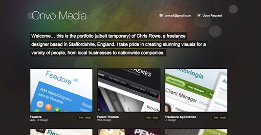
Unless you want to showcase your copywriting skills, focus more on showing off your work than conveying your life history. Displaying only one or two designs can leave potential clients wondering how much experience you really have. Feel free to pull out all the stops and display everything you’re proud of creating.
Use Social Media To Encourage Personal Contact
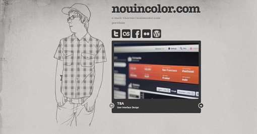
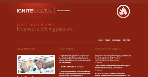
Giving social media links prime real estate on your page encourages visitors to make lasting connections with you. This can have several benefits. First, repeated contact builds familiarity and makes you more approachable if the person ever finds themselves in need of a designer. It also have the viral effect of granting you visibility to their other friends and professional connections.
Contrast Is Your Friend
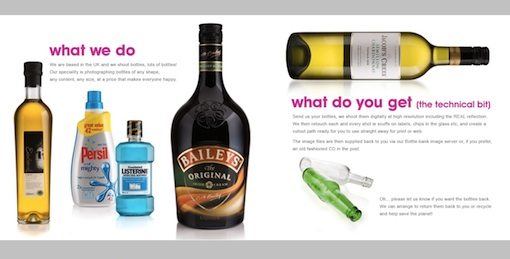
Creative use of contrast will emphasize the beauty of your work. The website above takes bottle designs we see everyday and transforms them into stunning portfolio pieces by making the bottles the most visually appealing item on an otherwise plain page. They could’ve just as easily placed the bottles in their natural environments but the effect would not have been as powerful.
Side Scrolling
Don’t be afraid to break the mold of a vertically scrolling site. Side scrolling sites like “We Shoot Bottles” from the previous example can provide an unexpected and welcome impression of creativity. However, keep in mind that users will expect a vertically scrolling site so it’s often a good idea to include arrows and/or instructions to help them along the way. Also be sure to consider popular screen sizes when creating a side scrolling site. The site above did not fit well on my laptop’s 13″ screen and left me scrolling both vertically and horizontally in an awkward scavenger hunt to discover all of the content.
Themes are Cool
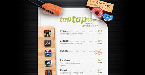
Consider using a theme as a creative method of tying disparate content together. The site above displays a portfolio of unrelated iPhone apps spanning multiple categories. This is ingeniously pulled off through the illusion of a sushi menu, which has nothing to do with any of their apps but makes for a familiar, easy to read format supported by attractive visuals.
One Page, Lots of Content
jQuery makes it extremely easy to cram multiple pages of information and graphics into a single page layout. Bite-sized content presented in a click-to-proceed manner can add an interactive feel not found through scrolling and gives the creator greater control over the viewer experience.
Make Contact Effortless
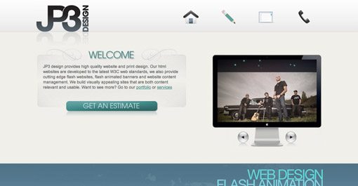
Single page sites can be tricky. You need to convey who you are, what you do and how to you can be reached in as succinct a manner as possible. Contact information and means can quickly get lost in the heap of content or take a back seat to “more important stuff”. However, if making new contacts is your primary goal for the site, then that should be reflected in the layout of the page. Notice how important the “get an estimate” button is in the layout of the site above. This immediately conveys that the site owner is eager to take on new customers and will be open and forward regarding cost (a characteristic many designers lack). Considering cost is often the among the most important concerns of your potential clients, this openness can be an important competitive advantage.
Travelling Navigation
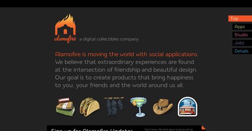
If your single page portfolio contains enough content to require lots of scrolling, consider using a navigation menu that stays with the user as they scroll and provides shortcuts to specific sections. Visit Alamofire above and click on one of the tabs in the top right of the page to see this technique put into practice.
Always Consider Your Target Audience
Think about the two contrasting examples above. Personally, I love the first. It’s crazy, unique and contains beautiful comic book illustrations (what’s not to love?). However, there are a lot of potential clients who wouldn’t give a second look at this site because it isn’t itself a display of what they would like. The second example, though still very attractive, is fairly boring by comparison. However, a serious professional might spend more time on this site than the one before it. So which is better? The answer, of course, is neither. When designing your portfolio you should consider what type of clients you desire to impress and therefore earn. There are a ton of businesses looking for serious, professional designers but there might be just as many looking for someone fun and creative that thinks outside the box and isn’t afraid to be original.
Putting Your Best Foot Forward
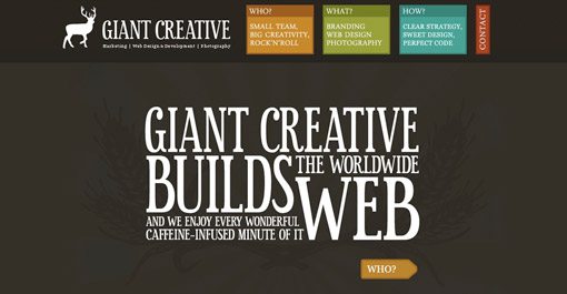
Think about what makes you unique as a designer. Put more practically, why would someone hire you instead of the million other designers screaming for their attention online? Don’t be afraid to list your huge skill set, but focus on one or two things that you do best and convey those ideas visually. The site above is for a team of web designers and programmers. However, their site and the examples featured on their site communicate one idea stronger than the rest: illustration. Like the comic book art in the previous example, these guys want you to know that they can create beautifully colorful, custom illustrations for your brand. This sets them apart from a huge portion of web designers that are limited to stock art due to their shortcomings as artists. So whether your strongest talent resides in pretty pictures, amazing typography or clean code, scream it loud and proud on your portfolio.
Inspiration
Want to see more examples of great single page portfolios? Here’s where I started:
- 95 Fresh Examples Of Single Page Website Designs
- 25 Beautiful One Page Portfolio Websites of Designers on Twitter
- Single-Page Portfolio Sites
Conclusion
I hope these ten tips have inspired you to create an amazing single page portfolio (or to revise your current one). Use the comments below and send us links to portfolios you find inspiring, whether they belong to you or someone else.
