7 Lessons Web Designers Can Learn From Print
Looking outside of your area of focus is an excellent way to learn a thing or two about design. Today we’ll see what value thinking like a print designer can bring to your website building skills.
Whether you’ve ever engaged in print design or not, these tips will provide you with some great ideas, ready to be applied to your next design.
Print vs. Web
I should begin by stamping out any suspicions that this article in any way presents one profession or design medium over another. As both a print and web designer, I’m familiar with the strengths and weaknesses of each as well as the challenges faced by designers in both industries.
I am not making any type of argument that print designers are more knowledgeable or have a more difficult job than web designers. This article could’ve just as easily been about lessons that print designers can learn web designers because the point here is that trends and techniques differ greatly across different design areas and there is therefore a lot to learn from looking outside of your own comfort zone and into another field.
With that said, let’s take our minds out of RGB and into CMYK and begin thinking like a print designer.
#1 The Power of a Brand

Sometimes web designers are prone to approaching a design with a limited focus that fails to think outside the browser. It’s easy to see designing a website for a client as simply that and nothing else. However, for many small clients and new businesses the website can be their single biggest (and perhaps only) face to the world. The design of the site is therefore crucial in the development of the personality of the business: their brand.
Print designers are almost always forced to either create a unique identity, work within a strict existing brand, or develop ideas for how to evolve the brand to meet new challenges. By contrast, web designers can easily focus more on standard interface elements like buttons, icons and navigation panels that look almost exactly like those found on a thousand different sites around the web.
Giving a business a brand brings it to life. It makes it real and easily identifiable to the public and communicates the company’s principles, goals, and strengths. This process often starts with a logo but stretches well beyond to colors, fonts, messaging, and underlying psychology that are setup as absolute guidelines for everything the company has developed from television commercials to ink pens.
The next time you’re designing a website with no real brand direction, consider putting some thought and effort into the psychology of the design. Deliver more than a website by creating a written explanation of the intentions of the design along with some suggestions for how to develop the brand further through other materials.
#2 Target Audience
This one comes particularly from the marketing side of print design. If you’re creating a print ad, one of they key questions to ask is “Who is my target audience?” In other words, who is the person you’d most like to communicate to and influence through this ad?
Granted, over-specialization can lead to a dramatically reduced possible customer base but not openly targeting specific groups of people that are either the most likely to buy your product or are currently a segment with great untapped potential can likewise lead to missed potential.
You might be tempted to think, “Isn’t everyone my target audience?” However, this is incorrect for just about every service, product and website out there. For instance, this site’s target audience is designers. We encourage everyone to read the site but cater the content specifically to this target group. Obviously, this site has a pretty narrow and easily identifiable focus compared to something like Facebook, but even they have a target audience.
Though we can’t be sure who they secretly target behind closed doors we can at least say that Facebook seeks to appeal to people who want a better way to stay in touch with friends and family. They can narrow this distinction further by looking at their average user demographics to see who uses the site the most and the least. The Facebook designers can then focus on structuring the site to either appeal better suit the needs of their current users, and/or evolve to become more enticing to a particular set of non-users.
The point is, when you’re designing a site for a client, you shouldn’t choose a visual aesthetic merely based on a whim or something from you saw in a CSS gallery. Instead, you should consider exactly who the site is seeking to attract and create a design that has a high likelihood of appealing to that particular group.
Remember to use both demographics and psychographics in your consideration. Demographics are general characteristics such as age, gender and location while psychographics are more about how the person thinks, what they love and hate and why they buy the things they buy.
#3 Brevity & Limited Space
A web page and a physical page are two completely different beasts, each presenting a unique set of challenges and opportunities. For instance, a web page has the unique ability to expand to accommodate an increasing amount of content. If you want to use 1,500 words and 27 pictures to tell visitors what the site is all about, you are more than able to do so.
However, print materials provide a much different experience as they are limited by their physical size. There is no unlimited scrolling or content condensed into slideshows, only a few inches of paper. Working under this constraint can give you a renewed appreciation for how to limit your messaging to a barebones, necessity-only offering.
When writing copy for the web, remember that just because you have a potentially unlimited amount of space doesn’t mean that you should use it. This applies particularly to an online service or web app that needs to get a quick “what it’s all about” message across on the homepage. Under these circumstances, lengthy in-depth instructions and information should be placed elsewhere on the site in favor of a clear, concise homepage.
If you’re trying to explain a fairly complex site to users, try breaking everything down into three steps. This magic number makes the complicated seem manageable and won’t be intimidating to new users.
#4 Clever Design is Better Design
There are two tendencies that I see among print designers that seem to rarely make their way over into web design. These are the infusion of humor (which we’ll discuss next) and the art of being clever.
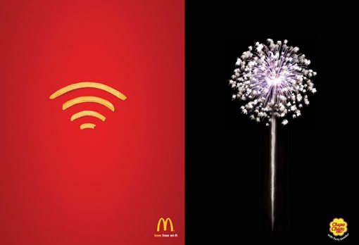
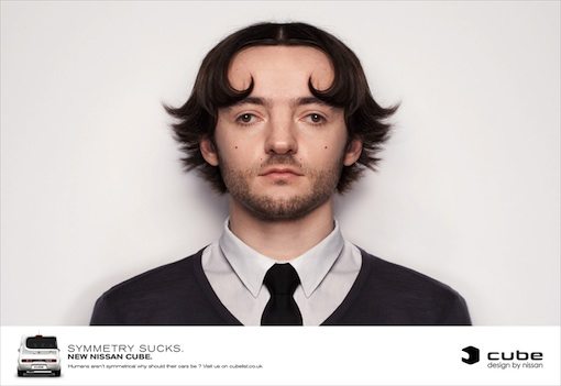
Being clever doesn’t require you to be a comedian or a genius, it merely requires you to look at your design and consider possible ways to enhance it with a little wit. The print ad examples below show exactly what I mean.

These ads aren’t really funny; few people would laugh upon seeing them. They’re simply amusing coincidences communicated through shapes. It was “clever” of the designers to turn fries into Wifi and fireworks into a sucker. This little trick ads value to the visual and makes people enjoy looking at it.
This kind of subtle wit needs to make its way into more web designs. Your goal as a designer is to make websites attractive enough that people want to stick around for a while. Adding wit to your design arsenal is a great way to not only add to the time a user spends looking at a page, but also increase the likelihood that the visitor will share the site with someone else.
#5 Why So Serious?

The second trend that we see a lot among both print ads and television commercials is the use of humor to engage viewers. For some reason, most websites seem to take themselves too seriously. A really useful online service with a website that makes you laugh out loud is a rare breed, and unfortunately so.
Despite the idea stated above that brevity in your messaging is a good thing, sometimes you can find real value in the superfluous. Advertisers know better than anyone that everyone loves a good laugh and are in fact more likely to connect with your brand if you can make them do so. You should consider taking this page out of the advertiser’s playbook and implementing it in the realm of web design.
Browse the endless funny ads at Ads Of The World and consider how you can infuse humor into your next web design project.
#6 The Value of a Good Photo

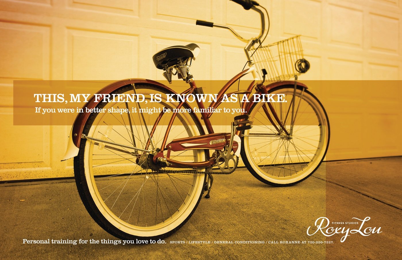
Print designers use stock and custom photography heavily in their designs. Often the photo isn’t so much an element of a design so much as it is the design.
If you’re designing a site that doesn’t really need a lot of UI elements, consider using photography as the main design element. Not only does it look excellent if your photos are nice enough, it can actually be a lot easier than designing an attractive site from scratch.
Grab all of your design inspiration straight from the photo you’re working with. Use the eyedropper to pull colors from the picture and choose fonts that match the mood of the scene.
Some of my favorite web designs have forsaken the gradients, shadows, gloss and icons so common in web design today in favor of this technique. I recommend snapping your own shots, but if you lack the time, experience or equipment, stop by Flickr Creative Commons or SXC for some free photos for your next site.
#7 Appreciate Interactivity
The final lesson I suggest you learn from print design is to appreciate what you have to work with in the web. For all of its complications, endless troubleshooting requirements, standards, and limitations, the web is an amazing medium to work with as a designer.
I was almost exclusively a print designer for over six years but instantly fell in love with web design as soon as I began learning it. Compared to print, web design can seem down right magical. Little things like hover effects, scrolling, and the ability to hide and show specific content based on user interaction are enough to leave a print designer in awe of the possibilities.
Though I will always treasure print as the place where i began my journey as a designer, I see the web as a medium with infinitely more potential to really grab and interact with viewers in ways that will never be possible with paper and ink. Never lose sight of the richness of the tools that you have to work with in web design and always seek to maximize their potential to make the web a truly magical place.
Closing Thoughts
To sum up, the web design industry would do good to pay more attention to the power of a brand, who they’re targeting and when to refocus, and the value of humor, wit and good photography in design. Finally, web designers should never fail to appreciate and take advantage of the interactive nature of the Internet and the possibilities for better, deeper design that it presents.
Use the comment section below to let us know what lessons you’ve gleaned from other areas of design and how they’ve improved your work.