Designing Interesting Websites With Space & Asymmetry
When an element uses asymmetrical space, it stands out against other surrounding elements. It will appear more vibrant, which is particularly helpful if you’re designing areas of a page where one link/button demands more attention than others.
Today we’re going to take a closer look at asymmetry expressed through contrast, spacing, and layout. We’re thinking about observable contrast, and how space drives attention.
Asymmetry isn’t always about external relationships with margins, padding, or gutters.
Asymmetry can also be concerned with the internal relationships like image thumbnails or text alignment. For example, an image gallery may showcase 5 thumbnails where the middle thumb is slightly larger than the others, primarily used to capture attention. Asymmetry is great for bringing attention to a particular area on the page or a particular element in the page.
And, like we described in the free e-book Web UI Design for the Human Eye, sometimes asymmetry is useful just for the sake of asymmetry.
Let’s look at closer look at asymmetry expressed through contrast, spacing, and layout.
Observable Contrast
By removing distractions, you force users to focus only on what’s immediately visible.
You might then apply design effects to these areas like background gradients or even jQuery animations. These effects can be used on one or two elements to make them stand out from the others.
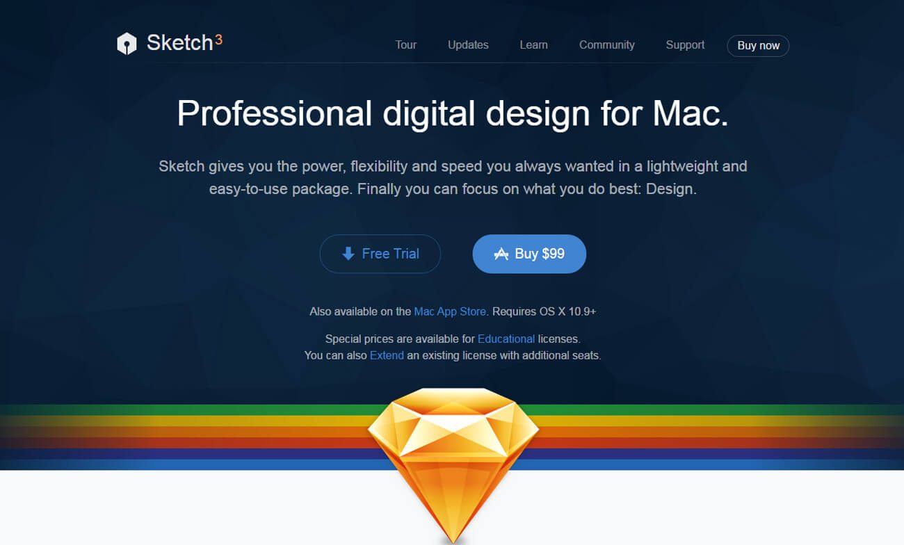
One of our favorite examples of this effect lives on the homepage of Sketch by Bohemian Coding. The homepage mixes dark and light colors to blend contrast into one unified layout.
In the header section, you’ll notice there are two buttons: one for a free trial and the other for purchasing the software. Both of the buttons are colored blue and take up the same amount of space. However, the free trial button uses an “empty” background which is commonly referred to as a ghost button. Layered on top of the dark header, the free trial button seems to fall out of focus into the background.
Because the purchase button uses a light blue background and white text, it stands out strong and loud against the dark background. When quickly scanning your eyes over the header, it’s quite obvious that the purchase button draws your attention almost immediately. This is caused by color choices but also from white space added between the elements.
Vertical and horizontal white space is used so the buttons appear separated from the header text. Since one button is brighter than the other, it naturally stands out since there’s plenty of space and not much else in the way to capture attention.
You can see a similar button style in the footer area:
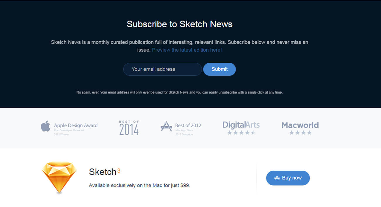
In this case, users only have the option to submit their email or withhold the information.
Because Sketch wants you to submit your email as quickly as possible after typing it in, the spacing is much tighter between the input field and Submit button. This follows Fitts’ Law since as you reduce distance (and size remains fixed), you speed up the time it takes to move between elements.
Finally, notice that the asymmetrical size of the input form compared to the Submit button also draws your eyes to that part of the page, which is exactly what Sketch wants.
Use white space to your advantage to draw wandering eyes onto certain page elements. To experiment and discover what works best, try different methods of A/B testing for different values of spacing.
Here are some general notes to be gleaned from Sketch’s website:
- Contrast doesn’t always refer to color. It may also refer to contrasting elements of space, size, and position relative to other elements on the page.
- Empty space can be either obvious or inconspicuous depending on context.
- Surrounding elements play a large role in the natural visibility of other elements.
- Symmetry creates memory and harmony, while asymmetry draws attention. Balance both accordingly.
Space Drives Attention
You can find a slightly different example on the homepage for Procreate, a digital drawing and painting tool for the iPad. By skimming the page, you’ll notice the whole layout is dark and features vastly oversized page elements.
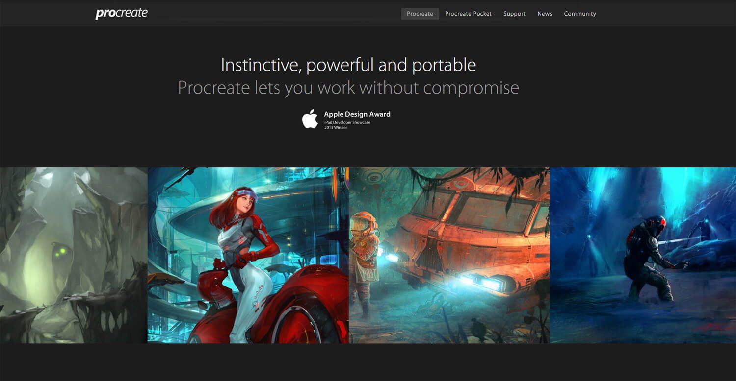
The design demonstrates how you can draw focus to singular elements on a very large page. Screenshots, demo paintings, and features all take up their own sections.
White space separates text and visual content. The design is especially noteworthy in its use of text colors to distinguish between headers (higher contrast) and general page text (lower contrast).
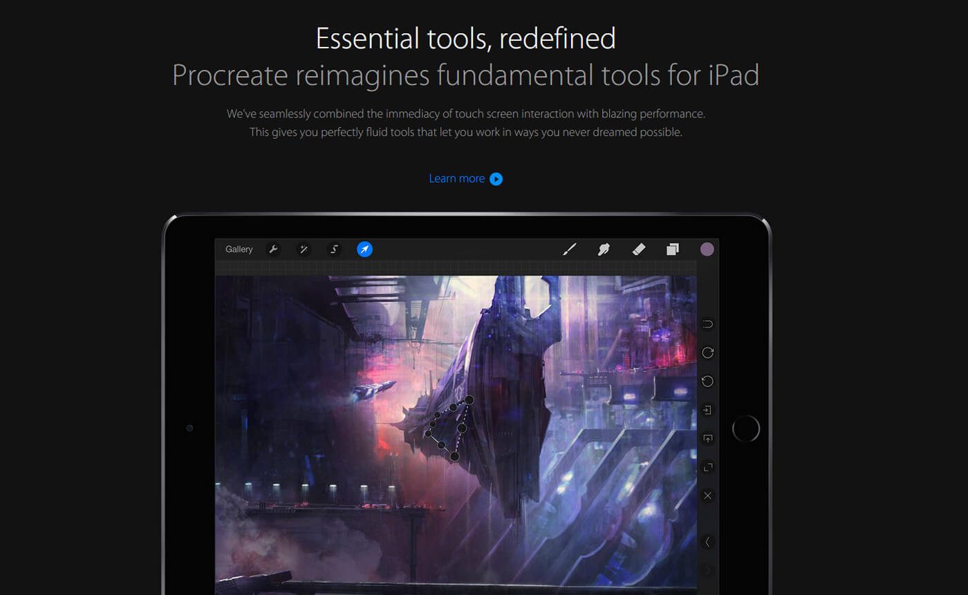
By splitting a page into sections, you create a natural content hierarchy. By then dividing these sections with unique styles(fullscreen backgrounds, oversized typography, app screenshots) the divisions become even more apparent.
Keep in mind that not all websites can benefit from large divisions of content — but this does seem to be a very popular trend amongst designers. It looks fantastic when executed properly.
The Alternating Layout
On the surface, alternating content may seem annoying because you force the reader’s gaze to jump around. But since the content is spaced out so well, it’s much easier to read a Z-Pattern than you might first imagine.
The pattern also forces visitors to stay on their toes since the design isn’t spoon-feeding information. Of course, this pattern is only possible because the tasteful white space carves out the path for scanning.
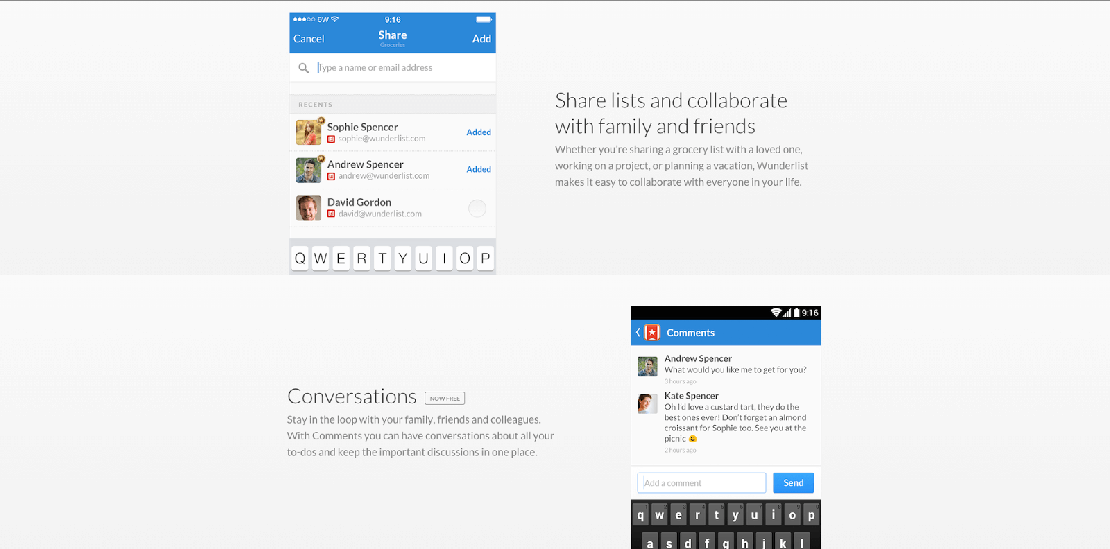
Looking at the page for Wunderlist, we can see this asymmetrical pattern emerging in the white space. The asymmetrical spacing is carefully executed so that it looks interesting without being infuriating.
We can learn a lot from the design patterns demonstrated by Wunderlist’s use of spacing:
- Asymmetry has its purpose when attempting to draw attention to certain areas of the page.
- Asymmetry in a repeating pattern becomes symmetry.
- Patterns of space between text or graphics will also appear as one larger pattern.
- White space should make browsing content easier and more predictable.
Further Reading
You can learn more actionable design techniques in the free Web Design Trends 2016 ebook. The 185-page guide explains 10 best practices in great detail. You’ll find 165 analyzed examples from today’s top companies.