Horizontal Harmony in Design: Keep It Between the Lines
Horizontal harmony. It’s one of those things that you seem to only notice when it is missing. Horizontal harmony is the relationship between elements across a design. It’s more than lines and rules; it’s also an invisible grid creates a sense of place for design elements.
How can you create horizontal harmony? While some techniques are easier than others, it is not an overwhelming concept. It just takes a little planning. By thinking about things such as a baseline grid, space between lines of text, positioning of elements and the overall aesthetic, horizontal harmony is just part of the design process.
Baseline Grids

Baseline grids, a popular design tool in printed projects, is less often talked about in web design. The reason is simple: Many web (and digital) projects feature a single column of text.
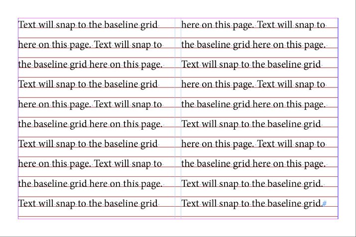
The baseline grid is an imaginary line that type sits on. Every letter in the text will rest on this grid so that multiple columns of type line up. (This keeps columns from having a jagged look.)
Baseline grids can work for almost any typographic purpose and most design software includes tools for creating baseline grid specifications. This gets a little trickier online but there are CSS baselines as well, including a nice example from Smashing Magazine.
The baseline grid only works when applied to every column in the layout, where type begins and ends in the same location (commonly the top and bottom of a page). In addition, the baseline grid is typically applied to the entire page in a digital project and the spread (or facing pages) in print projects.
Baseline grids are different than line heights or leading specs primarily because a baseline grid dictates where letters rest. The grid can force lines to type to be closer together or spaced more distantly. (In Adobe InDesign, for example, a baseline grid will override leading, forcing text to live on the appropriate grid.)
What’s nice about a baseline grid is the cleanliness of text. When everything aligns in an organized way, the result is lettering that is easy to read and look at. There are no jarring feelings. There is a reason that books, newspapers and magazines (which rely on multiple columns of text on a page) have been doing this for years.
Hint: Set a baseline grid
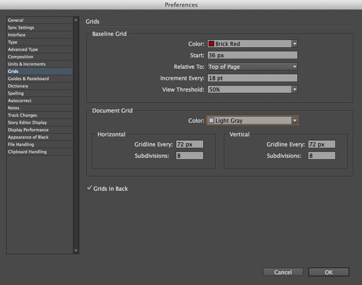
- InDesign: Under the Edit menu, select Preferences, then Grids. You can set a color for the baseline grid, where the grid starts (top of page or top margin) and increment (height of grid). Snap to Guides will apply to the baseline grid.
Leading
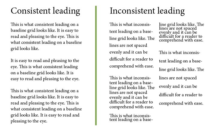

Leading, the amount of space between lines of type, is another important tool when creating harmony across the page or screen. Text should have consistent leading.
Think of it this way: If Paragraph 1 is 14 point type with 16 point leading and Paragraph 2 is 14 point type with 12 point leading, it will cause readers distress. This change is difficult on the eye and can make reading a challenge. This is true even with a single column of text.
Especially in printed projects, the combination of consistent leading and a complementary baseline grid are ideal. This pairing will ensure that type aligns from column to column and has a consistent feel from top to bottom.
Keep Spacing Consistent

The amount of space between elements is just as important. Is there one line of space between paragraphs? What about between the header and main text? Or a photo and the text around it?
Determine spacing rules that work with your baseline grid and leading specifications to ensure that the spaces around elements are consistent. It will be the easiest to create and maintain consistency with these spaces if they too are set to work with your type specs.
Take it a step further and consider vertical space as well – gutter width, text wraps and margins. These spaces too should be a part of your consistent spacing scheme.
Line It Up
Text is 14 points? Build elements to match.
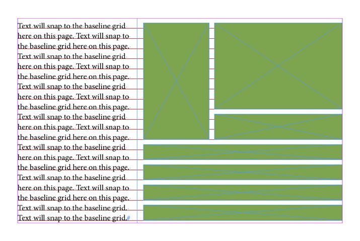
After you have a good feel for the text in a project, other elements will come into play. These elements should line up on your invisible grid as well. Text, photos, lines, buttons and every other design element should all work together when you look at them across the page or screen.
This can take a bit of planning. When it comes to images, sketch out placements and how each will rest on the horizontal grid. The bottom of the photo frame should rest on the baseline grid with text and stop in alignment with the tops of capital letters for perfect harmony.
Think about small pieces, such as buttons or navigational elements, in the same way. With small parts consider the vertical heights of these items to match the leading of text or a multiple of it. (Just remember to consider any additional spacing you have between lines.)
Think in Blocks
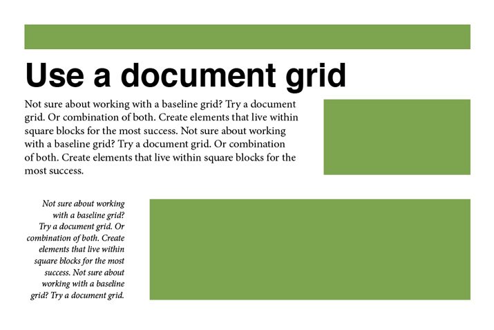
If all this baseline grid and leading has your head spinning, thinking about a grid in blocks might be easier. The old-school graphing paper you used in elementary school can be the perfect sketchpad for this application. (The Adobe software suite also has a grid mode you can apply to the background when sketching digitally.) Plan your design project so that each piece fits within a set number of blocks.
For example, text is two blocks high. Other elements will equal multiples of text, making images eight blocks high and buttons four blocks tall. Spacing between elements is also two blocks, vertically and horizontally. (Get the picture?)
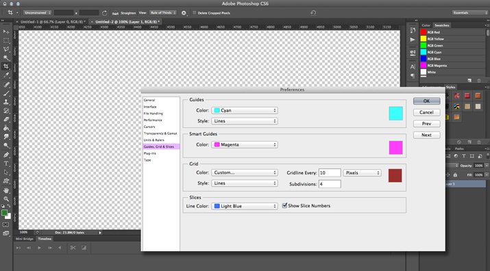
Hint: Set a document grid
- InDesign: Under the InDesign menus Edit (in Windows), select Preferences, then Grids. You can set a color for the grid, specify horizontal and vertical spacing and subdivisions. The grid can be set to appear behind or in front of objects in the layout.
- Photoshop: Under the Photoshop menu Edit (in Windows), select Preferences, then Guides, Grid & Slices. Set the spec for each gridline, including color, spacing and subdivisions.
Horizontal Thinking for Vertical Projects
Horizontal harmony is not just something to think about when working on projects that stretch across a long space, it can be equally important in vertically-oriented projects.
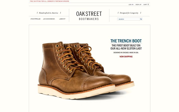
Consider how important horizontal harmony is for a website with parallax scrolling features. Each “screen” must work in horizontal harmony while moving up and down. A mobile website, often looked at in vertical orientation, needs to move in a way the makes sense.
The same is true for smaller print projects as well. Look at a label on a beverage container. The text is likely set in a grid that wraps around the container.
Conclusion
Horizontal harmony is everywhere. The key to it is that you don’t really see it. Projects will just feel right when it is there, and feel a bit off when it is not.
As a designer, it is important to think about grids and alignment throughout the design process. The end result of a design is to create something that is readable, usable and effective. Horizontal harmony can help you achieve this.