The Evolution of Apple.com
The Apple design team is widely regarded as one of the most talented group of designers in the industry today. The trends that they set are followed by not only every other major tech company, but by web designers in every conceivable product and service niche.
Follow along as we embark on an exciting journey through time and witness the evolution of Apple’s design style. You’ll get several amazing glimpses at Apple.com dating all the way back to 1997 as we witness the rise and fall of several important design trends.
Apple and Design
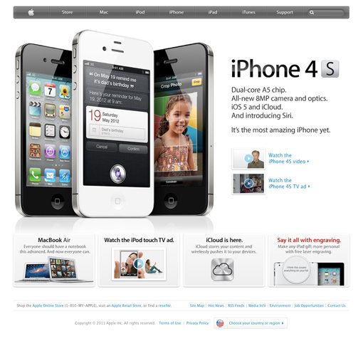
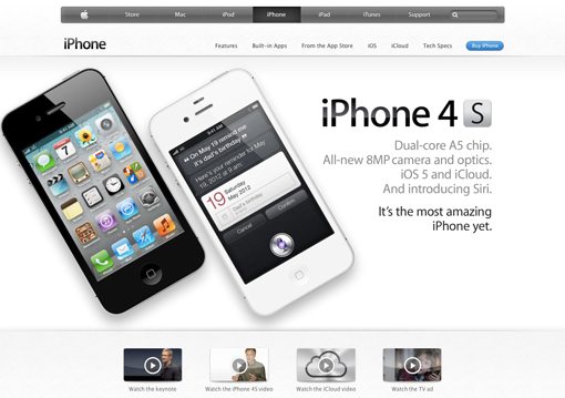
The image above is a snapshot of the Apple website as it currently stands. It’s a perfect picture of everything we love about Apple’s sense of design. It’s clean and minimal with a strong emphasis on the beauty of the product.
There aren’t a million different banners or mega drop down menus to sort through, just a simple navigation scheme, a featured product and four distinct content boxes along the bottom that serve as a universal way to highlight other important products and information.
Notice the copy as well: brief and to the point with a touch of hyperbole (where would Apple be without it?). Despite the fact that the iPhone 4S has hundreds of features to be bragged about, they’ve whittled it down to four basic bullet points, just enough to snag your interest and encourage you to look further.
Was It Always This Way?
Apple has long been known for their sense of style and superior design. Unbeatable innovation is at the forefront of their success, but pushing that success along has been a tightly integrated brand image that’s irrevocably ingrained in its products, commercials, web pages and even its stores.
As we look at Apple.com as perhaps the most prominent and frequently updating pulse for Apple’s visual brand, I can’t help but wonder about the journey. How did this brand evolve? What did early versions of Apple.com look like? Were they similar? Did they share the same simple aesthetic or were they more prone to reflect the busy web design styles from a decade ago?
Apple in Print
To get a feel for Apple’s brand evolution, we should briefly consider the time before Apple.com even existed. From the genesis of the company, Jobs always placed a strong emphasis on simplicity. However, that term had a very different visual translation back then. Mac Mothership has a delightful collection of vintage Apple ads that give us a glimpse into Apple’s brand image in the late 70s, as you can see, it’s a far cry from Apple.com today.
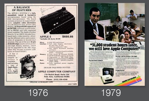
These ads are filled with sales pitches and informational copy. This may be a necessary evil for new product categories, but it goes beyond this. Even the logos show an evolution of Apple’s definition of itself. The original on the left is a very complex illustration of Newton under a tree, the updated version on the right is a colorful rainbow shooting across the page. Both are far more complex than the simple and ubiquitous symbol we see today.
For the next twenty years Apple would flirt with generous amounts of whitespace but only briefly in between ads that followed the same basic copy heavy approaches that we see above.
It could be said that the most important jump towards the simplicity of the Apple brand that we know today came from TBWA\Chiat\Day, the agency behind the original 1984 Macintosh commercial and subsequently one of the most famous ad campaigns of all time: Think Different.
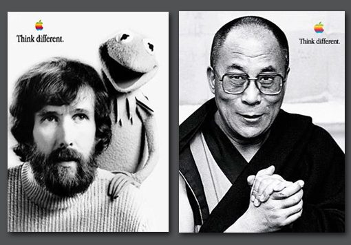
By 1997 Apple had found its identity. In over a decade, the Think Different campaign hasn’t aged a day. It doesn’t feel antiquated like the original Apple ads, it is instead timeless and powerful enough to impact many subsequent generations.
Back to the Web
Think Different changed everything for Apple (this charge was of course led by the return of Jobs in 1996-97). It provided an amazing identity not only to Apple, but to its customers. Visually, it rocked Apple’s brand style into what we know today.
Nowhere is this clearer than on Apple.com. Using the wonderful time machine of The Internet Archive, we can travel back to the early days of Apple’s website. Think Different hit in 1997 so if our premise proves true, we should see this as a year of change for the site. Here’s a look at Apple.com around the middle of 1997:
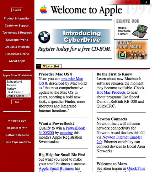
Not quite what you’d expect from Apple is it? Like the early print ads, here we see type, and lots of it. To be fair, compared to the general state of web design at the time, this was in fact a fairly minimal design. Indeed, everything is laid out nicely, but there is a ton of content. In fact, what you don’t see in the screenshot is that those news paragraphs go on for miles (click here for the live version).
Keep in mind that this design is pre-Think-Different. The previous Apple.com designs shared this aesthetic. Now let’s jump to May of 1998, the first in-tact post-Think-Different Apple site I could find.
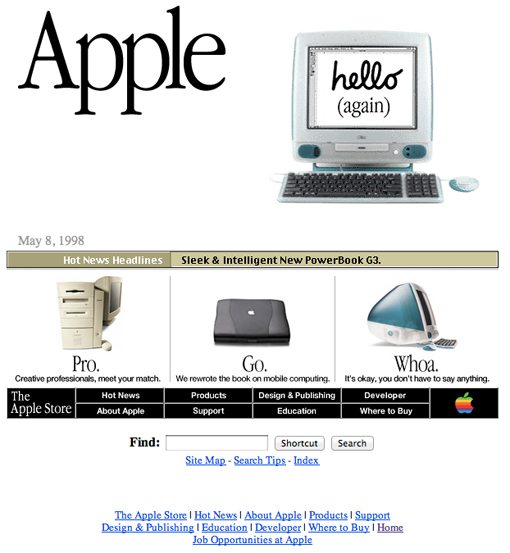
The difference between the two aesthetics is incredible, they don’t even appear to be from the same company (let’s face it, they really aren’t). Where we used to find clutter and an over-abundance of information, we now find whitespace; tons and tons of white space. Where we used to find a page that scrolled for miles, we now find brevity.
The simple headline just says “Apple,” the product shot has made its rise to the hero and there’s even an impressive animation of the iMac spinning into place via the wonder of the animated GIF.
Think Same
The most amazing part of the 1998 design to me is just how similar it is to what Apple is currently using going into 2012! The typography, logo and splashes of color serve as an important design lesson in what type of elements you can expect to age over time in your design, but the fundamental layout here is shockingly close to what we see on Apple.com today.
The top portion of the site is reserved for the main product feature (in this case the original iMac), and the bottom is split into a few horizontal rectangles that feature other important products.
Key Differences
As I mentioned, the typography is a main element that stands out in this evolution. There’s a reason we refer to sans-serif typefaces as “modern,” you can clearly see how Apple’s current font brings their designs forward in time compared to the classic old style serif from 1998.
One of the most important changes I see here is the navigation, notice how far down the page it is. These days we’re so accustomed to topside navigation that this design would certainly throw many users for a loop (perhaps even an infinite one). Apple has obviously learned that helping you get to where you want to go on the site is quite literally a top priority.
A very important component of the layout that you don’t get from the cropped screenshot above is that the fixed width content sits on the left side of your screen. These days modern sites usually center their layouts so that the origin is the middle of the browser window.
Also worth mentioning is the Apple news feed, which remained a staple on the site for years and was only removed earlier this year.
Moving Forward: 1999
By October of 1999, Apple was still using the same design. The products are evolving but the page design is almost exactly like it was the year before. Notice the shout out to Pixar’s Toy Story 2 right on Apple.com, can you tell that Steve is at the helm of both companies?
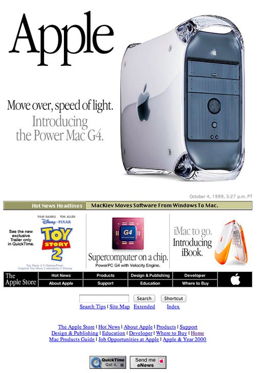
Also notice a big change in the logo, by now Apple has killed the rainbow in favor of a solid white Apple. Apple would prove to be a strong leader in a logo simplification movement that’s still going on today. You can read more about this in our article, Pepsi vs Coke: The Power of a Brand.
2000
When we hit May of 2000, we see a few big changes take place. For starters, the entire layout is now centered in the browser. Further, the navigation has finally been moved to the top and closely resembles the aqua-style interface that Apple made famous with OS X. Notice the how complicated the navigation is with the two layers of links.
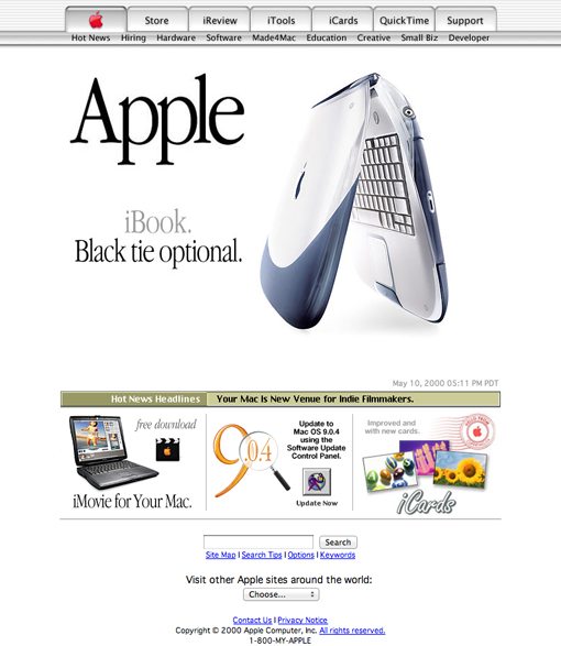
Glossy buttons and tabs were a huge movement in web design and were the standard “cool” for several years. The current web designer obsession with simple, minimal buttons with flat colors or subtle gradients is a direct response to this more ornate style
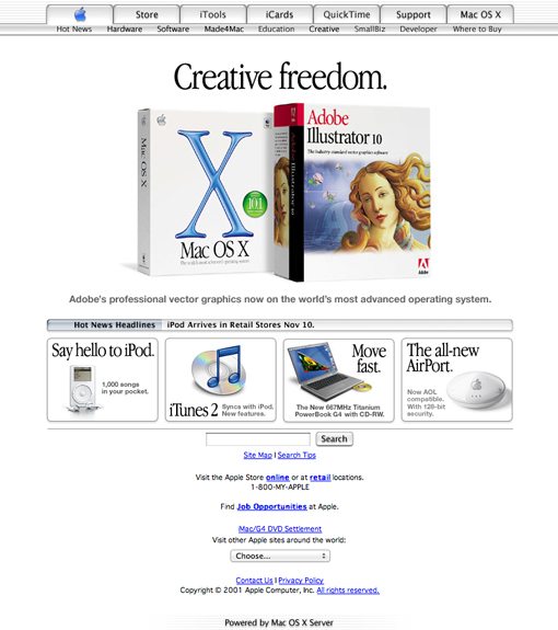
2001
Fast forward to November of 2001 and we see a few more important jumps. The aqua style has made its way down to the news feed, sans-serif type is beginning to take hold (notice the subhead) and the content boxes have evolved dramatically. We’ve made the jump to four instead of three and the boxes are now fully distinct shapes with rounded corners like those we see in the tabs at the top. They’re still rounded today, but Apple has pulled back dramatically on the border radius.
Though Adobe takes the center stage in this screenshot, 2001 was a monumental year for Apple due to the release of iTunes and the iPod. This marks their first foray into a generation of non-traditional devices that would entirely redefine the company. This was also the year they made the jump to OS X, a decisive move to a much more friendly and intuitive system which would prove helpful in winning over Windows users drawn to the Mac by their love of the iPod.
2004
By late 2004, Apple had begun to experiment with highlighting its main content area with a solid color rounded corner box. More typically, you would see this box in black, which made for beautiful contrast with the white background, but the iPod’s colorful advertising marked an occasion to bring some life to the page.
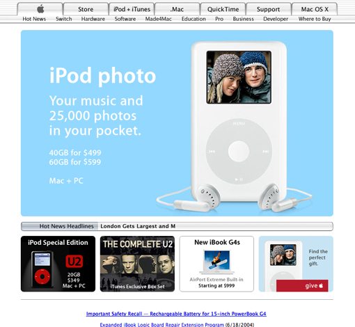
Another really important aspect of the 2004 design: they’ve made the jump to all sans-serif type. This is a major milestone in the advancement of design trends.
2005
Flirting with black in 2004 led to a major experiment for the release of Tiger in 2005. Here we see most of the Apple.com homepage flooded in black. A trend that carried to many of the product pages.
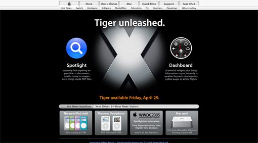
Also a very big deal by 2005 were product reflections, visible on the bottom of this page with the iPods. I fully remember seeing these and immediately ripping them off for the projects I was working on at the time.
2007
Apple trends stayed fairly static for the next few years, it wasn’t until late 2007 that they finally made a huge and very welcome leap towards the site that we know today.
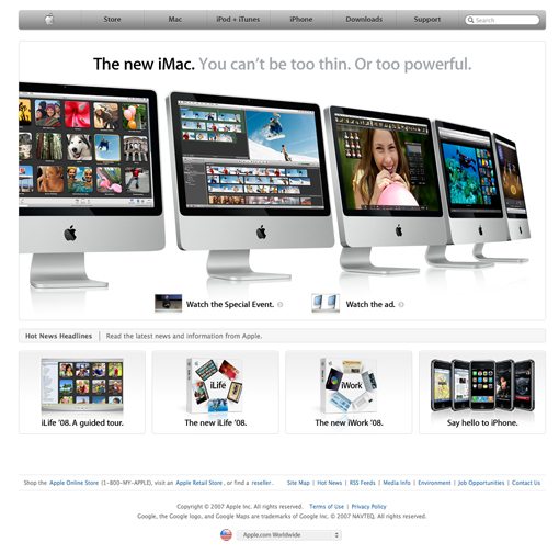
The site’s homepage has been completely overhauled. They’ve widened up the content considerably and killed the old aqua navigation, replacing it with a greatly simplified version utilizing the smooth gradients that I already mentioned would follow the aqua trend for most designers. The expanded content width can definitely be attributed to the widescreen displays that were now present on most desktops and notebooks alike. It’s very important to stay aware hardware evolutions that can and should affect UI design trends.
Also notice that the search bar is finally at the top of the page. This was an afterthought thrown in at the bottom for far too long and it was great to see it finally get the attention and prominence that it deserved.
2011
Apple found its stride with the previous design and it stuck largely unchanged until January of 2011, an impressive run by any standard!
At the beginning of this year, we saw Apple take a step back and return the navigation to a glossy look, albeit an updated dark finish. They also began experimenting with some subtle background noise texture, a painful move in my opinion that made their typically leading design team seem like they were jumping on popular trends set by countless others before them. Click the image below to see the texture up close.
What’s Next?
It’s difficult to predict where Apple’s homepage will go next, but we see some interesting experiments taking place further in the site. Despite the fact that the home page has dropped the noise texture, the current iPhone page has introduced a much heavier implementation of a textured background, with an inset product area.
There are also some really impressive animations of the iPhone flying in and out of view. These replace the animated GIFs of 1998 with modern web technologies, but the heart of the idea is definitely the same.
Going forward, will we see Apple return to old tricks like animated products and glossy buttons? And will they trudge on in their implementation of textured backgrounds, perhaps introducing more of the textures that we see in iOS? Your guess is as good as mine!
Conclusion
This study of the evolution of Apple.com is so much more than a look into the whims of a single company, it serves as an important lesson on several major web design trends for all companies in the last decade. We witnessed the simplification of layouts and reduction of text, the rise of sans-serif type and the several year love affair with gloss that we’re still toying with today despite the resulting rebirth of minimalism.
We can easily spot other trends as well such as the increase in importance of search bars, the realization that navigation should be prominent and easy to find and the richness that new web technologies are bringing to web design in a post-Flash era. Apple has been responsible for pushing HTMl5 and CSS3 perhaps more openly than any major tech company in a direct assault against Adobe’s reign.
A huge thanks is owed to the folks at Internet Archive for preserving these and countless other important pieces of design history. I greatly look forward to seeing whether Apple will serve as a leader or follower in web design trends in the years to come.