Phones Keep Getting Larger: Here’s How to Design for Them
Phones keep getting ever-larger, there’s no denying it. Looking back at the original iPhone today, it seems incredulously small. But large phones come with new design considerations and requirements. Let’s dive into them.
The highly anticipated Samsung Galaxy S10 5G comes out later this year. If your website design ready for it? The phone will feature a massive 6.7-inch display — the iPhone XS Max comes in at 6.5 inches, and many common devices are 5.5 inches or larger – making it important that you are creating something that renders well on what we used to call “phablets.”
Here are a few considerations to keep in mind when it comes to designing for phone screens that just seem to keep getting bigger.
Prioritize Content

Don’t make users guess what’s important about mobile design. The upper two-thirds of the screen should clearly communicate the most important element of the design.
The lower third of a mobile screen should include a secondary element or engagement opportunity. (And it’s actually OK if this content is related to the primary content element.)
When thinking about this priority content, create a design group with three elements – image, short message, and engagement.
- Image for attention and to show users what the design is about
- Short message to help users understand why they are here and what they should do
- The engagement opportunity is a button or invitation to scroll or fill out a form; it tells users what to do next
Create Navigation That Makes Sense
Mobile navigation might follow different patterns on different screens.
Like it or not, the hamburger menu has become pretty standard on small screens. But it might not be the best option for large mobile screens, where you have more room and opportunity for larger navigation elements.
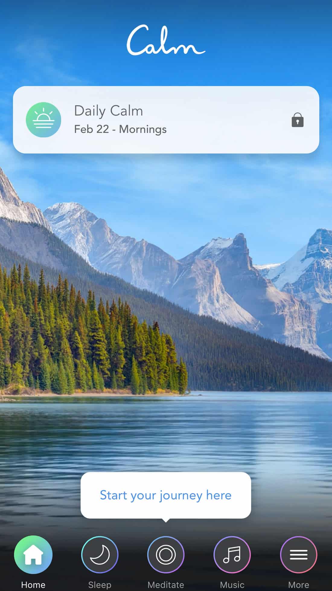
Think of that row of anchored elements at the bottom of your iPhone screen or the standard buttons in the lower portion of a mobile browser. Larger, button-style navigation at the bottom of the screen can be an ideal option for these larger mobile devices, such as the Calm app (above).
Users are already accustomed to a user pattern and you actually have room to put the information there. Bottom-of-the-screen navigation can also provide one more opportunity to engage a user to interact with the design.
Make sure that navigation doesn’t go away when different content is accessed – even if that means it is in a slightly different format.
Hand (and Thumb) Size Matters
For a while, we worked under the assumption that everyone held a phone in one hand and used their thumb to reach key content areas and buttons.
Not with these huge phones! More users are holding devices with two hands, changing what those touch patterns look like. I often hold my phone – a 6.5-inch iPhone – with two hands, using both thumbs to navigate content (making the center of the screen a key area). I use that same two-thumb pattern for text inputs as well.
Someone with larger or smaller hands might not interact in the same way. It’s easy to see that the one-thumb reach area might not hold true as the standard anymore. (This is why you want to play with devices for yourself and see how you actually hold and use them. It can greatly impact the design.)
Consider Typography Sizes
Don’t forget the type.
With wider screens, you might want to readjust type sizes. Recommended reading size is still 35-55 characters and spaces per line. Linespacing should probably be at least 1.5 times larger than the text size.
Keep Forms Succinct
Even if it might be easier to fill out forms on larger phones, don’t give users hand cramps trying to collect information.
Keep forms succinct; follow up via email for additional information. (That way users can choose to enter information on a phone versus desktop device.)
Attention spans are short and attention spans on mobile devices are some of the shortest you will encounter. Succinct forms have a great chance of completion when you are competing for the user’s attention.
Scroll

Phone users are highly accepting of scroll actions. Just make sure to leave plenty of room for them. (This is one thing that actually works well on larger devices.)
Design the usable part of the canvas so that users don’t accidentally tap items when they are trying to move down the page. While users don’t mind scrolling, they will abandon the idea quickly if it becomes a challenge.
In terms of design, all of this means that you should leave some extra padding on the edges to enhance the scroll experience. With a larger viewport, it should be no big deal!
Use the Viewport Wisely

Don’t be tempted to get crazy with columns just because screens are getting wider; stick to a one-column format. It’s easier to read and provides a more streamlined focus area for users.
And don’t try to cram too much information in just because you have more vertical space either.
Think of viewport as one opportunity to provide one action or interaction at a time. What do you want users to do here? Don’t clutter the screen with other elements or ideas.
Think About Content Placement
Where is the first place you look on your phone? Unlike some other devices, phone eye tracking often starts in the middle, not at the top of the screen.
Try to place key elements, calls to action or interactive elements in this portion of the screen.
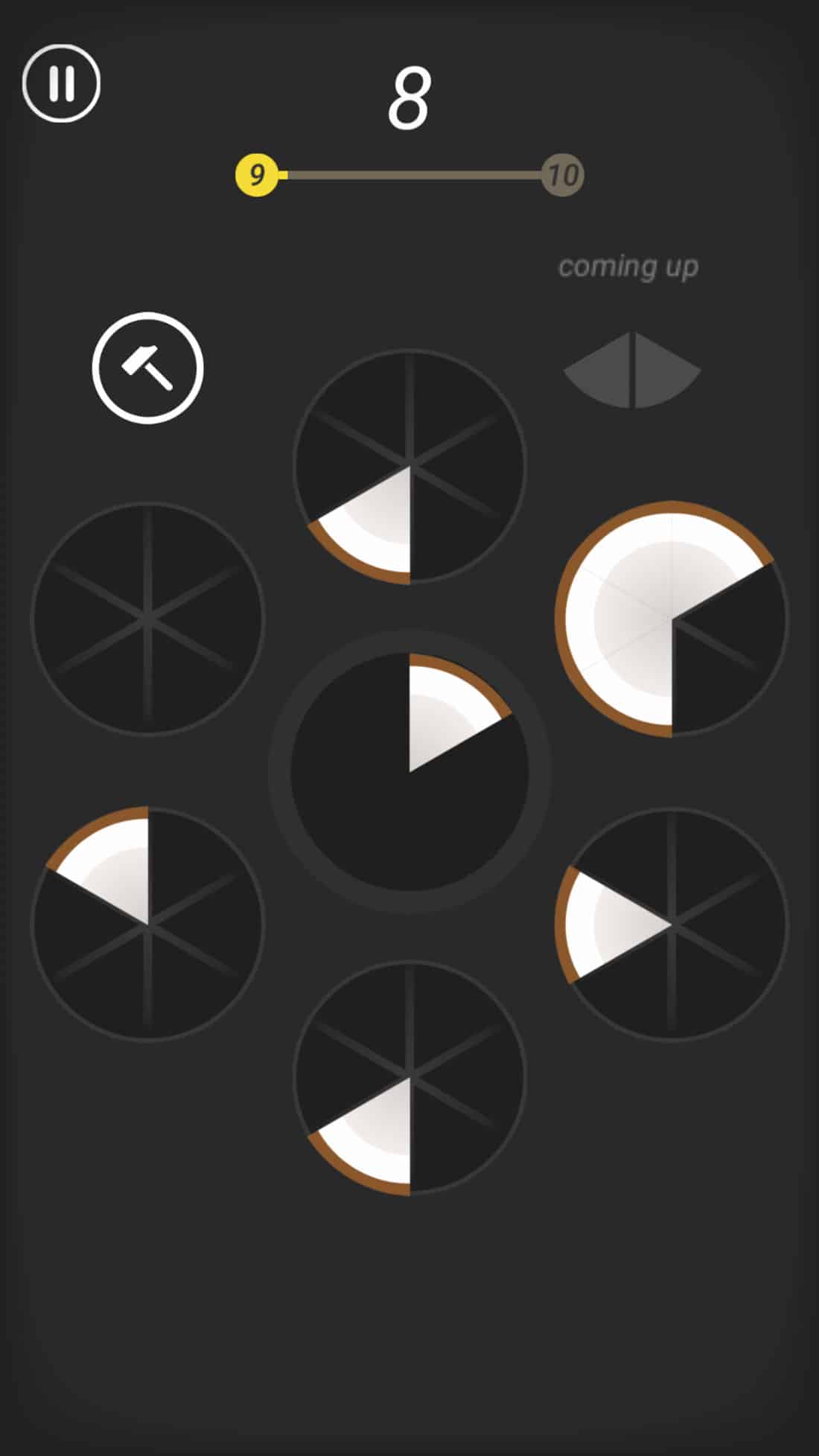
Lately, I’ve been quite addicted to the Slices game and element placements in this game are spot on. Note how the key element is in the center with touch points around it. You don’t even really spend too much time looking at the other edges.
Avoid placing key content or buttons at the very top of the screen or in the corners. Those are the most difficult positions to reach on handheld devices. (They are also the last places the eye goes when scanning content.)
Conclusion
When it comes to designing for bigger hand-held devices the key might be holding one for yourself. Look at your hands. How are you holding it? Where are your fingers? How are you managing the phone and interactions?
Use it as an excuse for a new device (or two) in the name of research. While all of the theory and things we know about good design hold true on these devices, it also throws us a curveball because you have to think about how interactions work differently, depending on the size of the screen. This is a problem you just don’t encounter with traditional desktops that rely on mouse-guided interactions, so give yourself time to think it out.