20+ Examples of Fantastic Fixed-Position Navigation
A site with fixed-position navigation is one that never allows the user to lose site of the directory links as they scroll.
This simple trick makes for a site that is incredibly easy to navigate and is ideally suited for specific types of content. Below we’ll take a look at both the most common and the most unique uses of fixed navigation in web design.
Blogs
One of the most common places you’ll find fixed navigation is on blogs, particularly Tumblr blogs. The reason this format works so well for blogs is that they are notoriously long and therefore involve a lot of scrolling. Applying a fixed-position to the navigation allows users to navigate your site from all the way at the bottom of a page, eliminating the annoying need to scroll back to the top. Here’s a list of several blogs I found using this technique.
Brian Casel
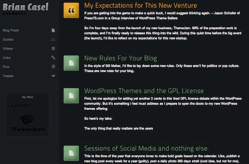
In this site, both the links at the top and the navigation at the left stay with you as you scroll, making it really easy to access anything you need from any point in the site.The navigation on the left doesn’t take you to a different part of the site but rather filters the content so you can see only blog posts, quotes, videos, etc.
David Appleyard
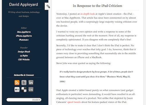
The personal blog of Design Shack’s own David Appleyard (shhhhh, he has no idea I’m including this). David has placed a search bar, social media info, and various links to other sites in his fixed sidebar making it easy to get a quick glimpse of his entire digital life.
Doug Neiner
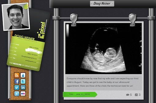
Doug Neiner’s Tumblr page follows the same format as David’s with the social links and miscellaneous information fixed on the left side of the screen. Doug has also created a great looking interface for his posts that uses metal poles and different attachments depending on the type of post. Overall, a really unique design!
Jaype
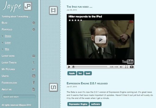
In contrast to Doug Neiner’s metallic poles, Jaype uses a much more feminine approach with light blue textures and scrapbook-ish edges. The sidebar navigation uses a nice accordion effect to expand each section for more options. Another nice touch, the search bar is fixed to the bottom of the page so it stays with you as you resize the window.
Mark Jardine
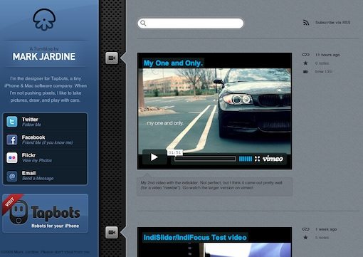
In this blog we again see the sidebar being used not so much for navigation within the site itself but pointing to social media sites and associated content. Mark is a designer for Tapbots, a two man team of developers creating some of the most beautiful apps available for the iPhone.
Right Hand Navigation
Placing the navigation on the right side of the page is pretty rare and is in fact a great way to get usability nazis riled up. Applying a fixed-position to your right-side navigation increases it’s visibility as the user interacts with your site and reduces the chance of confusion for where to find more content. Here are some examples.
Fat-Man Collective
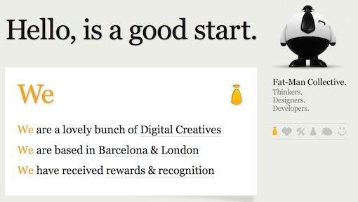
Fat-Man Collective is my absolute favorite site in this post for one simple reason: the fat man. He’s this crazy CG character that hangs out at the top right of the screen. He’s funny looking enough that I would love the site for this alone, but as I scrolled through the site the fat man started to walk! I laughed out loud when I saw this oddly proportioned, chubby character hiking along with his tie flapping back and forth. Click on one of the links below his feet and the page jumps to a specific location, which of course, makes the fat man jump. Hats off to the guys who made this site; it radiates with nerdy awesomeness.
Piensa en Pixels
For all I know, the content of this site is so funny it tops the fat man (unlikely). Seeing as how I can’t read a word of it though, I’m going to assume it contains pretty straightforward portfolio information. Piensa en Pixels is an simple but attractive site with links to different projects running down the right side of the page.
Sisu
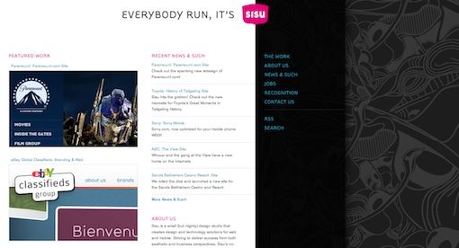
Sisu is a small design firm with some BIG clients. Their fixed navigation is contained within a band so that the content to the left and the illustrations on the right both scroll while the links stay put. It makes for a really nice effect and comes in handy when you are scrolling through the numerous awards they’ve won.
Horizontal Sites
It’s always a bit refreshing to find a site that breaks the typical, vertical scrolling mold. These sites use fixed navigation to make sure the horizontal nature of the experience doesn’t cause you to lose your way.
Netontwerp
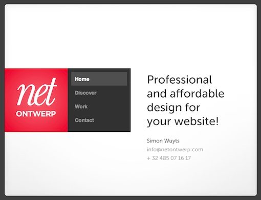
Netontwerp uses jQuery to handle the sideways animation that occurs when you click on a link. As the site scrolls by, the navigation stays fixed on the left and eases right into the design of each page in an amazingly seamless fashion. I love the contained nature of this site, which fits perfectly with the strong, grid-based design.
f$ dsign
f$ dsign is another dose of horizontal action via JavaScript. This site has four sections, easily reachable using the fixed navigation on the left side of the page. The crazy illustrations make the fast moving ride a fun one!
Catch Me If You Can
Some site designers want the functionality of fixed navigation without the boring, static nature of a fixed element. The solution is to allow the navigation to come along for the ride as you scroll, but to build in a delay so there’s a sort of “catching up” effect.
Astrel Creative
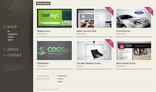
This original site features a disappearing navigation section. As you scroll down, the navigation fades out. When you cease scrolling, it magically reappears with a nice transition. It’s a subtle bit of animation that really increases the “wow factor” of the site.
The Molitor
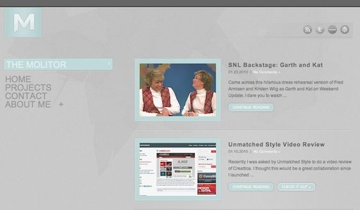
The Molitor takes a different approach to the trailing navigation that emphasizes the “catch up” idea a bit more. As you scroll down, it looks as if the navigation is going to stay put at the top of the page. However, as you slow down or stop, the navigation zooms into view and eases to a stop. This is fun to play with and is worth about six solid seconds of entertainment.
Even More!
Want some more fixed-nav inspiration? Ask and you shall receive my friend. Here are a bunch more examples, conveniently sorted in descending order of how cool and/or unique I think they are (all are great selections). Enjoy.
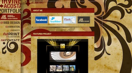
Irvine Acosta
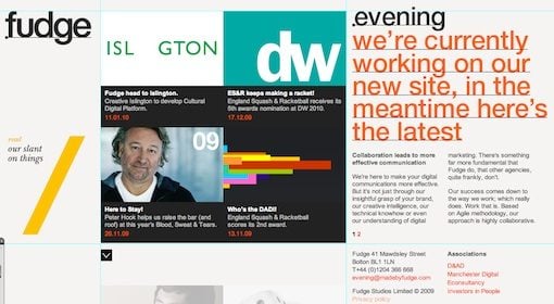
Fudge
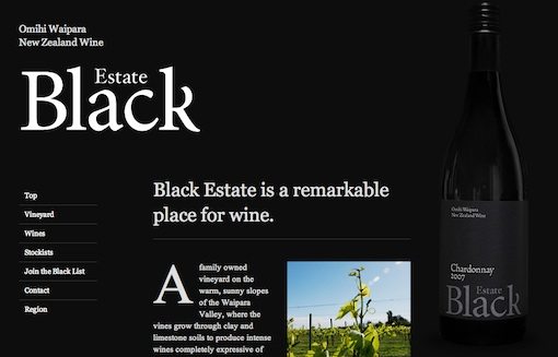
Black Estate
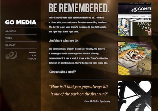
Go Media
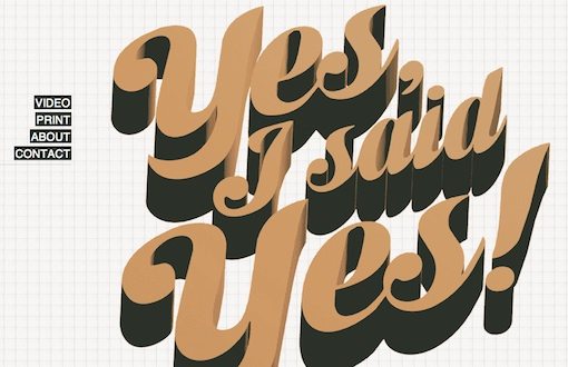
Yes I Said Yes
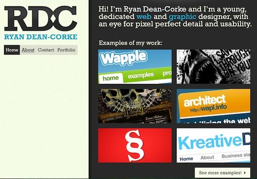
Ryan Dean-Corke
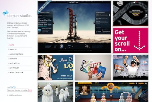
Domani Studios
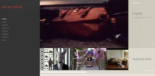
Fallon
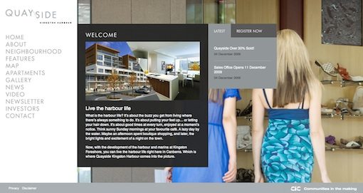
Quay Side
What Do You Think?
It took me forever to find that many sites using fixed navigation so I really hope you liked the post. Otherwise I wasted the better part of a day searching the web when I could’ve been doing what I normally do on any given day… which is definitely not browsing design blogs and CSS galleries like a big nerd. Ok, I’m lying, that’s exactly what I do all the time anyway.
Lame jokes aside, use the comments below to let us know what you think of fixed-position navigation in general and which example you liked the best. Also feel free to share any examples you find.