Design Trend: Side Navigation Is Everywhere, but Does It Work?
There’s a trending topic in website design navigation: sidebar menus. More designers are working with vertical side navigation for projects, with a specific location on the left side for many of these website designs.
And while it looks nice and can help streamline clutter in the overall canvas, does it really work? Will users respond to side navigation? Is it a design trend that you should consider? Today, we’ll try to get to the heart of the questions with some practical and usable answers.
Side Navigation Is Popping Up Everywhere
Side navigation is part of an evolution of hidden and interesting menu styles. Responsive design almost forced designers to think about alternative navigation patterns to make getting around on small screens easier. And the hamburger menu icon was born.
That’s evolved to more pop-out styles that start with a hamburger icon. Some of these navigation menus swing completely open, while others offer a drop down or drop across style with a full palette of user options. The common theme is that many hamburger icons open into vertical sliding navigation.
Full sidebar navigation seems to be an extension of that idea.
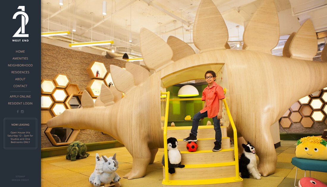
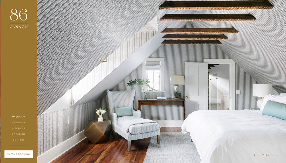
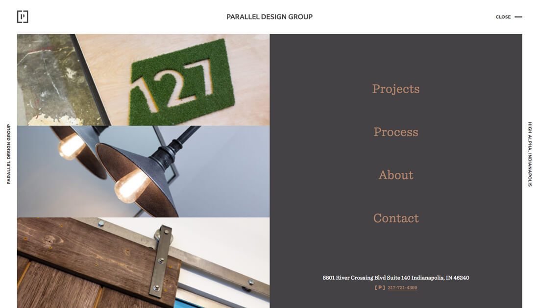
The trend in its current iteration features mostly thin left-hand navigation sidebars. They tend to be simple, of a single solid color (or overlay) and include a handful of items to choose from. The navigation bar can include a mix of logo or branding marks, text links and social media or other icons and search.
The key to making this trend work is to ensure that the sidebar includes enough contrast to be clearly visible in relationship to the rest of the screen, it must work on mobile devices (this can be rather tricky) and is wide enough to contain typefaces that are readable.
One more word of advice when thinking about vertical navigation: Don’t be tempted to cram it too full of elements just to fill up the depth of a standard-resolution screen. White space is totally acceptable – and even highly recommended – as a design tool in this format. Looking at the examples in this article, you can see that leaving space between items or aligning elements to the top, bottom or center with space around can each have appeal. The additional space in the navigation bar will help draw the eye to it, helping add to overall usability.
Side Navigation Pros
Side navigation has plenty of aesthetic value. While this concept was used frequently in the early days of the web, today’s vertical navigation menus are sleek and stylish.
Pros of using vertical side navigation include:
- Left vertical navigation falls into the long stroke of the F-shape, in which readers look first across the top and then down the left side as a natural reading pattern
- Menus items re not initially hidden as often happens with other trendy styles such as hamburger menus
- Items hold equal weight above the scroll
- Top-down reading is easy to scan when there is adequate spacing between elements
- Leaves uncluttered canvas for the rest of the design
- Provides a different shape canvas, which can add to visual interest or make it easier to user certain image or video content
- Can potentially contain more links in a clean manner
Side Navigation Cons
There’s a pretty large contingent of people who don’t like vertical navigation at all. While the biggest complaints in terms of usability are related to right-side navigation, some designers argue that vertical navigation styles add a level of complexity for users and developers.
Reasons against using vertical side navigation include:
- It can be difficult to get vertical navigation to work properly in a responsive framework
- The words in the navigation must be short enough to fit in a narrow column without using an unreadable typeface
- The space used by vertical navigation might be more valuable for other content.
- With wider screens, the scroll is higher and some navigation elements might get “lost.”>/li>
- The extra “space” from vertical navigation might encourage some designers to go overboard and clutter the navigation menu; as with top, horizontal navigation, stick to only the top four or five links within the site.
- Many mouse-users (right-handed) have to go across the screen to click navigation elements. This can be a cumbersome and eventually annoying user pattern.
- Vertical navigation needs to scroll and “stick” to the screen so that users don’t lose it. Often vertical navigation works well on a single page design, but gets awkward with wider usage.
Does It Really Work?
Does vertical side navigation really work?
The jury is still out on that one.
The trend is eye-catching and makes you look. So, there’s some value in that because users will see it. If your navigation is a vital part of click patterns and user flow, this option could be a consideration.
Overall, this navigation style seems to be most effective for small websites with only a handful of navigation options and limited content. Many of the examples in this article seem to be for real estate complexes (totally by chance), while it seems like something that would also work for a creative portfolio or agency website. Any design with lots of content might feel like side navigation is too restrictive in terms of design and content hierarchy.
What About Other Nav Locations?


Non-traditional navigation styles can be a fun way to break up some of the same old design patterns. The vertical option is just one of a few ideas.
The issue with any non-standard user pattern is that you run the risk of confusing users, causing them to abandon the website altogether. Any such experiment is best with a smaller site that has a simple overall visual flow.
Two other navigation styles that are starting to gain some traction include the horizontal hamburger pop-out, as used by Aurora (top) and the 90-degree tilted text nav used by AndCulture (below).
Both styles offer something a little unexpected and work well in their respective environments, though they might be hard to understand with different designs. As with any design technique, if you do something outside of normal user patterns, make sure to watch your analytics and test frequently. If there are odd click patterns or if users stop moving through navigation, you might have a problem with the non-traditional design and need to rethink it.
Conclusion
One thing is certain when it comes to navigation trends, users and designers seem to be fed up with completely hidden styles and demand options that work in similar formats on desktops and mobile devices. This might be one of the reasons a vertical pattern is trending.
What trends are you seeing in navigation? Are you bored with designing links across the top of the screen? Drop me a line on Twitter and let’s chat about it. (Make sure to tag Design Shack also.)