Review: The Mobile Book by Smashing Magazine
Smashing Magazine, one of the most significant forces on the web for all things design and development related, is hitting us with another tome of practical and insightful industry knowledge. The Mobile Book is the latest product of Smashing’s foray into publishing, and it just might be the best one yet.
Read on to see what The Mobile Book is, who it’s for, and why there should be a copy sitting on your shelf as soon as possible.
What is The Mobile Book?
Contrary to what the name implies, this book isn’t simply about designing for mobile devices, it’s about designing for everything. It’s about how the landscape of web design is changing dramatically and how our old standard design practices are no longer relevant.
The web hasn’t just hit a few different nicely separated screen sizes, it’s everywhere, on every screen (heck, it’s even hooked up to lots of things entirely without screens!). So how do we respond? What’s our move? Is Responsive Web Design our saving grace? Is that all we need to consider? The Mobile Book will answer all these questions and more.
Who Is It For?
The Mobile Book has been carefully structured so that it’s relevant for web designers and developers from every level of experience. If you’ve been doing this for ten years, great, this book is for you. If you’ve been doing it for six months, this book also happens to be for you.
Bottom line, the ubiquity of the web is affecting us all and we all, as designers and developers, need to make sure that our skills stay relevant and marketable in an evolving industry. If you’re looking to do that, this book can help.

A Tale in Three Parts
The Mobile Book hits you with a motherlode of information aimed at helping you handle the impossibly complex task of creating websites that function well across a wide spectrum of devices. It does this with three sections of content:
- The Mobile Landscape
- Responsive Web Design
- UX Design for Mobile
This may seem like a simple outline, but don’t let it fool you, each section is packed with top-notch discussions from leading industry experts. Let’s take a brief look at each.
The Mobile Landscape
The first section of book is titled, “The Mobile Landscape.” It’s split into two chapters: “What’s Going On In Mobile?” by Peter-Paul Koch and “The Future Of Mobile” by Stephanie Rieger.
The first of these is a seriously in-depth look at the state of the mobile web. You meet the major players in the mobile device industry and learn the story of what goes into a mobile phone before it hits the hands of a consumer.
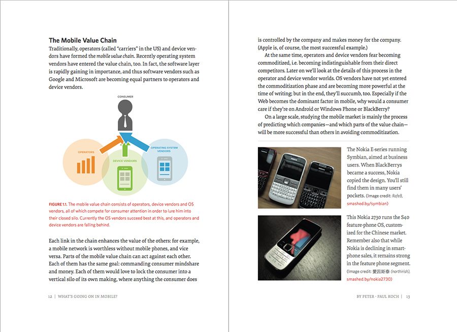
You also get a glimpse into which operating systems, browsers and device manufacturers are the most widespread and the pros and cons of developing for each system.
Moving on from here, we get a glimpse of the future of mobile. The time of the “Internet Things” is upon us. The idea of only computers, phones and tablets being connected to the web is a thing of the past. Soon, everything will be web connected, from the car you drive to that prescription pill bottle on your nightstand.
You’ll learn all about the latest and upcoming technologies that can and will change the landscape of how we interact with the world around us. Most importantly, you’ll learn how to prepare for this revolution.
Data That’s Relevant Now
One thing that I really appreciated from this section was the timeliness of the data. When I was browsing through the OS marketshare charts, I wasn’t looking at useless data from 2005, but 2012. I applaud the time and effort invested to make sure that the numbers and statistics being thrown around were directly applicable to design and development right now.
Responsive Web Design
For me as a CSS guy and lover of all things layout, this was the real meat of the book. Smashing pulled in two of this biggest names in RWD right now to explain responsive techniques and concepts: Trent Walton and Brad Frost. I look up to and closely follow these guys’ work daily and it was great to read their contributions to this book.
Trent Walton discussed “Responsive Design Strategy,” a solid introduction to the concepts involved in RWD. From fluid grids to responsive images and media queries, Trent lays it all out in a simple to follow fashion with coded examples that you can actually follow.
Trent starts super basic but quickly dives into advanced topics like mobile-first design, relative units, and the idea of content choreography.
Both Trent and Brad spend a lot of time discussing actual layout and design patterns prevalent in RWD today. This is extremely practical as it provides you with actual layout strategies and techniques that you can apply to your work today.
Trent introduces the idea of patterns but Brad’s article really digs into specific areas of every design and how they’re being approached by the people who are working on responsive sites every day.
The RWD section wraps up with a more development-centric discussion by Dave Olsen on how to optimize your site for mobile. He talks about how the weight of sites is steadily increasing and the practices that you can follow to counteract the slowdown effects of this phenomenon. This piece is overflowing with great tips that you can take directly to your site to improve performance.
UX Design for Mobile
Up to this point, the book has been very heavily skewed towards developers. The techniques discussed were largely related to code: HTML, CSS and JavaScript.
So, if you’re a designer who doesn’t code much or at all, are you left out? Nope, the UX section is for you. Here we get a glimpse of how Responsive Web Design and the mobile revolution are actually changing the design process at a core level.
Dennis Kardys has a piece called “Hands on Design for Mobile” where he discusses redefining how we think about a web “page” and how to redefine our approach based on more accurate models of though.
He gets into really fun stuff that we designers absolutely love, such as sketching and brainstorming techniques. One part that I particularly enjoyed was the concept of putting your content into a table, then mapping each cell of the table to a specific place in your evolving wireframes. It’s some fantastic stuff and definitely has the potential to completely change the way you approach the design process.
The book finishes off with a chapter by Josh Clark called “Designing for Touch.” This is exactly what it sounds like, an insightful discussion on the challenges that arise when you’re designing for fingers and direct interaction as opposed to cursors and indirect interaction.
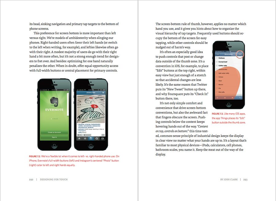
He discusses the unique issues that you’ll face when designing for phones, tablets and even a new category of hybrids that blur the lines between traditionally separate device categories.
Something that I enjoyed here was Josh’s look into how video games are so well designed for teaching users interaction methods as they go. It’s an awesome metaphor and I really think that he’s onto something when he says that UX designers should play more video games and think about the lessons that they can glean from how they’re structured.
What Did I Think? Worth a Read?
To be honest, anything with the word “mobile” in it almost throws up red flags for me. It has become such a useless buzzword for shallow and obvious discussions about how people now own smartphones (big surprise right?).
Fortunately, this book defies that stereotype. In place of obvious conclusions we see tough questions that lead to real challenges. We also tons of see real, applicable solutions to the issues that face every web designer in the industry right now.
The Mobile Book isn’t a lesson on history and it’s not filled with stuff that you won’t be able to apply for five years, it’s a handbook for web design today. Earlier I mentioned that you should add this book to your shelf, in reality, you’ll probably want to keep it on your desk.
As you start a new project and think about how to outline a content and design strategy, the UX chapter will be there to guide you with great new ideas. As you move into coding up actual web pages, Trent Walton and Brad Frost will show you how they overcome the major hurdles. And as you become overwhelmed by an industry that seems to vast and fast-moving to comprehend, the section on the mobile landscape will calm you down and help you feel as informed as possible.
Conclusion
For me, there are a few key questions that drive a book purchase, considering the wealth of free content online: Will I really use this book? Is it filled with practical, applicable information or just fluff? Is the information reliable?
The Mobile Book stands up well under all of these questions and therefore earns my stamp of approval. If you’re interested, you can pick up a physical copy here (comes with a digital copy) or grab the eBook here. At the time of this writing, the physical book is going for just under $40 and the eBook is on sale for $14.32.