Adobe Illustrator 101: 10 Things You Should Know About Ai
Adobe Illustrator is one of my absolute favorite applications. For vector work, Illustrator simply can’t be beat and you should really set your reservations aside and give it a shot. Even if you’re commonly creating raster graphics for the web, there are a number of things that Illustrator simply does better than Photoshop so getting to know both apps and their strengths/weaknesses is a must.
Today’s article is for the extreme Illustrator newbies. You have the Adobe Creative Suite installed on your computer and have seen Illustrator sitting there quietly begging to be played with but you’ve never jumped in. We’ll go over ten basic things you should know before starting.
A Photoshop-Centric Discussion
In writing this article, one of the major assumptions that I’m making is that you’re fairly familiar with Photoshop. Most web designers live in Photoshop and/or Fireworks so this should work well for you if you fit that description.
As I go through the tips below, a lot of the explanation will be based on how working in Illustrator is different than Photoshop. The two apps are quite similar so you should be able to leverage your existing knowledge as long as you keep the information below in mind.
Like Photoshop, Illustrator is a huge app so we can’t possibly cover everything in one post but this is a decent overview of some techniques, tools and knowledge to keep in mind.
Vector Graphics Are Magic
The absolute first thing you should know about Illustrator is that it’s used to create vector graphics. As you probably know, vector graphics are very different than the raster graphics that you typically create in Photoshop (it’s true that Photoshop has some limited vector capabilities, but no where near what you can achieve in Illustrator.). Instead of being comprised of static individual pixels, vector graphics are mathematically drawn by your computer and can therefore be drastically changed with absolutely zero loss in quality.
What this means on a practical level is that when you create art in Illustrator, no matter what its original size is, at any time you want you can make it as big as a billboard or as small as a thumb tac. This has major positive implications to the way you work.
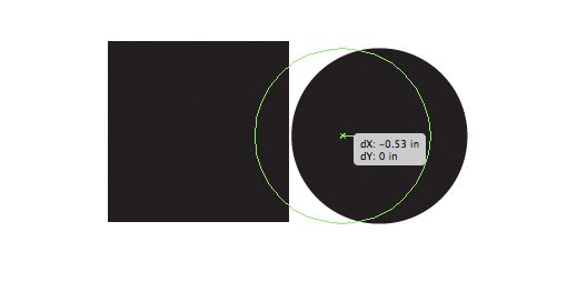
For instance, let’s say you’re in Photoshop and you have a circular logo that is small and you want it to be big. As you’ve probably no doubt run into a million times, if you try to increase the size of that element, it pretty much gets destroyed. Watch how much a simple circle loses quality as its size increases:

This makes creating and working with complex graphics in raster quite difficult because your freedom to change your mind is limited, even if you’re using Smart Objects you’re constrained to the object’s original size.
With vector graphics, these problems simply don’t exist, giving you the freedom to continually change your mind and your artwork at will without worrying about any visual degradation.

Also, since vector graphics are comprised of points and lines, you have an unlimited amount of freedom to go in and change individual line segments.

But You Already Knew That
Odds are, if you’re reading this blog you already know what the differences between vector and raster graphics are. The thing that you need to accept now is that Illustrator really does blow Photoshop away in this area (Fireworks is an interesting in-between that does both fairly well). Even better, you don’t have to choose one over the other but can instead use them and all the other apps in the Creative Suite synergistically throughout your various projects.
What’s All This Crap on My Screen?
The first thing that you’re likely to notice when you start using Illustrator is that there is a whole lot of stuff going on when you select and edit something. This is something that lots of new users tend to hate right off the bat because it looks confusing, but in reality all of the information and controls that Illustrator throws as you are extremely helpful.
The Bounding Box
For starters, whenever you select anything, you’ll see its bounding box. This is an intuitive feature that you should instantly understand, the part that’s not intuitive is why it won’t go away.
In Photoshop, you only see an object’s bounding box when you’re in the midst of a transform. In Illustrator, you see the bounding box whenever you have a complete object selected and the active tool is the Direct Selection Tool (V).
If you have multiple objects selected, the bounding box will appear around all of them, allowing you to move or transform them together. The same rules apply as you’re used to in Photoshop: hold shift to scale uniformly, throw in the Alt/Option key to scale from the center, etc.
One major different here is that you can’t grab and independently move a specific corner of the bounding box like you can in a Photoshop transform. This makes shearing and putting perspective on objects a bit trickier as you have to use the dedicated tools for these types of transformations. Later we’ll get a glimpse of how to use Free Transform, which will feel much more like you’re used to in Photoshop.
Smart Guides
Smart Guides are the major thing that bugs many newbies and pros alike. These are the little bits of information and outlines that pop up as you hover over, move or transform something. They may seem like they’re just getting in your way but try to get used to them and use them as much as possible, you’ll soon start to see their value.
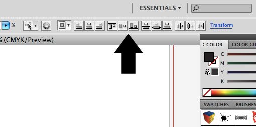
Smart Guides allow you to size objects on the fly using precise measurements and align whatever you have selected with points and lines from other objects around it. They make it really easy to create complex layouts very quickly and are much easier than “eyeballing” things. You also of course have a full set of alignment tools for these types of operations:
Turn It All Off
I highly recommend working with all of these extras turned on, but some users simply hate all of the distractions. Admittedly, I feel the same way about the extras for InDesign so I definitely understand this mindset.
Fortunately, Illustrator allows you to silence the noise and turn all of this stuff off. As a quick way to turn off the bounding box, hit Command-Shift-B, or go to View>Hide Bounding Box.
Similarly, turning off the Smart Guides is as easy as hitting Command-U, or going to View and unchecking Smart Guides.
Layers Are Different
When switching from Photoshop to Illustrator, it’s important to note the conceptual changes in the workflow. Despite the fact that the two applications share so many features, it’s frequently the case that the feature is used in a very different way.
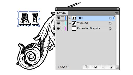
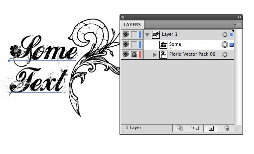
Layers are an excellent example of this. In Photoshop, every piece gets its own layer. In fact, an individual object is really defined by the layer it’s on. If you throw two elements on the same layer, they become a single element and if they overlap, you won’t be able to separate them anymore. Also, applying an effect to an object affects the whole layer.
In Illustrator, layers aren’t so much the way to access every separate piece on the page as they are a convenient organization utility. If you choose, you can create an incredibly complex piece of art with thousands of individual elements all using a single layer. Further, the elements on that layer have their own sub-hierarchy and can be independently edited and arranged at any time.
So, for example, instead of having a layer for every item, it would be pretty typical to create one layer that holds all your various text items, another for your vector graphics and possibly even a third for imported Photoshop art.
How Layers Work in Ai
There is a ton of functionality in Illustrator layers that you won’t see in Photoshop. For starters, each layer has a little dropdown arrow that allows you to see the hierarchy of each element within that layer. Here elements can be rearranged to adjust the visual stacking order of the result (use Command-[ and Command-] to bring an item forward or push it back).
On the right side of the palette you should see a circle next to a colored square. Clicking on the circle allows you to easily select an element. Click on the layer’s circle to select everything within the layer or an individual element’s circle to select only that item.
The colored square indicates the color of that layer. For convenience, the bounding box and other pop-up graphics are color-coded based on layers, that way when you select something you can instantly see which layer it is belongs to. To move an item from one layer to another, simply click and drag its little square.
The Pathfinder is Awesome
Let’s face it, drawing on a computer is hard. Even simple shapes can be difficult to create if you’re not a master of the Pen Tool. As with most professional vector software, Illustrator makes creating complex shapes much easier through the use of boolean operations found in the Pathfinder palette.
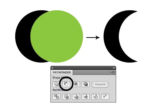
The little previews on the Pathfinder buttons are pretty self explanatory. They all essentially allow you to combine two shapes in an interesting way. When you first use Ai you might be tempted to think that this is a novelty feature that you’ll never use, but trust me, if you’re going to be doing illustration, putting the Pathfinder to work will save you loads of time.
A little bit of creativity goes a long way and once you can learn to see the simple shapes that make up complex objects, the Pathfinder will be your best friend.
Shape Builder
If you have CS5, Illustrator gives you another way to perform complex boolean operations. The Shape Builder Tool (Shift+M) allows you to simply click and drag through overlapping objects to combine them.
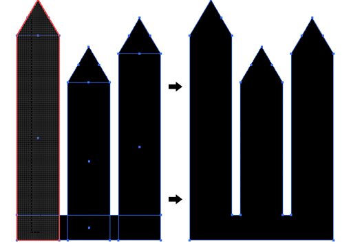
Try holding down the Option key to subtract geometry rather than add it. Check out a video tutorial on the new Shape Builder tool here.
Artboards, Not Pages
For over a decade Illustrator users have mourned the fact that it’s impossible to create multi-page documents. Adobe intentionally keeps multi-page projects as a key feature of InDesign though so there wasn’t much hope for a solution.
Recently though, the problem was solved in an interesting way by allowing users to create multiple artboards. These can be used in any number of ways: separate ideas for the same project, designing both the front and back of an object, etc.
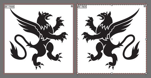
You can create as many artboards as you want in a single document. They can even be different sizes. Functionally, there are a lot of benefits to using multiple artboards within a single document instead of simply creating multiple documents. You can easily move/copy objects back and forth and print or export selected artboards all at once.
Effects Are Weird
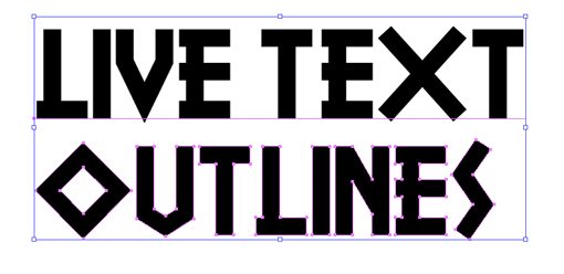
In place of “filters” like in Photoshop, Illustrator gives you various “Effects” that can be used to manipulate your artwork, and they take some getting used to. To see what I mean, let’s use one. Below I have some text that’s been converted to outlines and I want to give it some perspective. As I mentioned above, the bounding box doesn’t give me this freedom so I went to Effects>Distort & Transform>Free Distort.
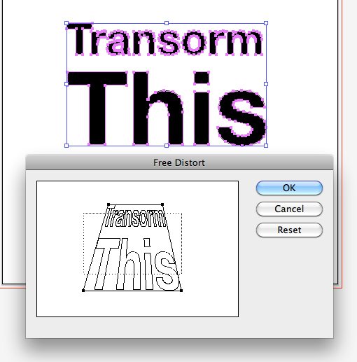
Now, when I apply the tranformation, things get a little wonky. The effect can clearly be seen on my text, but when I select the object, all of my points are still in their original positions and don’t reflect my current artwork at all.
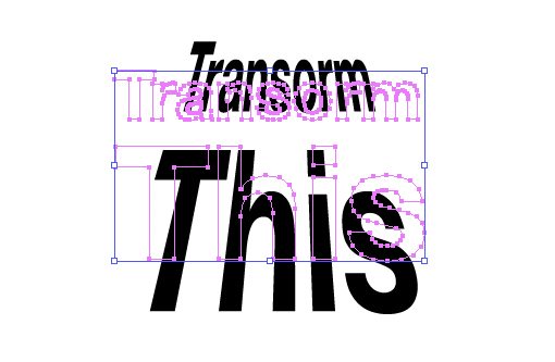
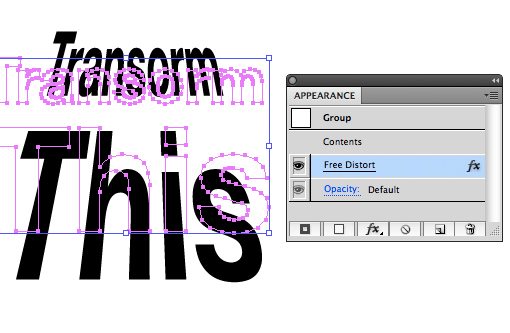
This is because the transformation isn’t actually applied in a permanent way. Instead of actually messing with the shape of your object, effects are applied “live”. This is actually a great thing because it means that you always retain the integrity of your original object and can go back and edit the effect at any time.
To edit the effect, select your object and bring up your appearance palette. There should be a little “fx” icon somewhere with the name of the effect that you applied. Simply double click that icon to edit it or drag it to the trash to delete it.
Photoshop Effects
You may have noticed that there is actually a set of Photoshop effects available inside of Illustrator. These can be fun to play with, but in all honesty I’d recommend using them sparingly, if at all. Illustrator effects are built for vectors and use mathematical calculations to adapt to changes in the artwork, Photoshop effects are raster and therefore not as reliable when attempting to apply them in a vector-driven workspace.
The Eyedropper Does a Lot
Inside of Photoshop, the Eyedropper tool grabs a color from your document or screen… that’s it. In Illustrator however, the tool is much more powerful. Here are a few things you can do with it.
Grab A Color from Another Item
This one you know about. Select one object, eyedropper another, the color of the second object will be applied to the first.
Example: Select red box, Eyedropper blue box, both boxes will now be blue.
Apply The Selected Object’s Color Elsewhere
An alternate way to use the Eyedropper tool is to select the object whose color you want to replicate elsewhere, then hold down the Option key and click on anything else that you want to give that color to.
Example: Select red box, Option-Click on blue box, both boxes will now be red.
Grab The Styling From Text and Other Objects
Illustrator’s Eyedropper tool not only grabs color but style as well. You can use it to make two text objects have identical fonts, color and size or to grab the stroke from a shape object.
Example 1: Select red Futura 12pt text, Eyedropper blue Helvetica 15pt text, both objects become blue Helvetica 15pt text.
Example 2: Select a white box with a black stroke, Eyedropper a blue box with a yellow stroke, both boxes become blue with yellow strokes.
Tip: hold down shift to only grab the foreground color of an object.
Fonts Make Sharing Files Difficult
When I pass a Photoshop document off to someone, no matter what fonts are used, they can actually open it up and see what the original design looked like. Without the fonts, they can’t edit the text, but they can at least view it.
In Illustrator this is not the case. If you create a piece of art for someone and send it along to them, if there are uncommon fonts used, odds are that person won’t be able to view your .ai file correctly (they’ll see the wrong fonts).
In practice, most people just send along the fonts, but this could be a poor choice for several reasons. First, font licensing is complicated and you’re technically not supposed to just give your expensive fonts to everyone who wants to see your file.
Also, it’s often the case that someone such as a commercial printer requests your files but you don’t really want them changing anything. In both of these cases you can save yourself a lot of trouble by going to Type>Create Outlines (Command-Shift-O). This essentially turns your text into vector shapes and therefore eliminates any font issues and takes away the viewer’s ability to change the text.
Alternatively, you could save the document as a PDF and share it that way. Many clients will request the “original layered files”, in which case a PDF won’t suffice, but if the person doesn’t care about file formats then PDF is the way to go.
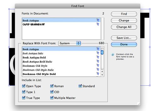
Dealing with Missing Fonts
If you’re on the other end of this discussion and receive a file with missing fonts, there is little you can do to fix it. However, Illustrator does make it easy to target specific missing fonts and replace them throughout a document with something from your system. This is done in the Type>Find Font dialog.
Useful Keyboard Shortcuts
To finish off our Illustrator basics discussion, you should familiarize yourself with how to get around the interface quickly and smoothly using keyboard shortcuts. Obviously, hovering over any tool will show you the equivalent shortcut, so here are some other useful tricks you may not know. Many of these are right out of Photoshop so you should feel right at home.
I’ll just throw in the Mac shortcuts here. PC users should just know that ⌘ (Command) = Control and ⌥ (Option) = Alt.
Zooming
- Zoom In/Out: ⌘+ or ⌘-
- Fit Artboard to Screen: ⌘0
- Zoom to Actual Size: ⌘1
Temporary Tool Switching
- Temporary Hand Tool: Hold Space from any tool
- Temporary Selection Tool: Hold ⌘ from any Tool (gives you Direct Selection if already in Selection Tool)
- Temporary Zoom Tool: Hold ⌘Space from any Tool
Pasting
- Paste In Front: ⌘F
- Paste In Back: ⌘B
- Paste In Place: ⌘⇧V
Working with Objects
- Duplicate an Object: Hold ⌥ while dragging
- Group Objects: ⌘G
- Ungroup Objects: ⌘⇧G
- Bring to Front: ⌘⇧]
- Send to Back: ⌘⇧[
- Select All on Active Artboard Only: ⌘⌥A
- Lock Selection: ⌘2, ⌘⌥2 to unlock all
- Hide Selection: ⌘3, ⌘⌥3 to show all
Other
- Check Spelling: ⌘I
- Show Grid: ⌘”
- Make Guides: ⌘5 (select a shape first)
Conclusion
I hope the ten tips above have encouraged you to give Illustrator another look. It’s a complicated application but it can’t be beat for vector work and once you get the hang of how it’s different from Photoshop, everything starts to make sense.
Leave a comment below and tell us any great Illustrator tips that come to mind. What did you struggle with when you first picked up this application? What do you still struggle with?