Help Prevent User Screw-Ups With These Awesome Tips
As a user, don’t you hate it when you click a button, only to realize that the resulting action really isn’t what you wanted at all? Sometimes this is a minor annoyance and sometimes it’s a complete disaster that ruins hours or even days of work.
As a designer, it’s up to you to help your users avoid these tragic mistakes whenever possible. Today we’ll look at some methods that you can use to achieve this goal.
What’s The Big Deal?
When you’re designing an interface, whether it’s on the web or in some sort of native application, you always want to carefully consider what can go wrong. Try to imagine the worst case scenario for every particular action that a user will take in the course of using your app and do whatever you can to make sure they understand the consequences of a click.
Why go through all of the trouble? Because there’s nothing that will make a user hate an app quicker than if they make a big mistake with it. Whether it’s completely their own fault or not, they’ll blame the application or, at the very least, develop a distrust for your product. When you give users the chance to discuss your product, “regret” and “distrust” are two words that you don’t want to come up in the conversation.
Tip: Warning Messages Suck
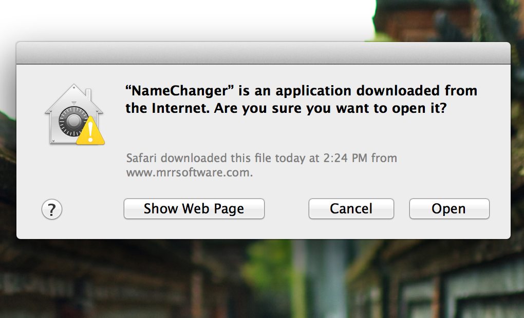
Now, when given the goal of making sure that a user never makes a mistake, some UI designers will go overboard and institute warning messages for every little action that the user could possibly take. Unfortunately, from a user’s perspective, this is the most annoying thing that a developer could do.
If I feel like you’re holding my hand too much through the process of using your app, I’ll resent you for thinking that I’m an idiot. I’ll also quickly get frustrated that everything takes so long because I have to work through the same warning messages over and over.
So When Can I Use a Warning Message?
The real trick for you as you’re planning the app is to decide what actions merit warning messages. There’s a happy medium between never warning a user and overdoing it, and it’s a tricky spot to find.
The guiding question is a simple one: “How easy is it to fix the problem if something goes wrong?” Put yourself in the user’s shoes and try to imagine the worst case scenario.
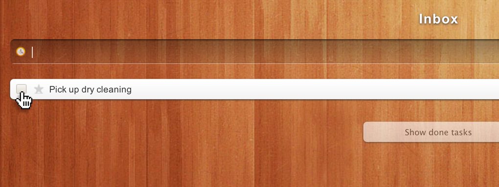
Let’s imagine a situation where you’re building a simple todo app similar to Wunderlist shown above. One action that the user might take is to check off a task and make it disappear. If they do this on accident or change their mind, ideally, they’d be able to get it back. But even without that functionally, typing in a simple todo title again really isn’t that much work. It should only take a second for the user to rectify their mistake. Given this fact, a warning message probably won’t be necessary for deleting a todo.
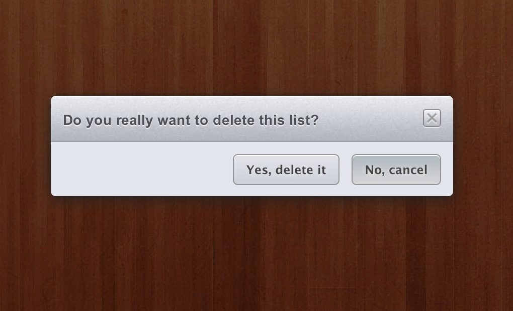
Now, what about if the same user wants to delete an entire list of todo items? This is something that could potentially be disastrous. If I have over a hundred todos and accidentally delete an entire list, I’m going to freak out if I can’t get it back. In that case, a warning message is definitely appropriate.
Help Prevent Screw-ups
Now that we have a feel for how warning messages can be good or bad, it’s time to take a look at some different methods that you can use and how they help prevent user screw-ups. Some of them use warning messages, others are a little more clever and tactful.
Preemptive Warnings
The reason that warning messages are so annoying is that they stop you dead in your tracks. This is only pleasant if you realize that you were about to make a big mistake, the rest of the time it simply blocks your progress.
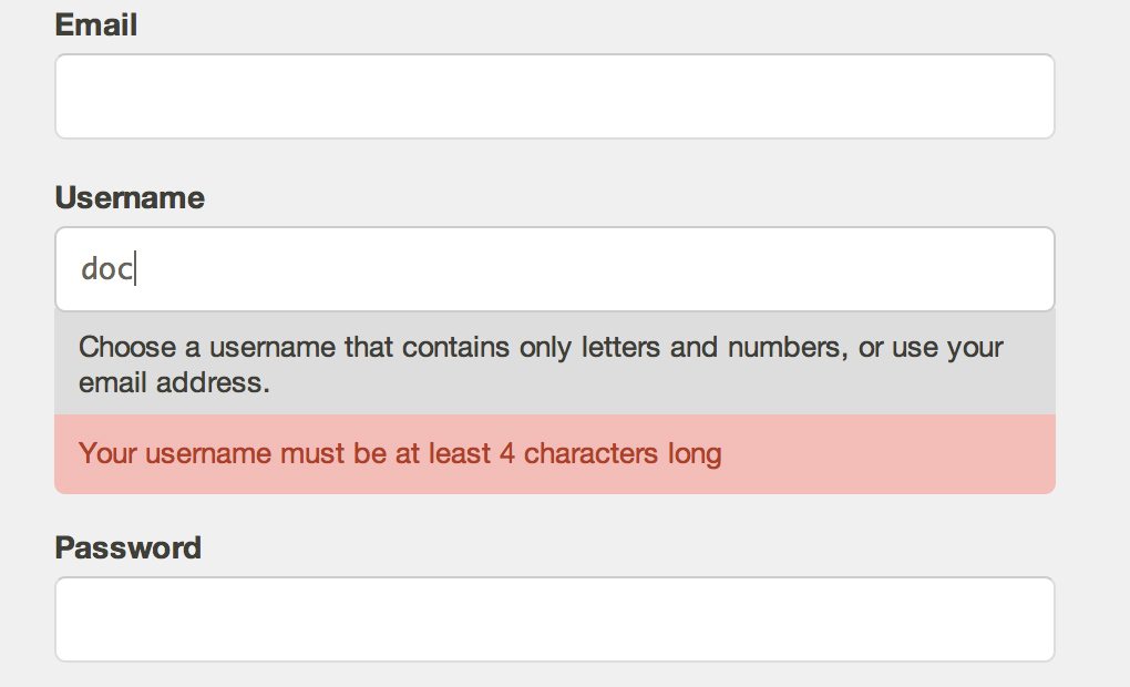
One way to eliminate this while still helping your users prevent mistakes is by using preemptive warnings. These don’t get in your way or inhibit your progress, but they do help you realize that you may have made a mistake.
You see this most often in live form validation. Check out how the Mailchimp sign up form tells me that I’ve made a mistake after typing in a user name that is only three characters long.
Are You Sure?
This is the most common type of warning used throughout web and native apps. It’s what we saw before with Wunderlist: a box that pops up, stops whatever you were trying to do and asks whether or not this is something you really wanted to do.
You likely see these pretty much all day every day if you work on a computer. For example, Mac users see one when they try to empty their trash.
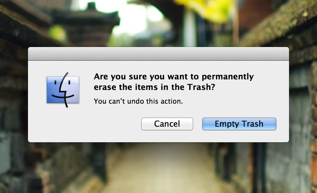
If we weigh Apple’s decision to put this here against the criteria that we set up earlier, then it checks out. As the window states, emptying the trash is not something that a user can do. Once you hit that button, those files are completely gone unless you’re the type of tech savvy nerd who knows how to get them back.
What Do You Want to Happen?
Sometimes a given action could be interpreted in more than one way. In these situations, you either have to choose between the interpretations as the designer or give the user the power choose what consequences the action will have.
Photoshop is an excellent example of this. When you drag a layer mask to the trash can, you get the following window.
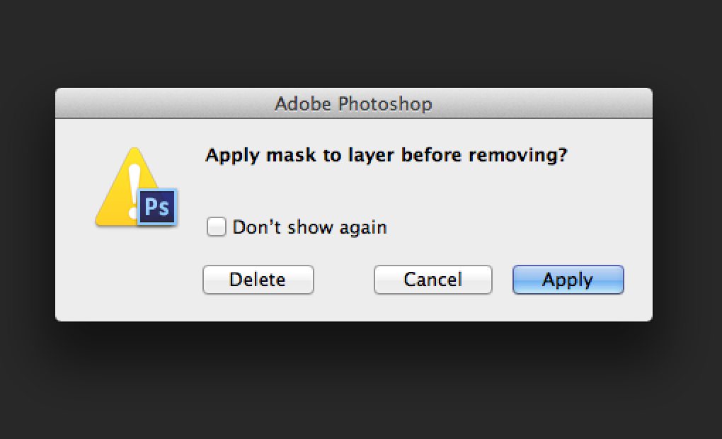
Here Photoshop is saying, “Hey, I know you want me to ditch this layer mask, but should I apply it first?” This is a helpful option because sometimes it is indeed the case that I want the mask to disappear completely and other times I want it applied to the layer. They also provide a hidden keyboard shortcut (Option) for pro users who want to skip this window.
Never Show This Again
There’s another interesting lesson to be learned from Adobe’s warning message. Notice that it has this little box that says “Don’t show again.” This is a really clever way to get the best of both worlds as a developer. You do your duty to always warn your users of an risky action, but also give them the choice to opt out of such warnings if they don’t need them.
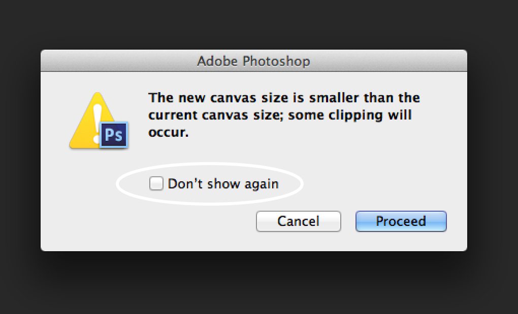
Adobe’s Creative Suite is positively overflowing with annoying warning messages and this opportunity to opt out saves me from going insane while using their apps.
Timed Cancel
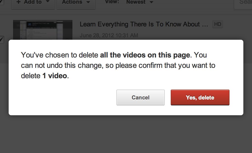
Today as I went to delete a YouTube video I noticed a UI trick that I had never seen before. A warning message popped up to inform me that I was about to delete all of the movies in my account, which is obviously a pretty big deal and is probably more often than not an accidental choice.
The weird part was that rather than allowing me to proceed with the action right away, they gave me the message, a cancel button and a button with a timer on it.
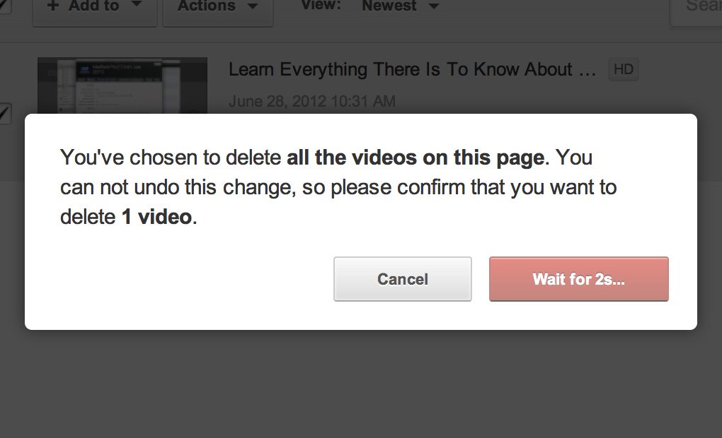
Only after a brief countdown did the second button turn into something that would allow me to delete the videos. Until then, it actually forced me to either cancel or read the message and make sure I knew what I was getting into.
This is a pretty nifty little idea, but keep in mind that users are likely to find it extremely annoying. Reserve this level of caution for actions that truly have dire consequences from which there is no return. Perhaps if a user wants to scrap his/her account completely or delete a large amount of data.
Show the Result Before the Action
One of my favorite ways that I’ve seen developers prevent screw-ups isn’t a warning message at all. Instead, it’s a simple preview of what things will look like after the action is taken.
There’s a great free Mac app called NameChanger that does a fantastic job of this. The app is meant to help you batch rename a bunch of files. On the left, there’s a column that shows the current filenames and the text to be replaced. On the right, there’s a column that shows the text you want to insert and the resulting filenames.
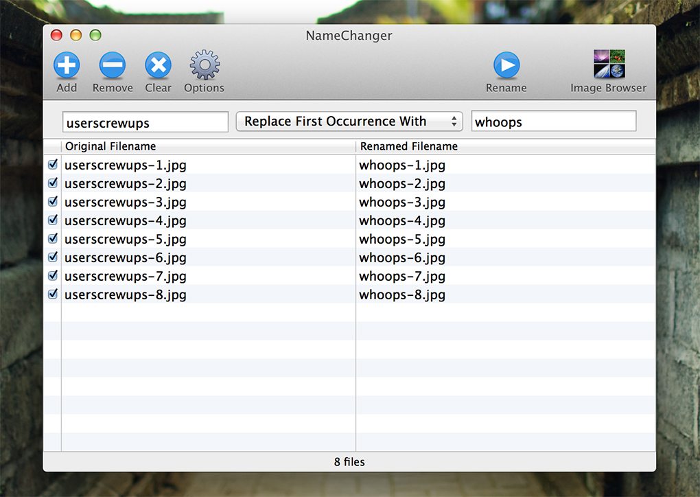
The clever part here is that this is all just a preview, no files are renamed until I hit the “Rename” button up top. This allows me to closely examine what I’m about to do and decide if everything is correct. I’ve also seen FTP apps use this same technique when syncing the contents of two folders. Given that you could be deleting valuable information by accident, it’s awesome to have a preview that shows what the folders will look like after the action.
How Do You Prevent User Screw-ups?
If you’re creating an app for anyone but yourself, you can pretty much guarantee that there’s going to be confusion over some aspect of the interface. Carefully considering user error is a must in all aspects of design and the tips above should help get you started in the right direction when you’re structuring app workflows.
Now that you’ve seen my examples, it’s time to chime in with your own. How do you help your users prevent mistakes? What other sites have you seen around the web with interesting solutions like the one we saw on YouTube?