The Ultimate Beginner’s Guide to Using Scatter Brushes in Photoshop
In web design we often focus on using Photoshop to create pixel perfect designs that are meticulously shaped and layered until they’re absolutely pristine. Repeated patterns, tiny strokes, complex gradients and reflections are trademarks of this design style.
But what if you’re going for something more organic? How can we use Photoshop to create complex and random particle arrangements that don’t look cheesy and contrived? The answer of course is to utilize scatter brushes. This awesome tool seems fairly simple on the surface but there’s a ton functionality and limitless possibilities to explore so even if you’re a Photoshop pro, read on to see some great ideas for how to use scatter brushes in your work.
Every Brush Is a Scatter Brush
Photoshop gives you a remarkable amount of control over every single brush that you use, whether you built it yourself or downloaded it from the web. This means that any brush that is currently in your Photoshop brush palette is potentially a scatter brush. Which is great news, because this equates to scatter brushes being super easy to implement.
To start off, simply open up your brush palette and select a brush. As I just mentioned, any brush will do, but I’m going to pick a star because its complex shape really helps show off the varying level of effects that you can achieve.
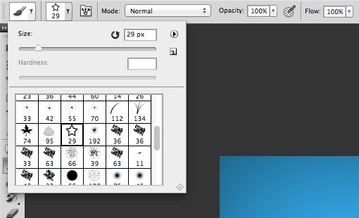
Spacing
Built into the brush you just selected are various attributes which are unique to just that brush. One of the most important attributes to our discussion today is the spacing. A default round brush is really just a circle shape that has the spacing set to 0. This creates a solid line when you click and drag. Some other brushes however, have a slightly higher spacing setting. Here’s what my star brush looks like when I click and drag with it:
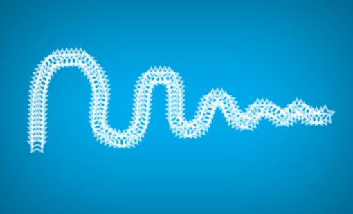
As you can see, instead of dragging a solid line, it looks more like a series of closely spaced stamps that follow my drawing line.
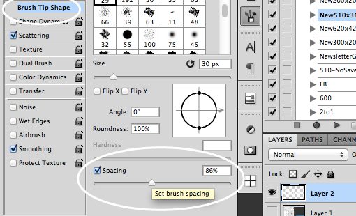
So how do we control this behavior? If we go to our Brush palette (Window>Brush), we find a ton of settings for controlling pretty, much every aspect of the brush. To start, make sure you have the “Brush Tip Shape” category selected on the left. At the bottom of this palette you’ll find the spacing options for the brush.
Cranking the spacing up decreases the frequency with which the star is stamped in our line. If we repeat our click and drag maneuver, we get something like this:

We’re moving in the right direction, but we still haven’t really created a nice scatter brush yet that’s capable of creating some nice particle effects.
Making It Scatter
Adjusting the spacing on a brush is nice, but in order to effect a scatter we need major vertical and horizontal shifts between each stamp. To do this, go into the “Scattering” section on the left side of the Brush palette.
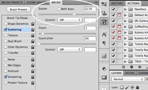
Here you can crank up the Scatter slider to really create a nice and random distribution. Adjust the Count slider to play with the frequency of the stamps. Now our brush is really starting to look like a scatter brush!

Jitter Bug
Throughout the Brush palette you’ll see various “Jitter” sliders. You might be asking yourself, “what the heck is jitter?”, which is a perfectly legitimate question. The word itself refers to deviations from a standard, so when you apply that to a brush setting it means that you’re introducing more variation into the result within a given range.
Size Jitter
Let’s take a look at a good jitter example. In our next step we want to start varying the size of our stars. Repeating the same basic shape is boring and jitter sliders allow us to make the scatter much more organic.
Under the “Shape Dynamics” category, you’ll find a Size Jitter Slider. Crank this to the max:
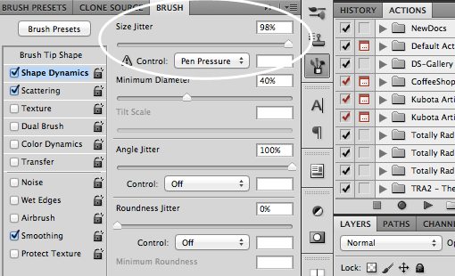
With that, click and drag your brush and the stars should come out in all different locations and all different sizes. Fancy!

Angle Jitter
Notice that, even though the sizes are different now, the stars all still look a little too similar. One reason for this is that they all share the same exact orientation. To fix this, jump down to the angle jitter:
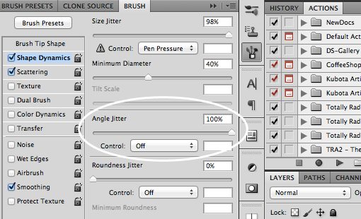
Now any semblance of uniformity is really starting to disappear. Our stars are all over the place with different locations, sizes and rotations.

Opacity, Color and Roundness Jitter
Under the “Transfer” section, you’ll find the Opacity Jitter, which helps you fade the stars in and out:

And under the “Color Dynamics” section, you’ll find the option to jitter between the foreground and background, and adjust the hue and saturation:

If we want to really go nuts, we can go back into the “Shape Dynamics” category and turn up the Roundness Jitter. This will make our stars look like they’re tilted in 3D space. The result is seems really layered and impressive for something that only tooks a single swipe.

Fun With Scatter Brushes
Armed with the knowledge above, you can create some really amazing things with scatter brushes. The possibilities are limited only by your imagination. Here are a few examples.
Bokeh Textures
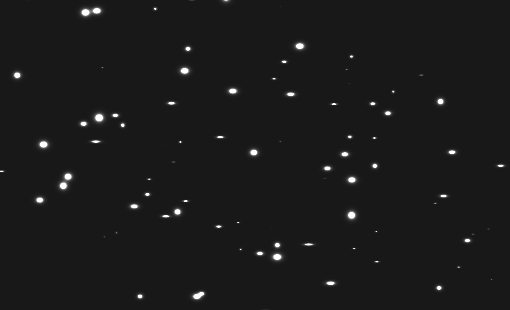
Bokeh textures are really popular in design right now. These utilize the blurry spots that result when lights are photographed out of focus (bokeh itself really refers to aesthetic quality of the blur, but that’s a different discussion entirely).
Creating these with scatter brushes is super easy. Just grab a nice hard round brush and set some of the parameters we just learned about. Here I kept the size constant but increased the scatter, spacing and opacity jitter.
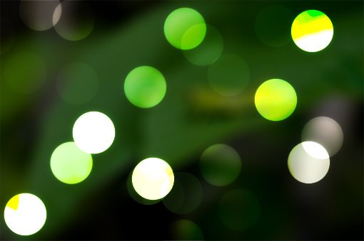
The result looks photographic but the dots were created entirely in Photoshop. The cool lighting effects are the wonder of Color Dodge in action. Let’s see how this works in a new example.
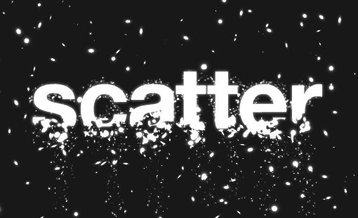
Disintegration Effect
To utilize this effect, create two layers, make the one on top black and the one on bottom “almost black” (really really dark gray).
One the black layer, grab a soft white brush and paint with a size a roundness jittered scatter brush. The result should look pretty weird at this point, like this:
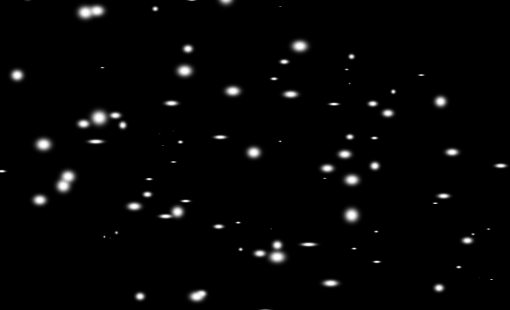
Now, if we take the top layer with all the scatter brush work and set it to Color Dodge, we get a nice glowing effect.
Now throw in some text, mask out the bottom and apply some more bright spots with tighter scattering around where the letters disappear and you’ve got the title image for this post:
Custom Shapes
Also be sure to experiment with various shapes, especially those that occur in nature and therefore tend to be scattered organically when we see them. Here I had some fun with a leafy arrangement:

Conclusion
To sum up, scatter brushes are a quick and easy way to make your designs more organic, interesting and complex. Absolutely any brush can quickly be turned into a scatter brush and you have lots of simple controls to vary the effect however you like.
Leave a comment and let us know if you learned anything. Do you ever use scatter brushes in your work? Leave a link to an example if you have one.