This Week in Design: March 14, 2014
From Facebook to Getty Images, big digital household names broke big news, including a redesign roll out and the release of millions of high-quality images for free use. Plus, we have a few fun tools for you to try as well.
Every week, we plan to a look at major product releases and upgrades, tools and tricks and even some of the most popular things you are talking about on social media. And we’d love to hear what’s going on in your world as well. Have we missed anything? Drop me a line at [email protected].
The Ultimate Designer Toolkit: 2 Million+ Assets
Envato gives you unlimited access to 19+ million pro design resources, themes, templates, photos, graphics and more. Everything you'll ever need in your design resource toolkit.


Facebook Tweaks Design Again
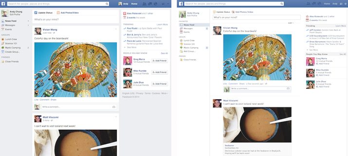
Some Facebook have started to notice changes to their news feeds in the last few days as the company rolled out a desktop design update. The major differences are bigger photos and a few new font choices with the new navigation concept that most users were already seeing. You can see a comparison of the new (left) and old news feed looks above.
The overall look is a little flatter by design and uses more Helvetica in terms of typography, fewer defined buttons and tinted boxes between content types. The overall function of the user interface is not changing, so Facebook will work the same way even if it looks a little different. Facebook also says it is not changing the algorithm that affects how items populate into users’ news feeds.
Aesthetically, the look and feel is a little more modern and organized. The flatter outline is on trend with what many web designers are doing right now. The tinted area for the news feed really separates it from the left and right sidebars. Bigger images are nice as well.
The new look has not rolled out to all users. The more than 1.23 billion active Facebook users around the world should see the changes to their feeds over the course of the next few weeks. The mobile design is not changing at this time.
Getty Makes Millions of Images Free to Use
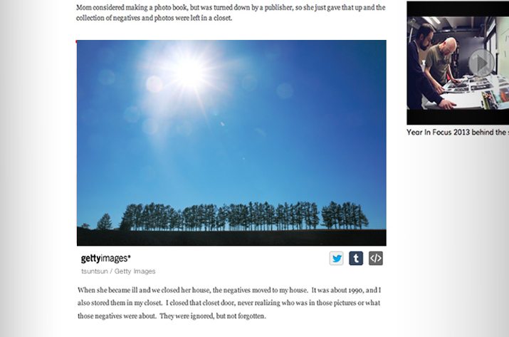
One of the most recognized names in the photography world announced that it will allow web designers and developers to use some of the more than 35 million images in its catalog free of charge for non-commercial projects. There is a small catch: Each image must be used with the proper embed code, which adds Getty Images insignia and attribution.
Getty Images released the tool in response to being unable to police all of the image theft happening online. So now, anyone can select an image, copy the embedded HTML and use an image from the Getty library on their website. Each image will link back to the Getty Images site.
Images from every Getty Images category – news, sports, entertainment and stock – are available to bloggers, personal websites, on social media and for other non-commercial purposes. The service went live on March 6.
Fun Freebies
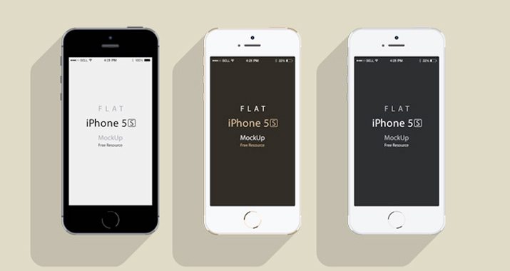
App and responsive design are an important part of any digital project. But sometimes showing these concepts can fall short during the presentation. A new PSD Review collection includes more than 80 free iPhone mockup designs in Adobe Photoshop format.
This great group of freebies includes everything you need to create and show off an iPhone mockup. With many different phone styles and orientations available, a collection like this makes creating a phone mock simple and fast.
The renderings come in a variety of styles and are completely free for you to use. Plus, PSD Review is continuing to update the list with new styles.
Glyphr Studio Made For Type Junkies
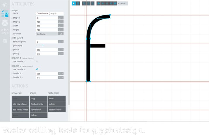
Typeface design is not something that you fall into overnight, but for the casual type junkie Glyphr Studio can be a great add-on. The web-based tool is a free HTML5-based font editor. It takes you through the process of creating your own typeface using vector-based tools.
Create complex shapes using tools such as copy and paste, invert and lock down, drag and resize. Edit paths with cubic Bezier curves. Glyphr Studio also uses linked shapes so that once you have that perfect “o,” you can copy and reuse the shape for multiple letterforms. (And if you make a change to the shape, it changes it for every usage.)
One of the nice features also includes the ability to see your font in action as you work on it. This gives you an idea of how letters will work together in a live environment, not just in the shape of an alphabet.
What’s Trending in the World of Web Fonts?
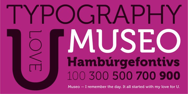
Does your website include the same typefaces as too many others out there? What typefaces are popular and trending? A List Apart writer Jenn Lukas broke it all down in a recent post, “The Latest in Web Font Trends.”
Not only does the article highlight some of the most popular choices out there – Open Sans, Neue Helvetica, Quicksand, Proxima Nova and Museo to name a few – but also how you can keep up with trends on your own.
Lukas breaks down the top three typefaces by the seven big web font providers. Plus, she explains how to get the data on your own from each.
This information is great for breaking down trends and even looking at typefaces that are known to work well. (A common typeface such as Museo would not be so popular if it did not work well in a variety of environments.) This list is also a nice source of inspiration if you are looking for a new typeface or just trying to avoid what everyone else is doing.
For Your Viewing Pleasure
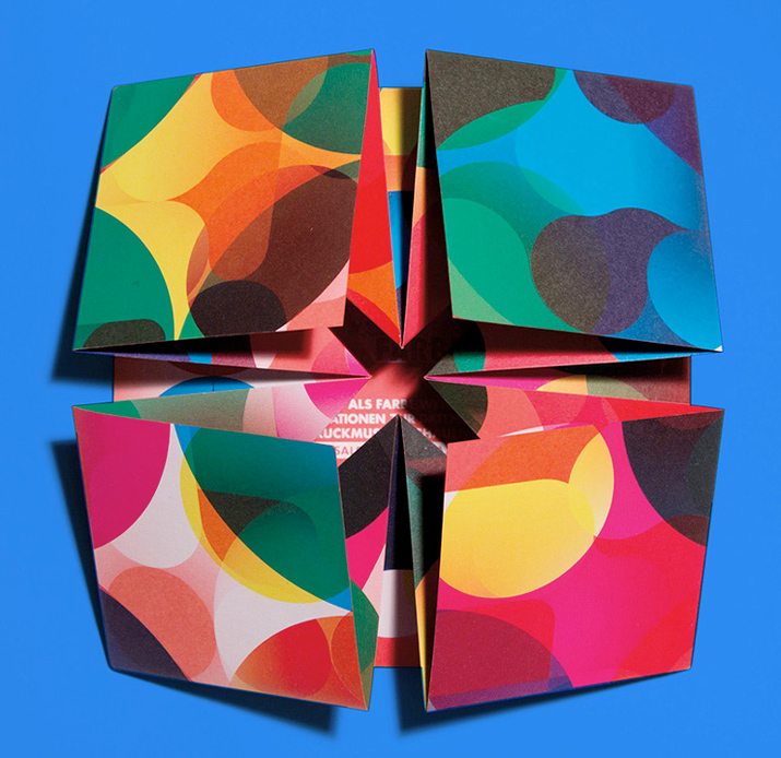
A stack of perfectly folded promotional pieces is designed to “open” when you unseal the package containing it. These “pop-up” brochures are fun and functionally designed, as showcased recently by Under Consideration.
The mailings were produced and distributed by Berlin-based digital printing company, MAGENTUR, one of the first printers in Germany to be able to digitally print white ink with their HP INDIGO 5500. The brochures were to alert customers about this new technique.
Not only is the look colorful and fun, but the user interaction is something not commonly seen in printed design. (I’d love to get my hands on one to see how it was put together.)